Bokeh Cheat Sheet: Data Visualization in Python
Bokeh is the Python data visualization library that enables high-performance visual presentation of large datasets in modern web browsers. The package is flexible and offers lots of possibilities to visualize your data in a compelling way, but can be overwhelming.
By Karlijn Willems, Data Science Journalist & DataCamp Contributor.
Python Data Visualization with Bokeh
Data visualization and storytelling one of the steps in the data science workflow that are often forgotten. Conversely, this might also be one of the hardest steps in your data science learning, as visualizing data or to tell a story about your data in such a way that your information sees the information that your analysis brings to the table can be particularly challenging. When you do start with taking these topics into account, you’ll mostly hear matplotlib is one of the preferred packages for data visualization and it is, but sometimes you do need to take your skills up a notch if you’re working with large datasets that you want to visualize interactively in web browsers.
That’s where the Bokeh package comes in: the Python data visualization library that enables high-performance visual presentation of large datasets in modern web browsers. The package offers lots of possibilities to visualize your data in a compelling way, but it’s also so flexible and big that once you want to get started, you can feel a bit overwhelmed by the possibilities. That’s why DataCamp has collaborated with Bryan Van de Ven, Bokeh core contributor, on a Interactive Data Visualization with Bokeh course, which was recently launched and which guides you through the possibilities that this package has to offer step-by-step and in an interactive way.
Additionally, DataCamp also made sure that you can download a Bokeh cheat sheet for free so that you have a handy reference sheet to fall back on when you’re in doubt!
Bokeh Cheat Sheet
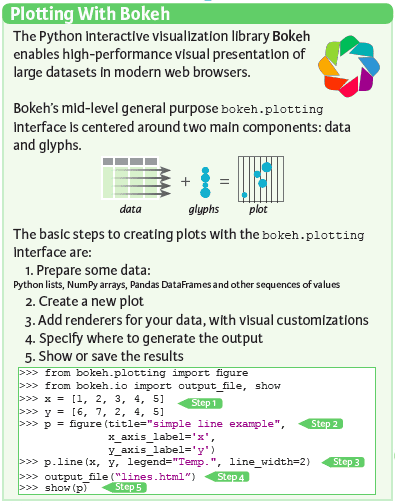
The Bokeh package offers a lot of flexibility to its users to make visualizations: the ones that are often used to quickly make plots and statistical charts are Bokeh’s mid-level general purpose bokeh.plotting interface and the high-level bokeh.charts interface.
There’s also the bokeh.models interface that provides the most flexibility to application developers, but which isn’t included into this Bokeh cheat sheet.
Now, when you work with bokeh.plotting, you’ll see that there are two main components that you know to work efficiently with this interface: data and glyphs, which make up your plot.
The basic steps that you need to take to make plots are five in total: you need your data to create new plots, to which you can add your glyphs and other visual customizations. You furthermore specify where you want to generate the output and then you show or save the results, as shown in the picture on the left-hand side.
Seems simple, right? Let’s look at all these steps in more detail.
The Data
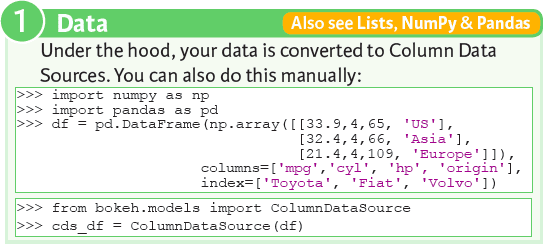
You can pass data of all sorts, such as Python lists or tuples, NumPy arrays or Pandas DataFrames to make your plots.
Under the hood, however, all data is converted to ColumnDataSource objects. However, you can also choose to create ColumnDataSource objects directly from dictionaries and Pandas DataFrames with ColumnDataSource() function, which you can use after importing it from bokeh.models. If you’re unsure on how to create and work with DataFrames and arrays, consider taking DataCamp’s Pandas tutorial and NumPy tutorial, but also the Pandas cheat sheet and NumPy cheat sheet.
Plotting
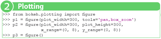
Much like when you’re working with Matplotlib, you start plotting with with Bokeh by initializing a figure. To do this, you first need to import figure from bokeh.plotting. You can use this function to create a new figure for plotting; When you do create the new figure, there are some extra arguments that you can specify to make sure that you modify the figure according to your preferences: with plot_width and plot_height, you adjust the width and height of the plot, with the tools argument, you add certain tools to your plot, such as pan or box_zoom.
Also, arguments such as x_range or y_range to set the range of your x-and y-axes can come in handy. You can, of course, also opt not to pass any arguments and just create a figure as is.
Renderers & Visual Customizations
Glyphs
When you have made a figure to plot in, the real work starts: adding renderers for your data and visual customizations, if necessary. You can not really keep up with all the glyphs that Bokeh has readily available for you, so the cheat sheet just lists the most important ones: scatter markers and line glyphs. You take the figure that you have created in the second step and by applying circle() or square() methods, you make sure that the data points that you want to scatter as circles and squares on your plot. The same goes for line() and multi_line(), which you can use to make line graphs. Your data points are then connected by lines.
Of course, these are not nearly all the glyphs that the Bokeh library has to offer. Go to this page to find more of them!
Customized Glyphs
The glyphs that you have seen in the previous section were not really highly customized, were they? Bokeh does allow you to add highly customized glyphs that will make the experience that the user has with your graphs totally different.
What do you think about selection and non-selection glyphs? They allow you to highlight certain data points or areas in your data; Or hover glyphs that highlight your data once you hover over the graph?
Cool, huh?
But what will probably come in very handy is the color mapping: you can display your data points with colors that correspond with the category to which they belong; Check out the cheat sheet for a code example of this!
Rows & Columns Layout
Another feature that will come in handy to make customized visualizations is the layouts module in Bokeh. It has row() and column() functions which allow you to create rows and columns of plots, respectively. This means that your plots will be displayed either horizontally or vertically. Nevertheless, that doesn’t mean that you can bring some variety: there is the option to combine both by nesting them.
This is already the first step in customizing the presentation of your graphs.
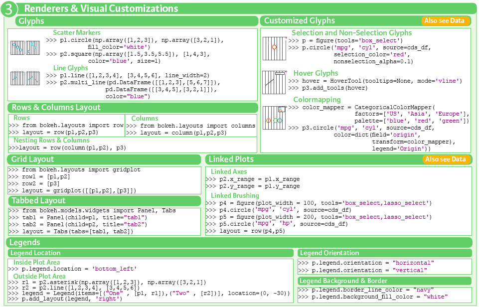
Grid Layout
Of course, there will be cases in which creating rows and columns will not be enough to satisfy your layout needs. That’s why Bokeh also has the grid layout: with the gridplot() function, you create a grid of plots that are rendered on separate canvases. What might be handy to know in this case is that the function builds a single toolbar for all the plots that are contained in the grid, which was not something that you could do with the row() and column() functions.
Tabbed Layout
Next to the rows and columns layout and the grid layout, there’s also the tabbed layout. Tab panes allow multiple plots or layouts to be shown in tabs; You can select from these tabs the plots that you want to see. In the code that is included in the cheat sheet, you see that the two plots that you have created before are now included into panels, which make up the tabs in your layout.
Linked Plots
You’ll see that it will often be useful to link plots so that you add connected interactivity between plots. Two examples of how linked plots can be made is by linking the axes or linked brushing, which means that the data sources are shared between glyph renderers. All selections that you do on one glyph also pass to all other glyphs that share that same source. To make this more concrete, let’s say that with the selection and non-selection glyphs, you select a certain area with data points for one plot. If your plots have linked brushing, this also means that the same data points for the other plot will also be selected. This is a great way to focus specifically on some parts of the data that call your attention.
When you link the axes of plots, you’ll see that once you drag the graph to left, right, above or below, the x-and y-axes of the other plots will also follow (or just one of the two axes will follow, it depends of course how you specify the linking exactly). In the code example above, both axes of the plots are linked.
Legends
Lastly, besides the glyphs, layouts and linking, it’s very important to consider that the legends that you add to your plots are essential for your audience to capture the true meaning of the graphs. You can make your graphs as pretty and meaningful as you want, but the legends will further help your audience to understand the message that your data visualization wants to put across. That’s also why legends have a place in this cheat sheet: you see how you can specify the legend location, orientation, background and border.
When it comes to the legend location, you can clearly put it inside the plot area or outside. In the first case, putting the legend is as simple as assigning a string to your plot’s attribute. In the second case, you need to type a little bit more code to get it fixed: you pass a list of tuples that need to make up the legend and you also add a location. You then add a layout to your plot and specify that you want to use the legend values in the variable that you have just created, and you add that they should appear on the right-hand side of your plot.
For legend orientation, you don’t have to worry much; It’s either vertical or horizontal. And again, it’s as simple as adjusting an attribute of your plot. Also for background and border specifications, you’re fine with just adjusting the plot attributes.
If you want to see a more elaborate code example, go to this page.
Output
The most notable ways to output your Bokeh visualizations is either to an HTML file or to display them in a Jupyter notebook. The functions that you can use to do these actions are output_file() and output_notebook(). The former function allows you to add an extra argument to specify the mode or how you want to include the BokehJS; You can find more information about all the modes and what they mean here.
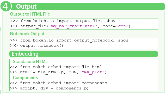
Of course, when you start working with Bokeh and you feel that you’re missing output options, make sure to check out this page for more information.
Show or Save Plots
Much like when you’re working with Matplotlib, it’s finally time to show or save your plots when you have gone through all of these steps! Use the show() and save() functions to make this happen!

Statistical Charts With Bokeh
The mid-level general purpose bokeh.plotting interface is great for when you actually have time to lay out your plot customizations line by line and step by step. This is great for when you’re making your images for a presentation or a final report. For data exploration purposes, however, you might consider using the high-level bokeh.charts interface, which is a really fast and convenient way of making plots with a minimum of code.
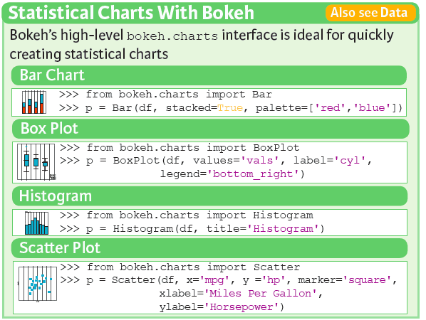
The cheat sheet includes the most common charts that you will be using when you’re quickly exploring your data or if you don’t feel like typing more code than necessary: the bar chart, boxplot, histogram and the scatter plot. As you might have already guessed, constructing these plots is super easy thanks to the Bar(), Boxplot(), Histogram() and Scatter() functions.
Of course, making plots with a minimum of code in a fast way doesn’t mean that you can specify any specific customizations: you can still add a variety of arguments to make sure that your plots are unique ☺ You can find some more information about those here.
Get Started!
You’re now ready to go and start experimenting with the Bokeh library! If you ever feel like you need some inspiration or if you have a certain visualization in mind, but you can’t seem to get the code to reproduce what you want, consider checking out the Bokeh Gallery. It contains tons of beautiful examples which will make you swoon!
PS. Don’t forget to keep your cheat sheet handy of course.
DataCamp is an online interactive education platform that that focuses on building the best learning experience specifically for Data Science. Our courses on R, Python and Data Science are built around a certain topic, and combine video instruction with in-browser coding challenges so that you can learn by doing. You can start every course for free, whenever you want, wherever you want.
Karlijn Willems is a data science journalist and writes for the DataCamp community, focusing on data science education, the latest news and the hottest trends. She holds degrees in Literature and Linguistics and Information Management.
Related: