Process Mining with R: Introduction
In the past years, several niche tools have appeared to mine organizational business processes. In this article, we’ll show you that it is possible to get started with “process mining” using well-known data science programming languages as well.
By Seppe vanden Broucke, KU Leuven
Today’s organizations employ a wide range of information support systems to support their business processes. Such support systems record and log an abundance of data, containing a variety of events that can be linked back to the occurrence of a task in an originating business process. The field of process mining starts from these event logs as the cornerstone of analysis and aims to derive knowledge to model, improve and extend operational processes “as they happen” in the organization. As such, process mining can be situated at the intersection of the fields of Business Process Management (BPM) and data mining.
The most well-known task within the area of process mining is called process discovery (sometimes also called process identification), where analysts aim to derive an as-is process model, starting from the data as it is recorded in process-aware information support systems, instead of starting from a to-be descriptive model and trying to align the actual data to this model. Process mining builds upon existing approaches, though the particular setting and requirements that come with event data has led to the creation of various specific tools and algorithms. Compared to traditional data mining, where an analyst works (most frequently) with a flat table of instances, process mining starts from a hierarchical and intrinsically ordered data set. Hierarchical as an event log is composed out of multiple trails recording the execution of one process instance, which in itself is composed out of multiple events. These events are ordered based on their order of execution. A prime use case in process mining is hence to abstract this complex data set to a visual representation, a process model, highlighting frequent behavior, bottlenecks, or any other data dimension that might be of interest to the end user.
Traditional data mining tooling like R, SAS, or Python are powerful to filter, query, and analyze flat tables, but are not yet widely used by the process mining community to achieve the aforementioned tasks, due to the atypical nature of event logs. Instead, an ecosystem of separate tools has appeared, including, among others: Disco, Minit, ProcessGold, Celonis Discovery, ProM, and others. In this article, we want to provide a quick whirlwind tour on how to create rich process maps using a more traditional data science programming language: R. This can come in helpful in cases where the tools listed above might not be available, but also provides hints on how typical process mining tasks can be enhanced by or more easily combined with other more data mining related tasks that are performed in this setting. In addition, the direct hands-on approach of working with data will show that getting started with process discovery is very approachable. We pick R here as our “working language” as the fluidity of modern R (i.e. the “tidyverse” packages, with especially “dplyr“) makes for a relatively readable and concise approach, though there is no reason why other tools such as Python wouldn’t work just as well.
We’re going to use the “example event log” provided by Disco as a running example. First, we load in some libraries we’ll need and define a few helper functions and load in the event log:
# Load in libraries
library(tidyverse)
library(igraph)
library(subprocess)
library(png)
library(grid)
library(humanFormat)

# Returns the max/min of given sequence or a default value in case the sequence
# is empty

max.na <- function(..., def=NA, na.rm=FALSE)

if(!is.infinite(x<-suppressWarnings(max(..., na.rm=na.rm)))) x else def

min.na <- function(..., def=NA, na.rm=FALSE)

if(!is.infinite(x<-suppressWarnings(min(..., na.rm=na.rm)))) x else def

eventlog <- read.csv('c:/users/seppe/desktop/sandbox.csv', sep=';')

eventlog$Start <- as.POSIXct(strptime(eventlog$Start.Timestamp,
                                 "%Y/%m/%d %H:%M:%OS"))

eventlog$Complete <- as.POSIXct(strptime(eventlog$Complete.Timestamp,
                                   "%Y/%m/%d %H:%M:%OS"))
Next up is the key step of the analysis process: for every event line in the event log, we want to figure out (i) the preceding activity, i.e. the activity that stopped most recently before the start of this activity in the same case and (ii) the following activity, i.e. the activity that started most quickly after the completion of this activity in the same case. To do so, we’ll first assign an increasing row number to each event and use that to construct two new columns to refer to the following and previous event in the event log:
eventlog %<>%

mutate(RowNum=row_number()) %>%

arrange(Start, RowNum) %>%

mutate(RowNum=row_number()) %>%

rowwise %>%

mutate(NextNum=min.na(.$RowNum[.$Case.ID == Case.ID & RowNum < .$RowNum &
                                                 .$Start >= Complete])) %>%

mutate(PrevNum=max.na(.$RowNum[.$Case.ID == Case.ID & RowNum > .$RowNum &
                                                   .$Complete <= Start])) %>%

ungroup
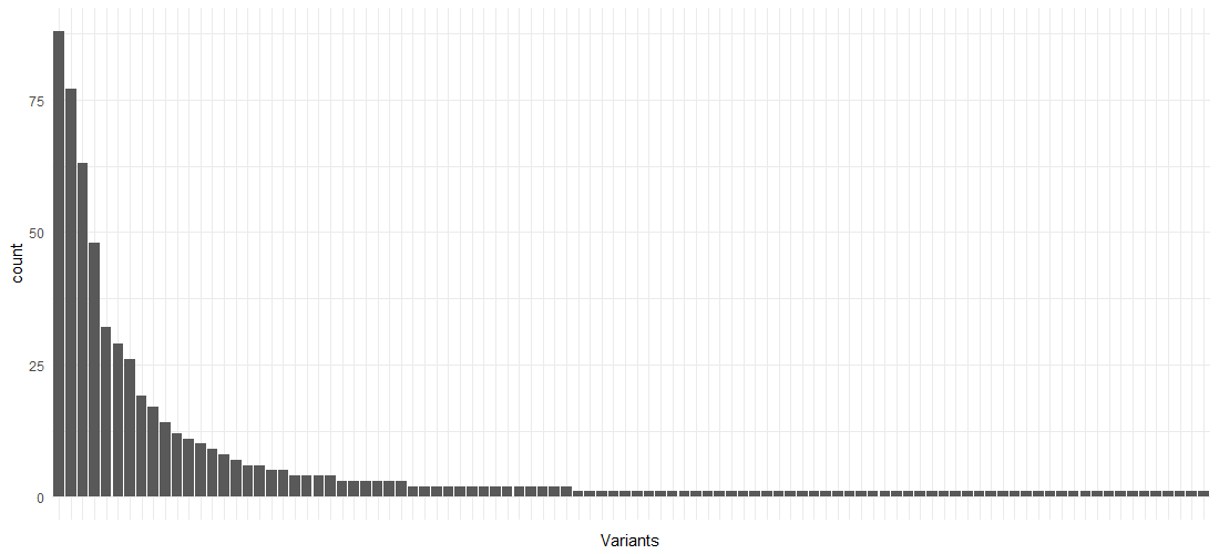
Using this prepared event log data set, we can already obtain a lot of interesting descriptive statistics and insights. For instance, the following block of code provides an overview of the different variants (pathways) in the event log:
eventlog %>%

arrange(Start.Timestamp) %>%

group_by(Case.ID) %>%

summarize(Variant=paste(Activity, collapse='->', sep='')) %>%

ggplot(aes(x=reorder(Variant, -table(Variant)[Variant]) )) +

theme_minimal() +

theme(axis.text.x=element_blank(),

axis.ticks.x=element_blank()) +

xlab('Variants') +

geom_bar()
As is the case with many processes, there are a few variants making up the largest part of the process instances, followed by a “long tail” of behavior:
Next, we construct two data frames containing only the columns we’ll need to visualize our process maps, for the activities and edges respectively. We’ll also calculate the event durations in this step:
activities.basic <- eventlog %>%

select(Case.ID, RowNum, Start, Complete, act=Activity) %>%

mutate(Duration=Complete-Start)

edges.basic <- bind_rows(

eventlog %>% select(Case.ID, a=RowNum, b=NextNum),

eventlog %>% select(Case.ID, a=PrevNum, b=RowNum)) %>%

filter(!is.na(a), !is.na(b)) %>%

distinct %>%

left_join(eventlog, by=c("a" = "RowNum"), copy=T, suffix=c("", ".prev")) %>%

left_join(eventlog, by=c("b" = "RowNum"), copy=T, suffix=c("", ".next")) %>%

select(Case.ID, a, b,

a.act=Activity, b.act=Activity.next,

a.start=Start, b.start=Start.next,

a.complete=Complete, b.complete=Complete.next) %>%

mutate(Duration=b.start-a.complete)
This latter requires some considerate thinking. Even although a distinct list of (ActivityA-ActivityB)-pairs is sufficient to construct the process map, we do need to take into account the correct number of times an arc appears in order to calculate frequency and other metrics. We hence first merge the (Case Identifier, RowNum, NextNum) listing with (Case Identifier, PrevNum, RowNum) and filter out all entries where an endpoint of the arc equals NA. We then apply the “distinct” operator to make sure we get a unique listing, albeit at the row number level, and not at the activity name level. This makes sure our frequency counts remain correct. We can then figure out the endpoints per arc at the activity level by joining the event log on itself on both endpoints. We then select, for each arc, the case identifier, endpoint row numbers (“a” and “b”), the activity names of the endpoints, the activity start and completion times of the endpoints, and the duration of the arc based on the endpoints, i.e. the waiting time of the arc.
This is all the information we need to start constructing process maps. We’ll use the excellent “igraph” package to visualize the process maps. Plotting it directly in R, however, gives non-appealing results by default. Sadly, igraph, like most graphing tools, is built with the assumption that graphs can be very unstructured (think social network graphs), so that the layout for process oriented graphs does not look very appealing. Luckily, igraph comes with powerful export capabilities that we can use to our benefit. Here, we’ll export our graphs to the dot file format and use “Graphviz” to perform the actual layout and generation of a resulting image.
Let’s try this out by creating a process map annotated with median duration times for the activities and arcs. First, we’ll define two color gradients for the activities and edges respectively, as well as another small helper function, and then construct two new activity and edges data frames with the duration information:
col.box.red <- colorRampPalette(c('#FEF0D9', '#B30000'))(20)

col.arc.red <- colorRampPalette(c('#938D8D', '#B30000'))(20)

linMap <- function(x, from, to) (x - min(x)) / max(x - min(x)) * (to - from) + from

activities.counts <- activities.basic %>%

group_by(act) %>%

summarize(metric=formatSeconds(as.numeric(median(Duration))),

metric.s=as.numeric(median(Duration))) %>%

ungroup %>%

mutate(metric=ifelse(metric.s == 0, 'instant', metric),

color=col.box.red[floor(linMap(metric.s, 1,20))])

edges.counts <- edges.basic %>%

group_by(a.act, b.act) %>%

summarize(metric=formatSeconds(as.numeric(median(Duration))),

metric.s=as.numeric(median(Duration))) %>%

ungroup %>%

mutate(metric=ifelse(metric.s == 0, 'instant', metric),

color=col.arc.red[floor(linMap(metric.s, 1, 20))],

penwidth=floor(linMap(metric.s, 1, 5)))