6 Tips for Effective Visualization with Tableau
We analyse principles for effective data visualization in Tableau, including color gradients, avoiding crowded dashboards, Tableau marks and more.
Tableau is an extremely powerful visualization software that focuses on business intelligence and analysis, utilised by thousands of companies worldwide.
With a simple drag-and-drop design, a community forum and countless tutorials online, Tableau enables users to produce beautiful visualizations quickly. However, there are some common mistakes that are made on a regular basis.
With that in mind, here are our 6 top tips for effective visualization with Tableau.
1. Keep it clean
The dashboard feature makes it easy for users to create complex, interactive visualizations, combining multiple graphics. When done correctly this can be an extremely useful tool for business analysts to portray data in a readable format. However, too often these dashboards can become cluttered and difficult to understand.
Reducing title text and removing repeated words can be an easy way to do this. Another simple change is to highlight the important facts/figures and present these at the top so that the viewer can see the important information straight away.
This shows a Tableau dashboard that would be considered untidy and crowded. It contains far too many graphs that don’t fit correctly onto the page.
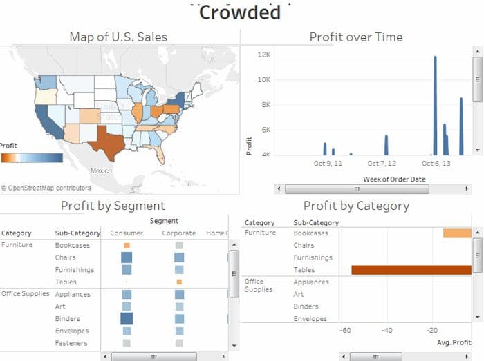
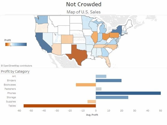
Below is a cleaner, improved version of this dashboard. A general rule of thumb is that only two or three visualisations should be shown on a single dashboard. Any more than this and it can become too complicated for the end user to understand and can also affect speed and performance. This new version contains just the map and diverging bar chart, both set to a width of 100%, which makes it much easier to comprehend.
2. Don’t use two parameters to convey the same information
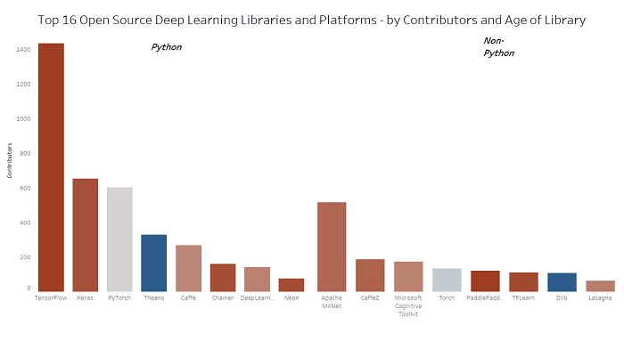
A common mistake seen on Tableau is using two parameters to display the same information. For example, using the data from this KDnuggets post - Top 16 Open Source Deep Learning Libraries and Platforms - we could create the below bar chart:

In theory, there’s nothing wrong with this as a graph and Tableau makes it very easy to add a color gradient. Simply drag and drop the variable onto the color icon and voila, you have a gradient! However, the color scheme and the height of the bar are showing the same variable. We could add a third variable – for example, the age of the library – and instead use this for the color gradient:
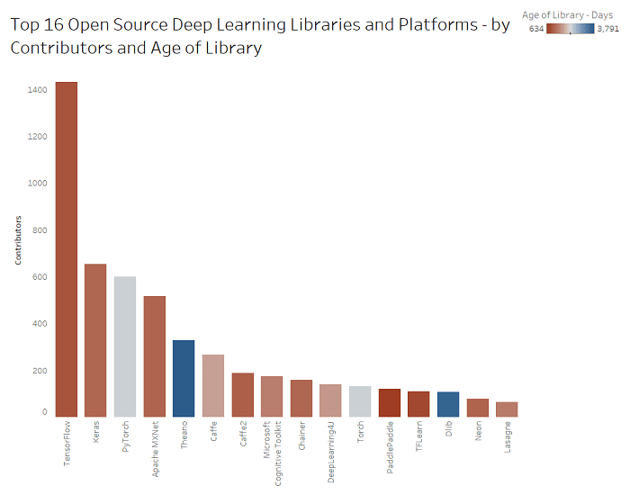
The age of library is shown on a color gradient from red (newer libraries) to blue (older). This improves the graph and displays more information to the end user.
3. Sensible color choice
This one sounds simple enough, but you’d be surprised. Not enough colors and the visualization can appear dull and un-engaging, but too many can have the opposite effect and may appear unprofessional.
Luckily, Tableau have produced a detailed explanation of their best color practices here. They also provide color palettes so you can easily see which colors work best together. Furthermore, if you plan on showcasing your dashboard to a wide audience, it may be best to test the accessibility and contrast of your font/color scheme using a tool such as Color Safe.
4. Clear typography and simple labeling
Using a clear, well-contrasted typography and simple labeling is vital for any visualisation. Tableau allows you to amend the typography easily. A useful feature is the ability to change the font on any individual part of the graph, from the axis, to the label, to the title. A third-party tool such as WebAim’s color contrast checker can be beneficial in ensuring the color scheme and font you are using has a sufficient contrast.

A simple way of cleaning up the feel of a dashboard is to remove any duplicate axis. Consider the below chart, with our early bar chart example split out into two separate graphs – Python and non-Python:
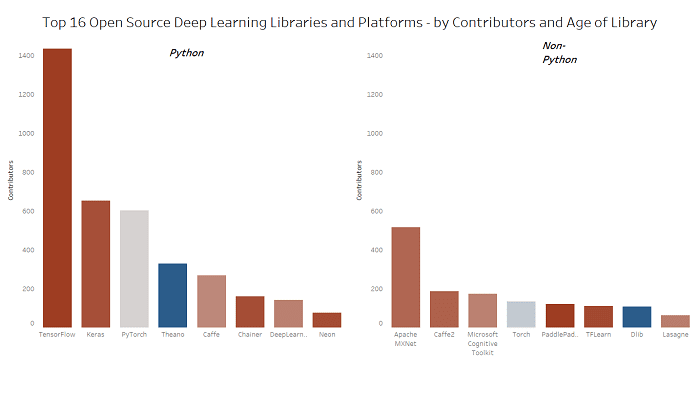
It’s a small change but we can easily remove the y axis from the second graph, which would allow both graphs to be slightly bigger and remove some unnecessary text. You can remove an axis by right-clicking it and unchecking ‘show header’. The amended, cleaner version can be seen below:
5. Use Tableau marks to show more variables
Quite often you will want to show more than one variable in a graph, without having to use a color gradient like our bar chart example earlier. Of course, we could use a scatter-graph for two variables, but what about if we have three? Carrying on with our earlier example, if we wanted to show number of Github commits and stars as well as contributors, we could use Tableau’s ‘size’ tool to display this. Like with colour, simple drag the relevant dimension/measure onto the size icon. The scatter-graph below shows this data now, Github commits by contributors, with the size of the circle representing the number of stars it has.

The Tableau shape mark can also be useful for displaying additional variables. For example, we could add a fourth variable to the above chart, showing which programming language each library used. By dragging and dropping this variable onto the shape icon, each type would be automatically designated a shape which could be manually altered.
6. Collaborate
The last, and perhaps most important tip, is to use the ever-growing Tableau community to collaborate and share your work with others. Of course, if you are tasked with creating something for your organisation that contains private information, then this doesn’t apply to you. But for any non-sensitive information, use Tableau Public so that others can see and learn from your work. Likewise, use the resource to get new ideas and overcome obstacles that you may be facing.
Related:
- A Comparative Analysis of Top 6 BI and Data Visualization Tools in 2018
- Best Practices in Data Visualization
- How To Choose The Right Chart Type For Your Data