 5 Quick and Easy Data Visualizations in Python with Code
 5 Quick and Easy Data Visualizations in Python with Code
This post provides an overview of a small number of widely used data visualizations, and includes code in the form of functions to implement each in Python using Matplotlib.
Data Visualization is a big part of a data scientist’s jobs. In the early stages of a project, you’ll often be doing an Exploratory Data Analysis (EDA) to gain some insights into your data. Creating visualizations really helps make things clearer and easier to understand, especially with larger, high dimensional datasets. Towards the end of your project, it’s important to be able to present your final results in a clear, concise, and compelling manner that your audience, whom are often non-technical clients, can understand.
Matplotlib is a popular Python library that can be used to create your Data Visualizations quite easily. However, setting up the data, parameters, figures, and plotting can get quite messy and tedious to do every time you do a new project. In this blog post, we’re going to look at 6 data visualizations and write some quick and easy functions for them with Python’s Matplotlib. In the meantime, here’s a great chart for selecting the right visualization for the job!
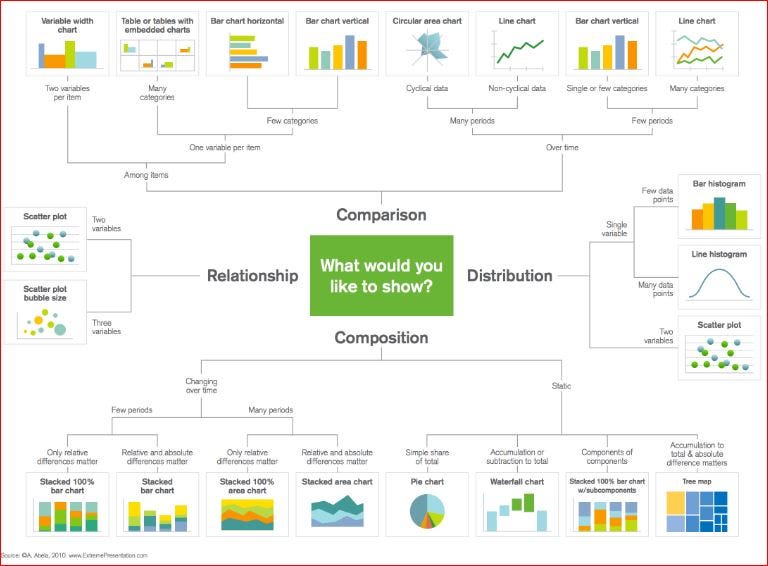
A chart for selecting the proper data visualization technique for a given situation
Scatter Plots
Scatter plots are great for showing the relationship between two variables since you can directly see the raw distribution of the data. You can also view this relationship for different groups of data simple by colour coding the groups as seen in the first figure below. Want to visualize the relationship between three variables? No problemo! Just use another parameters, like point size, to encode that third variable as we can see in the second figure below.
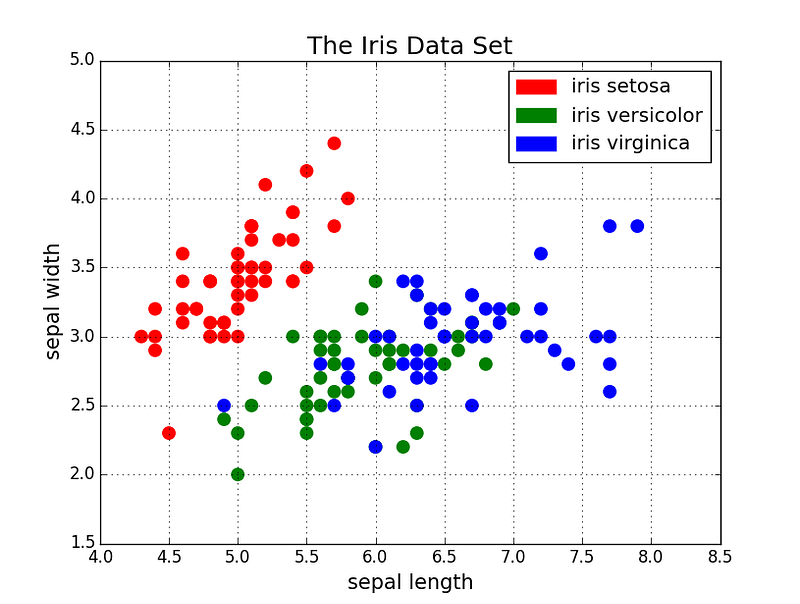
Scatter plot with colour groupings
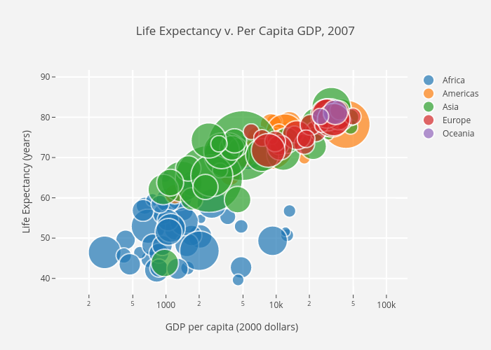
Scatter plot with colour groupings and size encoding for the third variable of country size
Now for the code. We first import Matplotlib’s pyplot with the alias “plt”. To create a new plot figure we call plt.subplots() . We pass the x-axis and y-axis data to the function and then pass those to ax.scatter() to plot the scatter plot. We can also set the point size, point color, and alpha transparency. You can even set the y-axis to have a logarithmic scale. The title and axis labels are then set specifically for the figure. That’s an easy to use function that creates a scatter plot end to end!
Line Plots
Line plots are best used when you can clearly see that one variable varies greatly with another i.e they have a high covariance. Lets take a look at the figure below to illustrate. We can clearly see that there is a large amount of variation in the percentages over time for all majors. Plotting these with a scatter plot would be extremely cluttered and quite messy, making it hard to really understand and see what’s going on. Line plots are perfect for this situation because they basically give us a quick summary of the covariance of the two variables (percentage and time). Again, we can also use grouping by colour encoding.
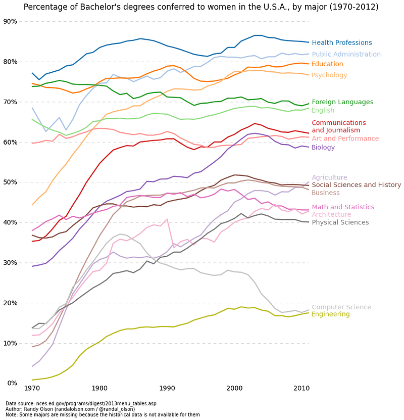
Example line plot
Here’s the code for the line plot. It’s quite similar to the scatter above. with just some minor variations in variables.
Histograms
Histograms are useful for viewing (or really discovering)the distribution of data points. Check out the histogram below where we plot the frequency vs IQ histogram. We can clearly see the concentration towards the center and what the median is. We can also see that it follows a Gaussian distribution. Using the bars (rather than scatter points, for example) really gives us a clearly visualization of the relative difference between the frequency of each bin. The use of bins (discretization) really helps us see the “bigger picture” where as if we use all of the data points without discrete bins, there would probably be a lot of noise in the visualization, making it hard to see what is really going on.
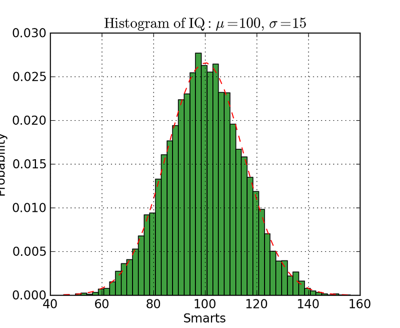
Histogram example
The code for the histogram in Matplotlib is shown below. There are two parameters to take note of. Firstly, the n_bins parameters controls how many discrete bins we want for our histogram. More bins will give us finer information but may also introduce noise and take us away from the bigger picture; on the other hand, less bins gives us a more “birds eye view” and a bigger picture of what’s going on without the finer details. Secondly, the cumulative parameter is a boolean which allows us to select whether our histogram is cumulative or not. This is basically selecting either the Probability Density Function (PDF) or the Cumulative Density Function (CDF).
Imagine we want to compare the distribution of two variables in our data. One might think that you’d have to make two separate histograms and put them side-by-side to compare them. But, there’s actually a better way: we can overlay the histograms with varying transparency. Check out the figure below. The Uniform distribution is set to have a transparency of 0.5 so that we can see what’s behind it. This allows use to directly view the two distributions on the same figure.
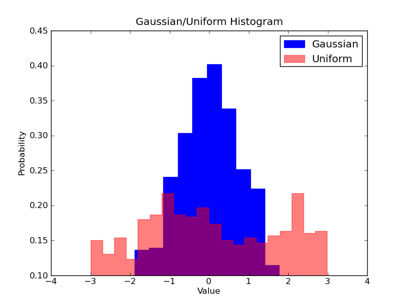
Overlaid Histogram
There are a few things to set up in code for the overlaid histograms. First, we set the horizontal range to accommodate both variable distributions. According to this range and the desired number of bins we can actually computer the width of each bin. Finally, we plot the two histograms on the same plot, with one of them being slightly more transparent.
Bar Plots
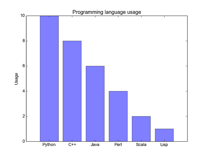
Bar plots are most effective when you are trying to visualize categorical data that has few (probably < 10) categories. If we have too many categories then the bars will be very cluttered in the figure and hard to understand. They’re nice for categorical data because you can easily see the difference between the categories based on the size of the bar (i.e magnitude); categories are also easily divided and colour coded too. There are 3 different types of bar plots we’re going to look at: regular, grouped, and stacked. Check out the code below the figures as we go along.
The regular barplot is in the first figure below. In the barplot() function, x_data represents the tickers on the x-axis and y_data represents the bar height on the y-axis. The error bar is an extra line centered on each bar that can be drawn to show the standard deviation.
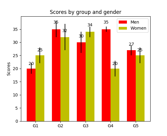
Grouped bar plots allow us to compare multiple categorical variables. Check out the second bar plot below. The first variable we are comparing is how the scores vary by group (groups G1, G2, ... etc). We are also comparing the genders themselves with the colour codes. Taking a look at the code, the y_data_list variable is now actually a list of lists, where each sublist represents a different group. We then loop through each group, and for each group we draw the bar for each tick on the x-axis; each group is also colour coded.
Stacked bar plots are great for visualizing the categorical make-up of different variables. In the stacked bar plot figure below we are comparing the server load from day-to-day. With the colour coded stacks, we can easily see and understand which servers are worked the most on each day and how the loads compare to the other servers on all days. The code for this follows the same style as the grouped bar plot. We loop through each group, except this time we draw the new bars on top of the old ones rather than beside them.
Regular Bar Plot
Grouped Bar Plot
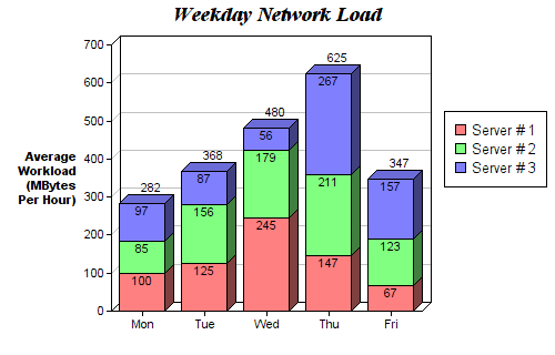
Stacked Bar Plot
Box Plots
We previously looked at histograms which were great for visualizing the distribution of variables. But what if we need more information than that? Perhaps we want a clearer view of the standard deviation? Perhaps the median is quite different from the mean and thus we have many outliers? What if there is so skew and many of the values are concentrated to one side?
That’s where boxplots come in. Box plots give us all of the information above. The bottom and top of the solid-lined box are always the first and third quartiles (i.e 25% and 75% of the data), and the band inside the box is always the second quartile (the median). The whiskers (i.e the dashed lines with the bars on the end) extend from the box to show the range of the data.
Since the box plot is drawn for each group/variable it’s quite easy to set up. The x_data is a list of the groups/variables. The Matplotlib function boxplot() makes a box plot for each column of the y_data or each vector in sequence y_data; thus each value in x_data corresponds to a column/vector in y_data. All we have to set then are the aesthetics of the plot.
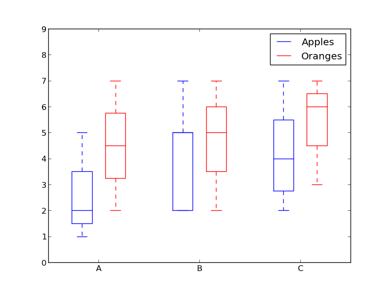
Box plot example
Conclusion
There are your 5 quick and easy data visualizations using Matplotlib. Abstracting things into functions always makes your code easier to read and use! I hope you enjoyed this post and learned something new and useful. If you did, feel free to give it some claps.
Cheers!
Bio: George Seif is a Certified Nerd and AI / Machine Learning Engineer.
Original. Reposted with permission.
Related:
- The 5 Clustering Algorithms Data Scientists Need to Know
- 7 Simple Data Visualizations You Should Know in R
- 5 of Our Favorite Free Visualization Tools