 The Essential Data Science Venn Diagram
 The Essential Data Science Venn Diagram
A deeper examination of the interdisciplinary interplay involved in data science, focusing on automation, validity and intuition.
By Andrew Silver, Adret LLC

A few years ago, Drew Conway came up with and shared his now-ubiquitous Data Science Venn Diagram. It was helpful, and we all were enlightened. Thank you, Dr. Conway!
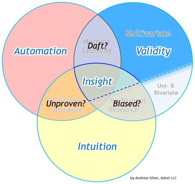
A number of variants followed, and I am here suggesting my own enhancements. Hopefully they will be enlightening as well. I am proposing two additions: the differentiating of statistical applications (multivariate vs. non-multivariate) and the addition of discipline essences (i.e., the main contribution or function of each skill set).
First off, let me say that my Venn diagram, like all the Venn diagrams, is inherently flawed. Why? Because it is a two-dimensional diagram illustrating what is inherently a multi-dimensional dynamic. Part of this is reflected in the disclaimer in the lower corner that the dimensions of communication (audial + visual) and soft skills are not shown. Creativity, tenacity, introspective honesty, and other attributes are missing from the graphic as well.
 The Need
Statistics deals extensively with quantifying the structure of variance, the happy result of which is being able to build descriptive, explanatory, predictive, and prescriptive models (the outputs of data science). There is no shame, therefore, in noting the largest source of variance in statistical methods on the Data Science Venn Diagram itself: the difference between multivariate statistical methods (where ≥ 3 variables are evaluated) vs. [univariate & bivariate] statistical methods.
Yes, I am here implying that this is a larger difference than that between supervised vs. unsupervised statistical modeling, parametric vs. non-parametric modeling, etc. The metric of variance I base this claim on is the pronounced discrepancy in awareness of advanced statistical methods in the human population. The need is that people ought to be more aware of the multivariate analytics playing a core role in the fourth industrial revolution.
One implication of this delineation is that “traditional research,” for the most part, has not made sufficient use of multivariate statistics. Depending on your discipline, this implication may not hold true. Unfortunately, for many disciplines, it does hold true. It could be said that this fact is part of why so many industries are susceptible to disruption.
An example of this is the persistent over-reliance on the coefficient of determination (R-squared) that continues in numerous circles. R-squared is not resistant to outliers, is only relative to the target variable, may inflate with serially-correlated data, and in many other ways can be unreliable. Even so, it is heavily utilized — in part because Excel and nearly every other graphing tool makes it readily available. While R-squared can be a useful tool, it is still a tool that must be used correctly (e.g., for assessing bivariate linear associations).
Multivariate problems require multivariate tools, and a majority of business challenges are inherently multivariate. Many analysts and technical professionals still have a long way to go in learning how to properly apply computational multivariate statistics ( ⊆ “machine learning”). As such, they remain susceptible to disruption from competitors who harness better insights from data using multivariate algorithms … or disruption from themselves by adopting invalid strategies (e.g., the innovator’s dilemma typified by ignoring down-market, lower-margin opportunities where future competition is likely to be spawned).
Essential Meaning
The three spheres of expertise may also be put in simpler terms of what they provide (i.e., their essences): Intuition, Validity, and Automation. Automation could also be referred to as up-scaling. Their confluence provides us with improved Insight. As portrayed, insight can also come simply from the overlap of having valid intuition (automation is not a prerequisite). Such has certainly been the case for much of history. The current hype of advanced analytics is largely about accelerating insights by automating data collection, processing, and analysis.
The danger of “bias” exists in the “traditional research” zone and is the main inspiration for this update of the Data Science Venn Diagram. Statistical “bias” is the exclusion or ignoring of significant variables, not unlike the colloquial meaning. Since most people are not familiar with handling multivariate analyses, the danger of bias most readily creeps in when multivariate problems are treated as bivariate or univariate problems. As noted above, the presence of bias makes organizations susceptible to disruption by newcomers whose multivariate approaches make them more insightful competitors.
Also note that the overlapping area corresponding to “machine learning” lacks intuition (i.e., is “daft” — a pronounced form of bias). Some will no doubt protest this. But consider that, over our decades of interactions with the physical world and society, people gain a level of intuition that no ML model is remotely close to obtaining (exempli gratia, know of any ML application that knows and appreciates what salt tastes like?). ML models only know what we tell them (the data we provide) and model outputs will ultimately reflect that. ML models can become very good at what we train them to do, but they still need to be trained by humans. (Note: even young humans need to be trained by older, wiser humans.) The context gained from a broad experience builds intuition. Context matters.
The area labeled as “traditional software” is problematic to describe. This ties back to the limitations of trying to summarize a multivariate system with a two-dimensional graphic. This overlap could also have been used to characterize mechanical automation (which certainly constitutes a significant portion of the global economy). For the purposes of this discussion, and in the context of most white-collar intellectual endeavors, suffice it to say that this area can represent a lack of rigor when performing risk assessments.
Order of Operations
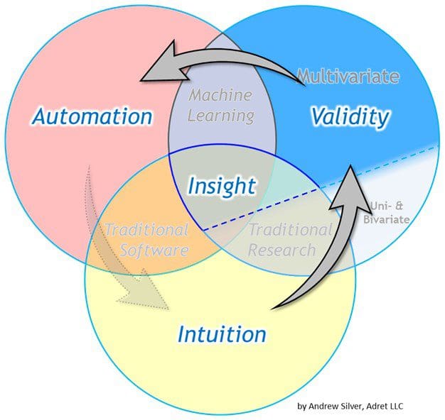
In In most cases, there is an inherent order of operations or “best practices” in the sequence of how each sphere of expertise is incorporated. The sequence of involvement is typically intuition first, then validation, then automation. We typically test whether an idea is valid after our intuition has led us to the idea in the first place. Likewise, we should not upscale (automate) implementations unless they are first deemed to be valid.
Are there exceptions to the sequence proposed above? Certainly! It is not uncommon for machine learning outputs to bring an association to a domain expert’s attention that they had previously dismissed or were unaware of. There are also plenty of cases where domain experts’ heuristics were already implemented in automated systems and later validated once data collection became possible. Let us also not forget the role of automation in helping us collect data in the first place that can later be evaluated with domain expertise and statistical rigor.
Σ
To sum it up, this new Venn diagram tells us things we already knew, but perhaps had not formally verbalized. It is a simple schema, and as such can help people better prioritize their workflows. For example, it encourages data scientists to start their work by first talking to domain experts — something that is already touted as a best practice. If you are the type of person who is not content with a list of what to do and also wants to understand why, understanding the essence of a of how things happen helps.
Nearly 70 years ago, Samuel Wilks wrote that “statistical thinking will one day be as necessary for efficient citizenship as the ability to read and write.” In the near future, multivariate statistical thinking may become a prerequisite for far more occupations. If my rehashing of the Data Science Venn Diagram helps anyone with that, I will consider it time well spent.
The world is what we make of it, and it needs to be smarter. If you enjoyed this article, consider sharing it with a friend.
(Note: These Venn diagram graphics may be used with attribution. The initial iterations of the diagrams above were first posted on www.adret-llc.com and on LinkedIn in early 2017. Article cross-posted on Medium.)
Bio: Andrew Silver is a geologist (domain expert) and statistician who holds a M.S. Analytics from Texas A&M University and a M.S. Earth Science from Rice University. He currently consults in the upstream energy sector.
Resources:
- On-line and web-based: Analytics, Data Mining, Data Science, Machine Learning education
- Software for Analytics, Data Science, Data Mining, and Machine Learning
Related: