 Top 10 Data Visualization Tools for Every Data Scientist
 Top 10 Data Visualization Tools for Every Data Scientist
At present, the data scientist is one of the most sought after professions. That’s one of the main reasons why we decided to cover the latest data visualization tools that every data scientist can use to make their work more effective.
By Andrea Laura, Freelance Writer
One of the most well-settled fields of study and practice in the IT industry today, Data Science has been in the limelight for nearly a decade now. Yes, that's right! It has proven to be a boon in multiple industry verticals. From top of the line methodologies to analyzation of the market, this technology primarily includes obtaining valuable insights from data.
This obtained data is then processed where data analysts further analyze the information to find a pattern and then predict the user behavior based on the analyzed information. This is the part where data visualization tools come into play.
In this article, we will be discussing some of the best data visualization tools that data scientists need to try, in order to make the process smooth while achieving valuable results.
What is Data Visualization?
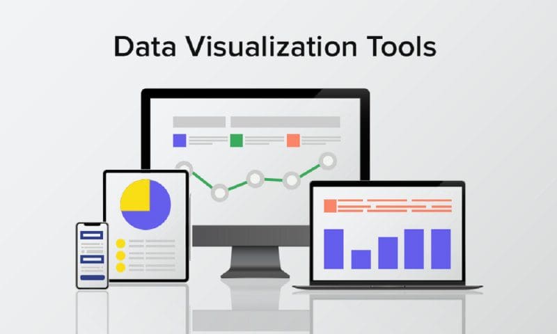
Data Visualization is basically putting the analyzed data in the form of visuals i.e - graphs, images. These visualizations make it easy for humans to understand the analyzed trends through visuals.
Data Visualization is very important when it comes to analyzing big datasets. When data scientists analyze complex datasets they also need to understand the insights collected. Data Visualization will make it easier for them to understand through graphs and charts.
Best Data Visualization Tools Data Scientists Need To Use
Nowadays, to hire an Android developer or iOS developer depends upon the kind of tools and techniques that they use to an extent. As for businesses around the world, using these tools can help gain business insights and stay ahead in the race. The majority of top iOS and Android mobile app development companies are using these tools to analyze the data sets extracted from mobile apps to help the business grow and maintain a customer base.
Here are some of the best data visualization tools every Data Scientist must use for the year 2020:
1. Tableau
It is an interactive data visualization software. This tool is used for effective data analysis and data visualization in the industry. It has a drag and drop interface and this feature helps it to perform tasks easily and very fast.
The software doesn’t force its users to write codes. The software is compatible with a lot of data sources. The tool is a bit expensive but it is the most preferred choice of a top company like Amazon. Qlik view is the biggest competitor of tableau and the tool is extensively used because of its unique drag and drop feature.
Key features of Tableau:
- Tableau is known as the simplest business intelligence tool for data visualization
- Data scientists do not need to write custom code in this tool
- The tool is also a real-time collaboration along with data mixing
2. D3
D3.js is a Javascript library for producing interactive data visualizations in web browsers. It is the most effective platform to work on data visualization. The tool was initially released on Feb 18, 2011, and became official in August.
It supports HTML, CSS, and SVG. Developers can present data in the form of creative pictures and graphics. It is a very flexible platform as it allows variations for the creation of different graphs.
Key features of D3:
- This data visualization tool offers powerful SVG operation capability
- D3 integrates multiple methods as well as tools for the processing of data
- Data scientists can effortlessly map their data to the SVG attribute
3. Qlikview
QlikView is a software similar to a tableau but you need to pay before using it for commercial purposes. It is a business intelligence platform that turns data into useful information.
This software helps to improve the data visualization process. The tool is preferred by well-established data scientists to analyze large scale data. Qlik view is used across 100 countries and has a very strong community.
Key features of QlikView:
- The tool integrates with a very wide range of data sources such as EC2, Impala, HP Vertica, etc
- It is extremely fast when it comes to data analysis
- This data visualization tool is easily deployable as well as configurable
4. Microsoft Power BI
It is a set of business analytics tools that can simplify data, prepare and analyze instantly. It is the most preferred tool as it can easily integrate with Microsoft tools and is absolutely free to use and download.
The tool is available for both mobile and desktop versions. So if a business uses Microsoft tools it can be a big benefit for them.
Key features of Microsoft Power BI:
- Generate interactive data visualizations across multiple data centers
- It offers enterprise data analytics as well as self-service on a single platform
- Even non-data scientists can easily create machine learning models
5. Datawrapper
This tool is a blessing for non-technical users and is the most user-friendly visualization tool. To create visualizations you need to have technical skills such as coding but in this app, you don’t need to have any technical skills.
The app can be best used by beginners who want to start their career in data visualization. This app is the most user-friendly app for a data scientist. The tool is widely used in media organizations where there is a high need for presenting everything through stats and graphs. The tool is the most popular choice because it has a simple and easy interface.
Key features of Datawrapper:
- It offers the users with an embed code and provides the ability to export charts as well
- Option to select multiple map types and charts at once
- The tool requires no advanced knowledge of coding for its installation
6. E Charts
Next, we have in the list of best data visualization tools is E Charts which is an enterprise-level chart data visualization tool from the expert team of Baidu. E Charts can be referred to as a pure Javascript chart library that runs smoothly on various platforms and is also compatible with the majority of browsers.
Key features of E Charts:
- Has multidimensional data analysis
- Charts are available for all sized devices
- It provides a framework for the rapid construction of web-based visualizations.
- These are absolutely free to use
7. Plotly
Plotly enables more complicated and intricate visualizations. It creates a way to its integration with analytics-orientated programming languages consisting of Python, Matlab, and R.
It is constructed on top of the open supply d3.Js visualization libraries for JavaScript, but this commercial package (with a potential non-industrial license available) adds layers of user-friendliness and support in addition to inbuilt support for APIs inclusive of Salesforce.
Key features of Plotly:
- It offers built-in permissions and integrations with SAML
- Super quick and easy deployment of the data visualization tool
- Provides access to users for rapid exploration and prototyping
8. Sisense
A complete analytics solution is provided by Sisense. The visualization abilities offer an uncomplicated drag and drop option that can easily support complicated graphics, charts and interactive visualizations.
It allows the accumulation of records in easily accessible repositories where it can be saved instantly on the dashboards.
Dashboards can then be shared throughout groups making sure even the non-technical-minded personnel can discover the solutions they need to their problems.
Key features of Sisense:
- Offers users with various tools to understand collected data in a visual environment
- You can connect directly to multiple data sources at once
- With this tool, data scientists can tie together various maps and charts
9. FusionCharts
FusionCharts is based on the charting of JavaScript. This visualization tool has secured itself as one of the leaders in the market.
It can produce 90 one of a kind chart kinds and integrates with a big variety of systems and frameworks giving a notable deal of flexibility.
FusionCharts can create any type of visualization from scratch and this is one of its unique features. Customers also have the option to choose from a selection of “live” example templates.
Key features of FusionCharts:
- It provides informative tooltips to assist users
- The tool makes sure that users can understand different functionalities
- You can compare the values of different data points with one another
10. HighCharts
Like FusionCharts, this also requires a license for business use, although it may be used freely as a trial, non-business or for non-public use.
Its internet site claims that it's used by seventy-two of the world’s a hundred largest agencies and it is often selected when a quick and flexible solution has to be rolled out, with a minimum need for specialist statistical visualization training before it may be put to work.
Key features of HighCharts:
- The tool for data visualization provides its users with good compatibility
- HighCharts is one of the most widely used tools for data analyzing
- This tool is convenient to add interactive charts to advanced applications
Final Word
In this article, we came across a list of great recorded visualization tools. Before choosing the tool, it is suggested that you spend some time exploring the various potential options.
Go via the loose trial version, request a demo from the vendor and compare the tool with its nearest competitor tools of equal type. Match the features and pricing plans offered by the vendor against your company and task needs.
Also, there are data monetization tools that are used to gain business insights from big data business models. Data is going to drive the economy in the coming years. So businesses are using different tools to analyze the big data sets to provide a personalized experience to its users.
We highly suggest everyone should learn Tableau software if they want to be a true data scientist and then can further change according to the business requirements.
Bio: Andrea Laura is a very creative writer and active contributor who would love to share informative news or updates on various topics and brings great information to her readers. Writing as her hobby, Andrea has come out with many interesting topics and information that attracts readers to unravel her write-up. Her content is featured on many mainstream sites & blogs.
Related:
- Plotnine: Python Alternative to ggplot2
- Top 9 Mobile Apps for Learning and Practicing Data Science
- How to Visualize Data in Python (and R)