 Plotnine: Python Alternative to ggplot2
 Plotnine: Python Alternative to ggplot2
Python's plotting libraries such as matplotlib and seaborn does allow the user to create elegant graphics as well, but lack of a standardized syntax for implementing the grammar of graphics compared to the simple, readable and layering approach of ggplot2 in R makes it more difficult to implement in Python.

Avid users of R know that ggplot2 is there to make your life simpler when dealing with exploratory data analysis and data visualization. It makes it so easy to create elegant and powerful plots that can help decipher underlying relationships in the data.
Python's plotting libraries such as matplotlib and seaborn does allow the user to create elegant graphics as well, but lack of a standardized syntax for implementing the grammar of graphics compared to the simple, readable and layering approach of ggplot2 in R makes it more difficult to implement in Python.
The answer to this problem lies in Plotnine.
The style I would say is 99% similar to ggplot2 in R. The major difference would be the use of parentheses as you will see in a few short examples below. One of the best takeaways of using plotnine is that the output is basically the same as you would get in R. There is visually no striking difference.
There are many options for the API in plotnine that we can use to make our plots.
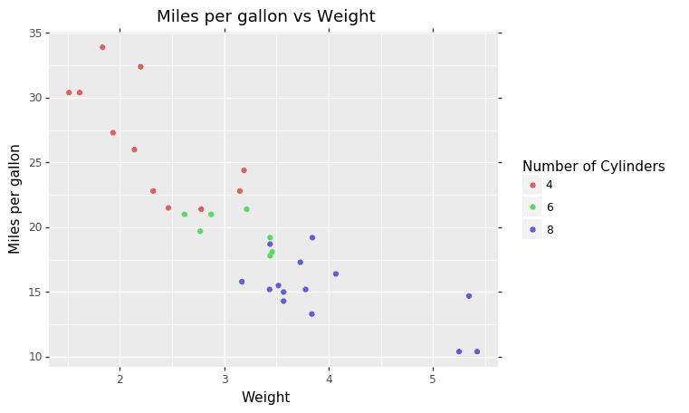
(
ggplot(mtcars, aes(‘wt’, ‘mpg’, color=’factor(cyl)’))
+ geom_point()
+ labs(title=’Miles per gallon vs Weight’, x=’Weight’, y=’Miles per gallon’)
+ guides(color=guide_legend(title=’Number of Cylinders’)) )
One of the major selling points of ggplot in R is the ability to FACET. We have many options for plotting subsets of our data with a single line of code as well.
(ggplot(mtcars, aes(‘wt’, ‘mpg’, color=’factor(cyl)’))
+ geom_point()
+ labs(title=’Miles per gallon vs Weight’,x=’Weight’, y=’Miles per gallon’)
+ guides(color=guide_legend(title=’Cylinders’))
+ facet_wrap(‘~gear’)
)
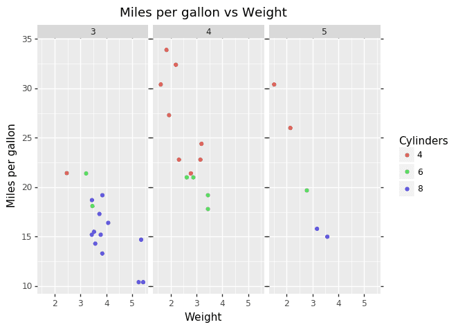
with simply adding facet_wrap(‘~gear’) to the end of the previous code we now have a faceted plot. This is actually much simpler than using Matplotlib and Seaborn. Matplotlib will require you to create a separate chart for each set of variables you want to plot (for example, the above plot has 3 charts so you will have to create 3 charts) and Seaborn is simpler than Matplotlib but will require the use of a different commands that may confuse an inexperienced user.
Aesthetic Improvements
There is no point creating all these visuals without properly formatting them.
(ggplot(mtcars, aes(‘wt’, ‘mpg’, color=’factor(cyl)’, size = ‘hp’))
+ geom_point()
+ theme_bw()
+ labs(title=’Miles per gallon vs Weight’,x=’Weight’, y=’Miles per gallon’)
+ guides(color=guide_legend(title=’Cylinders’))
+ facet_wrap(‘~gear’)
)
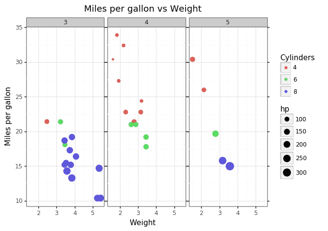
By adding the size = ‘hp’ we can obtain another insight from the data (the amount of horsepower) and theme_bw() to give a standardized format the plot with a nice simple theme. theme_bw() is that one theme command that any R user of ggplot2 will know. It is basically the defacto theme used before experimenting on other themes and formatting.
Checkout how we can integrate ipywidgets with Plotnine, Jupyter Notebook and JupyterLab.
As we go deeper we see that Plotnine gives us that simple API and stunning visuals we get from using ggplot2 in R. The ability to format plot with a single line of code is available in Seaborn but not in Matplotlib. Seaborn itself does have its similarities to Plotnine and ggplot2 in a way but the easily deciphered syntax is what gives it a unique selling point to make the switch.
Related:
- Vega-Lite: A grammar of interactive graphics
- How to Visualize Data in Python (and R)
- Understanding Boxplots