How to Create Custom Real-time Plots in Deep Learning
How to generate real-time visualizations of custom metrics while training a deep learning model using Keras callbacks.

What do we mean by real-time plots?
Training a complex deep learning model with a large dataset can be time-consuming. As the epochs go by, reams of numbers flash on your screen. Your eyes (and the brain) get tired.
Where is that exciting accuracy plot constantly updating you about the progress? How do you know if the model is learning something useful? And, just how fast?
A real-time visual update would be pretty great, won’t it?
Humans, after all, are visual creatures.
Humans Are Visual Creatures
Here we gathered some interesting facts to emphasize why using visual aids in scientific communication is so important...
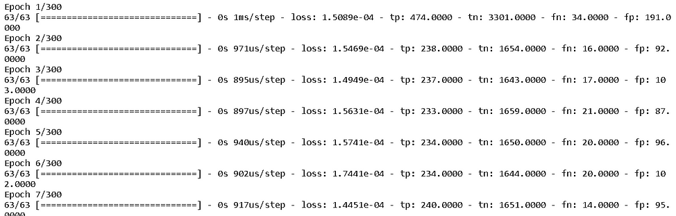
And by visual, I don’t mean all the scores of numbers pouring down on your screen as you turned the verbosity of the model ON.
Not this.
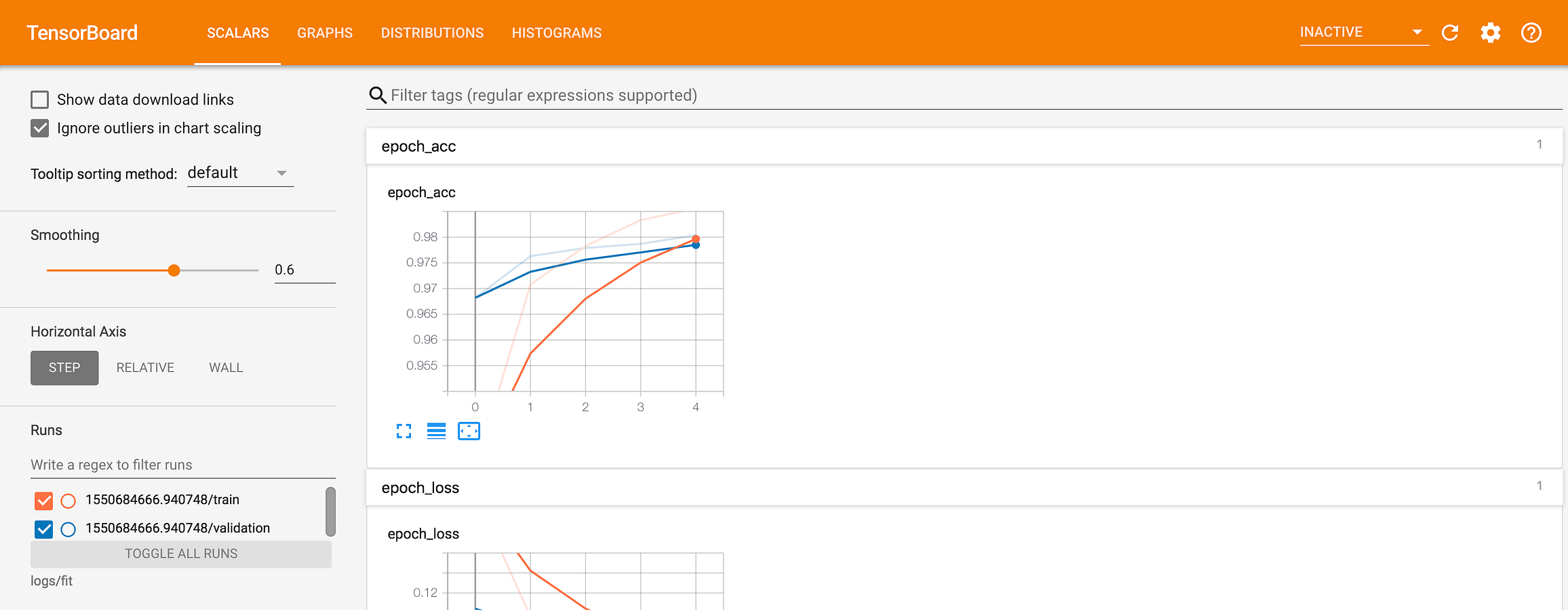
We want that.

Let’s see how we can get there.
Where is that exciting accuracy plot constantly updating you about the progress? How do you know if the model is learning something useful? And, just how fast?
What do we mean by custom plots?
There are established tools for regular jobs. But many a time, we need customized output.
Tensorboard is cool but may not work for all needs
If you are working with TensorFlow/Keras for your deep learning tasks, chances are strong that you have heard about or used Tensorboard. It is a fantastic dashboarding utility where you can pass on the log of the training and can get fantastic visual updates.
Get started with TensorBoard | TensorFlow
In machine learning, to improve something you often need to be able to measure it. TensorBoard is a tool for providing...
You can get standard loss, accuracy plots very easily with Tensorboard. If you just want to monitor those and nothing else in your DL model, you can stop reading this article and just go with the Tensorboard.
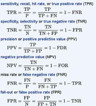
But what about the case when you have a highly imbalanced dataset to work with, and you want to plot precision, recall, and F1-score? Or, another less advertised classification metric like Matthew’s coefficient? How about the case where you just care about the ratio of True Negative and False Negative and want to create your own metric?
How do you see a live, real-time update of these non-standard metrics as your training progresses?
Keras has built-in calculations for a confusion matrix
Fortunately, Keras provides the basic logs of four fundamental quantities corresponding to a confusion matrix — True Positive (TP), False Positive (FP), True Negative (TN), and False Negative (FN). They come from the Keras Metrics module.
Module: tf.keras.metrics | TensorFlow Core v2.3.0
Built-in metrics.
We can simply define a list of metrics we want in the training log of your model and pass that list while compiling the model.
metrics = [
    tf.keras.metrics.TruePositives(name="tp"),
    tf.keras.metrics.TrueNegatives(name="tn"),
    tf.keras.metrics.FalseNegatives(name="fn"),
    tf.keras.metrics.FalsePositives(name="fp"),
]
And then,
model.compile(
        optimizer=tf.keras.optimizers.Adam(lr=learning_rate),
        loss=tf.keras.losses.BinaryCrossentropy(),
        metrics=metrics,
    )
So, we can get these measures (they are calculated on the training dataset though) as part of the training log. Once we get them, we can compute any custom metrics we want for a classification task from the first-principle definitions. For example, here we show the formulae for some of those non-standard metrics,
But, how do we create the custom real-time plots from these computed values?
We use callbacks, of course!
How do you see a live, real-time update of these non-standard metrics as your training progresses?
Custom callbacks for live visualization
Callbacks are a class of amazing utility that can be called at certain points (or on every epoch if you like) of your training. In short, they can be used to process data (related to the model performance or the algorithm) on a real-time basis while the training is undergoing.
Here is the TensorFlow official page for the Keras callbacks. But for our purpose, we have to write a custom plotting class derived from the base Callback class.
Module: tf.keras.callbacks | TensorFlow Core v2.3.0
Callbacks: utilities called at certain points during model training.
Demo Jupyter notebook
The demo Jupyter notebook is located here on my Github repo. This repository contains many other useful deep learning tutorial-style notebooks. So, please feel free to star or fork.
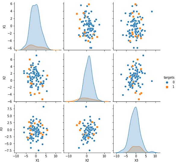
An imbalanced dataset

We created a synthetic dataset with imbalanced class frequencies (much more negatives than positives) for the binary classification task in the demo. This situation is quite common in practical data analytics projects and it emphasizes the need to have a visual dashboard for custom classification metrics, where accuracy is not a good metric.
The following code creates a dataset with 90% negative and 10% positive samples.
from sklearn.datasets import make_classificationn_features = 15
n_informative = n_featuresd = make_classification(n_samples=10000,
                        n_features=n_features,
                        n_informative=n_informative,
                        n_redundant=0,
                        n_classes=2,
                        weights=[0.9,0.1],
                        flip_y=0.05,
                        class_sep=0.7)
The pairplot below shows a sample data distribution with the two classes. Note the imbalance in the kernel density plots.
Callbacks are a class of amazing utility that can be called at certain points (or on every epoch if you like) of your training.
The custom callback class
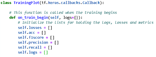
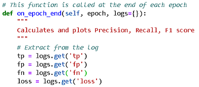
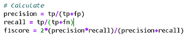
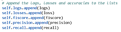
The custom callback class essentially does the following,
- initiates a bunch of lists to store values
- extracts the metrics from the model at the end of each epoch
- computes classification metrics from those extractions
- and store them in those lists
- creates multiple plots
Here is the initialization,
Here is the extraction,
Here is the computation,
Here is the storage,
And, I won’t bore you with a standard Matplotlib code for plotting except the following bit, which refreshes your Jupyter notebook plots on every iteration.
from IPython.display import clear_output# Clear the previous plot
 clear_output(wait=True)
Also, you don’t have to plot every epoch as that may be taxing and slowing down the display or the machine. You can choose to plot, say, every 5th epoch. Just put the whole plotting code under a condition (here epoch is the epoch number you get from the training log)
# Plots every 5th epoch
 if epoch > 0 and epoch%5==0:
Don’t worry about how all of these work together, as the demo notebook is still there for you.
Result
Here is a typical result, showing loss and precision/recall/F1-score in a simple dashboard style. Note, how the recall starts at a high value but the precision and F1-scores are low for this imbalanced dataset. These are the metrics you can compute and monitor in real-time with this kind of callback!

More results — probability distributions!
You can do whatever computation you want with the model (trained at that point), at each epoch end and visualize the result. For example, we could predict the output probabilities, and plot their distributions.
def on_epoch_end(self, epoch, logs={}):
    # Other stuff
    m = self.model
    preds = m.predict(X_train)
    plt.hist(preds, bins=50,edgecolor='k')
Note, how few are given high probabilities at the beginning and slowly the model starts learning the true distribution of the data.
Summary
We showed how you can create a dashboard of living, breathing visualizations of a deep learning model performance, with simple code snippets. Following the approach, outlined here, you don’t have to depend on Tensorboard or any third-party software. You can create your own computations and plots, customized to the fullest extent as you want.
Note that the method described above works only for Jupyter notebooks. You have to adapt it differently for standalone Python scripts.
On that, there is another fantastic article written on this subject, which you can check here.
How to plot the model training in Keras — using custom callback function and using TensorBoard
I started exploring the different ways to visualize the training process while working on the Dog breed identification...
You may also like…
If you liked this article, you may also like the following deep learning articles from me,
Are you using the “Scikit-learn wrapper” in your Keras Deep Learning model?
How to use the special wrapper classes from Keras for hyperparameter tuning?
Activation maps for deep learning models in a few lines of code
We illustrate how to show the activation maps of various layers in a deep CNN model with just a couple of lines of...
A single function to streamline image classification with Keras
We show, how to construct a single, generalized, utility function to pull images automatically from a directory and...
You can check the author’s GitHub repositories for code, ideas, and resources in machine learning and data science. If you are, like me, passionate about AI/machine learning/data science, please feel free to add me on LinkedIn or follow me on Twitter.
Tirthajyoti Sarkar - Sr. Principal Engineer - Semiconductor, AI, Machine Learning - ON…
Making data science/ML concepts easy to understand through writing: https://medium.com/@tirthajyoti Open-source and...
Original. Reposted with permission.
Related:
- Simple Python Package for Comparing, Plotting & Evaluating Regression Models
- 20 Core Data Science Concepts for Beginners
- Learn Deep Learning with this Free Course from Yann LeCun