Creating Good Meaningful Plots: Some Principles
Hera are some thought starters to help you create meaningful plots.
By Vikrant Dogra, Data Science, Analytics and Insights Specialist

Plots (or charts) are an intrinsic way to communicate information from data, yet good plots are rare. The primary reason, I think, is due to the passive approach taken while creating plots. But, if created actively, using principles of data investigation and interrogation, one can produce sensible and meaningful plots.
This article covers some principles to create meaningful plots. In addition, it lets you take a hands-on approach to learning using two custom web applications that permit you to explore/ set various options to create information rich scatter plots.
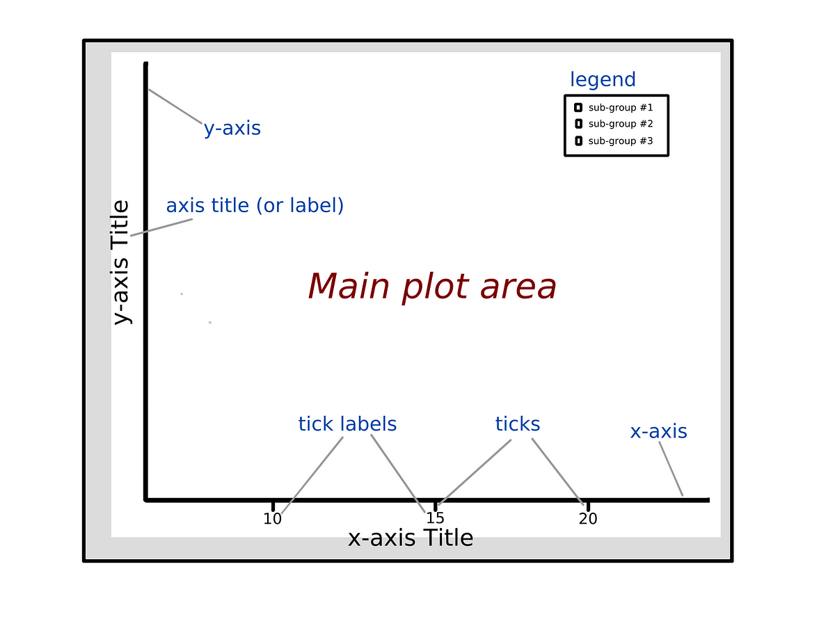
Components of a Plot
Plots typically comprise of the main plot area (where the graph is displayed) , axes (e.g. x-axis, y-axis), description of the axes including markers/ labels for explaining the data (e.g. ticks, tick labels) and, when required, legend to distinguish sub-groups.
Features of a Good Plot
A good plot should be meaningful, self-explanatory and easy to remember. Thus the ideal approach should in someway attempt to mimic the way we think, remember and correlate information in our minds.
Here are some suggestions to make good meaningful plots:
Do not create a plot in all situations
- Sometimes a simple data table might be more effective than a plot
Use the right plot based on the input data
- With a bit of active thinking, one can get this right . e.g. many people still confuse histogram vs. bar plots
- As one can plot any given data in more than one way- try to use the optimum plot which helps convey significant meaning from your data.
Make the plot easily readable
- Focus on what matters. De-emphasise the rest.
- Typically the default settings provided by tools for visualisation / presentation / business intelligence are not great. Thus you should improve upon these defaults.
- Describe the data when required so that your plot can be read without anyone’s assistance.
Identify and use relevant anchors/ cut-offs
- To help people assimilate information in the plots quickly- add anchors or cut-offs e.g. mean (average) line in a bar plot.
Highlight deviations from expectations, values/ items at extreme ends
- Usually deviations are of interest in plots — be it from averages or certain cut-offs e.g. top 10% or bottom 10%.
Identify similarities
- In some cases, the interest might lie in understanding similarities e.g. between two distributions
For detailed suggestions- read the section: ‘The common thread: areas of focus to improve your plot’ of this article.
Don’t Just Plot: Think While You Plot
Here I cover some common types of plots and explain what could possibly be done to improve them:
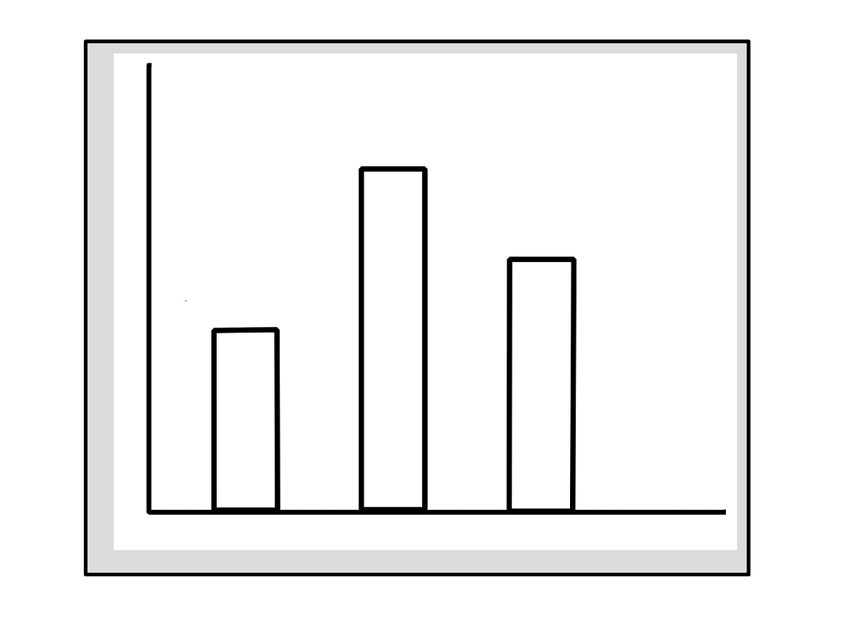
Bar plots (for categorical variables)
- Don’t rely only on tooltip (i.e. hover over the plot object to see the data ) for displaying the primary data. E.g. If you are displaying 4 categories via bars- that would mean using the tooltip 4 times to read-off the height of the bars; for 10 categories, it’ll mean using the tooltip 10 times ,…
- Show the data (%age or actual, whichever applicable) on the bars- this helps anyone easily compare these numbers and, if required, perform some simple mental maths e.g. ratios, differences etc
- If the representation is in %age, mention whether the %age add to 100 or not. This is typically the case when categories are independent or (in surveys) responses are single-choice.
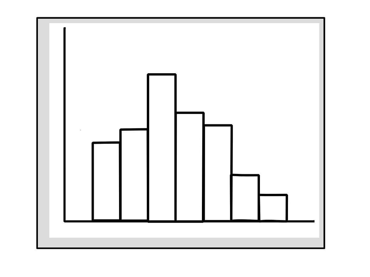
Histograms (for continuous variables)
- Get the bins (or class-intervals) right : number of bins, bin width
- If possible, display data (frequency or %age) for all the bins. If not, then display only important data points and supplement that with summary of the data e.g. mean/ median/ mode
Density/ distribution plots

- You have to show something more than the curve, which just gives an idea about the shape of the data.
- Adding summary of the distribution would be a good idea e.g. mean/ median/ mode, concentration (e.g. as appropriate- middle 67%, 80%, 95%), results of a statistical test indicating type of distribution
Word clouds
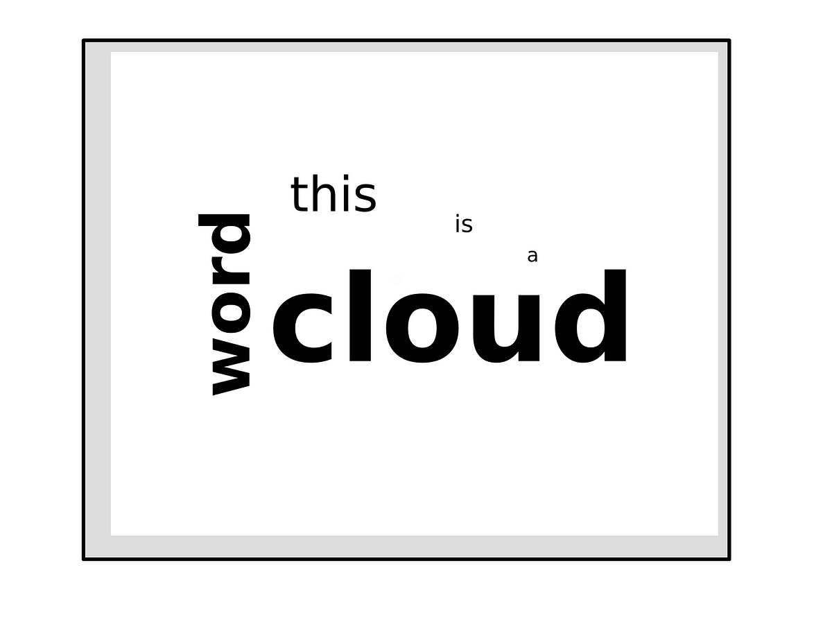
- These are visually appealing but difficult to internalise as it is impossible to rank order the items beyond the top 2–3 and these too are randomly placed in the word cloud. In addition, with just words proportionate to frequency- it is impossible to compare two words in a word cloud.
- Thus device a method to display the data (frequency, %age) used to create the word cloud- either as a sub-script/ super-script over the word in the graph or as an additional (sorted) frequency table.
Pie charts

- If there are more than three categories, use bar charts instead of a pie chart.
- The problem with Pie Chart is well established in the Data Science community, however most of the Business fraternity still love the Pie (& Donut) chart. This maybe because a Pie always add to 100%, where as a Bar plot might not. And for data amenable to Pie chart, I suspect, many advocates of Bar (over Pie) forget to mention that the columns of their Bar plot adds to 100%.
Box plots
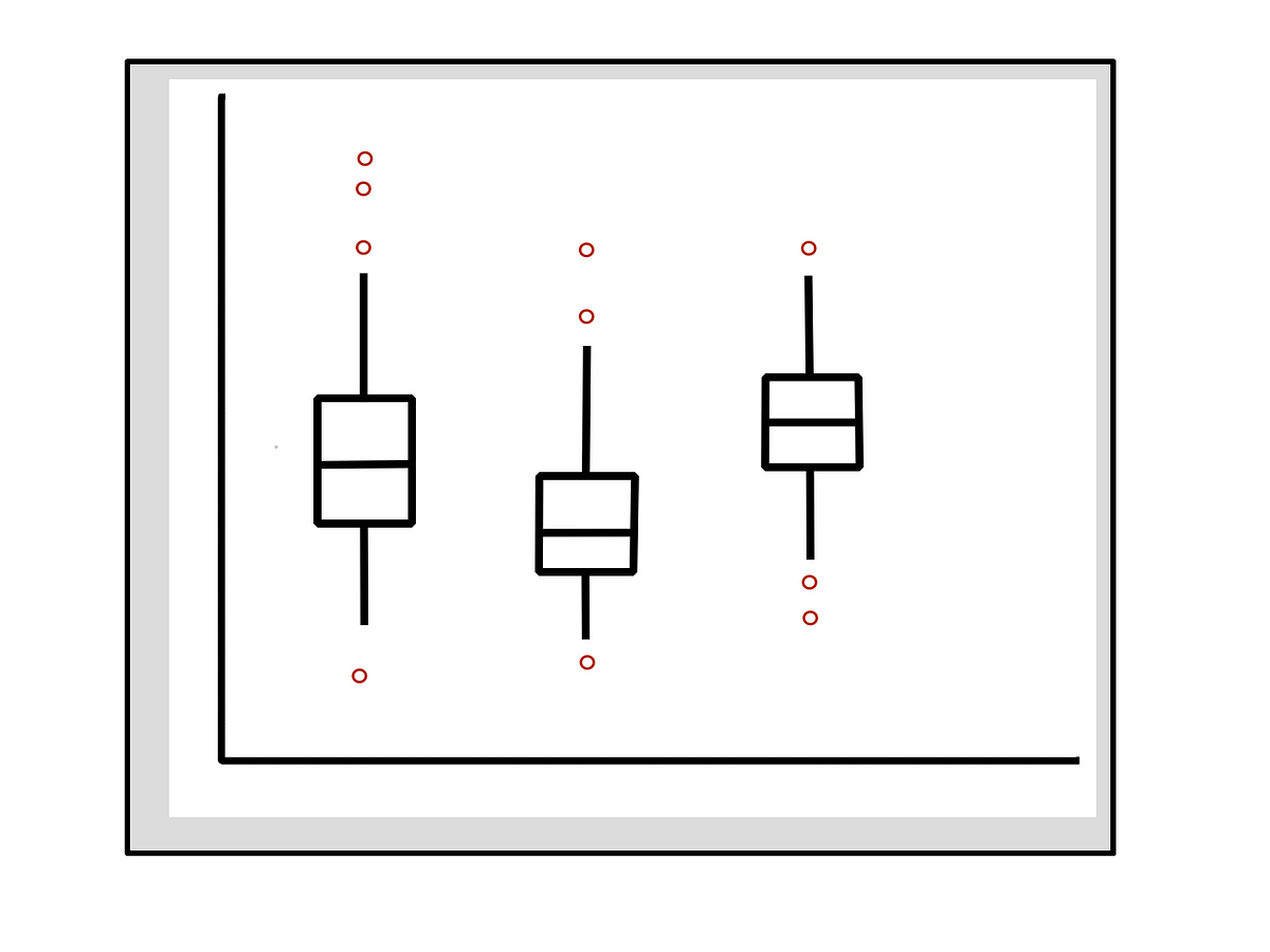
- These are extremely good to understand the distribution of data and remember key numbers- provided the numbers are displayed. Thus show the important values i.e. median, lower/ upper quartiles, lower/upper whiskers
- Also, investigate whether there is any pattern in the possible outliers (data points beyond the whiskers)
Time-series plots
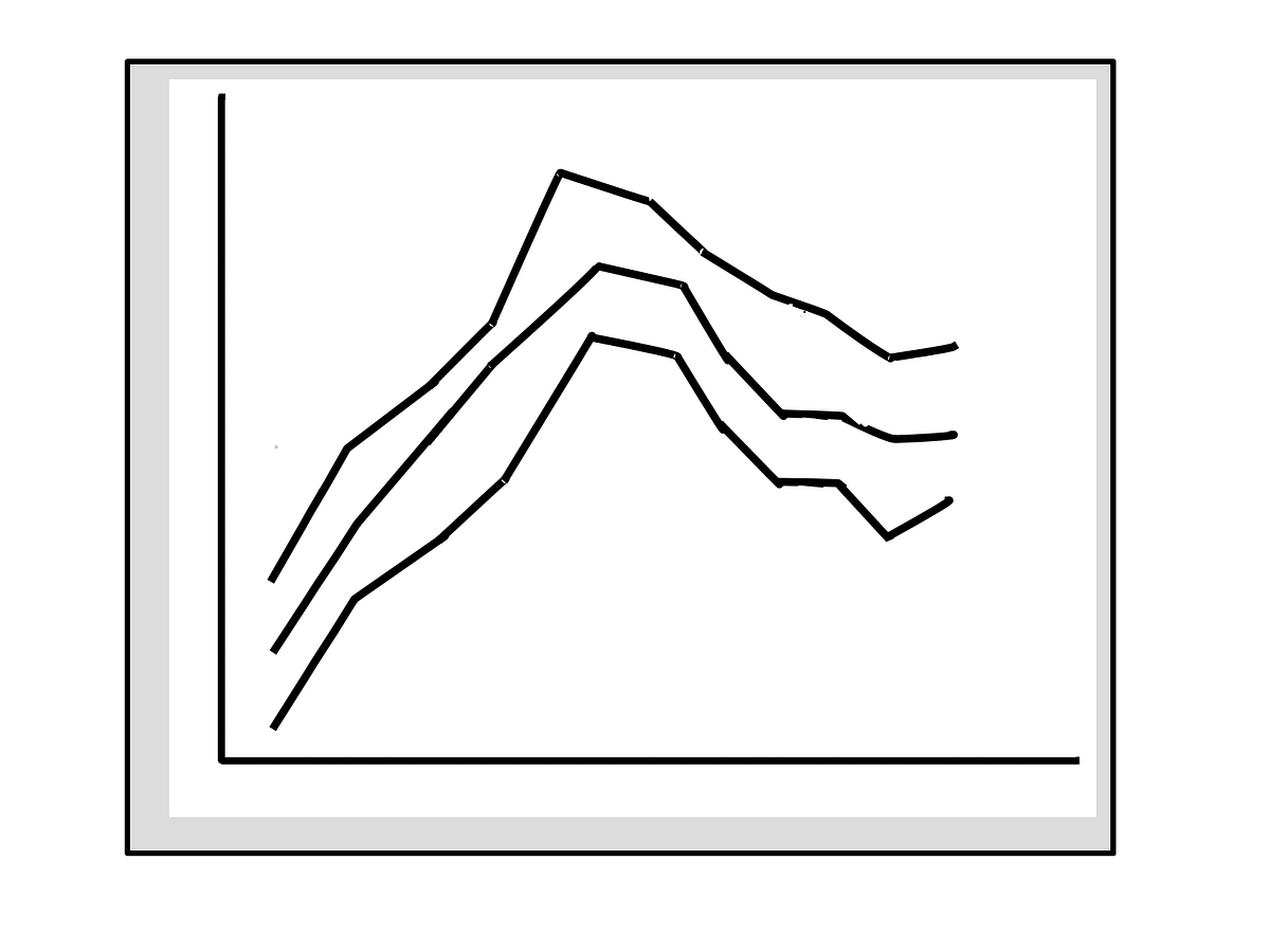
- These plots by nature repeat in a pattern. So for monthly data spread over years- one could show a stacked (by years) version by months (in x-axis). This should help readers notice the trend and seasonality.
- If a cycle exists- you could show that by displaying a single line plot over years x months
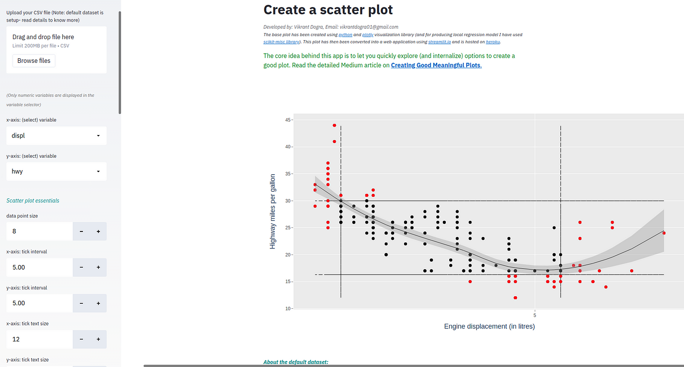
Scatter plots
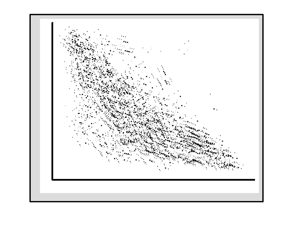
With many data points in a scatter plot- the core intent is to identify patterns in the dots. Thus one could do many things here e.g.
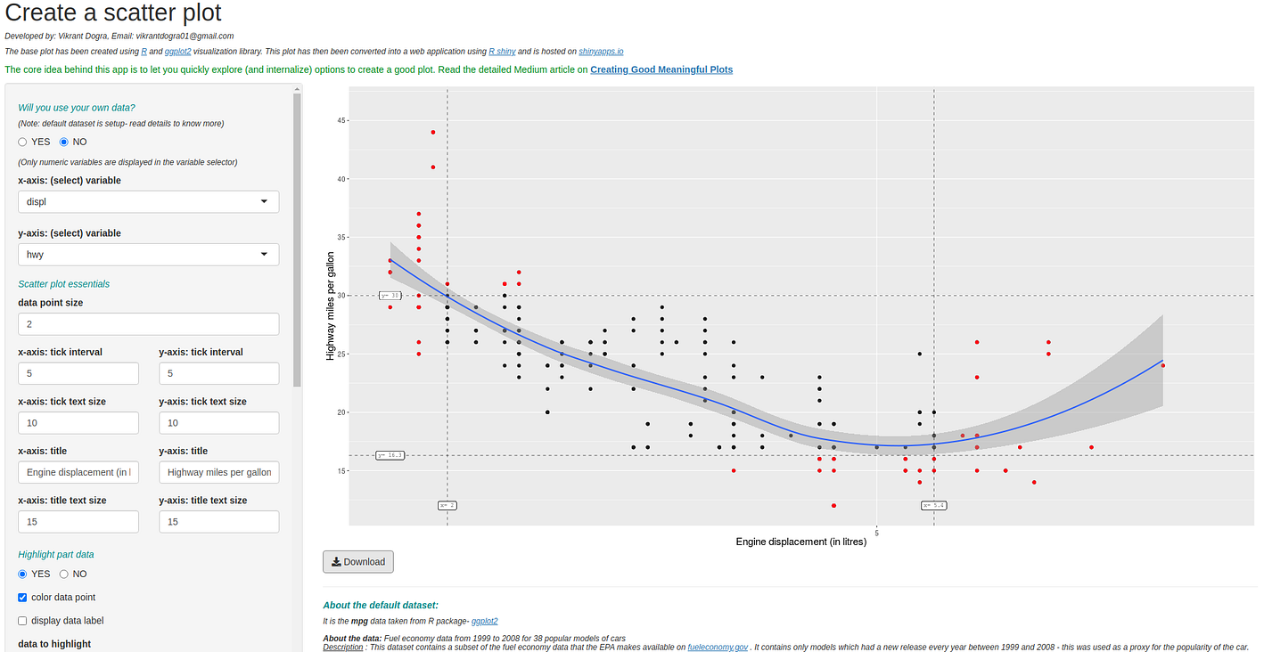
- Fit a model along with confidence bands. Mention model specification, if required
- Help the end-user read the data points easily by: using anchors/ cut-offs independently for X & Y variables e.g. mean, median, quartiles, extremes (e.g. bottom/ top 10%). While displaying these lines- try to mention values too
- Highlight data points of interest e.g. colour the dots, display data labels
- Can even display marginal plots e.g. box plot or histogram for x-variable and y-variables below the respective axis
The Common Thread: Areas of focus to improve your plot
Here I cover the core components of a plot and try to provide generalised suggestions on how and when should these be used for effective plotting:
Axis
axis: axis title
- how to use: use sensible titles- this means you usually have to improve the default variable names; titles have to be idiot-proof e.g. [vague] distance vs. [clear] distance (in miles)
- text font size: use an easily readable font size as the axes description sets the context to read the plot
axis: ticks
- whether required: use when data is numeric in nature; else avoid using it.
- text font size: smaller than the axis title font size as these are of lesser importance. You could also reduce emphasis by using grey colour for this text.
- intervals: it is essential to set good intervals between ticks. Overuse can render these useless to read the plot. However the right number of ticks can help create a mental map of rectangular blocks to read the data faster and better
axis: y-axis
- whether required: at times you can do away with the y-axis line itself (incl. title and ticks). e.g a bar plot (for a categorical variable) where you display data labels over the bars does not really require a y-axis line/ title/ ticks
Legend
- when to use: only when you want to represent sub-groups in the plot and can’t distinguish among them without the legend.
- whether required: this could act as a distraction from the main plot. Thus use only when necessary.
Main Plot
main plot: data labels
- when to use: ideally display data wherever possible. e.g. show for bar plots; for scatter plots ideally just display the extreme-values e.g. bottom 5% and top 5%
main plot: tooltip
- how not to use: avoid using tooltip solely to display value of the data points.
- how to use: instead use tooltip meaningfully to augment information about the data points
main plot: colour code data points
- how to use: use different colours to highlight important/ interesting data points
main plot: annotate
- when to use: add further layers of information through annotations.
Augmentation
augmentation: reference/ anchors
- how to use: display anchor lines representing e.g. mean, median, quartiles, extreme 5% on the lower as well as upper end, middle 80% etc
augmentation: highlight gaps
- how to use: highlight gaps too. e.g. between 2 columns in a bar plot
augmentation: model
- when to use: fit a model (e.g. in a scatter plot) to help understand relationship among variables. Can also help interpret data points better i.e. departures from modelled line
augmentation: summary data
- how to use: most plots are not designed to statistically summarise the data- thus adding key summary statistics below the main plot will help enrich the plot
DIY: Create Your Own Scatter Plot
The best way to internalise something is through experimentation and learning from those experiments by trying various options/ combinations and seeing what works best for you.
For a hands-on experience I have created, ground up, two almost identical scatter plots- one using R, the other using python. I have done so to minimise the debate around R vs. python and to help you focus on experimenting with the core concepts of creating good meaningful plots.
Why did I choose scatter plots?: They are among the more challenging plots to get right as there are many data points- each represented separately. Thus there is a lot that one has to do to make the scatter plot meaningful.
A bit about these plotting applications:
scatter plot (using R): use the application
The base plot has been created using R and ggplot2 visualisation library. This plot has then been converted into a web application using R shiny and is hosted on shinyapps.io
scatter plot (using python): use the application
The base plot has been created using python and plotly visualisation library (and for producing local regression model I have used scikit-misc library). This plot has then been converted into a web application using streamlit.io and is hosted on heroku.
Both these plots are reactive in nature- so any changes that you make in the specifications will reflect (almost instantaneously) in your updated plots. So upload your favourite test dataset or work with the default dataset and let lose the child in you- try various plot specifications- those suggested in this article and beyond. But at the end of your exploration- come up with your own rules for creating good meaningful plots henceforth. You can always revise/ refine your approach over time.
To Conclude
This article explores principles to create good plots in isolation but does not cover relationship among plots/ tables- which one typically tries to bring out in a presentation or in a dashboard. However I strongly believe that if you master the art of creating good plots- you can easily transfer those learning’s to create better dashboards.
The principles covered in this article are meant to get you started thinking actively about how you could create meaningful plots. It is hoped that you read this article with an open-mind, experiment with various settings in the provided applications and try to imbibe what your (plotting) True North accepts as methods to possibly add incremental value to your approach to creating meaningful plots.
Bio: Vikrant Dogra is a Data Science, Analytics and Insights Specialist.
Original. Reposted with permission.
Related:
- Top Python Libraries for Data Science, Data Visualization & Machine Learning
- 14 Data Science projects to improve your skills
- TabPy: Combining Python and Tableau