Learning from machine learning mistakes
Read this article and discover how to find weak spots of a regression model.
By Emeli Dral, CTO and Co-founder of Evidently AI
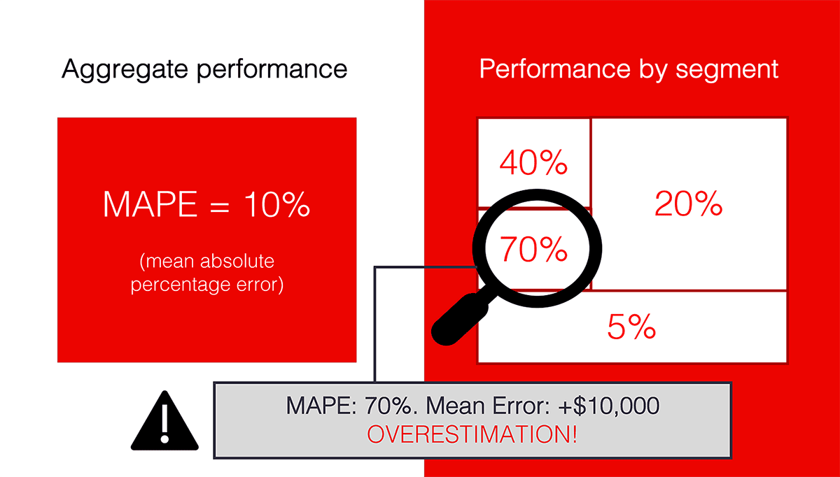
Image by Author
When we analyze machine learning model performance, we often focus on a single quality metric. With regression problems, this can be MAE, MAPE, RMSE, or whatever fits the problem domain best.
Optimizing for a single metric absolutely makes sense during training experiments. This way, we can compare different model runs and can choose the best one.
But when it comes to solving a real business problem and putting the model into production, we might need to know a bit more. How well does the model perform on different user groups? What types of errors does it make?
In this post, I will present an approach to evaluating the regression model performance in more detail.
Regression errors: too much or too little?
When we predict a continuous variable (such as price, demand, and so on), a common-sense definition of error is simple: we want the model predictions to be as close to actual as possible.
In practice, we might care not only about the absolute error value but also other criteria. For example, how well we catch the trend, if there is a correlation between the predicted and actual value — and what is the sign of our error, after all.
Underestimating and overestimating the target value might have different business implications. Especially if there is some business logic on top of the model output.
Imagine you are doing demand forecasting for a grocery chain. Some products are perishables, and delivering too much based on the wrong forecast would lead to waste. Overestimation has a clear cost to factor in.

Image by author. Source images from Unsplash: 1, 2.
In addition to classic error analysis, we might want to track this error skew (the tendency to over- or underestimate) and how it changes over time. It makes sense both when analyzing model quality during validation and in production monitoring.
To explain this concept of analyzing the error bias, let’s walk through an example.
Evaluating the model performance
Let’s say we have a model that predicts the demand for city bike rentals. (If you want to play with this use case, this Bike Demand Prediction dataset is openly available).
We trained a model, simulated the deployment, and compared its performance in “production” to how well it did on the training set.
In practice, we need to know the ground truth for that. Once we learn the actual demand, we can calculate our model’s quality and estimate how far off we are in our predictions.
Here, we can see a major increase in error between Reference performance in training and current Production performance.

Screenshot from the Evidently report.
To understand the quality better, we can look at the error distribution. It confirms what we already know: the error increased. There is some bias towards overestimation, too.

Screenshot from the Evidently report.
Things do not look ideal, and we want to dig deeper into what is going on. As do our business stakeholders. Why do these errors happen? Where exactly? Will retraining help us improve the quality? Do we need to engineer new features or create further post-processing?
Here is an idea of how to explore it.
Looking at the edges
Aggregate quality metrics show us the mean performance. However, these are the extreme cases that can often give us helpful information. Let us look directly there!
We can group the predictions where we have high errors and learn something useful from them.
How can we implement this approach?
Let’s take each individual prediction and calculate the error. Then, we create two groups based on the types of errors:
- Overestimation. Cases where the model predicts the values that are higher than actual.
- Underestimation. Cases where the model predicts the values that are lower than actual.
Let us limit the size of each group by choosing only 5% of the most extreme examples with the largest error. This way, we have the top-5% of predictions where the model overestimates and the top-5% where the model underestimates.
The rest 90% of predictions are the “majority.” The error in this group should be close to the mean.
That is how we can visualize the proposed segments. That is a sort of situation we’d like to see: most of the predictions are close to the actual values. Analyzing outliers can bring meaningful insight.

Image by Author.
How can it be useful?
Let’s take a time series example. If we built a great model and “learned” all the signal from the data, the error should be random. There should be no pattern. Except for a few likely outliers, the error would be close to the average in all groups. Sometimes slightly larger, sometimes smaller. But on average, about the same.
If there is some useful signal in the data that can explain the error, the situation can look differently. There can be a large error in specific groups. There can also be a clear skew towards under- or overestimation.
In these cases, the error may be dependent on specific feature values. What if we could find and describe the instances where it is higher than usual? That is precisely what we want to investigate!
Spotting the flaws
In our case, we can see that the error both in the over- and underestimation groups are significantly higher than the one in the “majority” group.

Screenshot from the Evidently report.
We can then try to investigate and explore the new patterns.
To do that, we look at the objects inside both 5%-groups and see what feature values correspond to them. Feature by feature, if we can.
Our goal is to identify if there is a relationship between the specific feature values and high error. To get deeper insight, we also distinguish between over- or under-estimation.
Imagine that we predict healthcare costs and consistently over-estimate the price for patients of certain demographics? Or, the error is unbiased but large, and our model fails on a specific segment? That is a sort of insight we want to find.

Image by Author.
We can make a complex (and computationally heavy) algorithm to perform this search for underperforming segments. As a reasonable replacement, we can just do this analysis feature by feature.
How can we do it? Let’s plot the feature distributions and our target demand and color-code the examples where we made high errors.
In our bike demand prediction use case, we can already get some insights. If we plot the “humidity” feature, we can notice that our model now significantly overestimates the demand when the humidity values are between 60 and 80 (plotted to the right).
We saw these values in our training dataset (plotted to the left), but the error was unbiased and similar on the whole range.

Screenshot from the Evidently report.
We can notice other patterns, too. For example, in temperature. The model also overestimates the demand when the temperature is above 30°C.

Screenshot from the Evidently report.
We can now suspect that something happened to the weather, and new related patterns emerged. In reality, we trained the model using the data from only cold months of the year. When it went to “production,” summer just started. With the new weather came new seasonal patterns that the model failed to grasp before.
The good news is that by looking at these plots, we can see that there seems to be some useful signal in the data. Retraining our model on new data would likely help.
How to do the same for my model?
We implemented this approach in the Evidently open-source library. To use it, you should prepare your model application data as a pandas DataFrame, including model features, predictions, and actual (target) values.
The library will work with a single DataFrame or two — if you want to compare your model performance in production with your training data or some other past period.

Image by Author.
The Regression performance report will generate a set of plots on model performance and an Error Bias table. The table helps explore the relations between the feature values and the error type and size.
You can also quickly sort the features to find those where the “extreme” groups look differently from the “majority.” It helps identify the most interesting segments without manually looking at each feature one by one.
You can read the full docs on Github.
When is this useful?
We believe this sort of analysis can be helpful more than once in your model lifecycle. You can use it:
- To analyze the results of the model test. For example, once you validate your model an offline test or after A/B test or shadow deployment.
- To perform ongoing monitoring of your model in production. You can do this at every run of a batch model or schedule it as a regular job.
- To decide on the model retraining. Looking at the report, you can identify if it is time to update the model or if retraining would help.
- To debug models in production. If the model quality fails, you can spot the segments where the model underperforms and decide how to address them. For example, you might provide more data for the low-performing segments, rebuild your model or add business rules on top of it.
If you want a practical example, here is a tutorial on debugging the performance of the machine learning model in production: “How to break a model in 20 days”.
Bio: Emeli Dral is a Co-founder and CTO at Evidently AI where she creates tools to analyze and monitor ML models. Earlier she co-founded an industrial AI startup and served as the Chief Data Scientist at Yandex Data Factory. She is a co-author of the Machine Learning and Data Analysis curriculum at Coursera with over 100,000 students.
Original. Reposted with permission.
Related:
- A Machine Learning Model Monitoring Checklist: 7 Things to Track
- MLOps: Model Monitoring 101
- Evaluating Object Detection Models Using Mean Average Precision