5 Must Try Awesome Python Data Visualization Libraries
The goal of data visualization is to communicate data or information clearly and effectively to readers. Here are 5 must try awesome Python libraries for helping you do so, with overviews and links to quick start guides for each.
By Roja Achary, Machine Learning Enthusiast
"The purpose of visualization is insight, not pictures."
―Ben Shneiderman
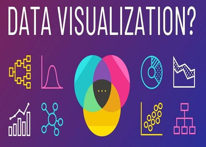
Source – Venn gage
Data visualization is the visual presentation of data or information. The goal of data visualization is to communicate data or information clearly and effectively to readers. Typically, data is visualized in the form of a chart, infographic, diagram, map and more.
How does it help?
- Identify trends and outliers
- Tell a story within the data
- Reinforce an argument or opinion
- Highlight an important point in a set of data
Let's dive into each of them.
Libraries required
Use the package manager pip to install below:
pip install matplotlib
pip install seaborn
pip install plotnine
pip install plotly
pip install bokeh
Matplotlib

Matplotlib is a comprehensive library for creating static, animated, and interactive visualizations in Python. Most of the coders start their Data Visualisation journey with Matplotlib.
Features:
- It is designed like MATLAB hence switching between the two is fairly easy.
- Comprises a lot of rendering backends.
- It can reproduce just about any plots (with a bit of effort).
- Has been out there for over a decade, therefore, boasts of a huge user base.
Quick Hand Codes for Matplotlib in 10 Minutes
Seaborn
Seaborn harnesses the power of Matplotlib to create beautiful charts in a few lines of code. The key difference is Seaborn’s default styles and color palettes, which are designed to be more aesthetically pleasing and modern. Since Seaborn is built on top of Matplotlib, you'll need to know Matplotlib to tweak Seaborn's defaults.
Features:
- Built in themes for styling matplotlib graphics
- Visualizing univariate and bivariate data
- Fitting in and visualizing linear regression models
- Plotting statistical time series data
- Seaborn works well with NumPy and Pandas data structures
- It comes with built in themes for styling Matplotlib graphics
Quick Hand Codes for Seaborn in 10 Minutes
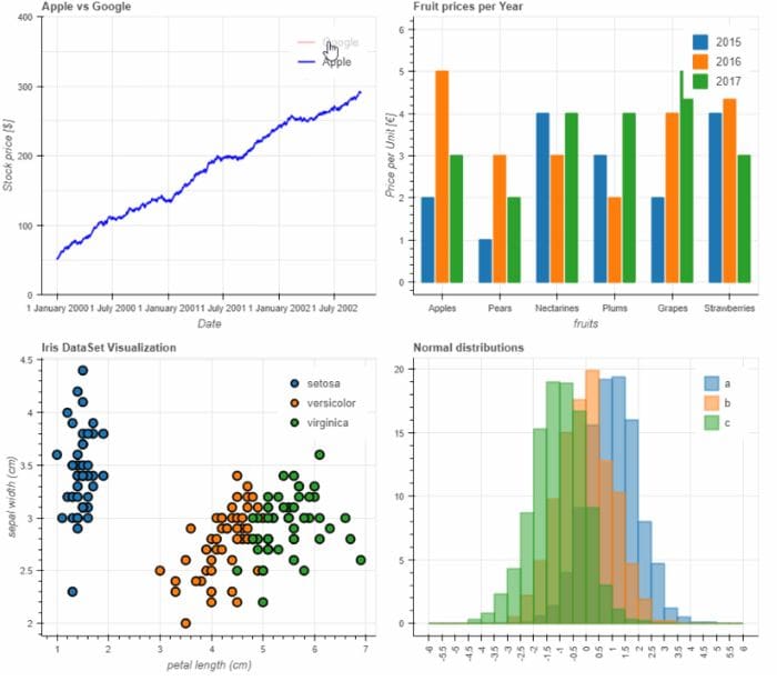
Plotnine

Plotnine is an implementation of a grammar of graphics in Python, it is based on ggplot2. The grammar allows users to compose plots by explicitly mapping data to the visual objects that make up the plot.
Features:
- Statistical transformations
- Scales
- Coordinates systems
- Facets
- Themes
Quick Hand Codes for Plotnine in 10 Minutes
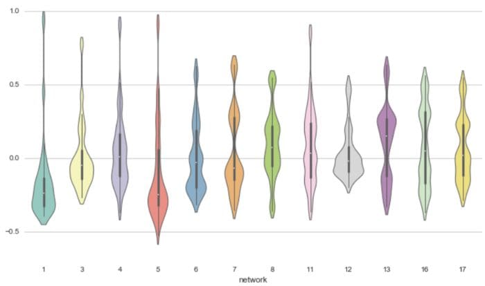
Bokeh
Source: Patrik Hlobil
Bokeh is an interactive visualization library for modern web browsers. It provides elegant, concise construction of versatile graphics, and affords high-performance interactivity over large or streaming datasets. Bokeh can help anyone who would like to quickly and easily make interactive plots, dashboards, and data applications.
Features:
- Flexible
- Interactive
- Powerful
- Productive
- Sharable
- OpenSource
Quick Hand Codes for Bokeh in 10 Minutes
Plotly
plotly is an interactive, open-source, and browser-based graphing library for Python. Built on top of plotly.js, plotly.py is a high-level, declarative charting library. plotly.js ships with over 30 chart types, including scientific charts, 3D graphs, statistical charts, SVG maps, financial charts, and more.
Features:
- Charts, Dashboards
- File Export, App Manager
- Kubernetes, Authentication
- Jobs Queue, Snapshot Engine
- Embedding, Big Data for Python
Quick Hand Codes for Plotly in 10 Minutes
References and Help:
- https://matplotlib.org/stable/tutorials/index.html
- http://seaborn.pydata.org/index.html
- https://plotnine.readthedocs.io/en/stable/
- https://bokeh.org/
- https://plotly.com/python/
Bio: Roja Achary (Kaggle, GitHub) is a Machine Learning Enthusiast, and a passionate learner. She is interested in the field of AI, Data Science with software engineering and always open to meaningful collaborations.
Related:
- Animated Bar Chart Races in Python
- How Visualization is Transforming Exploratory Data Analysis
- Get Interactive Plots Directly With Pandas