Visualizing Time-Series Change
When creating time-series line charts, it’s important to consider which of the following messages you would like to communicate: Actual value of units? Change in absolute units? Percent change? Change from a specific point in time?
By Nick Heitzman, Managing Consultant, Data Science for FI Consulting.
Note: The Python code and data used for this post can be found here
Time-series data visualizations are everywhere. While these charts are understood amongst individuals of all professions, effectively communicating change over time can present unexpected challenges. When creating any type of visualization, it is important to first determine the message you would like to communicate. The increased popularity of exploratory data visualization tools such as Tableau and Microsoft Power BI make it easy to forget this step. These tools provide users with the ability to connect to databases and click around until they find the prettiest visualization. Unfortunately, the exploratory nature of these tools can often lead to ineffective visualizations with no explicit purpose.
When creating time-series line charts, it’s important to consider which of the following messages you would like to communicate:
- Actual value of units?
- Change in absolute units?
- Percent change?
- Change from a specific point in time?
Ultimately, no chart can communicate all of these effectively. It is important to recognize this, determine which message is most important, and then design your visual accordingly.
To evaluate the different methods for visualizing change, I chose to examine population data from the three major North American countries. I used Python to access and analyze World Bank population data from Quandl, an online data warehouse (the code can be found here).
Methods for Visualizing Change
Plot the Data
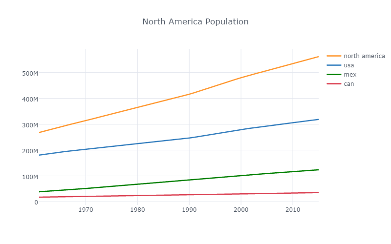
The most basic method for visualizing change is to directly plot the data. The chart above shows population of the United States, Mexico, Canada, and North America as a whole (including Central America and the Caribbean). While this affords readers the ability to see the absolute units, each series has a vastly different scale. These differences in scale makes it difficult for your audience to quickly compare change. Looking at this chart, which country do you think grew at the fastest rate?
Using Subplots
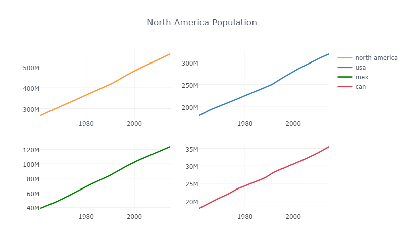
The subplots method allows us to look at each series individually while also comparing the general trends. The subplots method can be helpful for comparing datasets with vastly different scales; however, it is not particularly useful for this analysis. Subplots are informative when there is large variation in your data. They are not particularly effective for datasets that constantly increase over time. These four charts essentially just show ~45 degree angles.
Dual Y-Axes
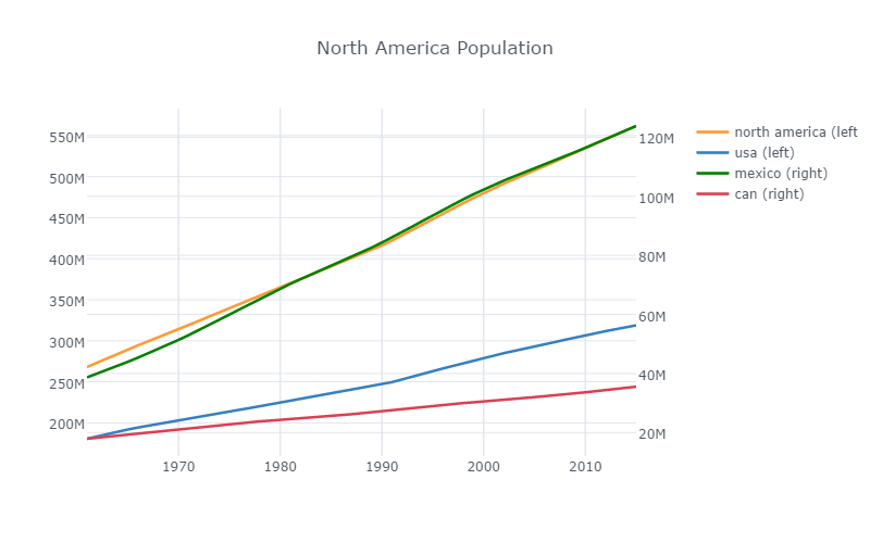
It can be tempting to use a secondary y-axis such as to help solve the problem of scale. I strongly caution against this approach. In this chart, the populations of Canada and Mexico are plotted on the right-axis. A dual axes chart can cause a few different issues:
- Readers have to fight the tendency to compare magnitude between lines
- Our brains are trained to look for periods in time in which lines intersect. We instinctively believe these are significant points in time. In a dual axes chart, these intersections are meaningless.
Stephen Few, one of the experts in the field of data visualization, wrote he couldn’t “think of a single case when there isn’t a better solution than a graph with a dual-scaled axis”. While I mostly agree, I believe there are circumstances where a dual y-axis can help provide context (such as how many observations took place in a specific location on a chart). These circumstances are rare, and for this analysis, a dual y-axis is not an effective way of communicating change in our dataset.
Periodic Change
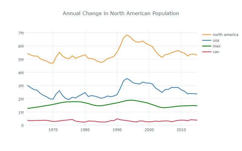
While plotting change in absolute units allows us to make comparisons within specific datasets, it is not particularly effective for comparing change across datasets with vastly different scales. If we examine the periods of 1990–1994, we can see the population of the United States had much higher than normal growth. What this chart does not effectively communicate, is the rapid growth in Mexico from 1960–1980.
Periodic Percent Change
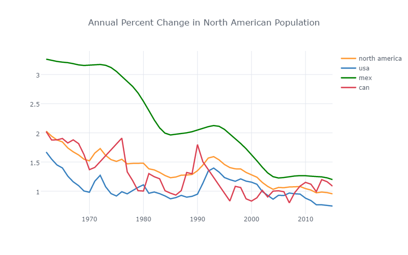
Visualizing percent change is a great way to evaluate growth between datasets of different units and scales. Of all the charts I made when creating this post, this yielded the most surprising results. Two items particularly jumped out at me:
- None of the previous charts communicated the rapid population growth rate Mexico has experienced. This chart clearly communicates Mexico consistently growing at a faster rate than the United States and Canada.
- Population growth is slowing amongst the three major countries in North America. While this is a bit surprising, a closer look at the previous chart helps explain this. Absolute annual population growth (the numerator) has been relatively flat since 1960; however, the current population (the denominator) continues to increase.
While this type of chart demonstrates change, readers completely lose context of scale. This chart does not communicate how much larger the population of the United States is compared with Canada (the US has roughly 10x the population of Canada). Another drawback to the percent change method is the outlier effect. If the population of a country decreased one year, an increase in population the following year would be overstated.
Indexing Data
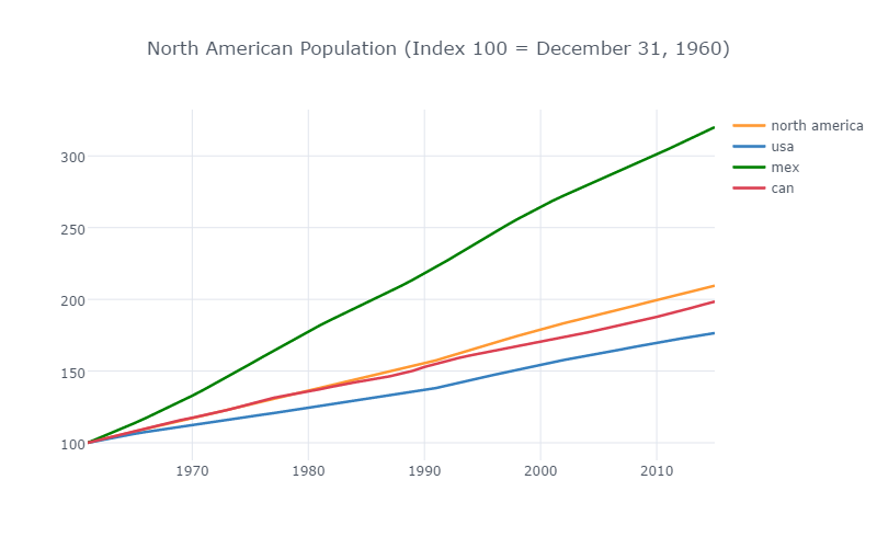
Indexing data is my absolute favorite way to compare change across datasets. This chart allows the reader to understand the rate at which change has occurred across datasets from a certain point in time (December 31, 1960). By using this fixed point in time as a reference, we reduce the impact of single outliers. This method not only allows us to not only compare datasets which have different scales, but also those which are measured in different units. It was very surprising to see Mexico’s population has more than tripled since 1960!
While I love index charts, there is no perfect time-series chart. Two specific areas of caution when using an index are:
- It is irresponsible to pick an outlier as the starting point. This misleads your audience, as the change since an outlier rarely relevant.
- Similar to the percent change chart, an audience would be unable to understand the differences in magnitude across datasets.
Conclusion
All of the previously discussed charts can be useful for communicating change across time. That being said, no time-series chart is perfect. As data visualizers, we must accept this and:
- Determine the message we would like to communicate and
- Choose the method which most effectively delivers this message
It is also important to remember that charts are free! There is no need to try to squeeze every bit of information into a single chart. I feel the entire story of North American population growth can be explained using the following three charts:
Bio: Nick Heitzman is a data scientist who specializes in data analysis and statistics, data visualization, and data story-telling. Nick is passionate about writing and applying data science solutions to real-world problems. As a Managing Consultant, Data Science for FI Consulting, Nick creates data science solutions for financial institutions.
Original. Reposted with permission.
Related: