 A Comparative Analysis of Top 6 BI and Data Visualization Tools in 2018
 A Comparative Analysis of Top 6 BI and Data Visualization Tools in 2018
In this article, we will compare the most commonly used platforms and analyze their main features to help you choose one or several platforms that will provide indispensable aid for your work communication.
Geckoboard
Image credit: geckoboard.com
Yet another cloud-based visualization solution. It can be an appropriate tool for you if you need to display some values using a basic predefined widget. Geckoboard provides an ability to compose dashboards with various widgets. It has a rich library of prepared integrations with facebook; twitter, Salesforce API’s so you can instantly visualize your social media engagements or business data.
It also provides an ability to create a custom integration with your own data sources in two ways: Pull or Push. Pull means that your widget makes a request for the data every N seconds (you can set up the N value) linked to a specific URL (which you can also set) from where it extracts the data. Push means that you can feed the widget with data manually by sending an HTTP request to the special widget URL. This will associate the data you have sent with that widget and showed it on the dashboard.
Geckoboard gives you few possible widget templates, like line charts or histogram, each of them has its own data JSON format which can be displayed. It’s important that your pull server or push feeder send the data in an appropriate format. Otherwise, it won’t show you anything on the dashboard. You can find much more information here.
You can also change the stylesheet for widgets, change the color schema, add two or more dashboards, or add multiple users. Geckoboard has a reliable support team that usually responds relatively fast and carefully guides you until your problem is fully resolved. When you register your company, they will usually call you on your phone a few days later to ask several questions about you, your company, and your business purpose in order to give useful advice about their relevant services and pricing.
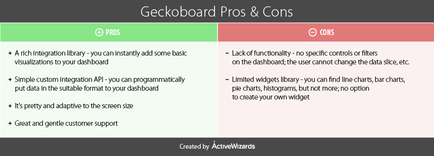
Product differentiators
It is one of the most democratic tools for visualizations as popular among individual users and freelancers, as among business and corporate users. Nonetheless, pricing is not very democratic, we will elaborate more on this later.
Geckoboard allows work on raw data and transforms metrics to fit visuals and make sense of your data. The metrics may also be chosen and focused to depict the frames of data that are most relevant.
The Geckoboard’s interface is a fine piece of work. The design pattern of drag and drop workflow is seamless and easy to follow. This type of interface makes it very simple to create any visualizations. Furthermore, the nice layout promotes navigational comfort while working with Geckoboard, and all the styles are magnificent. The themes give us both light and dark options. Additionally, the custom CSS styles can be applied to dashboards.
Features
- Integration to a variety of services such as Google Analytics, Zendesk, Bitium, etc
- An attractive, user-friendly interface
- Data transformation support
- Collaboration facilities
- Customization of visualizations
- Fused responsiveness
- Customer support and documentation are really helpful.
Usability
The overall evaluation of Geckoboard shows that the tool satisfies most of the needs of business users. First of all, the supported integrations make it easy to connect with the demanded data sources. The data visualization is accomplished by dragging the desired types onto the area of the report, dropping it there, and then dragging/dropping data that needs to be visualized. Finally, bringing the team to work on the report is as straightforward as creating this report.
Pricing
The detailed information about pricing can be found here. When you sign up, you have 30-days trial to train with the Geckoboard features and consider whether it is worth to spend money on buying it.
The pricing schema is broken into three main plans:
- The Starter pack at $25 per month, or $275 per year is the least flexible option which also includes the Geckoboard branding styles. It allows for work of one user and the creation of 1 dashboard, which is a perfect offer for startups, or projects with a strict budget.
- The Growth pack at $149 per month, or $1,639 per year gives more flexibility with styling, priority customer support, and, more importantly, extends the use to 5 dashboards with an unlimited number of users.
- The Company pack at $599 per month, or $6,589 per year is a corporate version of the tool designed for work with company-wide metrics. It allows for unlimited dashboards and users, and dedicated customer service is provided to the subscriber.
Power BI
Power BI is the software solution, developed and supported by Microsoft, for business intelligence and analytics needs. At the core of Power BI is an online service with various options for interaction, also featuring several outlets for connection to data provided by a third party software and services.
Power BI provides a simple web-based interface with a plenitude of useful features varying from customizable visualization to certainly limited controls of data sources. The desktop application expands the available functionality to an even larger extent with the addition of tools for data cleansing and normalization.
Another way to work and make data-driven decisions on the go is through the mobile app, which is available for multiple platforms. It is also amazingly simple to share insights by publishing your work to Power BI service and forming lively dashboards from a combination of reports which makes the data communication centralized and easy to follow up for all the participants.
Power BI is concise and minimalistic, yet powerful and robust. However, like any other software, it also has its ups and downs which must be carefully considered.
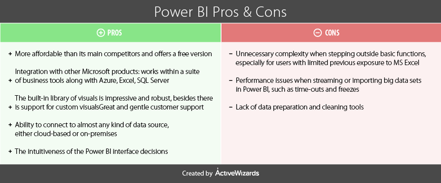
Product differentiators
What makes Power BI different from other solutions?
First of all, as it is a Microsoft product, it follows a philosophy, principles, and architecture similar to other major Microsoft products. It also exposes a familiar interface for the Windows users.
Power BI was created and designed with the aim to build upon the functionalities of MS Excel, upgrade it to the next level, extend its operability even further to unlock new use cases, cover more platforms, and reach out to the cloud.
As a Microsoft product, Power BI has connections to some other software from the Microsoft’s toolbelt but goes much farther than that by utilizing a whole suite of novel business analytics tools. Thus, Power BI is not just related to other products; it is tightly integrated with the main Microsoft tools including MS Excel, Azure Cloud Service, and SQL Server.
Features
- Power BI has a free basic version, giving users a chance to explore it first
- It supports plenty of ways to incorporate or import your data (streaming data, cloud services, excel spreadsheets, and third-party connections)
- It has interactive dashboards with real-time feed of data
- Simple API for integrating Power BI with your applications
- Different ways to share reports and dashboards
- Multiplatform support (Web, Desktop, Mobile).
Usability
The interface is straightforward for all users familiar with Windows (i.e., almost everyone), so working with Power BI is usually highly intuitive.
Many controls and depictions have a similar outlook on MS Excel and other MS Office products that provide a profound understanding of your progress while working on a report.
The visualizations are created with the use of good old drag-and-drop. All you need to do to build a new chart or visualize a piece of data is just drag and drop a visual type onto the blank area of the report. This will create a placeholder for the future visualization in the form of a blank visual with the default look. The same technique comes to play when you choose what data (the exact fields or pieces of data) to be presented in this visual by simply dragging and dropping the fields of data onto the placeholder itself or into its properties (they will be available when highlighted).
Pricing
Microsoft Power BI is considered as a decent analytics tool, and its pricing policy is highly democratic.
The pricing structure is simple and offers two options: a free version of Power BI with somewhat limited abilities, and an enterprise version of Power BI Pro with a full-fledged set of services.
The free option is available for any single user and has a 1 GB data capacity limit, 10K rows/hour of streaming data in total for your dashboards and reports, along with limited capabilities of data refreshing and collaboration.
Power BI Pro costs $9.99 for one user per month and expands the capacity limits to 10 GB data per user with up to 1M rows/hour of streaming data which is the maximum rate of their API). It also enables connection to the data sources directly and provides access to your on-premises data with the Data Connectivity Gateway, as well as advanced collaboration tools such as Office 365 Groups, content packs, Active Directory groups, row-level security measures, and Data Catalog.
Google Data Studio
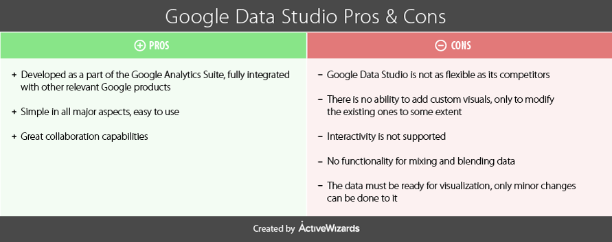
The youngest tool on our list today is a part of Google’s analytics solutions - Google Data Studio. Being relatively new to the field, it strives to take its position among many competitors via ease of usage, simple yet beautiful design, innovative problem-solving, and straightforward, habitual ways to share dashboards (just as you usually share documents).While still being in Beta, Google Data Studio gives an interesting insight into how it can process the data. It is a fully web-based solution, and there is no desktop version (unlike other BI solutions). The tool had a pretty decent start, but time will show whether it will perform well in the long run.
Product differentiators.
Google aspires to hit the right spot on the market with not just going for a single BI tool, but also promoting all their other tools for working with data by conveniently combining them into the Google Analytics Solutions data toolkit, a software suite for analyzing data and facilitating data-driven solutions.
Google typically strives to achieve maximum simplicity and intuitiveness in all their products. You will be pleasantly surprised to find how easily a plain dashboard can be put together.
However, some parts may still be quite challenging, especially when it comes to data manipulation. Please note that the tool is still in Beta, so many things are not supported, and it is not quite clear whether this is just a limitation of an early version or the tool’s permanent flaw.
Google Data Studio allows for the transformation of raw data to present it in interactive visualizations that will be compiled into dashboards. In addition, the tool is perfectly accommodated for use with Google specific data sources. It provides easy access to the data through the convenient facility of data connectors.
Finally, one of the best parts concerns the collaboration techniques that are used in Google Data Studio, bringing the team of developers to work together on a single problem. With Data Studio, you may allow others to view and edit the dashboard you are working on in the same way as in Google Docs.
Features
- Connectors to Google Data Sources
- Transformation tools for working with raw data
- Decent library of built-in visual types
- Great teamwork capabilities.
Usability
As we have already discussed, the tool is incredibly easy to use. It is quick to connect to data and figure out how the interface works. You will enjoy creating reports and dashboards as it is straightforward and fun. It is done in three simple steps: pick the type of a visual, drag and drop it into the report area positioning it in the desired location, then set up the metrics for visualization.
Nonetheless, certain parts are not so easy to accomplish. It may be quite puzzling to figure out how to personalize and tweak formatting of visuals and charts. However, though it may not be obvious for the first time, you will likely get the hang of it after practicing several times.
Sharing is straightforward and functions analogously to Google Drive, so you will not have to get used to it anew since you probably have the same experience. The control of access levels also works similarly: you can send invitations to access a report or a folder of reports via either email, or a shareable link, and choose to either grant permission to view only or allow editing.
However, be advised that the overall capabilities are still limited. In particular, you will not find any support for rich interactivity of reports, like letting users drill in on some parts of data or click and focus visuals on highlighting the parts that they want to check out. Also, the ability to customize visuals is narrow, as you can only pinch some of the settings. And finally, calculations only provide around 50 functions, which is a small choice, in comparison to other BI tools.
Pricing
Google Data Studio is distributed on the free basis. Initially, at the launch of Data Studio, there was a limitation of only 5 reports per user, but starting from February 2017 this bar has been lifted, and now users can enjoy unlimited access to the tool.
Summary
All of the highlighted visualization platforms have their own pros and cons, but all of them can also make your data talk and show its hidden values. For your convenience, we have summarized the key information about each product in the table below.
Now you are ready to try any of these tools for yourself and decide which platform will be the best solution for your project depending on your tasks and business style. We hope that this overview will help you to discover your perfect visualization tool and wish you good luck!
For further professional guidance and technical help with your individual project, please contact our expert team.

financesonline.com
 Bio: Igor Bobriakov is data scientist and technology entrepreneur. He helps innovative startups to implement data science initiatives serving as advisor for ActiveWizards machine learning company. Also he helps to develop educational programs for Data Science School.
Original. Reposted with permission.
Related:
- Top Modules and Features of Business Intelligence Tools
- Top 15 Scala Libraries for Data Science in 2018
- Top 15 Python Libraries for Data Science in 2017