An Introduction to t-SNE with Python Example
In this post we’ll give an introduction to the exploratory and visualization t-SNE algorithm. t-SNE is a powerful dimension reduction and visualization technique used on high dimensional data.
By Andre Violante, Data Scientist at SAS
Introduction
I’ve always had a passion for learning and consider myself a lifelong learner. Being at SAS, as a data scientist, allows me to learn and try out new algorithms and functionalities that we regularly release to our customers. Often times, the algorithms are not technically new, but they’re new to me which makes it a lot of fun.
Recently, I had the opportunity to learn more about t-Distributed Stochastic Neighbor Embedding (t-SNE). In this post I’m going to give a high-level overview of the t-SNE algorithm. I’ll also share some example python code where I’ll use t-SNE on both the Digits and MNIST dataset.
What is t-SNE?
t-Distributed Stochastic Neighbor Embedding (t-SNE) is an unsupervised, non-linear technique primarily used for data exploration and visualizing high-dimensional data. In simpler terms, t-SNE gives you a feel or intuition of how the data is arranged in a high-dimensional space. It was developed by Laurens van der Maatens and Geoffrey Hinton in 2008.
t-SNE vs PCA
If you’re familiar with Principal Components Analysis (PCA), then like me, you’re probably wondering the difference between PCA and t-SNE. The first thing to note is that PCA was developed in 1933 while t-SNE was developed in 2008. A lot has changed in the world of data science since 1933 mainly in the realm of compute and size of data. Second, PCA is a linear dimension reduction technique that seeks to maximize variance and preserves large pairwise distances. In other words, things that are different end up far apart. This can lead to poor visualization especially when dealing with non-linear manifold structures. Think of a manifold structure as any geometric shape like: cylinder, ball, curve, etc.
t-SNE differs from PCA by preserving only small pairwise distances or local similarities whereas PCA is concerned with preserving large pairwise distances to maximize variance. Laurens illustrates the PCA and t-SNE approach pretty well using the Swiss Roll dataset in Figure 1 [1]. You can see that due to the non-linearity of this toy dataset (manifold) and preserving large distances that PCA would incorrectly preserve the structure of the data.
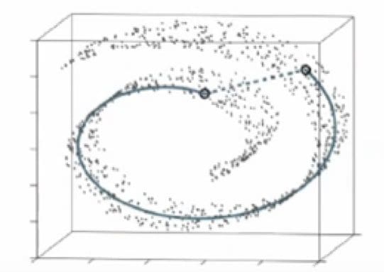
Figure 1 — Swiss Roll Dataset. Preserve small distance with t-SNE (solid line) vs maximizing variance PCA [1]
How t-SNE works
Now that we know why we might use t-SNE over PCA, lets discuss how t-SNE works. The t-SNE algorithm calculates a similarity measure between pairs of instances in the high dimensional space and in the low dimensional space. It then tries to optimize these two similarity measures using a cost function. Let’s break that down into 3 basic steps.
- Step 1, measure similarities between points in the high dimensional space. Think of a bunch of data points scattered on a 2D space (Figure 2). For each data point (xi) we’ll center a Gaussian distribution over that point. Then we measure the density of all points (xj) under that Gaussian distribution. Then renormalize for all points. This gives us a set of probabilities (Pij) for all points. Those probabilities are proportional to the similarities. All that means is, if data points x1 and x2 have equal values under this Gaussian circle then their proportions and similarities are equal and hence you have local similarities in the structure of this high-dimensional space. The Gaussian distribution or circle can be manipulated using what’s called perplexity, which influences the variance of the distribution (circle size) and essentially the number of nearest neighbors. Normal range for perplexity is between 5 and 50 [2].
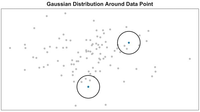
Figure 2 — Measuring pairwise similarities in the high-dimensional space
- Step 2 is similar to step 1, but instead of using a Gaussian distribution you use a Student t-distribution with one degree of freedom, which is also known as the Cauchy distribution (Figure 3). This gives us a second set of probabilities (Qij) in the low dimensional space. As you can see the Student t-distribution has heavier tails than the normal distribution. The heavy tails allow for better modeling of far apart distances.
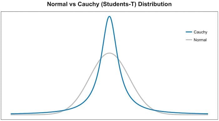
Figure 3 — Normal vs Student t-distribution
- The last step is that we want these set of probabilities from the low-dimensional space (Qij) to reflect those of the high dimensional space (Pij) as best as possible. We want the two map structures to be similar. We measure the difference between the probability distributions of the two-dimensional spaces using Kullback-Liebler divergence (KL). I won’t get too much into KL except that it is an asymmetrical approach that efficiently compares large Pij and Qij values. Finally, we use gradient descent to minimize our KL cost function.
Use Case for t-SNE
Now that you know how t-SNE works let’s talk quickly about where it is used. Laurens van der Maaten shows a lot of examples in his video presentation [1]. He mentions the use of t-SNE in areas like climate research, computer security, bioinformatics, cancer research, etc. t-SNE could be used on high-dimensional data and then the output of those dimensions then become inputs to some other classification model.
Also, t-SNE could be used to investigate, learn, or evaluate segmentation. Often times we select the number of segments prior to modeling or iterate after results. t-SNE can often times show clear separation in the data. This can be used prior to using your segmentation model to select a cluster number or after to evaluate if your segments actually hold up. t-SNE however is not a clustering approach since it does not preserve the inputs like PCA and the values may often change between runs so it’s purely for exploration.
Code Example
Below is a python code (Figures below with link to GitHub) where you can see the visual comparison between PCA and t-SNE on the Digits and MNIST datasets. I select both of these datasets because of the dimensionality differences and therefore the differences in results. I also show a technique in the code where you can run PCA prior to running t-SNE. This can be done to reduce computation and you’d typically reduce down to ~30 dimensions and then run t-SNE.
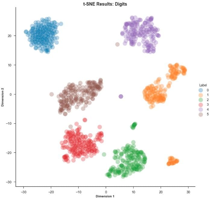
I ran this using python and calling the SAS libraries. It may appear slightly different than what you’re use to and you can see that in the images below. I used seaborn for my visuals which I thought was great, but with t-SNE you may get really compact clusters and need to zoom in. Another visualization tool, like plotly, may be better if you need to zoom in.
Check out the full notebook in GitHub so you can see all the steps in between and have the code:
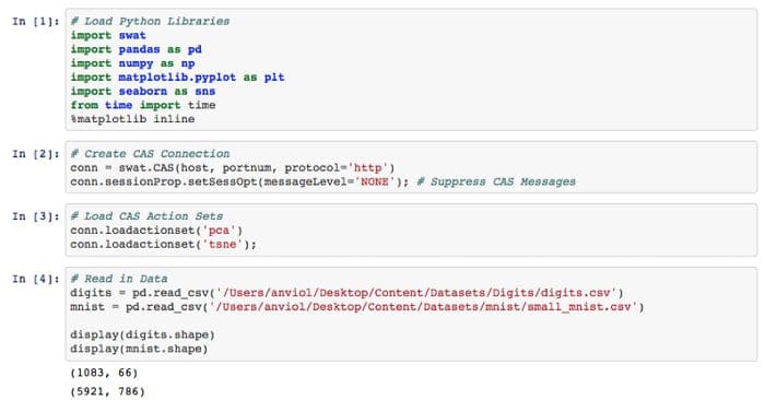
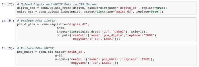
Step 1 — Load Python Libraries. Create a connection to the SAS server (Called ‘CAS’, which is a distributed in-memory engine). Load CAS action sets (think of these as libraries). Read in data and see shape.
Step 2 — To this point I’m still working on my local machine. I’m going to load that data into the CAS server I mentioned. This helps me to take advantage of the distributed environment and gain performance efficiency. Then I perform PCA analysis on both Digits and MNIST data.
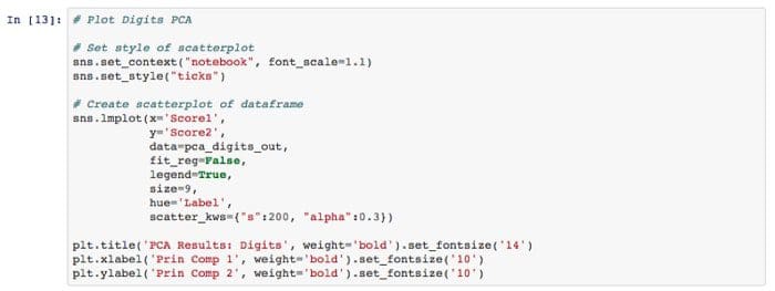
Step 3 — Visualize our PCA results for both Digits and MNIST
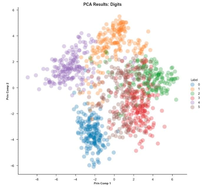
PCA actually does a decent job on the Digits dataset and finding structure.
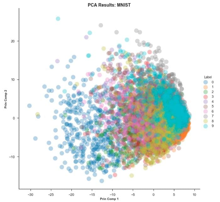
As you can see PCA on the MNIST dataset has a ‘crowding’ issue.
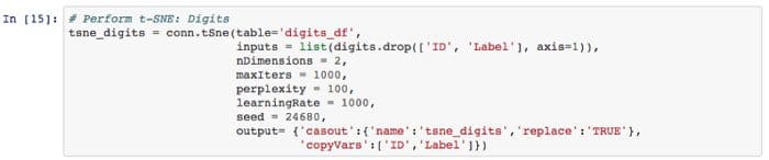
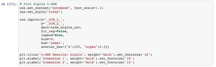
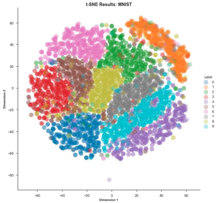
Step 4 — Now let’s try the same steps as above, but using the t-SNE algorithm
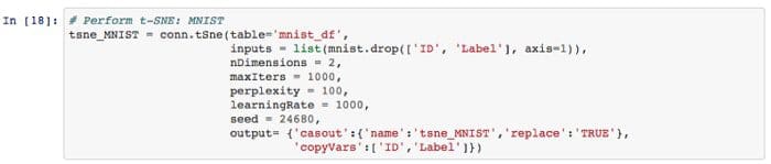
And now for the MNIST dataset…
Conclusion
I hope you enjoyed this overview and example of the t-SNE algorithm. I found t-SNE to be a very interesting and useful as a visualization tool since almost all the data I’ve ever worked on seemed to be high-dimensional. I’ll post the resources that I found super helpful below. The best resource for me was the YouTube video by Laurens. It’s a little long at almost 1 hour, but well explained and where I found the clearest explanation with detail.
Additional Resources I found Useful:
- T-SNE vs PCA: https://www.quora.com/What-advantages-does-the-t-SNE-algorithm-have-over-PCA
- Kullback-Liebler Divergence: https://en.wikipedia.org/wiki/Kullback%E2%80%93Leibler_divergence
- T-SNE Wikipedia: https://en.wikipedia.org/wiki/T-distributed_stochastic_neighbor_embedding
- T-SNE Walkthrough: https://www.analyticsvidhya.com/blog/2017/01/t-sne-implementation-r-python/
- Good hyperparameter Information: https://distill.pub/2016/misread-tsne/
- Lauren van der Maaten’s GitHub Page: https://lvdmaaten.github.io/tsne/
References
- YouTube. (2013, November 6). Visualizing Data Using t-SNE [Video File]. Retrieved from https://www.youtube.com/watch?v=RJVL80Gg3lA
- L.J.P. van der Maaten and G.E. Hinton. Visualizing High-Dimensional Data Using t-SNE. Journal of Machine Learning Research 9(Nov):2579–2605, 2008.
Bio: Andre comes to SAS with over 8 years of digital analytics experience. He has specialized in the retail industry with deep experience in customer analytics. Andre has worked with several different data platforms, both on-premises and cloud, using a variety of open source tools, but primarily R and Python. Andre is naturally curious with passion for problem solving.
Andre has a Bachelor’s in Business Management and a Master’s degree in Analytics. He is also currently enrolled in Georgia Tech working on a second Master’s degree in Computer Science with an emphasis in machine learning.
Andre loves spending time with his family going on vacations and trying new food spots. He also enjoys the outdoors and being active.
Related:
- Dimensionality Reduction : Does PCA really improve classification outcome?
- Optimization 101 for Data Scientists
- Ten Machine Learning Algorithms You Should Know to Become a Data Scientist