 How (not) to use Machine Learning for time series forecasting: The sequel
 How (not) to use Machine Learning for time series forecasting: The sequel
Developing machine learning predictive models from time series data is an important skill in Data Science. While the time element in the data provides valuable information for your model, it can also lead you down a path that could fool you into something that isn't real. Follow this example to learn how to spot trouble in time series data before it's too late.
By Vegard Flovik, Data Scientist, Axbit AS.
Time series forecasting is an important area of machine learning. It is important because there are so many prediction problems that involve a time component. However, while the time component adds additional information, it also makes time series problems more difficult to handle compared to many other prediction tasks. Time series data, as the name indicates, differ from other types of data in the sense that the temporal aspect is important. On a positive note, this gives us additional information that can be used when building our machine learning model — that not only the input features contain useful information, but also the changes in input/output over time.
My previous article on the same topic, How (not) to use Machine Learning for time series forecasting, has received a lot of feedback. Based on this, I would argue that time series forecasting and machine learning is of great interest to people and that many recognize the potential pitfalls I discussed in my article. Due to the great interest in the topic, I chose to write a follow-up article discussing some related issues when it comes to time series forecasting and machine learning, and how to avoid some of the common pitfalls.
Through a concrete example, I will demonstrate how one could seemingly have a good model and decide to put it into production, whereas in reality, the model might have no predictive power whatsoever. Importantly, I will discuss some of these issues in a bit more detail and how to spot them before it is too late.
Example case: Prediction of time series data
The example data used in this case is illustrated in the below figure. We will get back to the data in more detail later, but for now, let’s assume this data represents e.g., the yearly evolution of a stock index, the sales/demand of a product, some sensor data or equipment status, whatever might be most relevant for your case. The basic idea, for now, is that what the data actually represent does not really affect the following analysis and discussions.
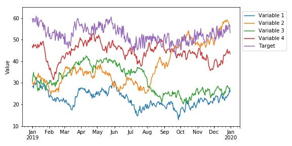
As seen from the figure, we have a total of 4 “input features” or “input variables” and one target variable, which is what we are trying to predict. The basic assumption in cases like these is that the input variables to our model contain some useful information that allows us to predict the target variable based on those features (which might, or might not be the case).
Correlation and causality
In statistics, correlation or dependence is any statistical relationship, whether causal or not. Correlations are useful because they can indicate a predictive relationship that can be exploited in practice. For example, an electrical utility may produce less power on a mild day based on the correlation between electricity demand and weather. In this example, there is a causal relationship, because extreme weather causes people to use more electricity for heating or cooling. However, in general, the presence of a correlation is not sufficient to infer the presence of a causal relationship (i.e., correlation does not imply causation). This is a very important distinction, which we will get back to in more detail later.
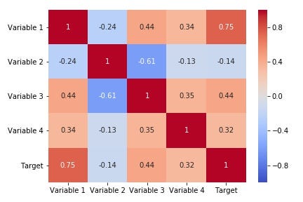
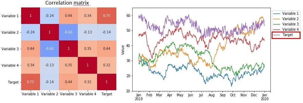
To inspect our data, one thing we can look into is calculating the correlation matrix, which represents the correlation coefficients between all variables in our dataset. In statistics, the Pearson correlation coefficient is a measure of the linear correlation between two variables. According to the Cauchy-Schwarz inequality, it has a value between +1 and −1, where 1 is a total positive linear correlation, 0 is no linear correlation, and −1 is a total negative linear correlation.
However, while correlation is one thing, what we are often interested in is rather causality. The conventional dictum that "correlation does not imply causation" means that correlation cannot be used by itself to infer a causal relationship between the variables (in either direction).
A correlation between age and height in children is fairly causally transparent, but a correlation between mood and health in people is less so. Does improved mood lead to improved health, or does good health lead to good mood or both? Or does some other factor underlie both? In other words, a correlation can be taken as evidence for a possible causal relationship, but cannot indicate what the causal relationship, if any, might be.

(Source: https://xkcd.com/925/)
The important distinction between correlation and causality is one of the major challenges when building forecasting models based on machine learning. The model is trained on what should (hopefully) be representative data of the process we are trying to forecast. Any characteristic patterns/correlations between our input variables and the target are then used by the model for establishing a relationship that can be exploited to give new predictions.
In our case, from the correlation matrix, we see that our target variable is indeed correlated with some of our input variables. Still, training a model on our data, it might be that this apparent correlation is merely a statistical fluke and that there is no causal relationship between them at all. However, for now, let’s ignore this fact and try to set up our prediction model. We’ll get back to discussing these potential pitfalls in more detail later.
Machine learning models for time series forecasting
There are several types of models that can be used for time-series forecasting. In my previous article, I used a Long short-term memory network, or in short LSTM Network. This is a special kind of neural network that makes predictions according to the data of previous times, i.e., it has a concept of “memory” explicitly built into the model structure.
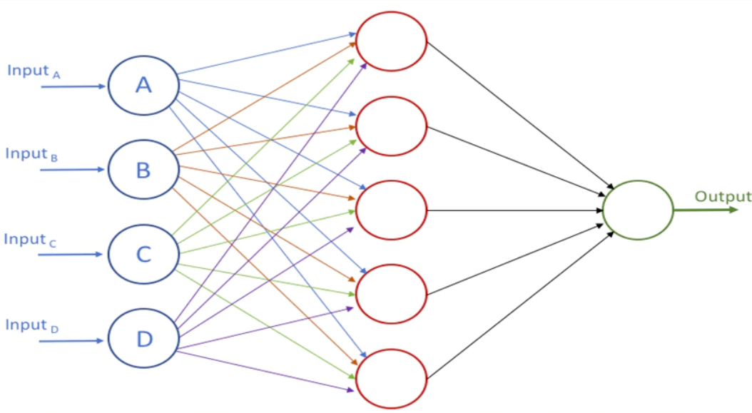
However, it is my experience that, in many cases, simpler types of models actually provide just as accurate predictions. In this example, I thus implement a forecasting model based on a feedforward neural network (as illustrated below), instead of a recurrent neural network. I also compare the predictions to that of a random forest model (one of my go-to models, based on its simplicity and usually good performance out-of-the-box).
Implementing the models using open source software libraries
I usually define my neural network type of models using Keras, which is a high-level neural networks API, written in Python and capable of running on top of TensorFlow, CNTK, or Theano. For other types of models (like the random forest model in this case), I usually use Scikit-Learn, which is a free software machine learning library. It features various classification, regression and clustering algorithms, and is designed to interoperate with the Python numerical and scientific libraries NumPy and SciPy.
The main topic of this article does not concern the details of how to implement a time series forecasting model, but rather how to evaluate the predictions. Due to this, I will not go into the details of model building, etc., as there are plenty of other blog posts and articles covering those subjects. (However, if you are interested in the code used for this example, just let me know in the comments below, and I'll share the code with you).
Training the model
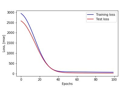
After setting up the neural network model using Keras, we split the data into a training set and a test set. The first 6 months of data are used for training, and the remaining data is used as a hold-out test set. During the model training, 10% of the data is used for validation to keep track of how the model performs. The training process can then be visualized from the training curve below, where the train and validation loss as a function of epochs is plotted. From the training curve, it indeed appears that the model has been able to learn something useful from the data. Both training and validation loss decrease as the training progress, and then start to level out after approximately 50 epochs (without apparent signs of overfitting/underfitting). So far, so good.
Evaluating results
Let us now visualize the model predictions vs. the ground truth data in the hold-out test set to see whether we have a good match. We can also plot the real vs. predicted values in a scatter plot and visualize the distribution of errors, as shown in the below figure to the right.
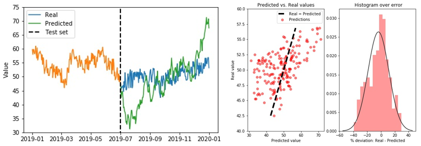
From the figures above, it becomes clear that our model does not obtain a very good match when comparing the real and predicted values. How could it be that our model, which seemingly was able to learn useful information, performs so badly in the hold-out test set?
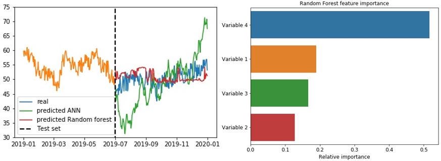
To get a better comparison, let us also implement a random forest model on the same data, to see whether that would give us any better results. As we can see from the results in the below figure to the left, the random forest model does not perform much better than the neural network. However, a useful feature of the random forest model is that it can also output the “feature importance” as part of the training process, indicating the most important variables (according to the model). This feature importance can, in many cases, provide us useful information and is also something we will discuss in a bit more detail.
Spurious correlations and causality
Interestingly, we notice from the above figure that Variable 4 was apparently the most important input variable, according to the random forest model. From the correlation matrix and plot in the figure below, however, we notice that the variable which is most strongly correlated with the target is “Variable 1” (which has the 2nd highest feature importance). Actually, if you have a closer look at the plotted variables below, you probably notice that Variable 1 and Target follow exactly the same trend. This makes sense, as will become apparent in our following discussion of the data used in this example.
Origin of the data used in this example
As we are getting closer to finishing up the article, it is time to reveal some additional details on the origin of the data used. If you have read my previous article on the pitfalls of machine learning for time series forecasting, you might have realized that I am quite a fan of random walk processes (and stochastic processes in general). In this article, I indeed chose a similar approach to address that of spurious correlations and causality.
Actually, all the variables in the dataset (4 input variables, and one “target”), are just generated by random walk processes. I originally generated 4 random walkers, and to obtain the target variable, I simply implemented a time shift of 1 week of “Variable 1” (with a little bit of added random noise, to make it less obvious to notice by first glance).
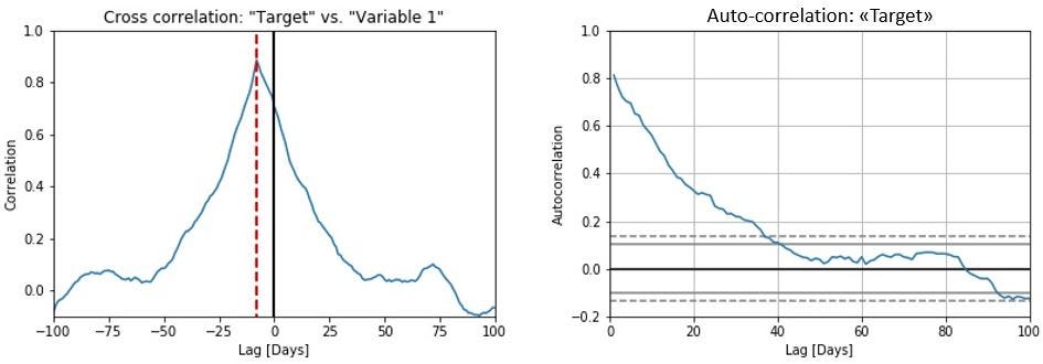
As such, there is, of course, no causal relationship between the variables and the target. When it comes to the first variable, as the target is shifted one week back in time compared to variable 1, any changes in the target variable happens prior to the corresponding change in variable 1. Due to this, the only coupling to the target variable is through the inherent autocorrelation of the random walk process itself.
This time shift can be easily spotted if we calculate the cross-correlation between variable 1 and the target, as illustrated in the below figure to the left. In the cross-correlation, there is a clear peak for a time shift of 7 days. However, we notice both from the correlation matrix above, and from the figure below, that there exists a significant correlation between the target and variable 1 even at a lag of zero days (correlation coefficient of 0.75, to be precise). However, this correlation is merely due to the fact that the target variable has a slowly decaying autocorrelation (significantly longer than the time shift of one week), as illustrated in the below figure to the right.
The Granger Causality test
As mentioned previously, the input variables of our model are correlated with the target, which does not mean that they have a causal relationship. These variables may actually have no predictive power whatsoever when trying to estimate the target at a later stage. However, when making data-driven predictive models, mistaking correlation and causality is an easy trap to fall into. This then begs the important question: is there anything we can do to avoid this?
The Granger causality test is a statistical hypothesis test for determining whether one time series is useful in forecasting another. Ordinarily, regressions reflect “mere” correlations, but Clive Granger argued that causality could be tested for by measuring the ability to predict the future values of a time series using prior values of another time series. A time series X is said to Granger-cause Y if it can be shown, usually through a series of t-tests and F-tests on lagged values of X (and with lagged values of Y also included), that those X values provide statistically significant information about future values of Y.
Granger defined the causality relationship based on two principles:
- The cause happens prior to its effect.
- The cause has unique information about the future values of its effect.
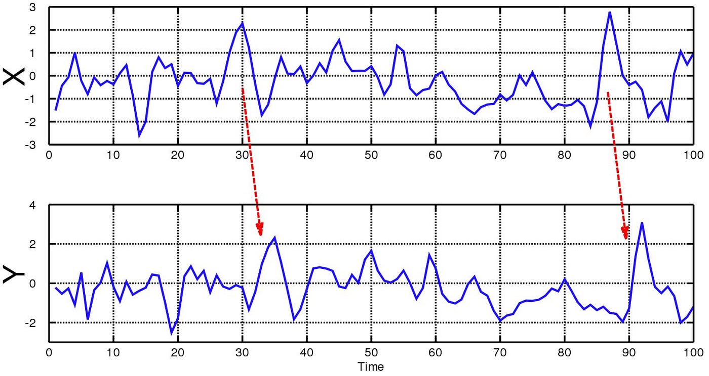
When time series X Granger-causes time series Y (as illustrated below), the patterns in X are approximately repeated in Y after some time lag (two examples are indicated with arrows). Thus, past values of X can be used for the prediction of future values of Y.
The original definition of Granger causality does not account for latent confounding effects and does not capture instantaneous and non-linear causal relationships. As such, performing a Granger causality test cannot give you a definitive answer on whether there exists a causal relationship between your input variables and the target you are trying to predict. Still, it can definitely be worth looking into and provides additional information compared to relying purely on the (possibly spurious) correlation between them.
The “dangers” of non-stationary time-series
Most statistical forecasting methods are based on the assumption that the time series can be rendered approximately stationary (i.e., “stationarized”) through the use of mathematical transformations. A stationary time series is one whose statistical properties, such as mean, variance, autocorrelation, etc. are all constant over time. One such basic transformation is to time-difference the data.
What this transformation does, is that rather than considering the values directly, we are calculating the difference between consecutive time steps. Defining the model to predict the difference in values between time steps rather than the value itself is a much stronger test of the model's predictive powers. In that case, it cannot simply use that the data has a strong autocorrelation, and use the value at time “t” as the prediction for “ t+ 1”. Due to this, it provides a better test of the model and if it has learned anything useful from the training phase, and whether analyzing historical data can actually help the model predict future changes.
Summary
The main point I would like to emphasize through this article is to be very careful when working with time series data. As shown through the above example, one can easily be fooled (as also discussed in one of my previous articles on the hidden risk of AI and Big Data). By simply defining a model, making some predictions, and calculating common accuracy metrics, one could seemingly have a good model and decide to put it into production. Whereas, in reality, the model might have no predictive power whatsoever.
With access to high quality and easy to use machine learning libraries and toolboxes, the actual coding part of building a model has become quite straightforward. This progress is great news. It saves us lots of time and effort and limits the risk of coding errors during implementation. The time saved during model building should rather be used to focus on asking the right questions. In my opinion, this is one of the most important aspects of data science. How do you properly validate your model predictions? Is there any hidden bias in your data that can potentially skew your predictions or any subtle feedback loops that can cause unintentional results?
The most important point I want to emphasize is that it is key to always be skeptical of what the data is telling you. Ask critical questions and never draw any rash conclusions. The scientific method should be applied in data science as in any other kind of science.
Original. Reposted with permission.
Bio: Vegard Flovik is a Lead Data Scientist in machine learning and advanced analytics at Axbit AS.
Related: