 Do’s and Don’ts of Analyzing Time Series
 Do’s and Don’ts of Analyzing Time Series
When handling time series data in your Data Science analysis work, a variety of common mistakes are made that are basic, but very important, to the processing of this type of data. Here, we review these issues and recommend the best practices.

Photo by Nathan Dumlao on Unsplash.
The examples in this article use the Starbucks data stock market dataset, available to download here.
Helpful Techniques in Analyzing Time-Series Data
1 . Visualizing Time Series and Data Exploration
- Line Graph
Line plots are some of the most simple and basic types of plots, which can show the change of a feature over time.
In Pandas, we can do it as follows.
df['Close'].plot(color='blue', figsize=(12,8))
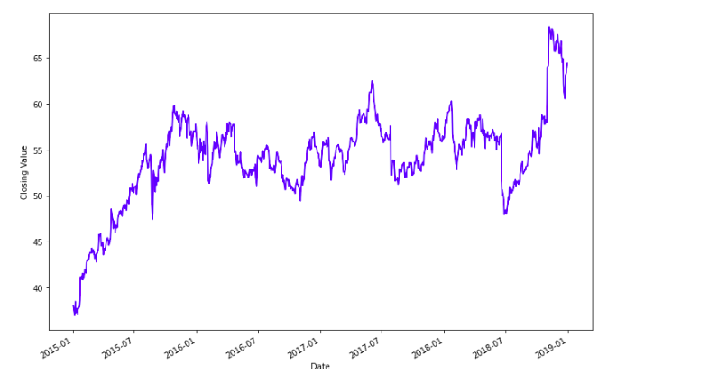
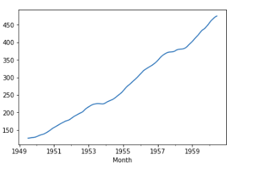
Here, we can see that the closing value of the stocks of Starbucks is increasing over time. We can see some ups and downs in it, but generally, the company is performing well.
Now, we can observe from the plot that the closing value is decreasing from 2018 January to 2018 July. We can have a closer look as follows.
df['Close']['2018-01':'2018-09'].plot( figsize=(12,8), marker='o')
plt.ylabel('Closing Value')
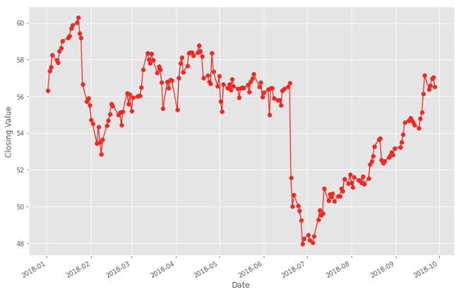
Here, we can see that stocks were around 60 in 2018–01 but reduced to 48 in 2018–07. The good news is that company managed to raise itself some months back to near 60.
- Histograms
Histograms are a good way to tell how often each different value in a set of data occurs.
Here, in our case, we can check that what is the most occurred value of our stock via
df['Close'].plot.hist(figsize=(15,8), bins=20, edgecolor='black')
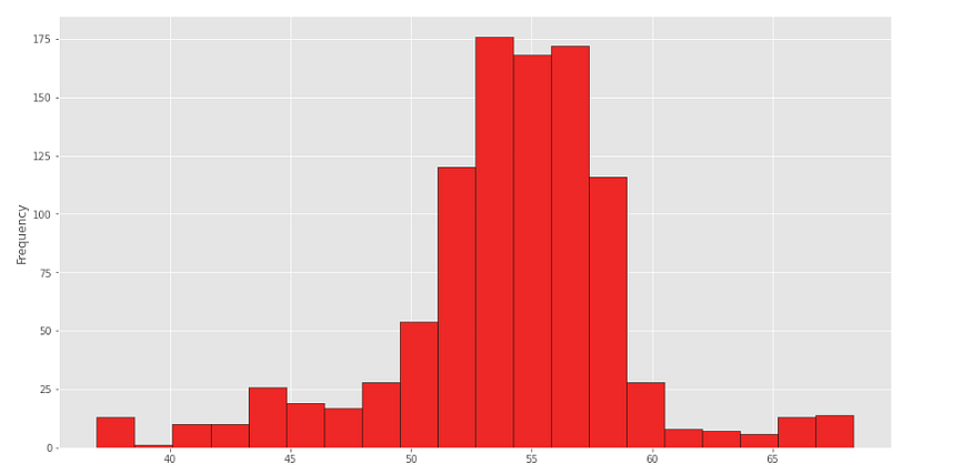
And here, we can see that the closing value of our stock is mostly at 53–58.
2. Decomposition of Time Series
We can decompose our Time Series into 4 parts. These are
- Level:The measure of Average of the value in the time series.
- Trend: The general trend in your time series, which tells increasing or decreasing value in the series.
- Seasonality: Characteristic of a time series in which the data experiences regular and predictable changes that recur every calendar year.
- Noise: The random variation in the series.
Trend
Finding trends in your time series can give you a lot of awareness about your data, and it can help you know that the value at any certain point is above the trend or below the trend.
You can find the trend via some methods, such as ETS Decomposition. Now to understand more and in-depth about ETS Decomposition and how it works, you need to refer to some book or a teacher as it involves some maths and stats to understand how it works.
But the good news is that you can easily do it in Python using statsmodel library.
from statsmodels.tsa.seasonal import seasonal_decompose
Now, if you can see that your feature is increasing or decreasing at a non-linear rate, by line plotting it, we have to use a multiplicative model. Otherwise, if the feature is increasing or decreasing by a linear rate, then you have to use the additive model.
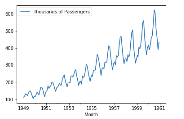
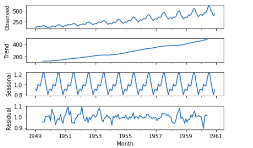
For example, in this case, we can see that our trend is non-linear and almost exponential for the number of passengers on flights, so we have to use the multiplicative model.
We can then find the trend for the number of passengers via the following code.
result = seasonal_decompose(df[‘Thousands of Passengers’], model=’multiplicative’)
Here, we have to pass the column name for which we want to find the trend. We can then observe the trend by calling the plot function on trend the attribute, which is basically a Pandas Series.
Now the returning value result consists of 4 components. Those are Residual, Seasonal, Trend, and Observed.
You can check the values for each component by calling them from result,
i.e.,
result.trend
And to plot it, you can simply call plot function over this series.
result.trend.plot()
To plot all of these, we can simply call plot function the result.
result.plot()
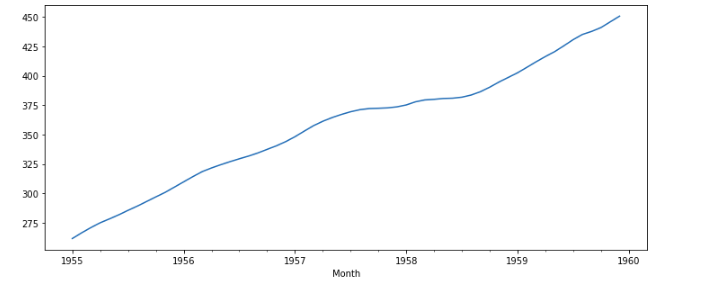
If we want to see the trend of a specific period, let’s say from 1955 to 1999, we can do it by,
result.trend['1955':'1959'].plot(figsize=(12,5))
If we want to compare the value of Passengers with the current trend, we can do it by plotting the value for the column and the trend in the same figure.
result.trend['1955':'1959'].plot(figsize=(12,5), label='Trend')
df['Thousands of Passengers']['1955':'1959'].plot(label='Thousands of Passengers')
plt.legend()
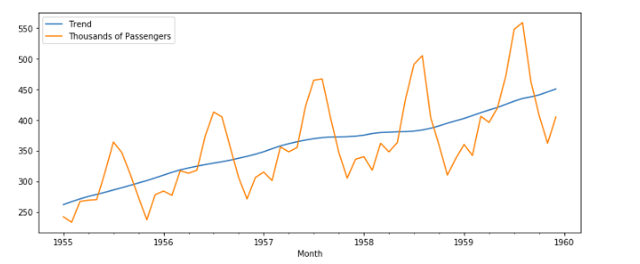
Here we can see that from 1955 to 1960, at specific intervals, the number of passengers drop(maybe during Work months) and increase(summer vacations maybe).
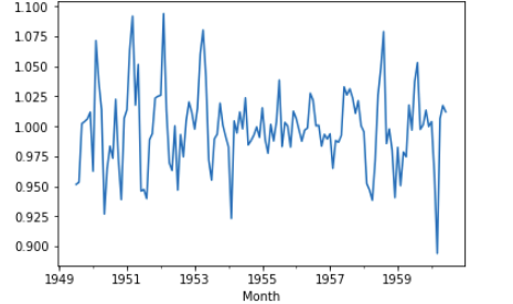
Seasonality
The seasonality component explains the periodic ups and downs in a time series.
Image Credits: Towards Data Science.
A time series can contain multiple seasonal periods or one single seasonal periods depending upon the nature and quality of the dataset.
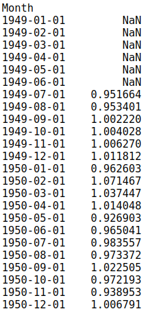
As we have already found the result component from ETA decomposition, it comes with Seasonality component, and we can plot it via
result.seasonal.plot()
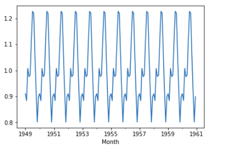
This can show us the periodic pattern repeating in the dataset.
Noise
Residual is composed of 2 parts: Noise and Error.
Noise is that part of the residual, which is in-feasible to model by any other means than a purely statistical description. Note that such modeling limitations which arise due to limitations of the measurement device (e.g., finite bandwidth & resolution).
We can reduce residual by either reducing noise or by reducing error.
As discussed earlier, it is the part of result and we can achieve it via
result.resid
and plot it via
result.resid.plot()
Mistakes to Avoid
1. Ignoring The Timestamp Column
A lot of beginners seem to completely ignore the timestamp or time series column and just drop it. This might result in not understanding the data correctly and might result in a model that is not good.
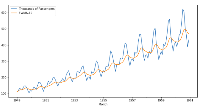
2. Using Normal Average instead of Exponentially Weighted Moving Average
A lot of times, you have to plot the average of any feature to check it’s behavior, and it is a lot beneficial to use EWMAs instead of the normal average. You can check the details and maths in this video by Professor NG, where he explains why EWMA is better than normal averages.
Luckily, you can achieve it in Pandas in a single line by using ewm function.
df['EWMA-12'] = df['Thousands of Passengers'].ewm(span=12).mean()
Here, we are finding EWMA for 12 months span in our dataset.
We can plot it by
df[['Thousands of Passengers', 'EWMA-12']].plot(figsize=(12,6))
3. Defining Trend as a Linear growth over time
Suppose I have a dataset for GDP of a country over time and related features, and if I plot the trend for 1 year and it is linear, it does not mean that it might be a linear trend because most real-world datasets are not linear. And 1 year is a really short span to see and observe any trend.
For example, the Trend of GDP for 1 year is
df['trend_gdp']['2005'].plot(figsize=(12,5))
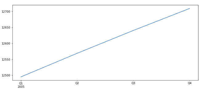
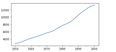
It seems quite linear, but when we plot it on a long dataset, with a lot of data, we can see the actual trend, which is not fully linear.
df['trend_gdp'].plot()
Related: