Forget Telling Stories; Help People Navigate
When designing reporting & visualizations, think of them as part of a navigation framework rather than stand-alone information.
Great reporting and visualizations should create an action path that will guide users through the analysis process and eventual action to improve the business. The goal is not just story telling, but to help user navigate from data to action.
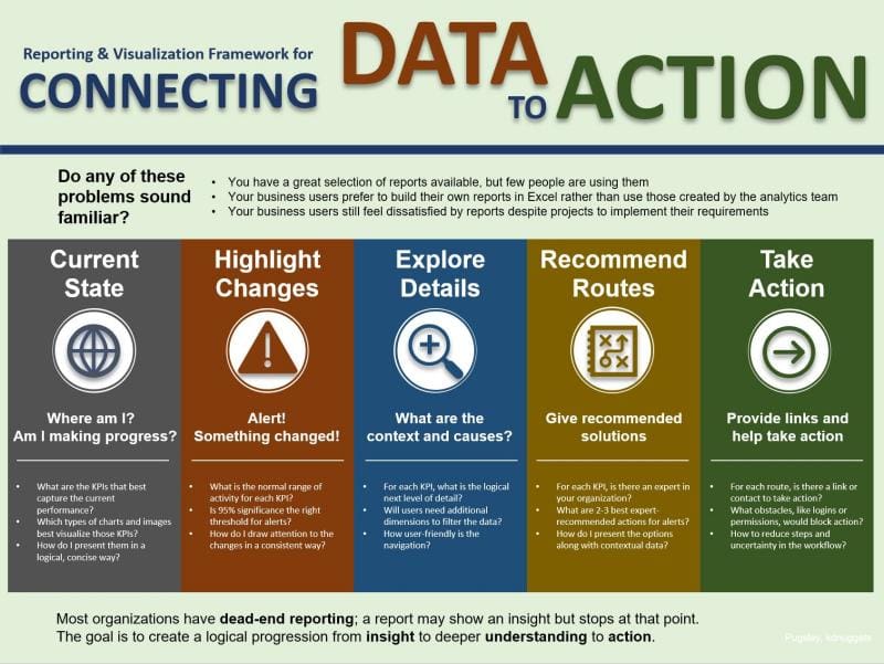
Following is a simple infographic for this framework:

Click image to enlarge
Let’s start with the “Current State” batch of KPIs. These are the lead visualizations that you would place on your executive dashboards. They give people a sense for where the key metrics for the business in one place. What are the KPIs that tell the current story of the organization?
The next step is to look for significant signals, changes or events. In our reporting we should use bright colors and attention-grabbing icons to highlight changes in the data.
Every lead KPI and alert needs to be paired with one or more drill-down paths to explore details. These are supplemental visualizations. The path to do drill downs needs to be simple and clearly linked. Ideally each department or business process would have its own drill-down area or folder.
Now we’ve got to move beyond just doing a data dump. People want to be led by the hand to recommended routes to resolve issues. Not every change in every chart will have an automatic recommended best route. But many do. If inventory is low in a particular SKU, there are just a few routes to follow, so why not note them right on the report? If costs are increasing faster than planned in one department, do you have standard ways to address the issue? If so, then list out those standard actions right where the information is needed and useful as the information is consumed.
At the end we need to help users to take action by embedding links to the associated applications right in the reports. If inventory is low, add a link below the KPI to the warehouse management software. If sales are dropping in one region, add a link at the bottom of the KPI to Salesforce or your CRM system to follow up.
We can make our reporting tools into navigation tools by using the five steps in the framework.
Bio: Stan Pugsley is a data warehouse and analytics consultant with Eide Bailly Technology Consulting based in Salt Lake City, UT. He is also an adjunct faculty member at the University of Utah Eccles School of Business. You can reach the author via email.
Related:
- Telling a Great Data Story: A Visualization Decision Tree
- Data Science vs Business Intelligence, Explained
- 5 Concepts Every Data Scientist Should Know
