
 Charticulator: Microsoft Research open-sourced a game-changing Data Visualization platform

 Charticulator: Microsoft Research open-sourced a game-changing Data Visualization platform
Creating grand charts and graphs from your data analysis is supported by many powerful tools. However, how to make these visualizations meaningful can remain a mystery. To address this challenge, Microsoft Research has quietly open-sourced a game-changing visualization platform.
By Josh Taylor, Head of Systems and Insights, UK Cabinet Office.
Charticulator allows for truly bespoke visualisation through a drag-and-drop interface. (Source: Charticulator)
Data visualisation is an area where experimentation is rewarded. It is important to be able to rapidly prototype ideas when creating charts. It is easy to think up impressive ways of building a graph to show a trend in a data set only to find out that, once created, it simply does not work as expected.
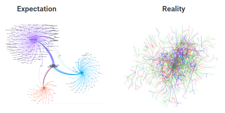
Even well thought out charts can turn into a mess when real data is added.
Whilst open source tools such as Python and R have a large number of packages to support the creation of charts and graphs, iterating with code can be slow and introduces a steep learning curve. Given that visualisation of data is normally only a small part of a data scientist’s workflow, spending time understanding the specifics of a visualisation library can be painful.
Charticulator
The Charticulator platform not only enables charts to be created from data using a simple drag-and-drop interface, but it also enables full customisation of the elements within charts in the same way. The platform is open-source (MIT license, source code here).
The way that all of the chart attributes can be built from data allows for almost anything to be created. When using the platform, you can concentrate more on bringing your data to life than on the process of doing so.
If this sounds a bit abstract, it is probably better explained through the video below:
Building a bespoke chart in under 2 minutes (Source: Charticulator).
An added bonus
Whilst charts can be exported and saved in a number of formats, it is the ability to create a custom visual for Power BI which makes Charticulator even more powerful:

Export to Power BI to create and share outputs on interactive reports.
The below video shows the process in more detail:
How to create a custom visual in Power BI using Charticulator. (Source: Curbal)
You can find Charticulator here!
Original. Reposted with permission.
Related: