Understanding Functions for Data Science
Most data science problems boil down to finding the mathematical function that describes the relationship between feature and target variables.
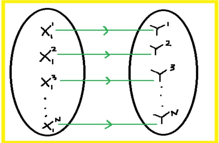
Image by Author
Key Takeaways
- Most beginners interested in getting into the field of data science are always concerned about the math requirements.
- Data science is a very quantitative field that requires advanced mathematics.
- But to get started, you only need to master a few math topics.
- In this article, we discuss the importance of functions in data science and machine learning.
Functions
Most of basic data science is focused on finding the relationship between features (predictor variables) and a target variable (outcome). The predictor variables are also referred to as the independent variables, while the target variable is the dependent variable.
The importance of functions is that they can be used for predictive purposes. If one can find the function that describes the relationship between X and y, that is y = f (X), then for any new value of X, one could then predict the corresponding value for y.
For simplicity, we will assume that the target variable takes on continuous values, that is, we will focus on a regression problem. The same principles discussed in this article will apply to classification problems in which the target variable takes only discrete variables, for example, 0 or 1. In this article, we will focus on linear functions, as they form the basis of most linear models in data science and machine learning.
1. Linear functions with one predictor variable
Let’s assume we have a one-dimensional dataset containing a single feature (X) and an outcome (y), and let’s assume there are N observations in the dataset:
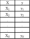
Table 1. Simple one-dimensional dataset with single predictor variable.
The goal is then to find the relationship between X and y. The first thing to do would be to generate a scatter plot that can inform us about the type of relationship between X and y. Is it linear, quadratic, or periodic? For example, using the cruise ship dataset cruise_ship_info.csv, and taking X = cabins and y = crew, the scatter plot looks like this:
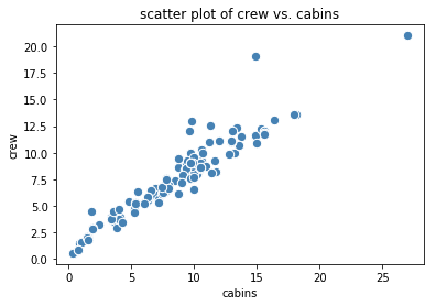
Figure 1. Scatter plot of crew vs. cabins | Image by Author
From Figure 1, we observe an approximate linear relationship exist between the predictor (cabins) and target (crew) variables. A simple linear model to fit the data is then given as:
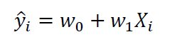
where w0 and w1 are the weights that can be obtained using simple linear regression. When simple linear regression is performed, the output is plotted in Figure 2, with an R2 score of 0.904.
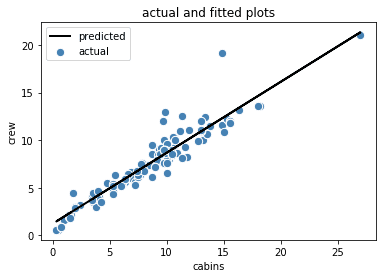
Figure 2. Actual and fitted plots for crew vs. cabins | Image by Author
Sometimes, there is no obvious predictable relationship between the predictor variable and the target variable. In this case, a function can’t be used to quantify the relationship, for instance, as shown in Figure 3 below.
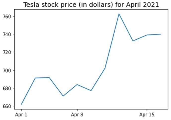
Figure 3. Tesla stock price for the first 16 days in April 2021 | Image by Author
2. Linear functions with several predictor variables
In the previous example, we used X = cabins and y = crew. Now supposed we would like to use the entire dataset (see Table 1).
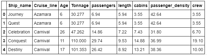
Table 2: Shows the first 5 rows of the dataset of the cruise_ship_info.csv dataset.
Then in this case, our predictor variable is a vector X = (age, tonnage, passengers, length, cabins, passenger_density), and y = crew.
Since our target variable now depends on 6 predictor variables, we need to compute and visualize the covariant matrix to see which variables correlate strongly with the target variable (see Figure 4).
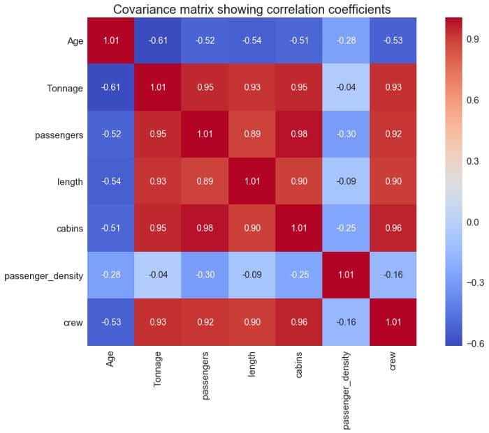
Covariance matrix plot showing correlation coefficients
From the covariance matrix plot above (Figure 4), we see that the “crew” variable correlates strongly (correlation coefficient ? 0.6) with 4 predictor variables: X = (Tonnage, passengers, length, cabins). We can, therefore, build a multiple regression model of the form:
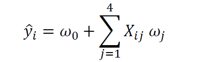
where X is the features matrix, w0 is the intercept, and w1, w2, w3, and w4 are the regression coefficients. For a full python implementation of a multi-regression model for this problem, please see this GitHub repository: https://github.com/bot13956/Machine_Learning_Process_Tutorial
Summary
- Most data science problems boil down to finding the mathematical function that describes the relationship between feature and target variables.
- If the function can be determined, then it could be used for predicting new target values for given predictor values.
- Most data science problems can be approximated as linear models (single or multiple predictor variables).
Benjamin O. Tayo is a Physicist, Data Science Educator, and Writer, as well as the Owner of DataScienceHub. Previously, Benjamin was teaching Engineering and Physics at U. of Central Oklahoma, Grand Canyon U., and Pittsburgh State U.