Getting Started with PyCaret
An open-source low-code machine learning library for training and deploying the models in production.

Image by Editor
Any AI model training and deployment goes through a long data journey. Some of these steps are standard and can be automated thereby enabling fast model development and deployment. PyCaret is one of the packages developed in pursuit of churning out machine-learning models at a factory scale. Let's get started with learning about it.
What is PyCaret?
PyCaret is an open-source, low-code data science package in Python that speeds up the experiment cycle by automating ML workflows. It replaces hundreds of lines of code with only a few lines, facilitating faster and more efficient experimentation.
It's a wrapper around multiple ML libraries and frameworks such as scikit-learn, boosting libraries like LightGBM/XGBoost/CatBoost, spaCy, Hyperopt, Ray, etc, providing seamless and flexible development.

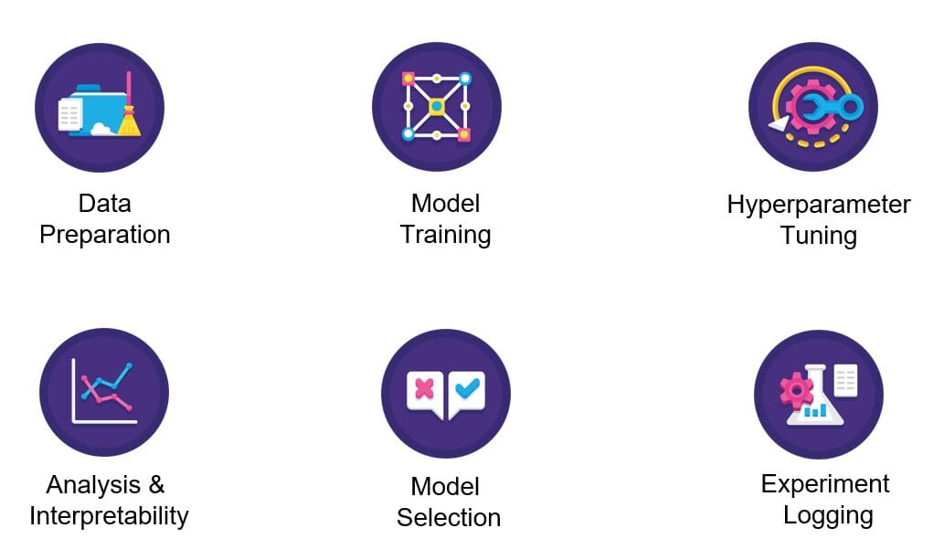
Image by Pycaret
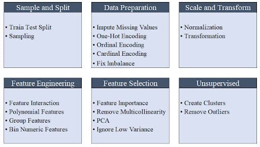
PyCaret is simple and easy to use wherein the operations are sequentially stored in a pipeline ready for deployment. PyCaret automates preprocessing, feature engineering, as well as hyperparameter tuning all out of the box.

Image by Moez Ali
Its model collection has over 70 untrained models for tasks like classification, regression, clustering, etc with an exceptional spread of modules including supervised and unsupervised methods.
PyCaret has everything covered – whether it is integration with the SHAP framework for explainability or with MLFlow for experiment tracking.
Installation
Pycaret can be installed using pip. The default installation installs only the hard dependencies as shown below.
pip install pycaret
To install the full version run the below command in your terminal/command line.
pip install pycaret[full]
Hands On!
Pycaret offers some standard datasets out of the box. We will use the “Boston Housing Prices” dataset (boston.csv) for this tutorial.
First, let's import libraries such as “get_data” from PyCaret for loading the data into the Jupyter environment and “plotly express” for charting/plotting.
from pycaret.datasets import get_data
import plotly.express as px
from pycaret.regression import *
In case you witness any error while importing the libraries, then it might be because of dependency issues that need to be resolved first. Please note that PyCaret is not yet compatible with Python 3.9. For this demo, Python 3.7 is used on Google Colab.
Load the dataset into the Jupyter Notebook using the get_data function imported previously from pycaret.datasets. The get_data function returns a data frame that can be stored as shown below.
data = get_data('boston')
PyCaret shows the top five rows of the data frame by default. Therefore you do not need to call dataframe.head() function explicitly.

Each row in the dataset represents a suburb or a town in the Boston region. The data is originally drawn from the Boston Standard Metropolitan Statistical Area (SMSA) in the year 1970 with a data dictionary sourced from here.
We are solving a regression problem given the continuous nature of the target variable, MEDV.
The below chart represents one of the interesting scatter plots with the following characteristics:
- Bivariate distribution between the Median value of owner-occupied homes in $1000s (MEDV) and the percentage of the lower status of the population (LSTAT)
- An index of accessibility to radial highways (RAD) to the equation as a faceted column (equivalent to “hue” in Seaborn)
- A trendline using the trendline argument with value as “OLS” representing Ordinary Least Squares
- The color of the trendline is chosen to be red for easy visibility using the argument trendline_color_override
fig = px.scatter(x = data['lstat'], y = data['medv'], facet_col =
    data['rad'], opacity = 0.2, trendline = 'ols',
    trendline_color_override = 'red')
fig.show()
The plot shows a strong negative relationship between median housing prices and the lower status of the population. This means that the weaker the financial status of the population, the lower the disposable income, and thus the lower would be the housing prices.

The RAD value of 24 fits the data well excluding a few outliers and has decent support with respect to the number of records.
Looking at the distribution of the target variable i.e. MEDV, it appears to be fairly normally distributed barring a few outliers.
fig = px.histogram(data, x=["medv"])
fig.show()

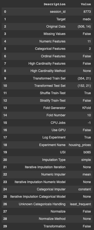
Setting up a PyCaret experiment is quite easy using the setup function. The function uses the following arguments as input – the data frame, target variable name, a boolean to log the experiment results, and the name.
s = setup(data, target = 'medv', log_experiment = True,
    experiment_name = 'housing_prices')
As evident from the PyCaret output, it does a gamut of things automatically including but not limited to identifying missing values, continuous and categorical features, the cardinality of variables, splits train and test sets and performs cross-validation that would otherwise take considerable time and resources.

Once the experiment is set up, you need to run compare_models() in order to experiment with a multitude of algorithms for a particular problem. The below code stores the best model in a variable.
best_model = compare_models()
The above code trains and tests the model on different algorithms and arranges them in the ascending order of the error. It also displays the training time in seconds which is denoted by ‘TT (Sec)’ in the last column.
Notably, the training time is based on using all CPU cores in this particular example and might differ on different machines.

The “get_params()” method is used to retrieve the hyperparameters of the best model which is the Extra Tree Regressor in our example.
best_model.get_params(){'bootstrap': False
'ccp_alpha': 0.0,
'criterion': 'mse',
'max_depth': None,
'Max_features': 'auto',
'max_leaf_nodes': None,
'max_samples': None,
'min_impurity_decrease': 0.0,
'min_impurity_split': None,
'min_samples_leaf': 1,
'min_samples_split': 2,
'min_weight_fraction_leaf': 0.0,
'n_estimators': 100,
'n_jobs': -1,
'oob_score': False,
'random _state': 8773,
'verbose': 0,
'warm_start': False}
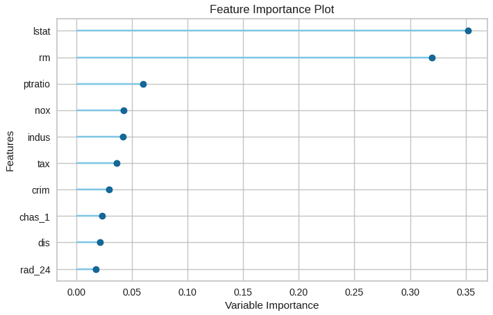
Feature importances can be plotted using the below code.
plot_model(best_model, plot = 'feature')

The visualization makes it easier to identify the top n features, with the most important feature at the top.
Model predictions are generated using the predict_model() function.
data_cpy = data.copy()
data_cpy.drop(‘medv’, axis = 1, inplace = True)
y_pred = predict_model(best_model, data = data_cpy)
The save_model() function is used to save the trained model for easy deployment.
save_model(best_model, 'my_best_pipeline')
Summary
In this post, you learned about how PyCaret makes the life of many data scientists and machine learning engineers easier by automating a lot of mundane tasks. The post also demonstrated how to automate the standard steps in a machine-learning pipeline using the PyCaret package.
Vidhi Chugh is an AI strategist and a digital transformation leader working at the intersection of product, sciences, and engineering to build scalable machine learning systems. She is an award-winning innovation leader, an author, and an international speaker. She is on a mission to democratize machine learning and break the jargon for everyone to be a part of this transformation.
