Statistics in Data Science: Theory and Overview
High-level exploration of the role of statistics in data science.
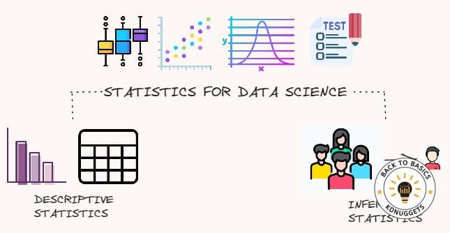
Illustration by Author | Source: Flaticon.
Are you interested in mastering statistics for standing out in a data science interview? If it’s yes, you shouldn’t do it only for the interview. Understanding Statistics can help you in getting deeper and more fine grained insights from your data.
In this article, I am going to show the most crucial statistics concepts that need to be known for getting better at solving data science problems.
Introduction to Statistics
When you think about Statistics, what is your first thought? You may think of information expressed numerically, such as frequencies, percentages and average. Just looking at the TV news and newspaper, you have seen the inflation data in the world, the number of employed and unemployed people in your country, the data about mortal incidents in the street and the percentages of votes for each political party from a survey. All these examples are statistics.
The production of these statistics is the most evident application of a discipline, called Statistics. Statistics is a science concerned with developing and studying methods for collecting, interpreting and presenting empirical data. Moreover, you can divide the field of Statistics into two different sectors: Descriptive Statistics and Inferential Statistics.
The yearly census, the frequency distributions, the graphs and the numerical summaries are part of the Descriptive Statistics. For Inferential Statistics, we refer to the set of methods that allow to generalise results based on a part of the population, called Sample.
In data science projects, we are most of the time dealing with samples. So, the results we obtain with machine learning models are approximated. A model may work well on that particular sample, but it doesn’t mean that it’s going to have good performances on a new sample. Everything depends on our training sample, that needs to be representative, to generalise well the characteristics of the population.
EDA with graphs and numerical summaries
In the data science project, exploratory data analysis is the most important step, which enables us to perform initial investigations on the data with the help of summary statistics and graphical representations. It also allows us to discover patterns, spot anomalies and check assumptions. Moreover, it helps to find errors that you may find in data.
In EDA, the centre of the attention is on the variables, that can be of two types:
- numerical if the variable is measured on a numerical scale. It can be further categorised into discrete and continuous. It’s discrete when there are distinct quantities. Examples of discrete variables are the degree grade and the numbers of people in a family. When we are dealing with a continuous variable, the set of possible values is within a finite or infinite interval, such as the height, the weight and the age.
- categorical if the variable is typically constituted by two or more categories, like the occupation status (employed, unemployed and people searching for a job) and the type of the job. As the numerical variables, the categorical variables can be split into two different types: ordinal and nominal. A variable is ordinal when there is a natural ordering of the categories. An example can be the salary with low, medium and high levels. When the categorical variable doesn’t follow any order, it’s nominal. A simple example of a nominal variable is the gender with levels Female and Male.
EDA of Univariate Data
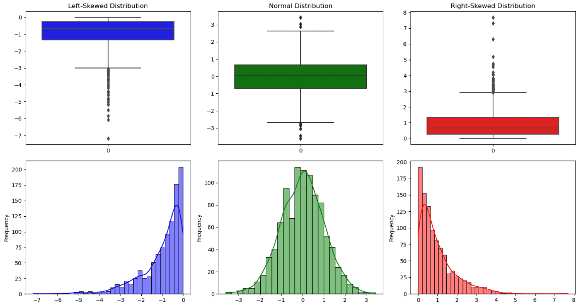
Distribution Shape. Illustration by Author.
To understand the numerical features, we typically use df.describe() to have an overview of the statistics for each variable. The output contains the count, the average, the standard deviation, the minimum, the maximum, the median, the first and the third quantile.
All this information can also be seen in a graphical representation, called boxplot. The line across the box is the median, while the lower hinge and upper hinge correspond respectively to the first and the third quartile. In addition to the information provided by the box, there are two lines, also called whiskers, that represent the two tails of the distribution. All the data points outside the boundary of the whiskers are outliers
From this plot, it can also be possible to observe if the distribution is symmetric or asymmetric:
- A distribution is symmetric when there is a bell shape, the median coincides approximately to the mean and the whiskers have the same length.
- A distribution is skewed to the right (positive skewed) if the median is near the third quartile.
- A distribution is skewed to the left (negative skewed) if the median is near the first quartile.
Other important aspects of the distribution can be visualised from a histogram that counts how many data points fall in each interval. It’s possible to notice four types of shapes:
- one peak/mode
- two peaks/modes
- three or more peaks/modes
- uniform with no evident mode
When the variables are categorical, the best way is to observe the frequency table for each factor of the feature. For a more intuitive visualisation, we can employ the bar chart, with vertical or horizontal bars depending on the variable.
EDA of Bivariate Data
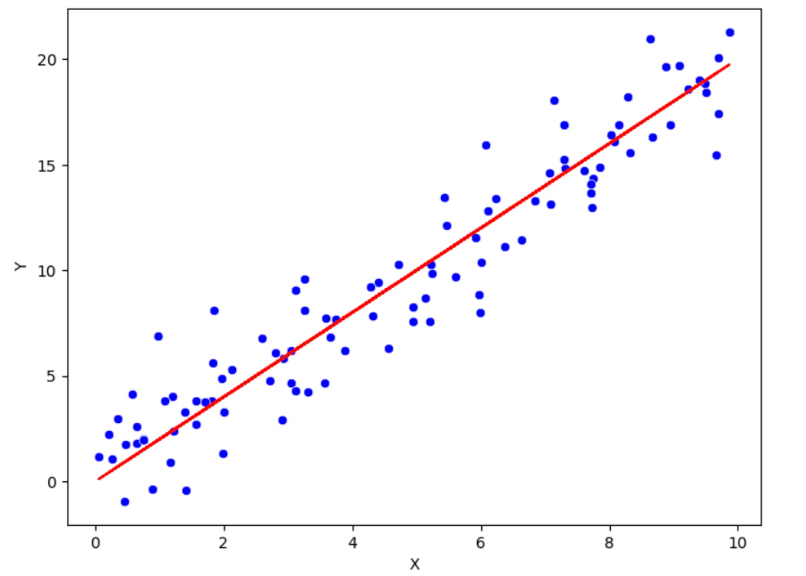
Scatterplot that shows the positive linear relationship between x and y. Illustration by Author.
Previously we have listed the approaches to understand the univariate distribution. Now, it’s time to study the relationships between the variables. For this purpose, it’s common to calculate Pearson correlation, which is a measure of the linear relationship between two variables. The range of this correlation coefficient is within -1 and 1. The more the value of the correlation is near to one of these two extremes, the more the relationship is strong. If it’s near to 0, there is a weak relationship between the two variables.
In addition to the correlation, there is the scatter plot to visualise the relationship between two variables. In this graphical representation, each point corresponds to a specific observation. It’s often not very informative when there is a lot of variability within the data. To capture more information from the pair of variables is by adding smoothed lines and transforming the data.
Probability Distributions
The knowledge of Probability distributions can make the difference when working with data.
These are the most used probability distributions in data science:
- Normal distribution
- Chi-squared distribution
- Uniform distribution
- Poisson distribution
- Exponential distribution
Normal distribution
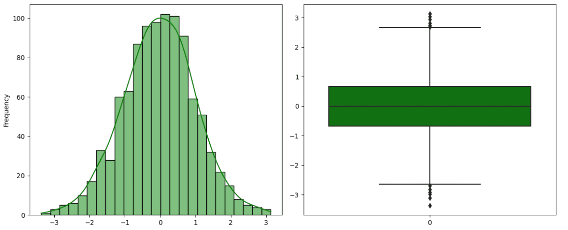
Example of Normal distribution. Illustration by Author.
The normal distribution, also known as Gaussian Distribution, is the most popular distribution in statistics. It’s characterised by a bell curve for its particular shape, tall in the middle and tails towards the end. It’s symmetric and unimodal with a peak. Moreover, there are two parameters that have a crucial role in normal distribution: the mean and the standard deviation. The mean coincides with the peak, while the width of the curve is represented by the standard deviation. There is a particular type of Normal distribution, called Standard Normal Distribution, with mean equal to 0 and variance equal to 1. It’s obtained by subtracting the mean from the original value and, then, dividing by the standard deviation.
Student’s t Distribution
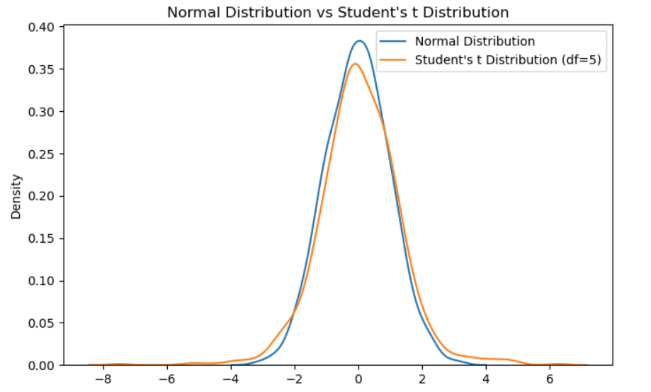
Example of Student’s t distribution. Illustration by Author.
It is also called t-distribution with v degrees of freedom. Like the standard normal distribution, it’s unimodal and symmetric around zero. It slightly differs from the gaussian distribution because it has less mass in the middle and there are more masses in the tails. It’s considered when we have a small sample size. The more the sample size increases, the more the t-distribution will converge to a normal distribution.
Chi-squared distribution
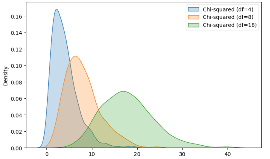
Example of Chi-squared distribution. Illustration by Author.
It is a special case of Gamma distribution, very known for its applications in hypothesis testing and confidence intervals. If we have a set of normally distributed and independent random variables, we compute the square value for each random variable and we sum every squared value, the final random value follows a chi-squared distribution.
Uniform distribution
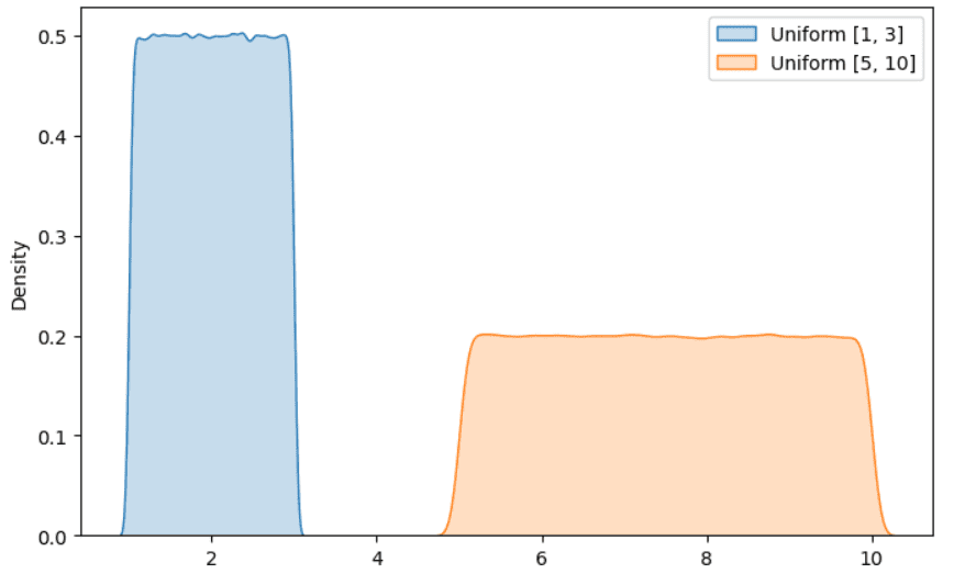
Example of Uniform distribution. Illustration by Author.
It is another popular distribution that you have surely met when working on a data science project. The idea is that all the outcomes have an equal probability of occurring. A popular example consists in rolling a six-faced die. As you may know, each face of the die has an equal probability of occuring, then the outcome follows an uniform distribution.
Poisson distribution
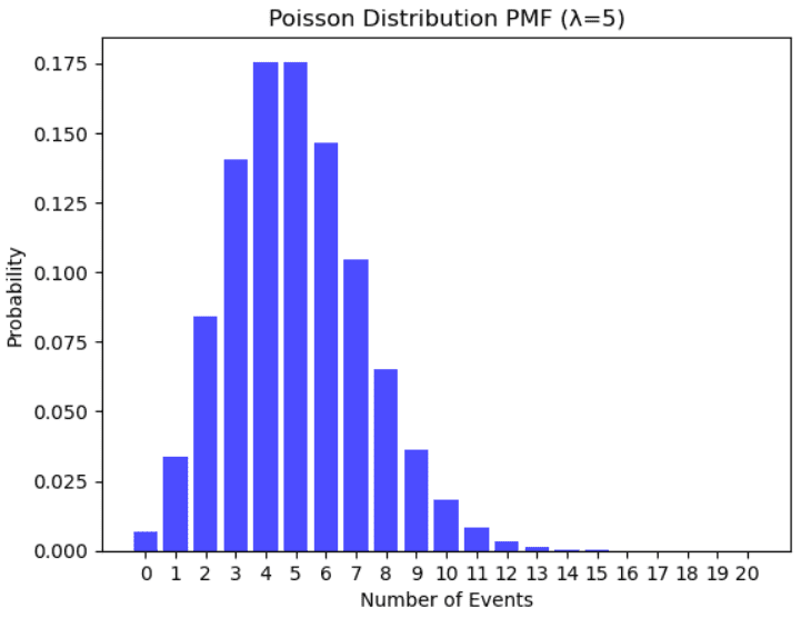
Example of Poisson distribution. Illustration by Author.
It is used to model the number of events that occur randomly many times within a specific time interval. Examples that follow a Poisson distribution are the number of people in a community that are older than 100 years, the number of failures per day of a system, the number of phone calls arriving at the helpline in a specific time frame.
Exponential distribution
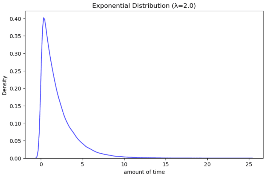
Example of Exponential distribution. Illustration by Author.
It is used to model the amount of time between events that occur randomly many times within a specific time interval. Examples can be the time on hold at a helpline, the time until the next earthquake, the remaining years of life for a cancer patient.
Hypothesis Testing
The hypothesis testing is a statistical method that allows to formulate and evaluate an hypothesis about the population based on sample data. So, it is a form of inferential statistics. This process starts with a hypothesis of the population parameters, also called null hypothesis, that needs to be tested, while the alternative hypothesis (H1) represents the opposite statement. If the data is very different from the assumptions we had, then the null hypothesis (H0) is rejected and the outcome is said to be “statistically significant”.
Once the two hypothesis are specified, there are other steps to follow:
- Set up the significance level, which is a criteria used for rejecting the null hypothesis. The typical values are 0.05 and 0.01. This parameter ? determines how strong the empirical evidence is against the null hypothesis until this latter is rejected.
- Calculate the statistic, which is the numerical quantity computed from the sample. It helps us to determine a rule of decision to limit as much as possible the risk of error.
- Compute the p-value, which is the probability of obtaining a statistic that is different from the parameter specified in the null hypothesis. If it’s less or equal to the significance level (ex: 0.05), we reject the null hypothesis. In case the p-value is bigger than the significance level, we can’t reject the null hypothesis.
There is a huge variety of hypothesis tests. Let’s suppose that we are working on a data science project and we want to use the linear regression model, which is known for having strong assumptions of normality, independence and linearity. Before applying the statistical model, we prefer to check the normality of a feature that regards the weight of adult women with diabete. The Shapiro-Wilk test can come to our rescue. There is also a Python library, called Scipy, with the implementation of this test, in which the null hypothesis is that the variable follows a normal distribution. We reject the hypothesis if the p-value is smaller or equal to the significance level (ex: 0.05). We can accept the null hypothesis, which means that the variable has a normal distribution, if the p-value is greater than the significance level.
Final Thoughts
I hope you have found this introduction useful. I think that mastering statistics is possible if theory is followed by practical examples. There are surely other important statistics concepts I didn’t cover here, but I preferred to focus on concepts that I have found useful during my experience as a data scientist. Do you know other statistical methods that helped you with your work? Drop them in the comments if you have insightful suggestions.
Resources:
- HyperStat Online Statistics Textbook
- Measures of Positions
- The most used probability distributions in data science
Eugenia Anello is currently a research fellow at the Department of Information Engineering of the University of Padova, Italy. Her research project is focused on Continual Learning combined with Anomaly Detection.