Political Data Science: Analyzing Trump, Clinton, and Sanders Tweets and Sentiment
This post shares some results of political text analytics performed on Twitter data. How negative are the US Presidential candidate tweets? How does the media mention the candidates in tweets? Read on to find out!
By Quentin Simms, ParseHub.
The US Presidential Primaries have been the world’s biggest news sensation for the past 12 months, and the coverage will only increase now that both major parties have their presumptive nominees for the general election. Twitter is one of the most powerful media platforms used by news stations and politicians alike, so I explored just how many, and what kind, of political messages were being seen by the public during the month of May – at the end of the presidential primaries. In total I collected and analyzed 27,000 tweets by combining the powerful graphical web scraping tool ParseHub and the sentiment analysis API from text-processing.com with python and Jupyter Notebook.
The data was collected from the twitter accounts of the candidates and USA’s biggest new sources – Fox News, MSNBC and CNN. The process I used to scrape the data and to analyze sentiment can be repeated for any twitter account of media page. You can analyze any data from the web with Python by yourself, instead of paying consultancies that will charge you thousands of dollars. I will show you exactly how here.
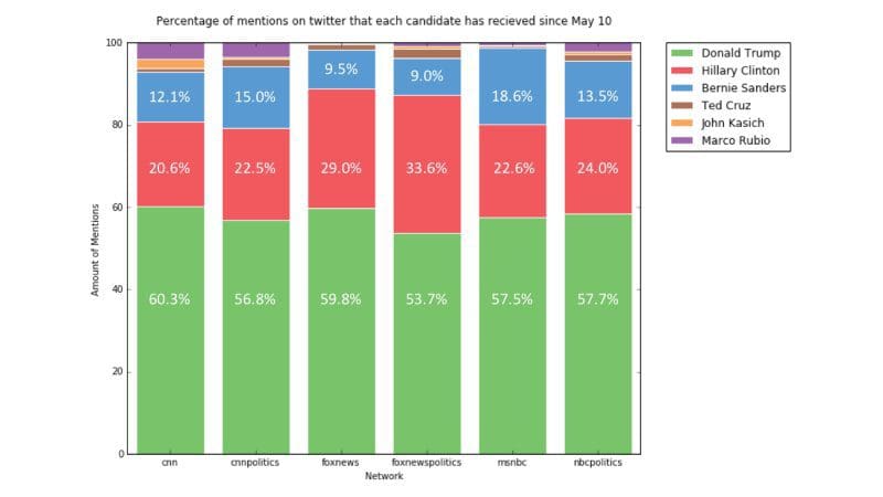
Does Donald Trump get the most media attention?
Over half of @msnbc’s last 3000 tweets mention a primary candidate. Two-thirds of the total tweets for political accounts of CNN (@cnnpolitics), Fox News (@foxnewspolitics) and NBC mention (@NBCpolitics) mentioned a candidate.
Majority of the attention fell on one very specific and most controversial candidate. Donald Trump received ~60% of the mentions by every single one of the 6 media twitter accounts. Between February and May, Trump received more mentions than all three of his Republican opponents combined from @NBCpolitics and @foxnewspolitics. This leads me to wonder – if this attention continues, will it decide whether Trump wins the general election?
Are Donald Trumps tweets really that insulting?
Trump is infamous for the insults and accusations he makes on twitter. The sentiment analysis tool detected that he did, in fact have the highest percentage of negative tweets. The most surprising result, as you can see from the graph below, is that Trump also has the greatest percentage of tweets that registered as positive.

Looking over Trump’s tweets I can confirm he does in fact tweet a lot of positive things, which I assume go unnoticed due to the more aggressive tweets. I did notice that many of the ones flagged positive did in fact contain insults, however.
For example, Trump has “insulting” nicknames for everyone – “Crazy Bernie Sanders”, “Crooked Hillary Clinton” and “Goofy Elizabeth Warren”. Despite the insults, the tweets have an undeniably enthusiastic tone. Thus, text-analysis.com picked up on more positive sentiment than negative sentiment.
Out of Clinton, Sanders and Trump, Trump was the only candidate who was consistently more often negative than positive when mentioning the other candidates. You can see in the graph below that this is true for all five of his political opponents.

Hillary Clinton talked about Donald Trump far more often than she talked about her direct opponent, Bernie Sanders. When she mentioned Trump, her tweet was more often negative than positive.

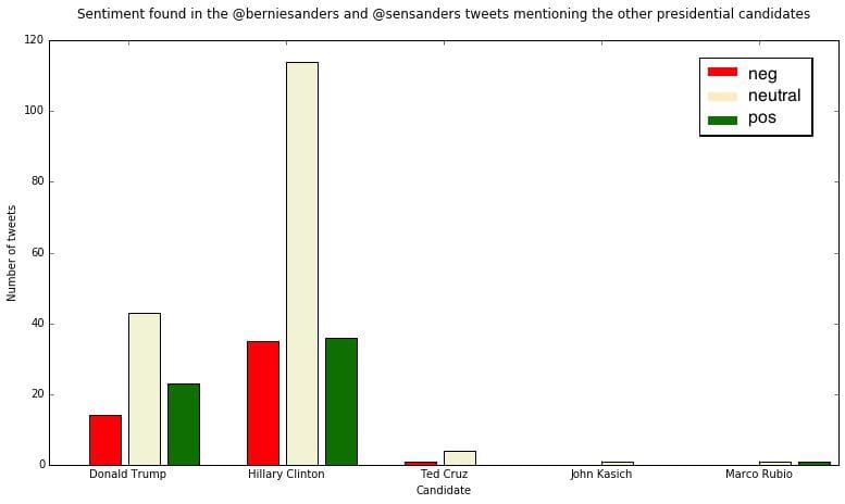
Meanwhile, Sanders mentioned Clinton far more often than he mentioned Trump during his campaign. His tweets were predominantly neutral compared to his opponents, but his tweets that mention Clinton were almost as likely to have a negative sentiment than a positive one.
How does the media mention the candidates?
I expected that Fox News would show more negative sentiment when mentioning Bernie Sanders, based on the public’s perception that they cater to a conservative audience. This turned out to be the complete opposite of the truth: for both @foxnews and @foxnewspolitics, Donald Trump received the most negative sentiment, followed by Hillary Clinton and then Bernie Sanders with less negative sentiment than either.

How I got the results
- To get the 3,000 most recent tweets for each twitter account I used a website called snapbird.org.
- To automate the process of collecting 27,000 tweets I used a web scraping tool called ParseHub. It is available as a desktop app and no coding was required to get the data.
- Snapbird.org had a number of interactive interactive elements that I had to deal with when collecting my data: an ajax pop-up window, text input boxes to search of the twitter account and a load more button that added more tweets to the bottom of the page. I also had to log-in with my Twitter account before being able to collect all of the data.
- I quickly put together a set of instructions that would crawl the text and date of every available tweet for any given account behind a log-in. See ParseHub’s documentation to see what else it can do.
- I integrated the text-processing.com API into my iPython Notebook. I looped through the text of each tweet in the pandas objects and sent them, through an HTTP Post, to the text-processing.com URL.
- In return I was sent a JSON with two elements which I saved into the pandas objects: the “negative”, “neutral” or “positive” label, as well as the probabilities for each sentiment that the API calculated. To learn more about the text-processing.com API, check out the demonstrations here.
 A complete summary of my results and more interesting statistics about the presidential race can be found in this article here. I put the specific ParseHub instructions and HTTP POSTS that I used in this step-by-step tutorial. It will teach you to mine the sentiment of tweets just as I did for this article, and will give you an idea of how it can be done for other social media sites.
To see the entirety of my python code and tables of data, see the second part of the tutorial, where I explain my process for creating the graphs in this article.
Bio: Quentin Simms is all about growth and marketing at ParseHub. Lover of statistics and data visualizations. Engineering physics students at Queen's University for 8 months of the year, catching up on lost sleep for the other 4.
Related:
- Money vs Votes in New Hampshire Primary – SuperPACs not very effective
- Trump vs Clinton – What are the Odds?
- Money does buy votes, unless you are Jeb Bush