How to make a simple bar chart in D3
D3 is a JavaScript library that continues to grow, both in terms of popularity and possibilities, capable of creating dynamic, interactive visualisations. This tutorial provides a step-by-step guide on how to create a basic bar chart in d3, populated with data from a csv file.
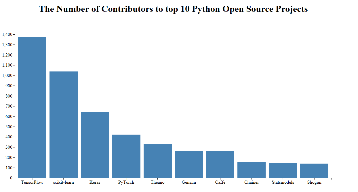
D3.js is a JavaScript library that allows developers to produce dynamic, data-driven, interactive visualizations in web browsers. It utilises SVG, HTML5 and CSS and can be extremely powerful if used correctly. This tutorial will outline how to create a very basic bar chart, as shown below, in d3.js:
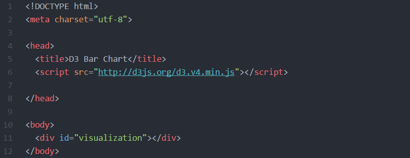
Firstly, you need to setup a basic HTML page, with a div for the visualization to sit in. You could in theory just append it to the body, but it’s usually cleaner if it has its own div. Within the page you need to have a script tag that links to the d3.js library (line 6).
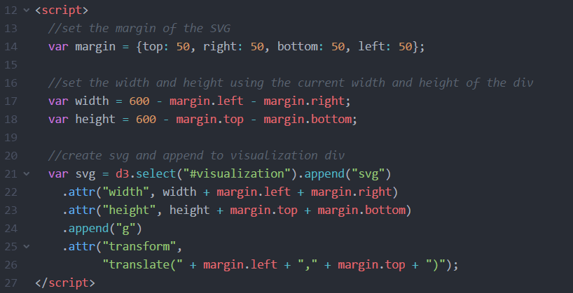
The next step is to create the SVG and append it within the visualization div. For this example, the SVG has been set a width and height in pixels, but if you wanted it to be responsive then you could instead grab the current width and height of the div. Then you need to also append something called a group element to the SVG and use a transform function to move it to the top left corner of the SVG. Think of a group element as a way of containing all the elements within the SVG.
The method of appending commands in d3, as seen in lines 21 through 26, is called ‘chaining’ and is something that other libraries such as jQuery utilise.
Ok, now we can setup the scales of our data. Scales mean that instead of resizing our SVG Coordinates space to our data, we can resize our data to fit into our pre-defined SVG Coordinate space. There are several different types of scale in d3, depending on what data you are using. Our y axis will be showing the numerical value of hours so this will use d3.scaleLinear(), whilst our x axis displays the employee name and so we will use d3.scaleBand(). You’ll notice that when we set the range of both axis we use the width and height variables that we set earlier on, but for the y axis the height comes first instead of the zero. This is because SVG coordinates start at 0,0 in the top left corner, but we want our bar chart to be coming up from the bottom so these range parameters must be switched. It is a little bit confusing but don’t worry too much about it for now, all that you need to know is that this is done to ensure the chart shows the correct way around.

Moving on, it’s time to create some data for our bar chart to show. We’re going to use the data from here to show the number of contributors to the top 10 Python Open Source Projects:

Now, we can get d3 to read the data from that csv and output it onto the page. Handily, d3 has a built-in function to read csv files automatically. Before we carry on with getting the information to show in a bar chart, lets write a console.log to output the contents of the csv, just to make sure it’s working:

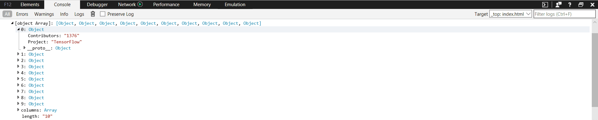
Great, the data is being read correctly so now we can concentrate on creating the individual bars. But before we do that, we need to format the data and set the domain of the x and y variables we created a couple of steps ago. The domain effectively tells d3 the range of the data to expect. So, for the x axis, this is just mapping the person. For the y axis, this is finding the maximum hours from the data and having this scale between 0 and that maximum:

Now we have everything in place, we just need to create the bars. This can be done by using the SVG rectangle element. We give that an x and y position using the x and y variables we set earlier. We also use these to help set the width and height of the bars:

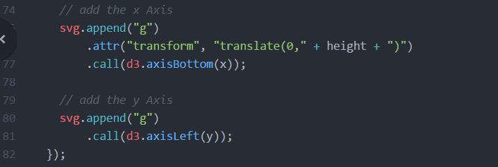
We finally have something showing, woo! Unfortunately, it doesn’t really make sense at the moment due to the lack of axis labelling, so that’s the next step. To do that, we can just append two new g elements, once against using the x and y variables. New to version 4 of d3 is the ability to simple set d3.axisBottom and d3.axisLeft so this is easy:
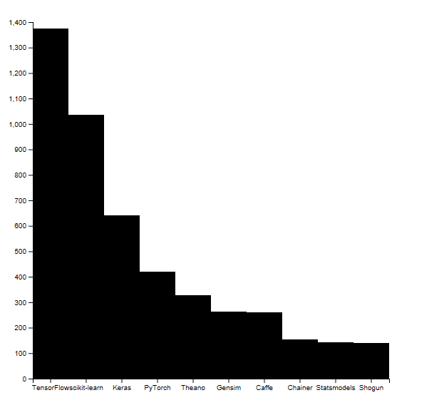
Awesome! With a bit of styling in CSS, the bar chart begins to look much more professional quickly:
This has just scratched the surface of what d3.js can create, but you can see from the example how useful and flexible it can be to use.
Related:
- Choropleth Maps in R
- Data Science for Javascript Developers
- A Comparative Analysis of Top 6 BI and Data Visualization Tools in 2018