6 Data Visualization Disasters – How to Avoid Them
If you intend to use data visualizations in a presentation or publication, be certain that your audience will understand and trust the information. Here are six mistakes you will want to avoid.
By Marie Fincher, TrustMyPaper
Data. It seems to drive so much of what we do today. And it should. Good research and resulting good data allows a scientific rather than a “gut” approach/answer to almost any issue or question.
Academia and medicine have always valued research as the key means to gather and analyze data to prove hypotheses or develop recommendations or treatment protocols. Now it is everyone’s turn. With oceans of data now available to anyone with the right visual analytics tools and algorithms, data can be gathered, categorized, churned, and analyzed to drive business decisions in every economic sector.
- Banks analyze consumer financial behaviors to determine loan products to offer
- the insurance industry uses it to determine premiums
- the healthcare industry uses it to identify individualized treatment protocols, to predict disease outbreaks, to determine the composition of flu vaccines, and even to bring efficiency to staffing needs in hospitals
- and consumer products and services companies use it to drive everything from inventory needs to developing new products (or improve on existing ones), to identifying their target audiences and methods for reaching those audiences. Data itself always has an audience too – stockholders, C-level executive decision-makers, medical professionals, teachers, and marketers, to name a few.
The issue is this: those who are often the recipients of data presentations do not always have a full understanding of statistical analysis. It is therefore critical that those who are presenting data do it as simply as possible and in visual form – charts, graphs, infographics, etc. that are easily absorbed by lay people. For presenters, therefore, there are special challenges.
If you plan to present data to a lay audience, there are some pitfalls that you should certainly avoid.
1. Using the Wrong Visual Tool for the Data You Present
What is the purpose of the data you are presenting? Are you dividing up segments of a research population based upon a research question? Then a pie graph may work quite well. Are you attempting to compare populations, time frames, etc.? Then, bar graphs are probably a good choice. If you are attempting to compare two things (e.g., average increase in salaries of executives and average employees over time), then a line graph will depict this well. But researchers, statisticians, and designers tend to get “wedded” to a specific type of chart or graph. They then try to “force” their data into that format, and the result is not as clear as it could be. Do some looking around and see how similar types of data are depicted visually. You may discover that you can better present yours with a design you have not used before.
2. Putting Too Much Data in a Single Visual
You want to get all of your information out there, and it is tempting to stuff a visual with all that you want to say. You may understand every little detail quite well. Not so your audience. Reflect again on the main purpose for your presentation. What more minor details can you leave out? Can you divide a complex presentation into a series of visuals rather than cram it all into one? See your visual from the perspective of the audience, especially if it is not going to be presented to a live audience with verbal explanation and the opportunity for questions. Going live, you can gauge audience reaction, provide clarifications, and answer questions, but not otherwise.
3. Visuals that are Too “Busy”
Colors and shapes are great but too many will impair a viewing audience’s focus. When there is just too much of either one, the viewer tires of looking at it and trying to figure out what it all means. Take a look at the data visualization below of power plants in the U.S.

Source: dezyro.com
How motivated would you be to study this graph in detail? Just the color key code alone is overwhelming, and, in some instances, it is even difficult to decipher which of the colors is actually represented on those bars. This is a prime example of a depiction that is too busy. The creator would have been well-advised to find a simpler model or to divide the data into several graphs and then speak to trends in various geographical areas of the country.
4. Confusing or Mistaken Math
Numbers that don’t add up or that are confusing. Errors in math that are not caught. When these occur, the data visualization is pretty much worthless.
Consider the very popular pie chart that is often used to show percentages – those percentages must add up to 100, or the viewer will be confused and suspect the validity of the data being presented. Here is a glaring example of a pie chart gone horribly wrong during the 2012 presidential primary season:
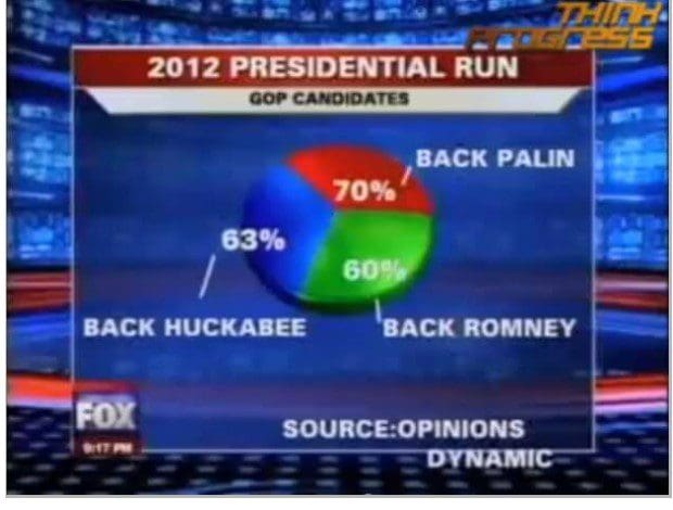
It is unlikely that viewers will review any explanatory text that might accompany this visual. They will see two things – the percentages add up to 193, which is “impossible,” and Palin’s piece of the pie is smaller than those of the other two candidates, even though their percentages are smaller. All in all, this was a disastrous depiction of data. In fact, the researchers allowed those surveyed to choose more than one candidate – thus the mathematical results. The “fix” for this disaster would have been to allow only one choice so that the percentages added up to 100. Alternately, the representation could have been broken up into three visuals, one for each candidate, showing 1st, 2nd, and 3rd choices of those surveyed.
5. Lack of Data Sourcing
Validity of data relies on the sources from which it has come. Academics and researchers understand this. Non-academics who gather data and then create charts and graphs may not understand the importance of both noting their sources and using sources that are reliable.
"Primary resources are those that come directly from the researchers who have gathered and analyzed data themselves. They are the types of resources that should be used when creating data visuals if those visuals are to have credibility".
6. Not “Testing” Before Publishing or Presenting
You are emotionally invested in your creations. But that attachment may mean that you have assumed things that are not carefully explained to your audience. The solution for this is to present your visuals to a friend or colleague who is unfamiliar with the subject of the data and have them explain it to you. If they do a good job, your visual is ready for publication or presentation.
Bio: Marie Fincher is a content marketer for TrustMyPaper, a researcher, a writer, and a frequent contributor to business blogs. She is soon to publish a book on content marketing strategies in this digital age. When not writing, she can be found on ski slopes almost anywhere in the world – wherever a new challenge beckons.
Resources:
- On-line and web-based: Analytics, Data Mining, Data Science, Machine Learning education
- Software for Analytics, Data Science, Data Mining, and Machine Learning
Related: