Clustering Metrics Better Than the Elbow Method
We show what metric to use for visualizing and determining an optimal number of clusters much better than the usual practice — elbow method.
Introduction
Clustering is an important part of the machine learning pipeline for business or scientific enterprises utilizing data science. As the name suggests, it helps to identify congregations of closely related (by some measure of distance) data points in a blob of data, which, otherwise, would be difficult to make sense of.
However, mostly, the process of clustering falls under the realm of unsupervised machine learning. And unsupervised ML is a messy business.
There is no known answers or labels to guide the optimization process or measure our success against. We are in the uncharted territory.
Machine Learning for Humans, Part 3: Unsupervised Learning
Clustering and dimensionality reduction: k-means clustering, hierarchical clustering, PCA, SVD.
It is, therefore, no surprise, that a popular method like k-means clusteringdoes not seem to provide a completely satisfactory answer when we ask the basic question:
“How would we know the actual number of clusters, to begin with?”
This question is critically important because of the fact that the process of clustering is often a precursor to further processing of the individual cluster data and therefore, the amount of computational resource may depend on this measurement.
In the case of a business analytics problem, repercussion could be worse. Clustering is often done for such analytics with the goal of market segmentation. It is, therefore, easily conceivable that, depending on the number of clusters, appropriate marketing personnel will be allocated to the problem. Consequently, a wrong assessment of the number of clusters can lead to sub-optimum allocation of precious resources.

The elbow method
For the k-means clustering method, the most common approach for answering this question is the so-called elbow method. It involves running the algorithm multiple times over a loop, with an increasing number of cluster choice and then plotting a clustering score as a function of the number of clusters.
What is the score or metric which is being plotted for the elbow method? Why is it called the ‘elbow’ method?
A typical plot looks like following,
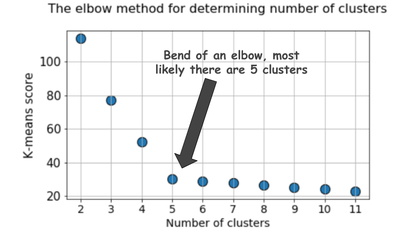
The score is, in general, a measure of the input data on the k-means objective function i.e. some form of intra-cluster distance relative to inner-cluster distance.
For example, in Scikit-learn’s k-means estimator, a score method is readily available for this purpose.
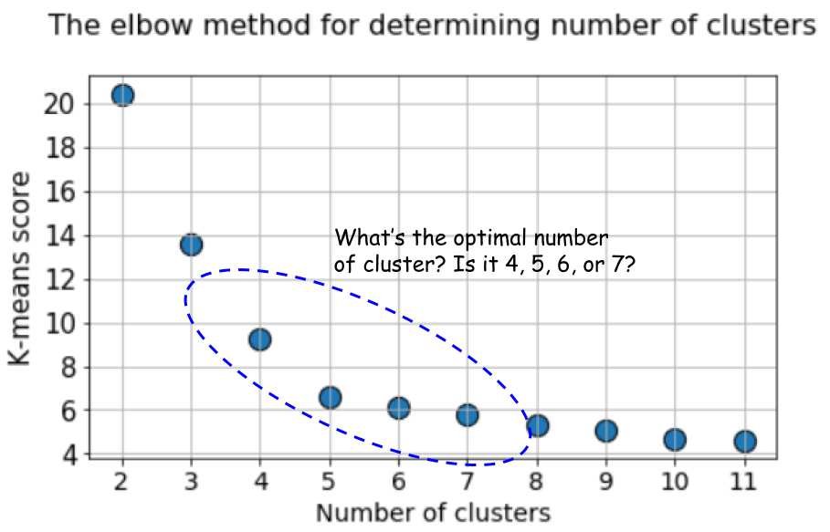
But look at the plot again. It can get confusing sometimes. Is it 4, 5, or 6, that we should take as the optimal number of clusters here?
Not so obvious always, is it?
Silhouette coefficient — a better metric
The Silhouette Coefficient is calculated using the mean intra-cluster distance (a) and the mean nearest-cluster distance (b) for each sample. The Silhouette Coefficient for a sample is (b - a) / max(a, b). To clarify, bis the distance between a sample and the nearest cluster that the sample is not a part of. We can compute the mean Silhouette Coefficient over all samples and use this as a metric to judge the number of clusters.
Here is a video from Orange on this topic,
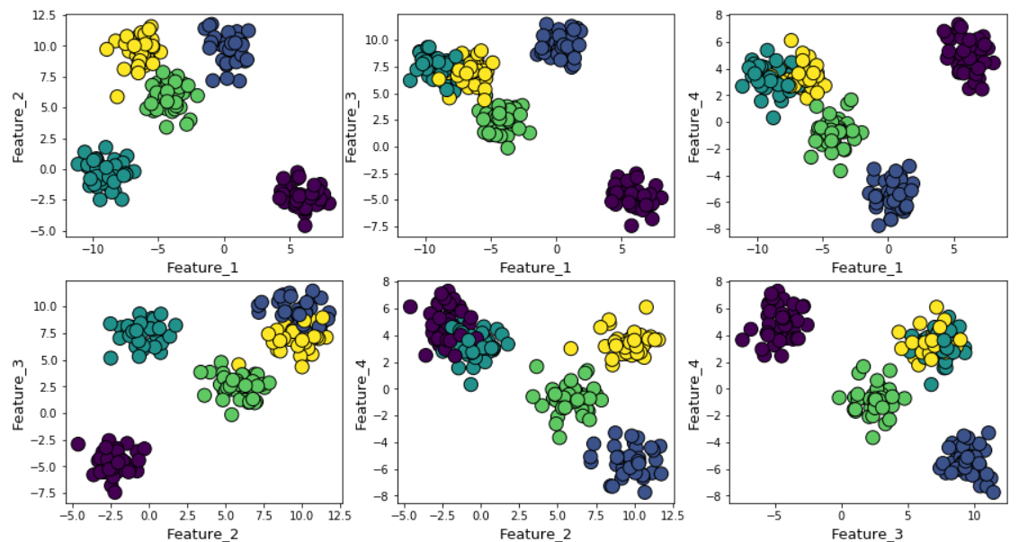
For illustration, we generated random data points using Scikit-learn’s make_blob function over 4 feature dimensions and 5 cluster centers. So, the ground truth of the problem is that the data is generated around 5 cluster centers. However, the k-means algorithm has no way of knowing this.
The clusters can be plotted (pairwise features) as follows,
Next, we run k-means algorithm with a choice of k=2 to k=12 and calculate the default k-means score and the mean silhouette coefficient for each run and plot them side by side.
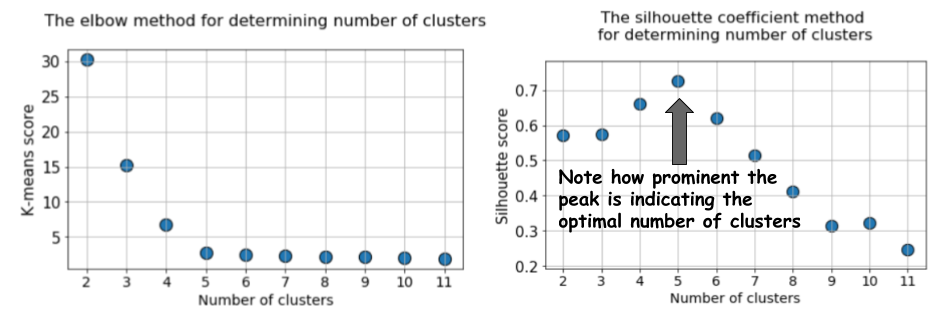
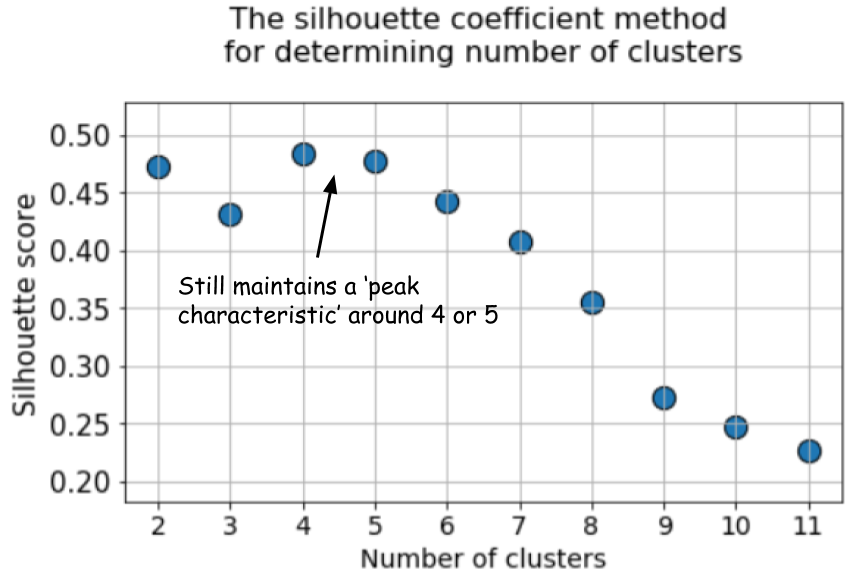
The difference could not be starker. The mean silhouette coefficient increases up to the point when k=5 and then sharply decreases for higher values of k i.e. it exhibits a clear peak at k=5, which is the number of clusters the original dataset was generated with.
Silhouette coefficient exhibits a peak characteristic as compared to the gentle bend in the elbow method. This is easier to visualize and reason with.
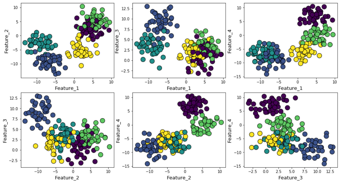
If we increase the Gaussian noise in the data generation process, the clusters look more overlapped.
In this case, the default k-means score with elbow method produces even more ambiguous result. In the elbow plot below, it is difficult to pick a suitable point where the real bend occurs. Is it 4, 5, 6, or 7?
But the silhouette coefficient plot still manages to maintain a peak characteristic around 4 or 5 cluster centers and make our life easier.
In fact, if you look back at the overlapped clusters, you will see that mostly there are 4 clusters visible — although the data was generated using 5 cluster centers, due to high variance, only 4 clusters are structurally showing up. Silhouette coefficient picks up this behavior easily and shows the optimal number of clusters somewhere between 4 and 5.
BIC score with a Gaussian Mixture Model
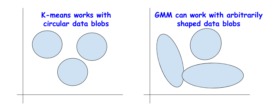
There are other excellent metrics for determining the true count of the clusters such as Bayesian Information Criterion (BIC) but they can be applied only if we are willing to extend the clustering algorithm beyond k-means to the more generalized version — Gaussian Mixture Model (GMM).
Basically, a GMM treats a blob of data as a superimposition of multiple Gaussian datasets with separate mean and variances. Then it applies the Expectation-Maximization (EM) algorithm to determine these mean and variances approximately.
Gaussian Mixture Models Explained
In the world of Machine Learning, we can distinguish two main areas: Supervised and unsupervised learning. The main...
The idea of BIC as regularization
You may recognize the term BIC from statistical analysis or your previous interaction with linear regression. BIC and AIC (Akaike Information Criterion) are used as regularization techniques in linear regression for the variable selection process.
BIC/AIC is used for regularization of linear regression model.
The idea is applied in a similar manner here for BIC. In theory, extremely complex clusters of data can also be modeled as a superimposition of a large number of Gaussian datasets. There is no restriction on how many Gaussians to use for this purpose.
But this is similar to increasing model complexity in linear regression, where a large number of features can be used to fit any arbitrarily complex data, only to lose the generalization power, as the overly complex model fits the noise instead of the true pattern.
The BIC method penalizes a large number of Gaussians and tries to keep the model simple enough to explain the given data pattern.
The BIC method penalizes a large number of Gaussians i.e. an overly complex model.
Consequently, we can run the GMM algorithm for a range of cluster centers, and the BIC score will increase up to a point, but after that will start decreasing as the penalty term grows.

Summary
Here is the Jupyter notebook for this article. Feel free to fork and play with it.
We discussed a couple of alternative options to the often-used elbow method for picking up the right number of clusters in an unsupervised learning setting using the k-means algorithm.
We showed that Silhouette coefficient and BIC score (from the GMM extension of k-means) are better alternatives to the elbow method for visually discerning the optimal number of clusters.
If you have any questions or ideas to share, please contact the author at tirthajyoti[AT]gmail.com. Also, you can check the author’s GitHubrepositories for other fun code snippets in Python, R, and machine learning resources. If you are, like me, passionate about machine learning/data science, please feel free to add me on LinkedIn or follow me on Twitter.
Original. Reposted with permission.
Related:
- What is Benford’s Law and why is it important for data science?
- A Single Function to Streamline Image Classification with Keras
- Object-oriented programming for data scientists: Build your ML estimator