Graph Machine Learning Meets UX: An uncharted love affair
When machine learning tools are developed by technology first, they risk failing to deliver on what users actually need. It can also be difficult for development teams to establish meaningful direction. This article explores the challenges of designing an interface that enables users to visualise and interact with insights from graph machine learning, and explores the very new, uncharted relationship between machine learning and UX.
By Nhung Nguyen, CSIRO Data61

I am a User Experience (UX) designer. Folks like me look into all aspects of the end-user’s interaction with a company, its services, its product. What drives us is designing meaningful products that are intuitive, meet user needs, and delight.
While I have these drivers, I’m certainly not playing in a space well-paved by other UX designers.
Day to day I work with a bunch of incredible humans who build machine learning algorithms for large-scale graph networks. We’re also building a visualisation tool so people can see the hidden insights from these models and make data-informed decisions in often high-risk scenarios.
For me, it’s fast, exciting, fascinating, uncharted, difficult. A steep learning curve? Absolutely. But compounding that, I’ve found very few case studies of other UX designers working with machine learning.
For others like me who may be equally as bedazzled by this rapidly emerging technology, and just as drawn to its budding relationship with UX; this article is for you!
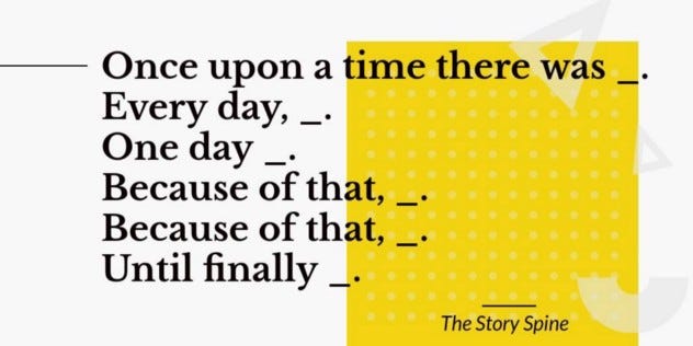
We’ll first explore what machine learning on graphs is, then build an end-to-end story to define the users, their relationships, and their different needs. I’ll also share three key challenges I faced in the task of designing visualisation solutions for graph machine learning, but how returning to UX design 101 resulted in an accessible, purposeful outcome.
Building the scenario
I quickly discovered that once you learn about graphs, you’ll start to see them everywhere. Many real-world datasets can be naturally represented as networks or graphs, with nodes representing entities and links representing relationships or interactions between them.

As for managing the vast, ever-increasing amount of connected data being generated in this data-driven age, this is when machine learning comes into play. Machine learning on graphs can draw powerful insights from connected data, like predicting relationships between entities that are missing from the data or resolving unknown entities across different networks (read ‘Knowing Your Neighbours; Machine Learning on Graphs’ to delve deeper).
Knowing Your Neighbours: Machine Learning on Graphs
We live in a deeply connected world. Graph Machine Learning provides Data Scientists with the tools to extract insights…
My job as a UX designer is to question what problems our users can solve with graph machine learning. Graphs have proven to be well suited to crime investigation, and the potential of using machine learning on graphs for investigative analytics in law enforcement is immense. The trouble is, understandable security restrictions in this domain make access to data impossible.
In the absence of data, it’s difficult to develop a tool that can analyse or visualise it. When products are developed by technology first, they risk failing to deliver on what the user actually needs. It can also be difficult for teams to establish a meaningful direction, ending up with something like this: “Let’s cater for all types of tasks, data and scenarios…!”
In mapping our product we ended up with a long list of features on a roadmap, which is a great start. But we needed something to connect these features in a meaningful way to demonstrate the value of the product and help us prioritise. We needed to build a scenario.
By scenario, I mean an end-to-end story of users with a data challenge, how they might use our machine learning on graph algorithms to solve that challenge, and how they could then use the visualisation tool to leverage further insight.
We found an open source Twitter dataset containing 100k users, and 20m tweets. A small portion of the dataset had users labelled as ‘hateful’ or ‘normal’ (not hateful). (Read ‘Characterizing and Detecting Hateful Users on Twitter’ for more detail about how these labels were created, and an explanation of labelled versus non-labelled data for supervised and unsupervised machine learning approaches).
We asked ourselves: Could machine learning on graphs be used to predict ‘hateful’ users in online social networks?
We used the profiles already labelled as hateful or normal as training data for the machine learning models before running our algorithms on the dataset. The results were promising, demonstrating that the model could indeed predict hateful Twitter users (see ‘Can graph machine learning identify hate speech in social media networks?’ for the full case study).
Can graph machine learning identify hate speech in online social networks?
A use-case study for Twitter users and the power of machine learning and graph neural networks to detect hateful online…
As well as this, I had user research from the law enforcement domain outlining two distinct user types: the data scientist, and the intelligence analyst. I also had mapping of how they work together, and the problems they encounter when working with data.
Combined, this information gave me the base ingredients to build a scenario around the features.
| The first challenge |
Ian and Dan
The first player in my scenario was Ian, an intelligence analyst, whose job is to watch social media and other public data sources to flag hateful behaviours and assess risks. This manual process means scrolling through a long list of feeds, every day, looking for hateful language or hashtags.
Manual labelling is labour-intensive. Say it takes just five minutes to manually check whether a user is hateful or not hateful, then labelling 100K users (equivalent to our Twitter dataset) would take just shy of 12 months for one person working 24/7. Additionally, new research shows there’s a correlation between retweets and the spread of online extremism.
So, I paired Ian with Dan; a data scientist specialised in machine learning on graphs. In my scenario, Dan plans to use an algorithm that uses the retweet network to infer whether a user is likely to be hateful or not across the remaining portion of data that is unlabelled. This will produce a shortlist of suspects for Ian to further investigate which he can filter by characteristics of the data or the confidence of the label, for example.
Now the story started coming together. There’s a context, user types, the problems they’re trying to solve, insight on how graph and machine learning might be useful, an idea of how the users might approach the problem, and the intended outcome.
When it came to user testing our tools, this storyboard acted as a context snapshot which was effective especially for participants not familiar with machine learning process and terminology. I also return frequently to the storyboard as a basis for my design to explore ideas, concepts and validation of a fleshed-out feature. What would Ian need to do at that step? What are the subsequent steps Dan might take?
This links nicely to the second challenge I faced.
| The second challenge |
Untangling the hairball
The side-effect of working on something very new like designing a user interface for machine learning technology is that there is little, or nothing, to copy or iterate from.
Take the example of a basic graph interaction: expanding the ‘neighbourhood’ of a node (or entity). As the name suggests, this is when we look at which other entities connect to the chosen entity in a graph.
It sounds simple enough. But, imagine there are hundreds of entities, or thousands, or millions? Things escalate pretty quickly and soon enough; you have one big hairball.
That’s why we need intuitive, meaningful ways to interact with graphs so users get what they need at the time.
Here’s where I confess that usually when I’m designing an interaction, I explore the solutions of the designers before me. To defend myself and perhaps other UX designers, it’s not out of laziness or pure plagiarism, nor an unwillingness to be creative. We have this heuristic in interaction design: “Recognition is better than recall”. If there’s a convention, or a well-used pattern that works, use it rather than reinventing the wheel and forcing the user to learn a new way of doing things.
When it comes to graph interaction, there’s little to go from.
I went back to my scenario to see what Ian the intelligence analyst might need to see from a busy network. Now that he can see the full Twitter dataset and the machine learning predictions on our visualisation tool, he might have identified a new, potentially hateful Twitter handle he wants to investigate.
Ian can use our tool to surface the user node (i.e. the owner of the hateful Twitter handle), and add it to the graph.

He won’t see all of the node’s connections yet, because this would likely be complicated and crowded. But if he hovers over the node, he can see a number appear which correlates to the number of neighbours connected to that node.

He can then double-click on that node to expand the network and see its neighbourhood.
Because our tool is smart, and doesn’t want to crowd Ian with information, it will ask which neighbours he’s looking for in the neighbourhood based on different attributes in the dataset.
In Ian’s case, he might only be interested in the neighbour nodes that have been predicted as hateful, and have been retweeting a particular white supremacist hashtag. This will reduce the network to a smaller one that’s easier to digest.
When we actually implemented this with the Twitter dataset, I could see that sometimes the neighbours were connected to each other too. The hairball grew.
To untangle the mess, I made the assumption that the user cares mostly about the relationships the neighbours have with the central root node, so I asked the engineers to bring these links forward, and make them a darker colour. We took this to usability testing to see if users could easily distinguish a node’s network, while keeping in context the connections between its neighbours.
This took me right back to UX design 101. When you have to design something new from scratch;
- Try to understand the intent of the interaction and where it fits in the full story of where your user needs to get to.
- Embrace the power of stories and use cases to develop that feature.
- Ask for feedback, test with real data, and iterate.
It’s not a new technique, but it’s important and comforting to know that the foundation skills we have as designers are useful in unknown territories.
Following this method, I got the hang of designing different graph interactions. But there’s a third and even bigger challenge: how can we visualise machine learning results?
| The third challenge |
Seeing is believing
I only got to see machine learning in action when I started working on the StellarGraph project. Think Jupyter notebooks, Python commands, lots of programming and maths. I’m lucky to have a team of patient and generous data scientists to ask questions of, but this is a benefit the end users of our tools may not have.
That’s why our team strives for three principles when displaying machine learning results:
- Results need to be accessible for users with different levels of technical understanding (like Dan the intelligence analyst) without the need for programming language. This means differentiating between machine learning predictions, and human-labelled data.
- Analysts need to be able to understand or interpret the predictions (to explore this, read ‘Looking behind the curtain: saliency maps for graph machine learning’.)
- Most importantly, clear explanations or guidance is provided so analysts can decide whether the results are trustworthy and can confidently use predicted data in their work.
While we have come a long way on our design journey, we still have a way to go in mastering these principles. By continuing our research of existing literature, frameworks and guidelines — and most importantly, our users — we hope not only to build on these guiding principles but better understand how we can support increasing trust in machine learning results.
For now, let’s return to our scenario. We have a subset of 5k Twitter users labelled by humans as either hateful, or normal (not hateful). These human-labelled users represent our ‘ground truth’ — what we know for certain — while our model will predict labels for the remaining users.
Knowing whether a user is hateful or not is of great value to Ian the intelligence analyst. Accordingly, we applied this as the attribute to define the style of the node from a visualisation point of view. For example, you can see differentiated below both human-labelled nodes, and predicted ones:
This approach was validated by our data scientists, but we needed to incorporate two other elements:
- Display the predictions the machine learning model made on the human-labelled nodes in the test set to serve as an accuracy measure.
- Apply colours that better align with natural human associations; i.e. red = bad, green = good.
In the third iteration, we refined the design to accommodate all these requirements:
To find out if the result was as intuitive as we hoped, we needed to do more user testing. From 11 participants, 10 found the visual styling intuitive. The eleventh participant saw something like the screen below right:
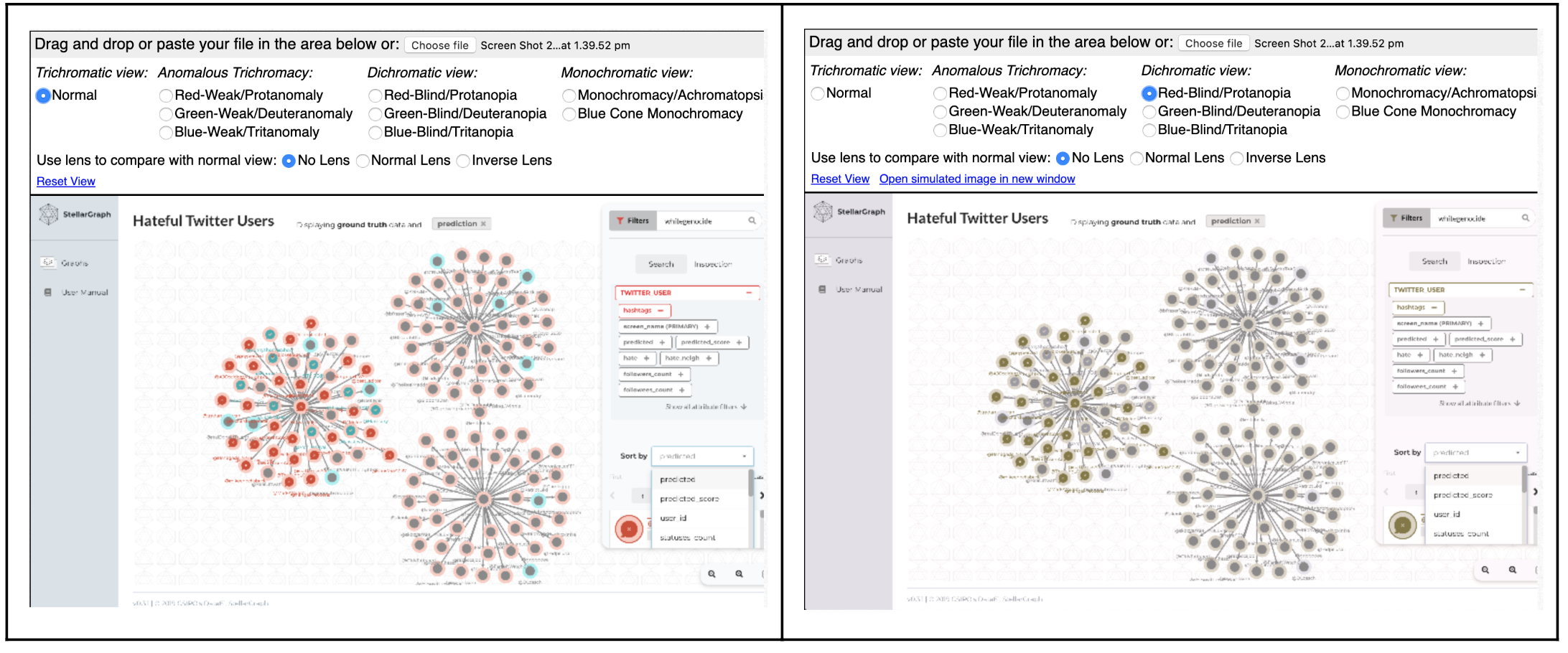
Colour blindness affects one in ten males, and this is not something to be ignored. We needed to use things other than colours to help users distinguish the different predictions, and settled on using a combination of colours and patterns to convey the prediction layers. By introducing patterns, we could enable people with colour blindness to distinguish the different predictions. Accessibility is very important to us.
But we also learned that while our visualisation solutions were working well for this dataset, as soon as we’d load up something different, the icons, colours and patterns would no longer make sense. We needed to develop a default set of styling that could work for any dataset, while still managing to attach meaning to the attributes.
So, we created a visual key which defines the attributes that each icon represents in ground truth, as well as what each pattern means for the predictive attributes.
Et, voila. We have a visualisation system that is flexible enough to accommodate different user requirements, but also different organisational needs. I can thank Ian and Dan for that.
A harmonious union
Going by the morsels of information that are available, it seems there’s a chasm between machine learning and UX folk. Machine learning might bling as a tech hype for UX designers, while data scientists may be unaware of, or question the value of our profession. But the two disciplines may just be a match made in heaven.
Machine learning has proven to augment and improve user experience (think recommender algorithms like Netflix or Spotify) and personally I find it helpful and fascinating to understand the basic concepts under the hood. But the power of storytelling and user testing in shaping machine learning models is a game-changer, because it delivers usable, meaningful applications for end-users.

It’s only the start of our UX-machine learning journey, and big challenges remain to be explored. How can we build trust in machine learning results? How might we visualise other graph machine learning outcomes like link prediction, entity resolution and pattern detection?
If these questions fascinate you as much as they do me, follow this channel for upcoming instalments.
This work is supported by CSIRO’s Data61, Australia’s leading digital research network.

Special thanks to my wonderfully patient and talented editor Leda Kalleske who helped me shape this article.
References
- Memory Recognition and Recall in User Interfaces https://www.nngroup.com/articles/recognition-and-recall/
Bio: Nhung Nguyen is a UX designer at CSIRO’s Data61, working on the StellarGraph project to develop machine learning on graph technology. Nhung is fascinated by data visualisation solutions, as well as observing and learning from the users of machine learning technology.
Original. Reposted with permission.
Related:
- UX Design Guide for Data Scientists and AI Products
- Scalable graph machine learning: a mountain we can climb?
- Vega-Lite: A grammar of interactive graphics