Getting Started with R Programming
An end to end Data Analysis using R, the second most requested programming language in Data Science.
Introduction
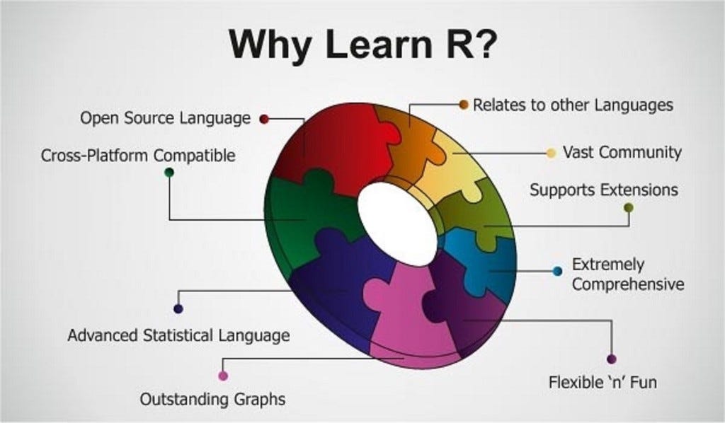
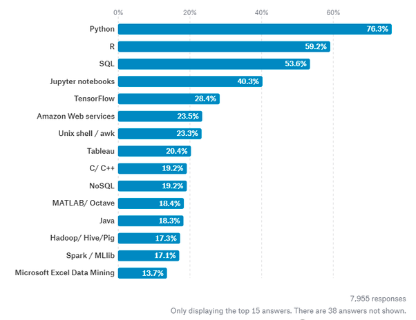
R is a programming language focused on statistical and graphical analysis. It is therefore commonly used in statistical inference, data analysis and Machine Learning. R is currently one of the most requested programming language in the Data Science job market (Figure 1).
R is available to be installed from r-project.org and one of R most commonly used integrated development environment (IDE) is certainly RStudio.
There are two main types of packages (libraries) which can be used to add functionalities to R: base packages and distributed packages. Base packages come with the installation of R, distributed packages can instead be downloaded for free using CRAN.
Once installed R, we can then get started doing some data analysis!
Demonstration
In this example, I will walk you through an end to end analysis of the Mobile Price Classification Dataset to predict the price range of Mobile Phones. The code I used for this demonstration is available on both my GitHub and Kaggle account.
Importing Libraries
First of all, we need to import all the necessary libraries.
Packages can be installed in R using the install.packages() command and then loaded using the library() command. In this case, I decided to install first PACMAN (Package Management Tool) and then use it to install and load all the other packages. PACMAN makes loading library easier because it can install and load all the necessary libraries in just one line of code.
The imported packages are used to add the following functionalities:
- dplyr: data processing and analysis.
- ggplot2: data visualization.
- rio: data import and export.
- gridExtra: to make plots graphical objects to which can be freely arranged on a page.
- scales: used to scale data in plots.
- ggcorrplot: to visualize correlation matrices using ggplot2 in the backend.
- caret: is used to train and plot classification and regression models.
- e1071: contains functions to perform Machine Learning algorithms such as Support Vector Machines, Naive Bayes, etc…
Data Pre-processing
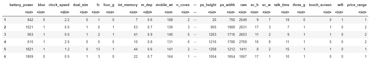
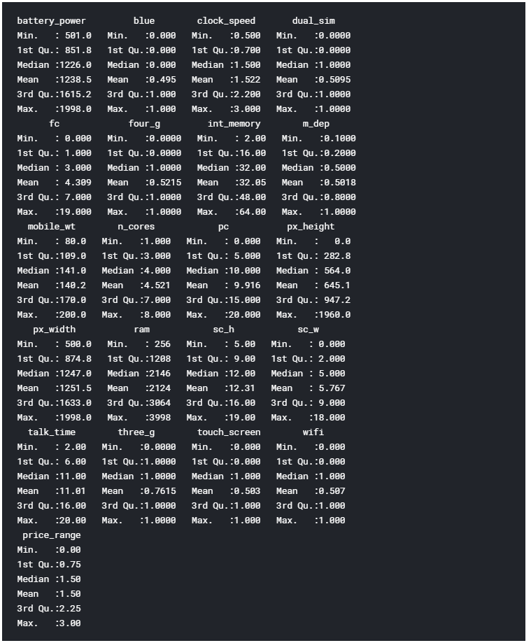
We can now go on loading our dataset, displaying it’s first 5 columns (Figure 2) and print a summary of the main characteristics of each feature (Figure 3). In R, we can create new objects using the <- operator.
The summary function provides us with a brief statistical description of each feature in our dataset. Depending on the nature of the feature in consideration, different statistics will be provided:
- Numeric Features: Mean, Median, Mode, Range and Quartiles.
- Factor Features: Frequencies.
- A mixture of Factor and Numeric Features: Number of missing values.
- Character Features: Lenght of the class.
Factors are a type of data object used in R to categorize and store data (eg. integers or strings) as levels. They can, for example, be used to one hot encode a feature or to create Bar Charts (as we will see later on). Therefore they are especially useful when working with columns with few unique values.
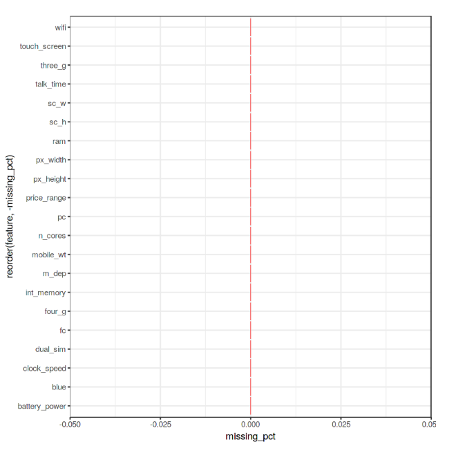
Finally, we can now check if our Dataset contains any Not A Numbers (NaNs) value using the code shown below.
As we can see from Figure 4, no missing numbers have been found.
Data Visualization
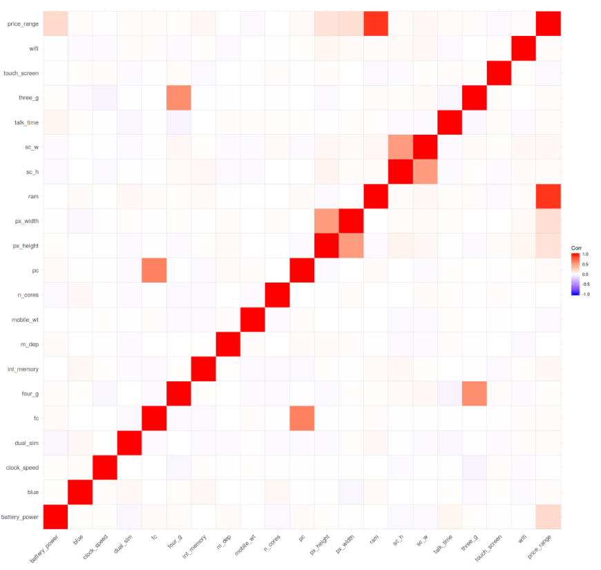
We can now start our Data Visualization by plotting a Correlation Matrix of our dataset (Figure 5).
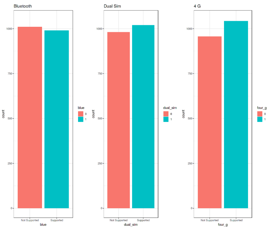
Successively, we can start analysing individual features using Bar and Box plots. Before creating these plots, we need though to first convert the considered features from Numeric to Factor (this allow us to bin our data and then plot the binned data).
We can now create 3 Bar Plots by storing them in there different variables (p1, p2, p3) and then add them to grid.arrange() to create a subplot. In this case, I decided to examine the Bluetooth, Dual Sim and 4G features. As we can see from Figure 6, a slight majority of mobiles considered in this Dataset does not support Bluetooth, is Dual Sim and has 4G support.
These plots have been created using R ggplot2 library. When calling the ggplot() function, we create a coordinate system on which we can add layers on top of it [2].
The first argument we give to the ggplot() function is the dataset we are going to use and the second one is instead an aesthetic function in which we define the variables we want to plot. We can then go on adding other additional arguments such us defining a desired geometric function (eg. barplot, scatter, boxplot, histogram, etc…), adding a plot theme, axis limits, labels, etc…
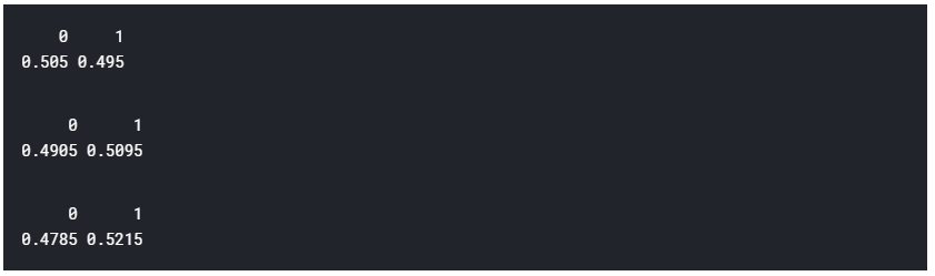
Taking our analysis a step further, we can now calculate the precise percentages of the difference between the different cases using the prop.table() function. As we can see from the resulting output (Figure 7), 50.5% of the considered mobile devices do not support Bluetooth, 50.9% is Dual Sim and 52.1% has 4G.
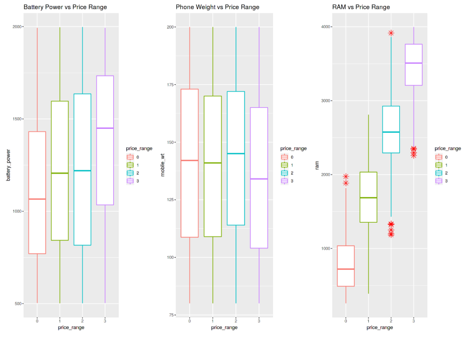
We can now go on creating 3 different Box Plots using the same technique used before. In this case, I decided to examine how having more battery power, phone weight and RAM (Random Access Memory) can affect mobiles prices. In this Dataset, we are not given the actual phone prices but a price range indicating how high the price is (four different levels from 0 to 3).
The results are summarised in Figure 8. Increasing Battery Power and RAM consistently lead to an increase in Price. Instead, more expensive phones seem to be overall more lightweight. In the RAM vs Price Range plot have interestingly been registred some outliers values in the overall distribution.
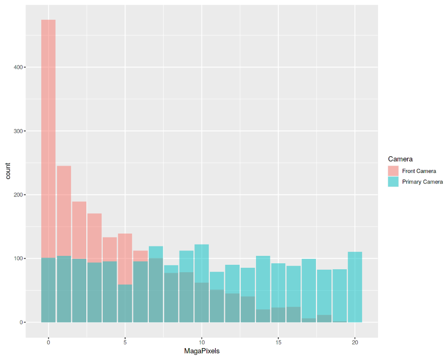
Finally, we are now going to examine the distribution of camera quality in Megapixels for both the Front and Primary cameras (Figure 9). Interestingly, the Front camera distribution seems to follow an exponentially decaying distribution while the Primary camera roughly follows a uniform distribution. If you are interested in finding out more about Probability Distributions, you can find more information here.
Machine Learning
In order to perform our Machine Learning analysis, we need first to convert our Factor variables in Numeric form and then divide our dataset into train and test sets (75:25 ratios). Lastly, we divide the train and test sets into features and labels (price_range).
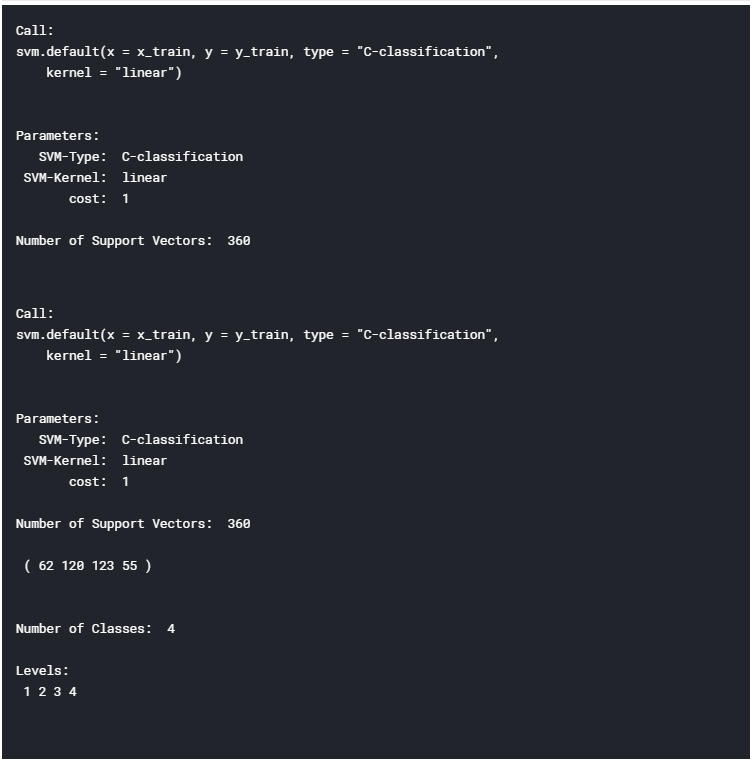
It’s now time to train our Machine Learning model. In this example, I decided to use Support Vector Machines (SVM) as our multiclass classifier. Using R summary() we can then inspect the parameters of our trained model (Figure 10).
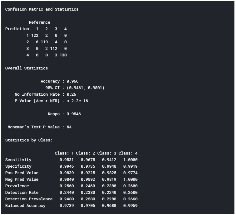
Finally, we can now test our model making some predictions on the test set. Using R confusionMatrix() function we can then get a complete report of our model accuracy (Figure 11). In this case, an Accuracy of 96.6% was registered.
I hope you enjoyed this article, thank you for reading!
Contacts
If you want to keep updated with my latest articles and projects follow me on Medium and subscribe to my mailing list. These are some of my contacts details:
Bibliography
[1] Which languages are important for Data Scientists in 2019? Quora. Accessed at: https://www.quora.com/Which-languages-are-important-for-Data-Scientists-in-2019
[2] R for Data Science, Garrett Grolemund and Hadley Wickham. Accessed at: https://www.bioinform.io/site/wp-content/uploads/2018/09/RDataScience.pdf
Bio: Pier Paolo Ippolito is a Data Scientist and MSc in Artificial Intelligence graduate from the University of Southampton. He has a strong interest in AI advancements and machine learning applications (such as finance and medicine). Connect with him on Linkedin.
Original. Reposted with permission.
Related:
- Basics of Audio File Processing in R
- How to Visualize Data in Python (and R)
- Serverless Machine Learning with R on Cloud Run