 Model Evaluation Metrics in Machine Learning
 Model Evaluation Metrics in Machine Learning
A detailed explanation of model evaluation metrics to evaluate a classification machine learning model.
Predictive models have become a trusted advisor to many businesses and for a good reason. These models can “foresee the future”, and there are many different methods available, meaning any industry can find one that fits their particular challenges.
When we talk about predictive models, we are talking either about a regression model (continuous output) or a classification model (nominal or binary output). In classification problems, we use two types of algorithms (dependent on the kind of output it creates):
- Class output: Algorithms like SVM and KNN create a class output. For instance, in a binary classification problem, the outputs will be either 0 or 1. However, today we have algorithms that can convert these class outputs to probability.
- Probability output: Algorithms like Logistic Regression, Random Forest, Gradient Boosting, Adaboost, etc. give probability outputs. Converting probability outputs to class output is just a matter of creating a threshold probability.
Introduction
While data preparation and training a machine learning model is a key step in the machine learning pipeline, it’s equally important to measure the performance of this trained model. How well the model generalizes on the unseen data is what defines adaptive vs non-adaptive machine learning models.
By using different metrics for performance evaluation, we should be in a position to improve the overall predictive power of our model before we roll it out for production on unseen data.
Without doing a proper evaluation of the ML model using different metrics, and depending only on accuracy, it can lead to a problem when the respective model is deployed on unseen data and can result in poor predictions.
This happens because, in cases like these, our models don’t learn but instead memorize; hence, they cannot generalize well on unseen data.
Model Evaluation Metrics
Let us now define the evaluation metrics for evaluating the performance of a machine learning model, which is an integral component of any data science project. It aims to estimate the generalization accuracy of a model on the future (unseen/out-of-sample) data.
Confusion Matrix
A confusion matrix is a matrix representation of the prediction results of any binary testing that is often used to describe the performance of the classification model (or “classifier”) on a set of test data for which the true values are known.
The confusion matrix itself is relatively simple to understand, but the related terminology can be confusing.
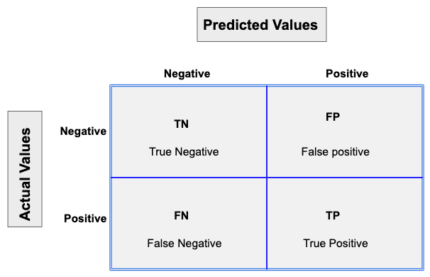
Each prediction can be one of the four outcomes, based on how it matches up to the actual value:
- True Positive (TP): Predicted True and True in reality.
- True Negative (TN): Predicted False and False in reality.
- False Positive (FP): Predicted True and False in reality.
- False Negative (FN): Predicted False and True in reality.
Now let us understand this concept using hypothesis testing.
A Hypothesis is speculation or theory based on insufficient evidence that lends itself to further testing and experimentation. With further testing, a hypothesis can usually be proven true or false.
A Null Hypothesis is a hypothesis that says there is no statistical significance between the two variables in the hypothesis. It is the hypothesis that the researcher is trying to disprove.
We would always reject the null hypothesis when it is false, and we would accept the null hypothesis when it is indeed true.
Even though hypothesis tests are meant to be reliable, there are two types of errors that can occur.
These errors are known as Type 1 and Type II errors.
For example, when examining the effectiveness of a drug, the null hypothesis would be that the drug does not affect a disease.
Type I Error:- equivalent to False Positives(FP).
The first kind of error that is possible involves the rejection of a null hypothesis that is true.
Let’s go back to the example of a drug being used to treat a disease. If we reject the null hypothesis in this situation, then we claim that the drug does have some effect on a disease. But if the null hypothesis is true, then, in reality, the drug does not combat the disease at all. The drug is falsely claimed to have a positive effect on a disease.
Type II Error:- equivalent to False Negatives(FN).
The other kind of error that occurs when we accept a false null hypothesis. This sort of error is called a type II error and is also referred to as an error of the second kind.
If we think back again to the scenario in which we are testing a drug, what would a type II error look like? A type II error would occur if we accepted that the drug hs no effect on disease, but in reality, it did.
A sample python implementation of the Confusion matrix.
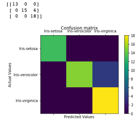
The diagonal elements represent the number of points for which the predicted label is equal to the true label, while anything off the diagonal was mislabeled by the classifier. Therefore, the higher the diagonal values of the confusion matrix the better, indicating many correct predictions.
In our case, the classifier predicted all the 13 setosa and 18 virginica plants in the test data perfectly. However, it incorrectly classified 4 of the versicolor plants as virginica.
There is also a list of rates that are often computed from a confusion matrix for a binary classifier:
1. Accuracy
Overall, how often is the classifier correct?
Accuracy = (TP+TN)/total
When our classes are roughly equal in size, we can use accuracy, which will give us correctly classified values.
Accuracy is a common evaluation metric for classification problems. It’s the number of correct predictions made as a ratio of all predictions made.
Misclassification Rate(Error Rate): Overall, how often is it wrong. Since accuracy is the percent we correctly classified (success rate), it follows that our error rate (the percentage we got wrong) can be calculated as follows:
Misclassification Rate = (FP+FN)/total
We use the sklearn module to compute the accuracy of a classification task, as shown below.
The classification accuracy is 88% on the validation set.
2. Precision
When it predicts yes, how often is it correct?
Precision=TP/predicted yes
When we have a class imbalance, accuracy can become an unreliable metric for measuring our performance. For instance, if we had a 99/1 split between two classes, A and B, where the rare event, B, is our positive class, we could build a model that was 99% accurate by just saying everything belonged to class A. Clearly, we shouldn’t bother building a model if it doesn’t do anything to identify class B; thus, we need different metrics that will discourage this behavior. For this, we use precision and recall instead of accuracy.
3. Recall or Sensitivity
When it’s actually yes, how often does it predict yes?
True Positive Rate = TP/actual yes
Recall gives us the true positive rate (TPR), which is the ratio of true positives to everything positive.
In the case of the 99/1 split between classes A and B, the model that classifies everything as A would have a recall of 0% for the positive class, B (precision would be undefined — 0/0). Precision and recall provide a better way of evaluating model performance in the face of a class imbalance. They will correctly tell us that the model has little value for our use case.
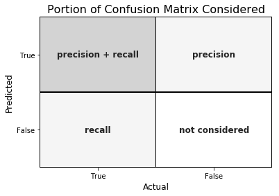
Just like accuracy, both precision and recall are easy to compute and understand but require thresholds. Besides, precision and recall only consider half of the confusion matrix:
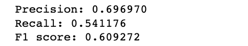
4. F1 Score
The F1 score is the harmonic mean of the precision and recall, where an F1 score reaches its best value at 1 (perfect precision and recall) and worst at 0.
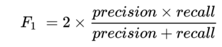
Why harmonic mean? Since the harmonic mean of a list of numbers skews strongly toward the least elements of the list, it tends (compared to the arithmetic mean) to mitigate the impact of large outliers and aggravate the impact of small ones.
An F1 score punishes extreme values more. Ideally, an F1 Score could be an effective evaluation metric in the following classification scenarios:
- When FP and FN are equally costly — meaning they miss on true positives or find false positives — both impact the model almost the same way, as in our cancer detection classification example
- Adding more data doesn’t effectively change the outcome effectively
- TN is high (like with flood predictions, cancer predictions, etc.)
A sample python implementation of the F1 score.
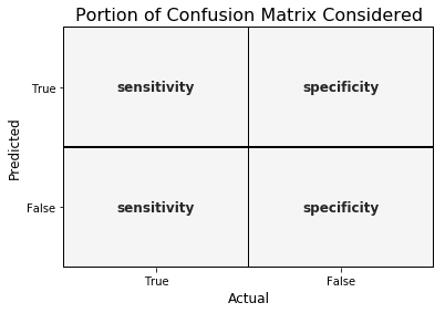
5. Specificity
When it’s no, how often does it predict no?
True Negative Rate=TN/actual no
It is the true negative rate or the proportion of true negatives to everything that should have been classified as negative.
Note that, together, specificity and sensitivity consider the full confusion matrix:
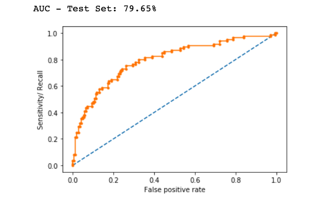
6. Receiver Operating Characteristics (ROC) Curve
Measuring the area under the ROC curve is also a very useful method for evaluating a model. By plotting the true positive rate (sensitivity) versus the false-positive rate (1 — specificity), we get the Receiver Operating Characteristic (ROC) curve. This curve allows us to visualize the trade-off between the true positive rate and the false positive rate.
The following are examples of good ROC curves. The dashed line would be random guessing (no predictive value) and is used as a baseline; anything below that is considered worse than guessing. We want to be toward the top-left corner:
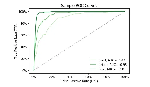
A sample python implementation of the ROC curves.
In the example above, the AUC is relatively close to 1 and greater than 0.5. A perfect classifier will have the ROC curve go along the Y-axis and then along the X-axis.
Log Loss
Log Loss is the most important classification metric based on probabilities.
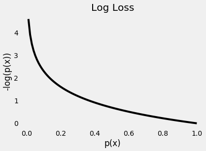
It measures the performance of a classification model where the prediction input is a probability value between 0 and 1. Log loss increases as the predicted probability diverge from the actual label. The goal of any machine learning model is to minimize this value. As such, smaller log loss is better, with a perfect model having a log loss of 0.
A sample python implementation of the Log Loss.
Logloss: 8.02
Jaccard Index
Jaccard Index is one of the simplest ways to calculate and find out the accuracy of a classification ML model. Let’s understand it with an example. Suppose we have a labeled test set, with labels as –
y = [0,0,0,0,0,1,1,1,1,1]And our model has predicted the labels as –
y1 = [1,1,0,0,0,1,1,1,1,1]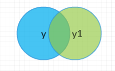
The above Venn diagram shows us the labels of the test set and the labels of the predictions, and their intersection and union.
Jaccard Index or Jaccard similarity coefficient is a statistic used in understanding the similarities between sample sets. The measurement emphasizes the similarity between finite sample sets and is formally defined as the size of the intersection divided by the size of the union of the two labeled sets, with formula as –
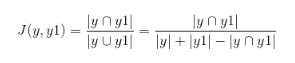
So, for our example, we can see that the intersection of the two sets is equal to 8 (since eight values are predicted correctly) and the union is 10 + 10–8 = 12. So, the Jaccard index gives us the accuracy as –
![]()
So, the accuracy of our model, according to Jaccard Index, becomes 0.66, or 66%.
Higher the Jaccard index higher the accuracy of the classifier.
A sample python implementation of the Jaccard index.
Jaccard Similarity Score : 0.375
Kolomogorov Smirnov chart
K-S or Kolmogorov-Smirnov chart measures the performance of classification models. More accurately, K-S is a measure of the degree of separation between positive and negative distributions.
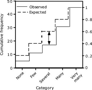
The K-S is 100 if the scores partition the population into two separate groups in which one group contains all the positives and the other all the negatives. On the other hand, If the model cannot differentiate between positives and negatives, then it is as if the model selects cases randomly from the population. The K-S would be 0.
In most classification models the K-S will fall between 0 and 100, and that the higher the value the better the model is at separating the positive from negative cases.
The K-S may also be used to test whether two underlying one-dimensional probability distributions differ. It is a very efficient way to determine if two samples are significantly different from each other.
A sample python implementation of the Kolmogorov-Smirnov.

The Null hypothesis used here assumes that the numbers follow the normal distribution. It returns statistics and p-value. If the p-value is < alpha, we reject the Null hypothesis.
Alpha is defined as the probability of rejecting the null hypothesis given the null hypothesis(H0) is true. For most of the practical applications, alpha is chosen as 0.05.
Gain and Lift Chart
Gain or Lift is a measure of the effectiveness of a classification model calculated as the ratio between the results obtained with and without the model. Gain and lift charts are visual aids for evaluating the performance of classification models. However, in contrast to the confusion matrix that evaluates models on the whole population gain or lift chart evaluates model performance in a portion of the population.
The higher the lift (i.e. the further up it is from the baseline), the better the model.
The following gains chart, run on a validation set, shows that with 50% of the data, the model contains 90% of targets, Adding more data adds a negligible increase in the percentage of targets included in the model.
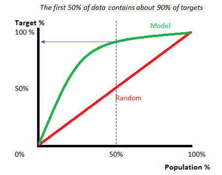
Lift charts are often shown as a cumulative lift chart, which is also known as a gains chart. Therefore, gains charts are sometimes (perhaps confusingly) called “lift charts”, but they are more accurately cumulative lift charts.
It is one of their most common uses is in marketing, to decide if a prospective client is worth calling.
Gini Coefficient
The Gini coefficient or Gini Index is a popular metric for imbalanced class values. The coefficient ranges from 0 to 1 where 0 represents perfect equality and 1 represents perfect inequality. Here, if the value of an index is higher, then the data will be more dispersed.
Gini coefficient can be computed from the area under the ROC curve using the following formula:
Gini Coefficient = (2 * ROC_curve) — 1
Conclusion
Understanding how well a machine learning model is going to perform on unseen data is the ultimate purpose behind working with these evaluation metrics. Metrics like accuracy, precision, recall are good ways to evaluate classification models for balanced datasets, but if the data is imbalanced and there’s a class disparity, then other methods like ROC/AUC, Gini coefficient perform better in evaluating the model performance.
Well, this concludes this article. I hope you guys have enjoyed reading it, feel free to share your comments/thoughts/feedback in the comment section.
Thanks for reading !!!
Bio: Nagesh Singh Chauhan is a Big data developer at CirrusLabs. He has over 4 years of working experience in various sectors like Telecom, Analytics, Sales, Data Science having specialisation in various Big data components.
Original. Reposted with permission.
Related:
- Dimensionality Reduction with Principal Component Analysis (PCA)
- Hyperparameter Optimization for Machine Learning Models
- DBSCAN Clustering Algorithm in Machine Learning