Feature Engineering for Numerical Data
Data feeds machine learning models, and the more the better, right? Well, sometimes numerical data isn't quite right for ingestion, so a variety of methods, detailed in this article, are available to transform raw numbers into something a bit more palatable.
Numeric data is almost a blessing. Why almost? Well, because it is already in a format that is ingestible by Machine Learning models. However, if we translate it into human-relatable terms, just because a PhD level textbook is written in English — I speak, read and write in English — does not mean that I am capable of understanding the textbook well enough to derive useful insights. What would make the textbook useful to me is if it epitomizes the most important information in a manner that considers the assumptions of my mental model, such as “Maths is a myth” (which, by the way, is no longer my view since I am really starting to enjoying it). In the same way, a good feature should represent salient aspects of the data, as well as taking the shape of the assumptions that are made by the Machine Learning model.

Feature engineering is the process of extracting features from raw data and transforming them into formats that can be ingested by a machine learning model. Transformations are often required to ease the difficulty of modelling and boost the results of our models. Therefore, techniques to engineer numeric data types are fundamental tools for Data Scientist (Machine Learning Engineers alike) to add to their artillery.
“data is like the crude oil of machine learning, which means it has to be refined into features — predictor variables — to be useful for training a model.” — Will Koehrsen
As we strive for mastery, it is important to note that it is never enough to know why a mechanism works and what it can do. Mastery knows how something is done, has an intuition for the underlying principles, and has the neural connections that make drawing the correct tool a seamless procedure when faced with a challenge. That will not come from reading this article, but from the deliberate practice of which this article will open the door for you to do by providing the intuition behind the techniques so that you may understand how and when to apply them.
The features in your data will directly influence the predictive models you use and the results you can achieve.” — Jason Brownlee
Note: You can find the code used for this article on my Github page.
There may be occasions where data is collected on a feature that accumulates, thereby having an infinite upper boundary. Examples of this type of continuous data may be a tracking system that monitors the number of visits that all of my blog posts receive on a daily basis. This type of data easily attracts outliers since there could be some unpredictable event that affects the total traffic that my articles are accumulating. For instance, one day, people may decide they want to be able to do data analysis, so my article on Effective data visualization may spike for that day. In other words, when data can be collected quickly and in large amounts, then it is likely that it would contain some extreme values that would need engineering.
Some methods to handle this instance are:
Quantization
This method contains the scale of the data by grouping the values into bins. Therefore, quantization maps a continuous value into a discrete value, and, conceptually, this can be thought of as an ordered sequence of bins. To implement this, we must consider the width of bins that we create, of which the solutions fall into two categories, fixed-width bins or adaptive bins.
Note: This is particularly useful for linear models. In tree-based models, this is not useful because tree-based models make their own splits.
In the fixed-width scenario, the value is automatically or custom-designed to segment data into discrete bins — they can also be linearly scaled or exponentially scaled. A popular example is separating ages of people into partitions by decade intervals such that bin 1 contains ages 0–9, bin 2 has 10–19 etc.
Note that if the values span across a large magnitude of numbers, then a better method may be to group the values into powers of a constant, such as to the power of 10: 0–9, 10–99, 100–999, 1000–9999. Notice that the bin widths grow exponentially, hence in the case of 1000–9999, the bin width is O(10000), whereas 0–9 is O(10). Take the log of the count to map from the count to the bin of the data.
import numpy as np

#15 random integers from the "discrete uniform" distribution
ages = np.random.randint(0, 100, 15)

#evenly spaced bins
ages_binned = np.floor_divide(ages, 10)

print(f"Ages: {ages} \nAges Binned: {ages_binned} \n")
>>> Ages: [97 56 43 73 89 68 67 15 18 36  4 97 72 20 35]
Ages Binned: [9 5 4 7 8 6 6 1 1 3 0 9 7 2 3]

#numbers spanning several magnitudes
views = [300, 5936, 2, 350, 10000, 743, 2854, 9113, 25, 20000, 160, 683, 7245, 224]

#map count -> exponential width bins
views_exponential_bins = np.floor(np.log10(views))

print(f"Views: {views} \nViews Binned: {views_exponential_bins}")
>>> Views: [300, 5936, 2, 350, 10000, 743, 2854, 9113, 25, 20000, 160, 683, 7245, 224]
Views Binned: [2. 3. 0. 2. 4. 2. 3. 3. 1. 4. 2. 2. 3. 2.]
Adaptive bins are a better fit when there are large gaps within the counts. When there are large margins in-between the values of the counts, then some of the fixed-width bins would be empty.
To do adaptive binning, we can make use of the quantiles of the data — the values that divide the data into equal portions like the median.
import pandas as pd

#map the counts to quantiles (adaptive binning)
views_adaptive_bin = pd.qcut(views, 5, labels=False)

print(f"Adaptive bins: {views_adaptive_bin}")
>>> Adaptive bins: [1 3 0 1 4 2 3 4 0 4 0 2 3 1]
Power Transformations
We have already seen an example of this: the log transformation is part of a family of variance stabilizing transformations know as power transformations. Wikipedia describes power transformations as a “technique used to stabilize variance, make the data more normal distribution-like, improve the validity of measures of association such as the Pearson correlation between variables and for other data stabilization procedures.”
Why would we want to transform our data to fit the Normal Distribution? Great question! You may want to use a parametric model — a model that makes assumptions of the data — rather than a non-parametric model. When the data is normally distributed, parametric models are powerful. However, in some cases, the data we have may need a helping hand to bring out the beautiful bell-shaped curve of the normal distribution. For instance, the data may be skewed, so we apply a power transformation to assist in helping our feature look more Gaussian.
The code below leverages data science frameworks such as pandas, scipy, and numpy to demonstrate power transformations and visualize them using the Plotly.py framework for interactive plots. The dataset used is the House Prices: Advanced regression techniques from Kaggle, which you can easily download (Click here for access data).
import numpy as np
import pandas as pd
from scipy import stats
import plotly.graph_objects as go
from plotly.subplots import make_subplots

df = pd.read_csv("../data/raw/train.csv")

# applying various transformations
x_log = np.log(df["GrLivArea"].copy()) # log
x_square_root = np.sqrt(df["GrLivArea"].copy()) # square root x_boxcox, _ = stats.boxcox(df["GrLivArea"].copy()) # boxcox
x = df["GrLivArea"].copy() # original data

# creating the figures
fig = make_subplots(rows=2, cols=2,
                    horizontal_spacing=0.125,
                    vertical_spacing=0.125,
                    subplot_titles=("Original Data",
                                    "Log Transformation",
                                    "Square root transformation",
                                    "Boxcox Transformation")
                    )

# drawing the plots
fig.add_traces([
                go.Histogram(x=x,
                             hoverinfo="x",
                             showlegend=False),
                go.Histogram(x=x_log,
                             hoverinfo="x",
                             showlegend=False),
                go.Histogram(x=x_square_root,
                             hoverinfo="x",
                             showlegend=False),
                go.Histogram(x=x_boxcox,
                             hoverinfo="x",
                             showlegend=False),
               ],
               rows=[1, 1, 2, 2],
               cols=[1, 2, 1, 2]
)

fig.update_layout(
    title=dict(
               text="GrLivArea with various Power Transforms",
               font=dict(
                         family="Arial",
                         size=20)),
    showlegend=False,
    width=800,
    height=500)

fig.show() # display figure
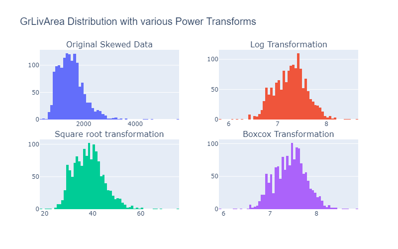
Figure 1: Visualizing the original data and various power transforms power transformations.
Note: Box-cox transformations only work when the data is non-negative
“Which of these is best? You cannot know beforehand. You must try them and evaluate the results to achieve on your algorithm and performance measures.” — Jason Brownlee
Feature Scaling
As the name implies, feature scaling (also referred to as feature normalization) is concerned with changing the scale of features. When the features of a dataset differ greatly in scale, then a model that is sensitive to the scale of the input features (i.e., linear regression, logistic regression, neural networks) would be affected. Ensuring features are within a similar scale is imperative. Whereas, models such as tree-based models (i.e., Decision Trees, Random Forest, Gradient boosting) do not care about scale.
Common ways to scale features include min-max scaling, standardization, and L² normalization. The following is a brief introduction and implementation in python.
Min-Max Scaling - The feature is scaled to a fixed range (which is usually between 0–1), meaning that we will have reduced standard deviations, therefore, suppressing the effect of outliers on the feature. Where x is the individual value of the instance (i.e., person 1, feature 2), max(x), min(x) is the maximum and minimum values of the feature — see Figure 2. For more on this, see the sklearn documentation.
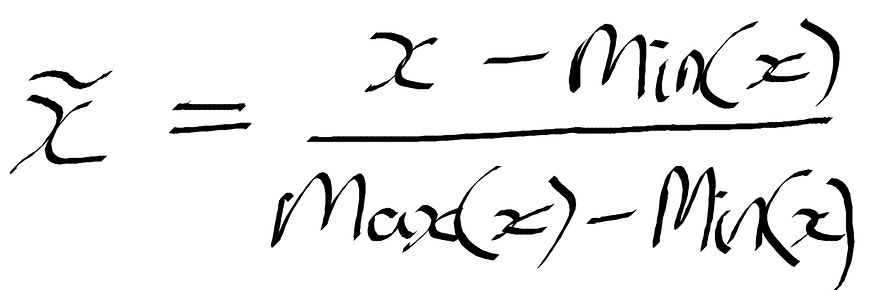
Figure 2: Formula for Min-max scaling.
Standardization - The feature values will be rescaled so that they fit the properties of a normal distribution where the mean is 0, and the standard deviation is 1. To do this, we subtract the mean of the feature — taken over all the instances — from the feature instance value, then divide by the variance — see Figure 3. Refer to the sklearn documentation for standardization.
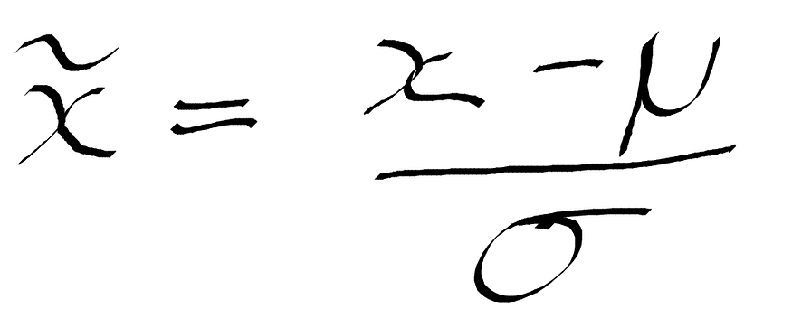
Figure 3: Formula for standardization.
L² Normalization - This technique divides the original feature value by the l² norm (also euclidean distance) — the second equation in Figure 4. L² norm takes the sum of squares of the values in the feature set across all instances. Refer to the sklearn documentation for L² Norm (note that there is also the option to do L¹ normalization by setting the norm parameter to "l1" ).
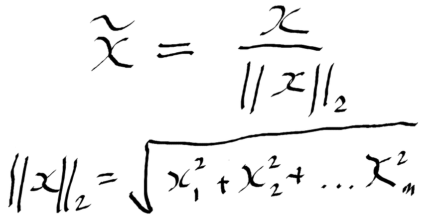
Figure 4: Formula for L² Normalization.
Visualization of the effects of feature scaling will give a better image of what is going on. For this, I am using the wine dataset that can be imported from sklearn datasets.
import pandas as pd
from sklearn.datasets import load_wine
from sklearn.preprocessing import StandardScaler, MinMaxScaler, Normalizer
import plotly.graph_objects as go

wine_json= load_wine() # load in dataset

df = pd.DataFrame(data=wine_json["data"], columns=wine_json["feature_names"]) # create pandas dataframe

df["Target"] = wine_json["target"] # created new column and added target labels

# standardization
std_scaler = StandardScaler().fit(df[["alcohol", "malic_acid"]])
df_std = std_scaler.transform(df[["alcohol", "malic_acid"]])

# minmax scaling
minmax_scaler = MinMaxScaler().fit(df[["alcohol", "malic_acid"]])
df_minmax = minmax_scaler.transform(df[["alcohol", "malic_acid"]])

# l2 normalization
l2norm = Normalizer().fit(df[["alcohol", "malic_acid"]])
df_l2norm = l2norm.transform(df[["alcohol", "malic_acid"]])

# creating traces
trace1 = go.Scatter(x= df_std[:, 0],
                    y= df_std[:, 1],
                    mode= "markers",
                    name= "Standardized Scale")

trace2 = go.Scatter(x= df_minmax[:, 0],
                    y= df_minmax[:, 1],
                    mode= "markers",
                    name= "MinMax Scale")

trace3 = go.Scatter(x= df_l2norm[:, 0],
                    y= df_l2norm[:, 1],
                    mode= "markers",
                    name= "L2 Norm Scale")

trace4 = go.Scatter(x= df["alcohol"],
                    y= df["malic_acid"],
                    mode= "markers",
                    name= "Original Scale")

layout = go.Layout(
         title= "Effects of Feature scaling",
         xaxis=dict(title= "Alcohol"),
         yaxis=dict(title= "Malic Acid")
         )

data = [trace1, trace2, trace3, trace4]
fig = go.Figure(data=data, layout=layout)
fig.show()
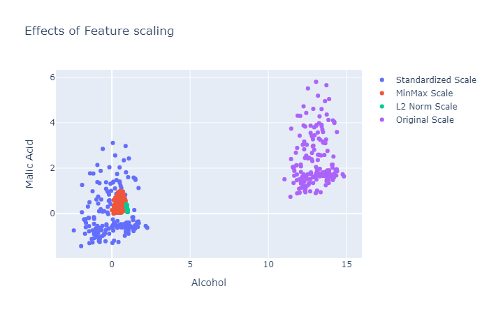
Figure 5: The plots for the original feature and various scaling implementations.
Feature Interactions
We can create the logical AND function by using the product of pairwise interactions between features. In tree-based models, these interactions occur implicitly, but in models that assume independence of the features, we can explicitly declare interactions between features to improve the output of the model.
Think of a simple linear model that uses a linear combination of the input features to predict the output y:
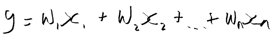
Figure 6: Formula for a linear model.
We can extend the linear model to capture the interactions that occur between features.

Figure 7: Extending the linear model.
Note: Linear functions are expensive to use, and the scoring and training of a linear model with a pairwise interaction would go from O(n) to O(n²). However, you could perform feature extraction to overcome this problem (feature extraction is beyond the scope of this article, but will be something I discuss in a future article).
Let’s code this in python, I am going to leverage the scitkit-learn PolynomialFeatures class, and you can read more about it in the documentation:
import numpy as np
from sklearn.preprocessing import PolynomialFeatures

# creating dummy dataset
X = np.arange(10).reshape(5, 2)
X.shape
>>> (5, 2)

# interactions between features only
interactions = PolynomialFeatures(interaction_only=True)
X_interactions= interactions.fit_transform(X)
X_interactions.shape
>>> (5, 4)

# polynomial features
polynomial = PolynomialFeatures(5)
X_poly = polynomial.fit_transform(X)
X_poly.shape
>>> (5, 6)
This article was heavily inspired by the book Feature Engineering for Machine Learning: Principles and Techniques for Data Scientists, which I'd definitely recommend reading. Though it was published in 2016, it is still very informative and clearly explained, even for those without a mathematical background.
Conclusion
There we have it. In this article, we discussed techniques to deal with numerical features, such as quantization, power transformations, feature scaling, and interaction features (which can be applied to various data types). This is by no means the be-all and end-all of feature engineering, and there is always much more to learn on a daily basis. Feature engineering is an art and will take practice, so now that you have the intuition, you are ready to begin practicing.
Original. Reposted with permission.
Bio: Kurtis Pykes is a Machine Learning Engineer Intern at Codehouse. He is passionate about harnessing the power of machine learning and data science to help people become more productive and effective.
Related: