 Geographical Plots with Python
 Geographical Plots with Python
When your data includes geographical information, rich map visualizations can offer significant value for you to understand your data and for the end user when interpreting analytical results.
By Ahmad Bin Shafiq, Machine Learning Student.

Plotly
Plotly is a famous library used for creating interactive plotting and dashboards in Python. Plotly is also a company, that allows us to host both online and offline data visualisatoins.
In this article, we will be using offline plotly to visually represent data in the form of different geographical maps.
Installing Plotly
pip install plotly
pip install cufflinks
Run both commands in the command prompt to install plotly and cufflinks and all of their packages on our local machine.
Choropleth Map
Choropleth maps are popular thematic maps used to represent statistical data through various shading patterns or symbols on predetermined geographic areas (i.e., countries). They are good at utilizing data to easily represent the variability of the desired measurement across a region.
How does a Choropleth map works?
Choropleth Maps display divided geographical areas or regions that are colored, shaded, or patterned in relation to a data variable. This provides a way to visualize values over a geographical area, which can show variation or patterns across the displayed location.
Using Choropleth with Python
Here, we will be using a dataset of power consumption of different countries throughout the world in 2014.
Okay, so let’s get started.
Importing libraries
import plotly.graph_objs as go
from plotly.offline import init_notebook_mode,iplot,plot
init_notebook_mode(connected=True)

import pandas as pd
Here, init_notebook_mode(connected=True) connects Javascript to our notebook.
Creating/Interpreting our DataFrame
df = pd.read_csv('2014_World_Power_Consumption')
df.info()
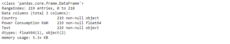
Here we have 3 columns, and all of them have 219 non-null entries.
df.head()

Compiling our data into dictionaries
data = dict(
        type = 'choropleth',
        colorscale = 'Viridis',
        locations = df['Country'],
        locationmode = "country names",
        z = df['Power Consumption KWH'],
        text = df['Country'],
        colorbar = {'title' : 'Power Consumption KWH'},
      )
type = ’choropleth': defines the type of the map, i.e., choropleth in this case.
colorscale = ‘Viridis': displays a color map (for more color scales, refer here).
locations = df['Country']: add a list of all countries.
locationmode = 'country names’: as we have country names in our dataset, so we set location mode to ‘country names’.
z: list of integer values that display the power consumption of each state.
text = df['Country']: displays a text when hovering over the map for each state element. In this case, it is the name of the country itself.
colorbar = {‘title’ : ‘Power Consumption KWH’}: a dictionary that contains information about the right sidebar. Here, colorbar contains the title of the sidebar.
layout = dict(title = '2014 Power Consumption KWH',
              geo = dict(projection = {'type':'mercator'})
             )
layout — a Geo object that can be used to control the appearance of the base map onto which data is plotted.
It is a nested dictionary that contains all the relevant information about how our map/plot should look like.
Generating our plot/map
choromap = go.Figure(data = [data],layout = layout)
iplot(choromap,validate=False)
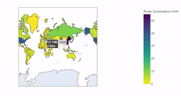
Cool! Our choropleth map for the ‘2014 World Power Consumption’ has been generated, and from the above, we can see that each country displays its name and its power consumption in kWh when hovering over each element on the map. The more concentrated the data is in one particular area, the deeper the shade of color on the map. Here ‘China’ has the largest power consumption, and so its color is deepest.
Density Maps
Density mapping is simply a way to show where points or lines may be concentrated in a given area.
Using Density Maps with Python
Here, we will be using a worldwide dataset of earthquakes and their magnitudes.
Okay, so let’s get started.
Importing libraries
import plotly.express as px
import pandas as pd
Creating/Interpreting our DataFrame
df = pd.read_csv('https://raw.githubusercontent.com/plotly/datasets/master/earthquakes-23k.csv')
df.info()
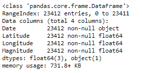
Here, we have 4 columns, and all of them have 23412 non-null entries.
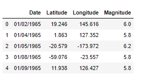
df.head()
Plotting our data
fig = px.density_mapbox(df, lat='Latitude', lon='Longitude', z='Magnitude', radius=10,
                        center=dict(lat=0, lon=180), zoom=0,
                        mapbox_style="stamen-terrain")
fig.show()
lat='Latitude': takes in the Latitude column of our data frame.
lon='Longitude': takes in the Longitude column of our data frame.
z: list of integer values that display the magnitude of the earthquake.
radius=10: sets the radius of influence of each point.
center=dict(lat=0, lon=180): sets the center point of the map in a dictionary.
zoom=0: sets map zoom level.
mapbox_style='stamen-terrain': sets the base map style. Here, "stamen-terrain" is the base map style.
fig.show(): displays the map.
Map
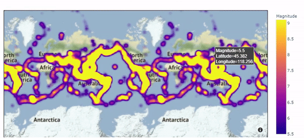
Great! Our Density map for the ‘Earthquakes and their magnitudes’ has been generated, and from the above, we can see that it covers all the territories that suffered from the earthquake, and also shows the magnitude of the earthquake of every region when we hover over it.
Geographical plotting using plotly can be a bit challenging sometimes due to its various formats of data, so please refer to this cheat sheet for all types of syntaxes of plotly plots.
Related: