Essential Math for Data Science: Integrals And Area Under The Curve
In this article, you’ll learn about integrals and the area under the curve using the practical data science example of the area under the ROC curve used to compare the performances of two machine learning models.

Calculus is a branch of mathematics that gives tools to study the rate of change of functions through two main areas: derivatives and integrals. In the context of machine learning and data science, you might use integrals to calculate the area under the curve (for instance, to evaluate the performance of a model with the ROC curve, or to calculate probability from densities.
In this article, you’ll learn about integrals and the area under the curve using the practical data science example of the area under the ROC curve used to compare the performances of two machine learning models. Building from this example, you’ll see the notion of the area under the curve and integrals from a mathematical point of view (from my book Essential Math for Data Science).
Practical Project
Let’s say that you would like to predict the quality of wines from various of their chemical properties. You want to do a binary classification of the quality (distinguishing very good wines from not very good ones). You’ll develop methods allowing you to evaluate your models considering imbalanced data with the area under the Receiver Operating Characteristics (ROC) curve.
Dataset
To do this, we’ll use a dataset showing various chemical properties of red wines and ratings of their quality. The dataset comes from here: https://archive.ics.uci.edu/ml/datasets/wine+quality. The related paper is Cortez, Paulo, et al. ”Modeling wine preferences by data mining from physicochemical properties.” Decision Support Systems 47.4 (2009): 547-553.
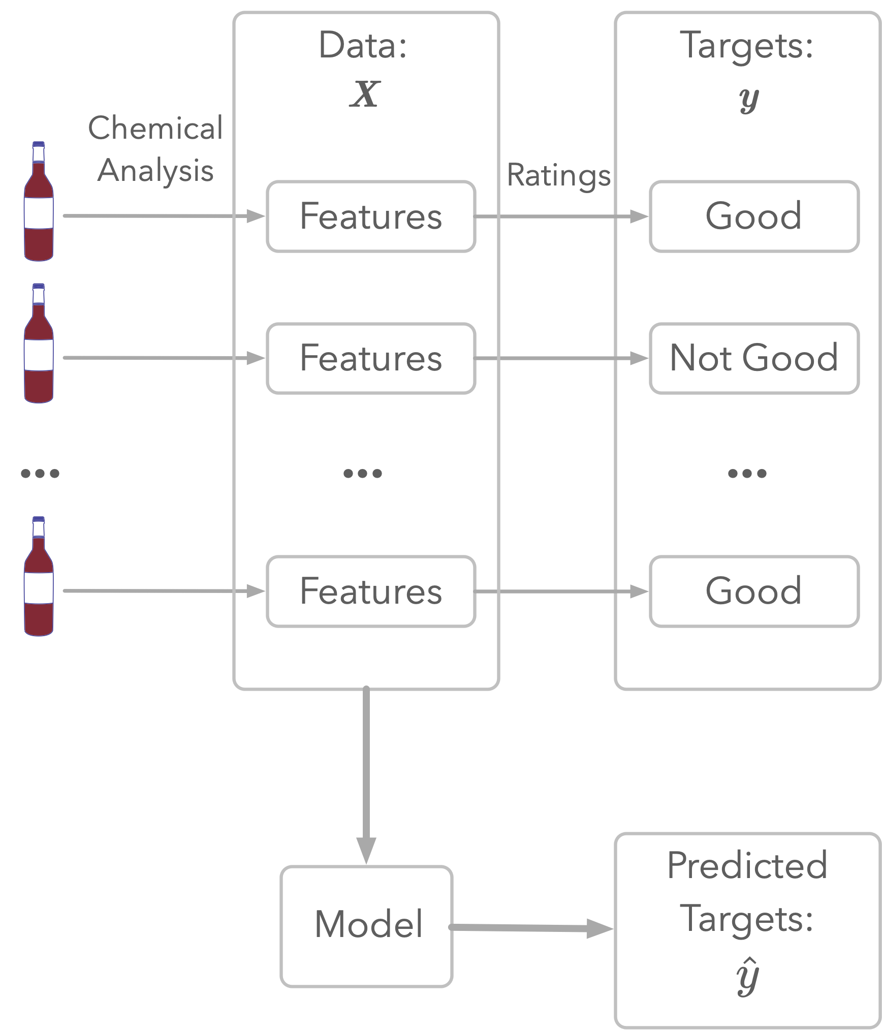
As illustrated in Figure 1, the dataset represents chemical analyses of wines (the features) and ratings of their quality. This rating is the target: this is what you’ll try to estimate.
First, let’s load the data and have a look at the features:
wine_quality = pd.read_csv("https://raw.githubusercontent.com/hadrienj/essential_math_for_data_science/master/data/winequality-red.csv",
                           sep=";")
wine_quality.columns
Index(['fixed acidity', 'volatile acidity', 'citric acid', 'residual sugar',
       'chlorides', 'free sulfur dioxide', 'total sulfur dioxide', 'density',
       'pH', 'sulphates', 'alcohol', 'quality'],
      dtype='object')
The last column quality is important as you’ll use it as the target of your classification. The quality is described by ratings from 3 to 8:
wine_quality["quality"].unique()
array([5, 6, 7, 4, 8, 3])
Since the goal is to classify red wines of very good quality, let’s decide that the wines are very good when ratings are 7 or 8 and not very good otherwise.
Let’s create the dataset with y being the quality (the dependent variable, 0 for ratings less than 7 and 1 for ratings greater than or equal 7) and X containing all the other features.
X = wine_quality.drop("quality", axis=1).values
y = wine_quality["quality"] >= 7
The first thing to do, before looking at the data, is to split it in a part for training your algorithms (the training set) and a part for testing them (the test set). This will allow you to evaluate the performance of your model on data unseen during the training.
from sklearn.model_selection import train_test_split
X_train, X_test, y_train, y_test = train_test_split(X, y, test_size=0.3, random_state=13)
Preprocessing
As a first step, let’s standardize the data to help the convergence of the algorithm. You can use the class StandardScaler from Sklearn.
Note that you don’t want to consider the data from the test set to do the standardization. The method fit_transform() calculates the parameters needed for the standardization and apply it at the same time. Then, you can apply the same standardization to the test set without fitting again.
from sklearn.preprocessing import StandardScaler

scaler = StandardScaler()
X_train_stand = scaler.fit_transform(X_train)
X_test_stand = scaler.transform(X_test)
First Model
As a first model, let’s train a logistic regression on the training set and calculate the classification accuracy (the percentage of correct classifications) on the test set:
from sklearn.linear_model import LogisticRegression
from sklearn.metrics import accuracy_score

log_reg = LogisticRegression(random_state=123, penalty="none")
log_reg.fit(X_train_stand, y_train)
y_pred = log_reg.predict(X_test_stand)
accuracy_score(y_test, y_pred)
0.8729166666666667
The accuracy is about 0.87, meaning that 87% of the test examples have been correctly classified. Should you be happy with this result?
Metrics for Imbalanced Datasets
Imbalanced Dataset
Since we separated the data into very good wines and not very good wines, the dataset is imbalanced: there are different quantities of data corresponding to each target class.
Let’s check how many observations you have in the negative (not very good wines) and positive classes (very good wines):
(y_train == 0).sum() / y_train.shape[0]
0.8650580875781948
(y_train == 1).sum() / y_train.shape[0]
0.13494191242180517
It shows that there are around 86.5% of the examples corresponding to class 0 and 13.5% to class 1.
Simple Model
To illustrate this point about accuracy and imbalanced datasets, let’s creates a model as a baseline and look at its performance. It will help you to see the advantages to use other metrics than accuracy.
A very simple model using the fact that the dataset is imbalanced would always estimate the class with the largest number of observations. In your case, such a model would always estimate that all wines are bad and get a decent accuracy doing that.
Let’s simulate this model by creating random probabilities below 0.5 (for instance, a probability of 0.15 means that there is a 15% chance that the class is positive). We need these probabilities to calculate both the accuracy and other metrics.
np.random.seed(1)
y_pred_random_proba = np.random.uniform(0, 0.5, y_test.shape[0])
y_pred_random_proba
array([2.08511002e-01, 3.60162247e-01, 5.71874087e-05, ...,
       4.45509477e-01, 1.36436118e-02, 2.61025624e-01])
Let’s say that if the probability is above 0.5, the class is estimated as positive:
def binarize(y_hat, threshold):
    return (y_hat > threshold).astype(int)

y_pred_random = binarize(y_pred_random_proba, threshold=0.5)
y_pred_random
array([0, 0, 0, ..., 0, 0, 0])
The variable y_pred_random contains only zeros. Let’s evaluate the accuracy of this random model:
accuracy_score(y_test, y_pred_random)
0.8625
This shows that, even with a random model, the accuracy is not bad at all: it doesn’t mean that the model is good.
To summarize, having a different number of observations corresponding to each class, you can’t rely on the accuracy to evaluate your model’s performance. In our example, the model could output only zeros and you would get around 86% accuracy.
You need other metrics to assess the performance of models with imbalanced datasets.
ROC Curves
A good alternative to the accuracy is the Receiver Operating Characteristics (ROC) curve. You can check the very good explanations of Aurélien Géron about ROC curves in Géron, Aurélien. Hands-on machine learning with Scikit-Learn, Keras, and TensorFlow: Concepts, tools, and techniques to build intelligent systems. O’Reilly Media, 2019.
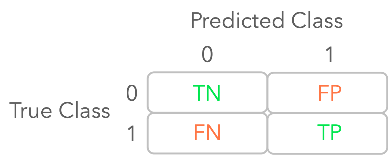
The main idea is to separate the estimations from the model into four categories:
- The true positives (TP): the prediction is 1 and the true class is 1.
- The false positives (FP): the prediction is 1 but the true class is 0.
- The true negatives (TN): the prediction is 0 and the true class is 0.
- The false negatives (FN): the prediction is 0 but the true class is 1.
Let’s calculate these values for your first logistic regression model. You can use the function confusion_matrix from Sklearn. It presents a table organized as follows:
from sklearn.metrics import confusion_matrix
confusion_matrix(y_test, y_pred_random)
array([[414,   0],
       [ 66,   0]])
You can see that there is no positive observation that has been correctly classified (TP) with the random model.
Decision Threshold
In classification tasks, you want to estimate the class of data samples. For models like logistic regression which outputs probabilities between 0 and 1, you need to convert this score to the class 0 or 1 using a decision threshold, or just threshold. A probability above the threshold is considered as a positive class. For instance, using the default choice of the decision threshold at 0.5, you consider that the estimated class is 1 when the model outputs a score above 0.5.
However, you can choose other thresholds, and the metrics you use to evaluate the performance of your model will depend on this threshold.
With the ROC curve, you consider multiple thresholds between 0 and 1 and calculate the true positive rate as a function of the false positive rate for each of them.
You can use the function roc_curve from Sklearn to calculate the false positive rate (fpr) and the true positive rate (tpr). The function outputs also the corresponding thresholds. Let’s try it with our simulated random model where outputs are only values bellow 0.5 (y_pred_random_proba).
from sklearn.metrics import roc_curve
fpr_random, tpr_random, thresholds_random = roc_curve(y_test, y_pred_random_proba)
Let’s have a look at the outputs:
fpr_random
array([0.        , 0.        , 0.07246377, ..., 0.96859903, 0.96859903,
       1.        ])
tpr_random
array([0.        , 0.01515152, 0.01515152, ..., 0.98484848, 1.        ,
       1.        ])
thresholds_random
array([1.49866143e+00, 4.98661425e-01, 4.69443239e-01, ...,
       9.68347894e-03, 9.32364469e-03, 5.71874087e-05])
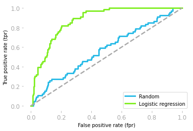
You can now plot the ROC curve from these values:
plt.plot(fpr_random, tpr_random)
# [...] Add axes, labels etc.
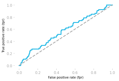
Figure 3 shows the ROC curve corresponding to the random model. It gives you the true positive rate as a function of the false positive rate for each threshold.
However, be careful, the thresholds are from 1 to 0. For instance, the point at the bottom left corresponds to a threshold of 1: there is 0 true positive and 0 false positive because it is not possible to have a probability above 1, so with a threshold of 1, no observation can be categorized as positive. At the top right, the threshold is 0, so all observations are categorized as positive, leading to 100% of true positive but also 100% of false positive.
A ROC curve around the diagonal means that the model is not better than random which is the case here. A perfect model would be associated with a ROC curve with a true positive rate of 1 for all values of false positive rate.
Let’s now look at the ROC curve corresponding to the logistic regression model you trained earlier. You’ll need probabilities from the model, that you can get using predict_proba() instead of predict:
y_pred_proba = log_reg.predict_proba(X_test_stand)
y_pred_proba
array([[0.50649705, 0.49350295],
       [0.94461852, 0.05538148],
       [0.97427601, 0.02572399],
       ...,
       [0.82742897, 0.17257103],
       [0.48688505, 0.51311495],
       [0.8809794 , 0.1190206 ]])
The first column is the score for the class 0 and the second column for the score 1 (thus, the total of each row is 1), so you can keep the second column only.
fpr, tpr, thresholds = roc_curve(y_test, y_pred_proba[:, 1])
plt.plot(fpr, tpr)
# [...] Add axes, labels etc.
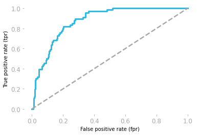
You can see in Figure 4 that your model is actually better than a random model, which is not something you were able to know from the model accuracies (they were equivalent: around 0.86 for the random model and 0.87 for your model).
Visual inspection is good, but it would also be crucial to have a single numerical metric to compare your models. This is usually provided by the area under the ROC curve. You’ll see what is the area under the curve and how you can calculate in the next sections.
Integrals
Integration is the inverse operation of differentiation. Take a function f(x) and calculate its derivative f′(x), the indefinite integral (also called antiderivative) of f′(x) gives you back f(x) (up to a constant, as you’ll soon see).
You can use integration to calculate the area under the curve, which is the area of the shape delimited by the function, as shown in Figure 5.

A definite integral is the integral over a specific interval. It corresponds to the area under the curve in this interval.
Example
You’ll see through this example how to understand the relationship between the integral of a function and the area under the curve. To illustrate the process, you’ll approximate the integral of the function g(x)=2x using a discretization of the area under the curve.
Example Description
Let’s take again the example of the moving train. You saw that speed as a function of time was the derivative of distance as a function of time. These functions are represented in Figure 6.
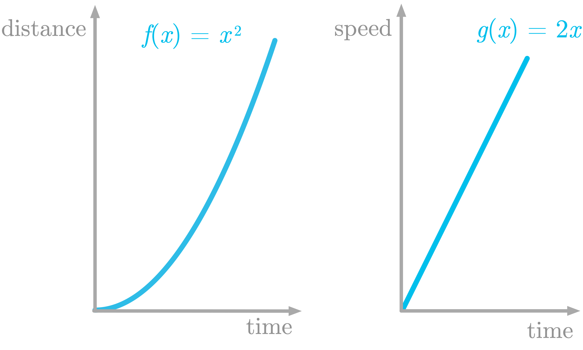
The function shown in the left panel of Figure 6 is defined as f(x)=x2. Its derivative is defined as g(x)=2x.
In this example, you’ll learn how to find an approximation of the area under the curve of g(x).
Slicing the Function
To approximate the area of a shape, you can use the slicing method: you cut the shape into small slices with an easy shape like rectangles, calculate the area of each of these slices and sum them.
You’ll do exactly that to find an approximation of the area under the curve of g(x).
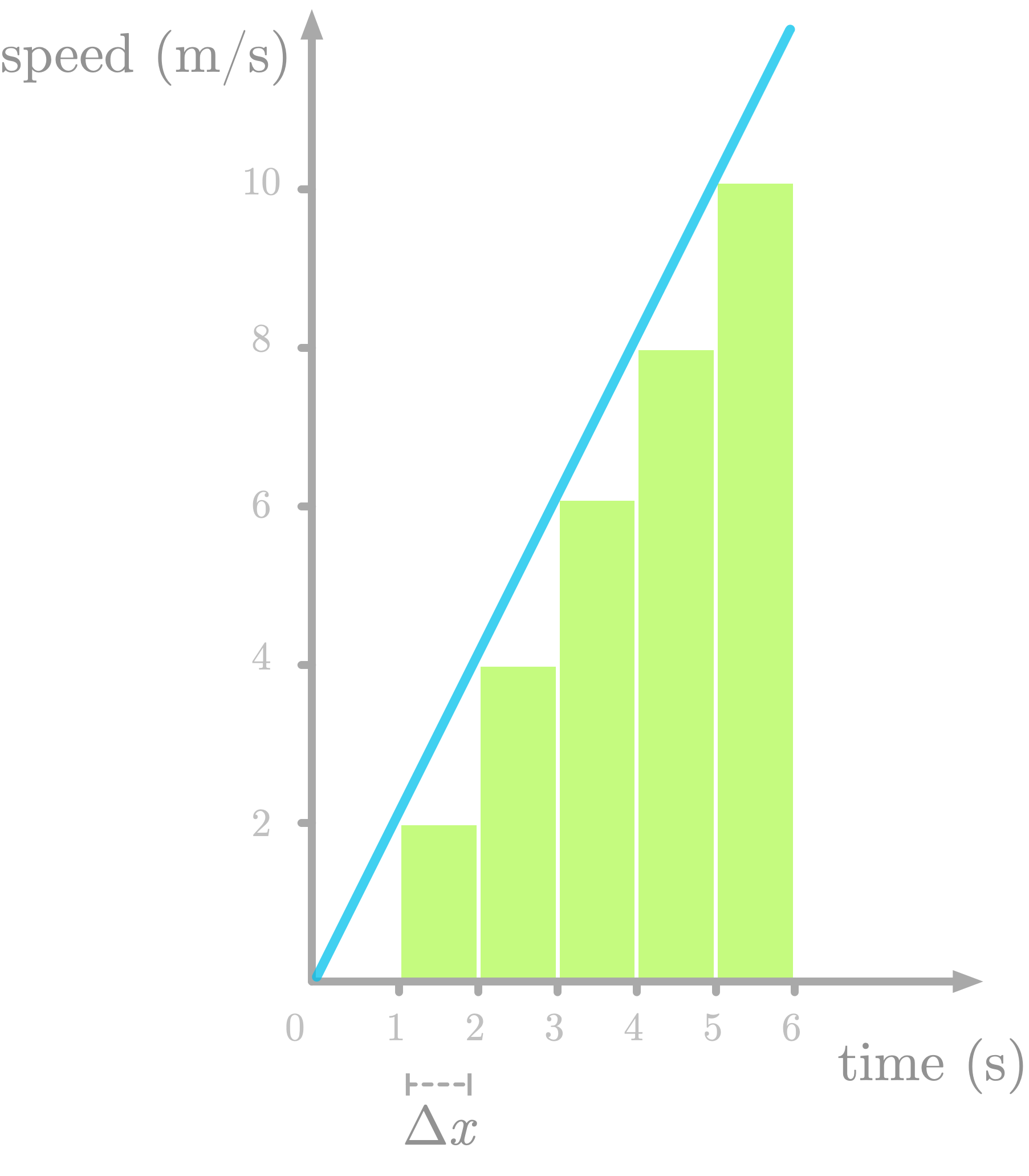
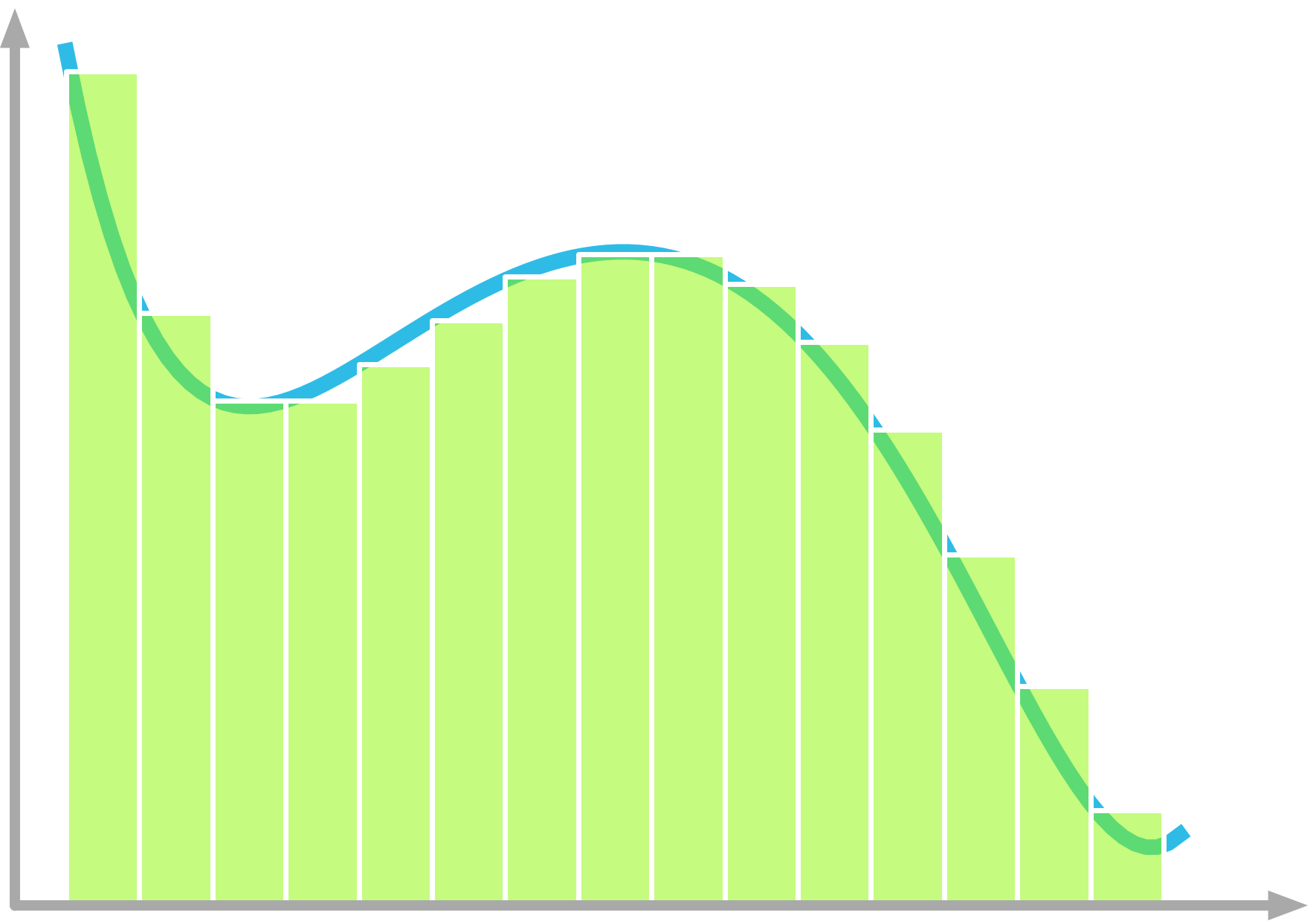
Figure 7 shows the area under the curve of f′(x) sliced as one-second rectangles (let’s call this difference Δx). Note that we underestimate the area (look at the missing triangles), but we’ll fix that later.
Let’s try to understand the meaning of the slices. Take the first one: its area is defined as 2⋅12⋅1. The height of the slice is the speed at one second (the value is 2). So there are two units of speed by one unit of time for this first slice. The area corresponds to a multiplication between speed and time: this is a distance.
For instance, if you drive at 50 miles per hour (speed) for two hours (time), you traveled 50⋅2=100 miles (distance). This is because the unit of speed corresponds to a ratio between distance and time (like miles per hour). You get:

To summarize, the derivative of the distance by time function is the speed by time function, and the area under the curve of the speed by time function (its integral) gives you a distance. This is how derivatives and integrals are related.
Implementation
Let’s use slicing to approximate the integral of the function g(x)=2x. First, let’s define the function g(x):
def g_2x(x):
    return 2 * x
As illustrated in Figure 7, you’ll consider that the function is discrete and take a step of Δx=1. You can create an x-axis with values from zero to six, and apply the function g_2x() for each of these values. You can use the Numpy method arange(start, stop, step) to create an array filled with values from start to stop (not included):
delta_x = 1
x = np.arange(0, 7, delta_x)
x
array([0, 1, 2, 3, 4, 5, 6])
y = g_2x(x)
y
array([ 0, 2, 4, 6, 8, 10, 12])
You can then calculate the slice’s areas by iterating and multiplying the width (Δx) by the height (the value of y at this point). of the slice. As you saw, this area (delta_x * y[i-1] in the code below) corresponds to a distance (the distance of the moving train traveled during the ith slice). You can finally append the results to an array (slice_area_all in the code below).
Note that the index of y is i-1 because the rectangle is on the left of the x value we estimate. For instance, the area is zero for x=0 and x=1.
slice_area_all = np.zeros(y.shape[0])
for i in range(1, len(x)):
    slice_area_all[i] = delta_x * y[i-1]
slice_area_all
array([ 0., 0., 2., 4., 6., 8., 10.])
These values are the slice’s areas.
To calculate the distance traveled from the beginning to the corresponding time point (and not corresponding to each slice), you can calculate the cumulative sum of slice_area_all with the Numpy function cumsum():
slice_area_all = slice_area_all.cumsum()
slice_area_all
array([ 0., 0., 2., 6., 12., 20., 30.])
This is the estimated values of the area under the curve of g(x) as a function of x. We know that the function g(x) is the derivative of f(x)=x2, so we should get back f(x) by the integration of g(x).
Let’s plot our estimation and f(x)f(x), which we’ll call the “true function”, to compare them:
plt.plot(x, x ** 2, label='True')
plt.plot(x, slice_area_all, label='Estimated')
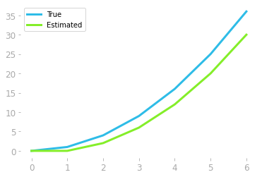
The estimation represented in Figure 8 shows that the estimation is not bad, but could be improved. This is because we missed all these triangles represented in red in Figure
- One way to reduce the error is to take a smaller value for ΔxΔx, as illustrated in the right panel in Figure 9.

Let’s estimate the integral function with Δx=0.1:
delta_x = 0.1
x = np.arange(0, 7, delta_x)
y = g_2x(x)
#  [...] Calculate and plot slice_area_all
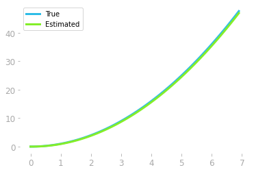
As shown in Figure 10, we recovered (at least, up to an additive constant) the original function whose derivative we integrated.
Extension
In our previous example, you integrated the function 2x, which is a linear function, but the principle is the same for any continuous function (see Figure 11 for instance).
Riemann Sum
Approximating an integral using this slicing method is called a Riemann sum. Riemann sums can be calculated in different ways, as you can see in Figure 12.
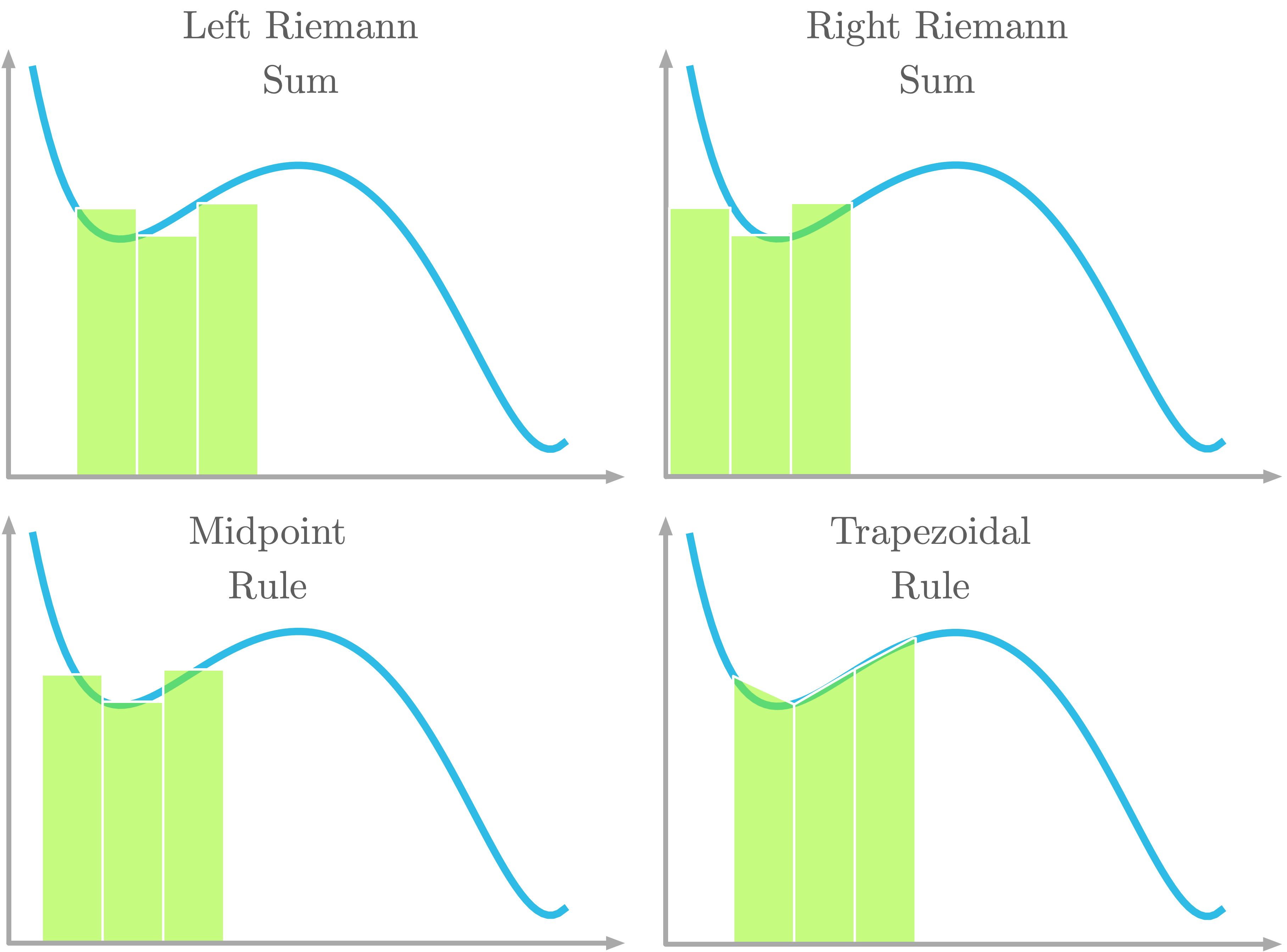
As pictured in Figure 12, with the left Riemann sum, the curve is aligned with the left corner of the rectangle. With the right Riemann sum, the curve is aligned with the right corner of the rectangle. With the midpoint rule, the curve is aligned with the center of the rectangle. With the trapezoidal rule, a trapezoidal shape is used instead of a rectangle. The curve crosses both top corners of the trapezoid.
Mathematical Definition
In the last section, you saw the relationship between the area under the curve and integration (you got back the original function from the derivative). Let’s see now the mathematical definition of integrals.
The integrals of the function f(x) with respect to x is denoted as following:
∫f(x)dx
The symbol dx is called the differential of x and refers to the idea of an infinitesimal change of x. It is a difference in x that approaches 0. The main idea of integrals is to sum an infinite number of slices which have an infinitely small width.
The symbol ∫ is the integral sign and refers to the sum of an infinite number of slices.
The height of each slice is the value f(x). The multiplication of f(x) and dx is thus the area of each slice. Finally, ∫f(x):dx is the sum of the slice areas over an infinite number of slices (the width of the slices tending to zero). This is the area under the curve.
You saw in the last section how to approximate function integrals. But if you know the derivative of a function, you can retrieve the integral knowing that it is the inverse operation. For example, if you know that:
d(x2)dx=2x
You can conclude that the integral of 2x is x2. However, there is a problem. If you add a constant to our function the derivative is the same because the derivative of a constant is zero. For instance,
d(x2+3)dx=2x
It is impossible to know the value of the constant. For this reason, you need to add an unknown constant to the expression, as follows:
∫2xdx=x2+c
with cc being a constant.
Definite Integrals
In the case of definite integrals, you denote the interval of integration with numbers below and above the integral symbol, as following:
∫baf(x)dx
It corresponds to the area under the curve of the function f(x) between x=a and x=b, as illustrated in Figure 13.
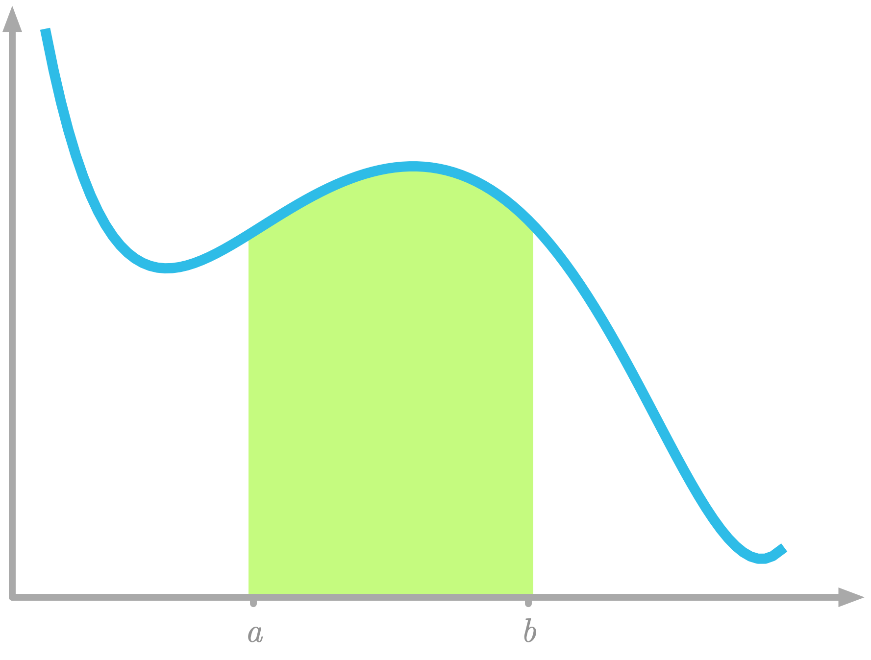 Figure 13: Area under the curve between x=a and x=b.
Area Under the ROC Curve
Now that you know how the area under the curve relates to integration, let’s see how to calculate it to compare numerically your models.
Remember that you had the ROC curves represented in Figure 14:
plt.plot(fpr_random, tpr_random, label="Random")
plt.plot(fpr, tpr, label="Logistic regression")
# [...] Add axes, labels etc.
Let’s start with the random model. You want to sum each value of true positive rate multiplied by the width on the x-axis that is the difference between the corresponding value of false positive rate and the one before. You can obtain these differences with:
fpr_random[1:] - fpr_random[:-1]
array([0.00241546, 0.01207729, 0.        , ..., 0.01207729, 0.        ,
       0.06038647])
So the area under the ROC curve of the random model is:
(tpr_random[1:] * (fpr_random[1:] - fpr_random[:-1])).sum()
0.5743302591128678
Or you can simply use the function roc_auc_score() from Sklearn using the true target values and the probabilities as input:
from sklearn.metrics import roc_auc_score

roc_auc_score(y_test, y_pred_random_proba)
0.5743302591128678
An area under the ROC curve of 0.5 corresponds to a model that is not better than random and an area of 1 corresponds to perfect predictions.
Now, let’s compare this value to the area under the ROC curve of your model:
roc_auc_score(y_test, y_pred_proba[:, 1])
0.8752378861074513
This shows that your model is actually not bad and your predictions of the quality of the wine are not random.
In machine learning, you can use a few lines of code to train complex algorithms. However, as you saw here, a bit of math can help you to make the most of it and speed up your work. It will give you more ease in various aspects of your discipline, even, for instance, understanding the documentation of machine learning libraries like Sklearn.
Bio: Hadrien Jean is a machine learning scientist. He owns a Ph.D in cognitive science from the Ecole Normale Superieure, Paris, where he did research on auditory perception using behavioral and electrophysiological data. He previously worked in industry where he built deep learning pipelines for speech processing. At the corner of data science and environment, he works on projects about biodiversity assessement using deep learning applied to audio recordings. He also periodically creates content and teaches at Le Wagon (data science Bootcamp), and writes articles in his blog (hadrienj.github.io).
Original. Reposted with permission.
Related:
- Boost your data science skills. Learn linear algebra.
- Preprocessing for Deep Learning: From covariance matrix to image whitening
- Essential Math for Data Science: ‘Why’ and ‘How’