Convolutional Neural Network for Breast Cancer Classification
See how Deep Learning can help in solving one of the most commonly diagnosed cancer in women.
Breast cancer is the second most common cancer in women and men worldwide. In 2012, it represented about 12 percent of all new cancer cases and 25 percent of all cancers in women.
Breast cancer starts when cells in the breast begin to grow out of control. These cells usually form a tumor that can often be seen on an x-ray or felt as a lump. The tumor is malignant (cancer) if the cells can grow into (invade) surrounding tissues or spread (metastasize) to distant areas of the body.
Here are some quick facts:
- About 1 in 8 U.S. women (about 12%) will develop invasive breast cancer over the course of her lifetime.
- In 2019, an estimated 268,600 new cases of invasive breast cancer are expected to be diagnosed in women in the U.S., along with 62,930 new cases of non-invasive (in situ) breast cancer.
- About 85% of breast cancers occur in women who have no family history of breast cancer. These occur due to genetic mutations that happen as a result of the aging process and life in general, rather than inherited mutations.
- A woman’s risk of breast cancer nearly doubles if she has a first-degree relative (mother, sister, daughter) who has been diagnosed with breast cancer. Less than 15% of women who get breast cancer have a family member diagnosed with it.
The Challenge
Build an algorithm to automatically identify whether a patient is suffering from breast cancer or not by looking at biopsy images. The algorithm had to be extremely accurate because lives of people is at stake.
Data
The dataset can be downloaded from here. This is a binary classification problem. I split the data as shown-
dataset train
  benign
   b1.jpg
   b2.jpg
   //
  malignant
   m1.jpg
   m2.jpg
   //  validation
   benign
    b1.jpg
    b2.jpg
    //
   malignant
    m1.jpg
    m2.jpg
    //...
The training folder has 1000 images in each category while the validation folder has 250 images in each category.


Environment and tools
Image Classification
The complete image classification pipeline can be formalized as follows:
- Our input is a training dataset that consists of N images, each labeled with one of 2 different classes.
- Then, we use this training set to train a classifier to learn what every one of the classes looks like.
- In the end, we evaluate the quality of the classifier by asking it to predict labels for a new set of images that it has never seen before. We will then compare the true labels of these images to the ones predicted by the classifier.
Where is the code?
Without much ado, let’s get started with the code. The complete project on github can be found here.
Let’s start with loading all the libraries and dependencies.
Next I loaded the images in the respective folders.
After that I created a numpy array of zeroes for labeling benign images and similarly a numpy array of ones for labeling malignant images. I also shuffled the dataset and converted the labels into categorical format.
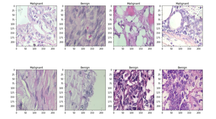
Then I split the data-set into two sets — train and test sets with 80% and 20% images respectively. Let’s see some sample benign and malignant images.
I used a batch size value of 16. Batch size is one of the most important hyperparameters to tune in deep learning. I prefer to use a larger batch size to train my models as it allows computational speedups from the parallelism of GPUs. However, it is well known that too large of a batch size will lead to poor generalization. On the one extreme, using a batch equal to the entire dataset guarantees convergence to the global optima of the objective function. However this is at the cost of slower convergence to that optima. On the other hand, using smaller batch sizes have been shown to have faster convergence to good results. This is intuitively explained by the fact that smaller batch sizes allow the model to start learning before having to see all the data. The downside of using a smaller batch size is that the model is not guaranteed to converge to the global optima.Therefore it is often advised that one starts at a small batch size reaping the benefits of faster training dynamics and steadily grows the batch size through training.
I also did some data augmentation. The practice of data augmentation is an effective way to increase the size of the training set. Augmenting the training examples allow the network to see more diversified, but still representative data points during training.
Then I created a data generator to get the data from our folders and into Keras in an automated way. Keras provides convenient python generator functions for this purpose.
The next step was to build the model. This can be described in the following 3 steps:
- I used DenseNet201 as the pre trained weights which is already trained in the Imagenet competition. The learning rate was chosen to be 0.0001.
- On top of it I used a globalaveragepooling layer followed by 50% dropouts to reduce over-fitting.
- I used batch normalization and a dense layer with 2 neurons for 2 output classes ie benign and malignant with softmax as the activation function.
- I have used Adam as the optimizer and binary-cross-entropy as the loss function.
Let’s see the output shape and the parameters involved in each layer.

Before training the model, it is useful to define one or more callbacks. Pretty handy one, are: ModelCheckpoint and ReduceLROnPlateau.
- ModelCheckpoint: When training requires a lot of time to achieve a good result, often many iterations are required. In this case, it is better to save a copy of the best performing model only when an epoch that improves the metrics ends.
- ReduceLROnPlateau: Reduce learning rate when a metric has stopped improving. Models often benefit from reducing the learning rate by a factor of 2–10 once learning stagnates. This callback monitors a quantity and if no improvement is seen for a ‘patience’ number of epochs, the learning rate is reduced.

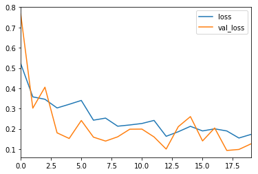
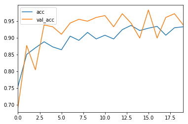
I trained the model for 20 epochs.
Performance Metrics
The most common metric for evaluating model performance is the accurcacy. However, when only 2% of your dataset is of one class (malignant) and 98% some other class (benign), misclassification scores don’t really make sense. You can be 98% accurate and still catch none of the malignant cases which could make a terrible classifier.
Precision, Recall and F1-Score
For a better look at misclassification, we often use the following metric to get a better idea of true positives (TP), true negatives (TN), false positive (FP) and false negative (FN).
Precision is the ratio of correctly predicted positive observations to the total predicted positive observations.
Recall is the ratio of correctly predicted positive observations to all the observations in actual class.
F1-Score is the weighted average of Precision and Recall.

The higher the F1-Score, the better the model. For all three metric, 0 is the worst while 1 is the best.
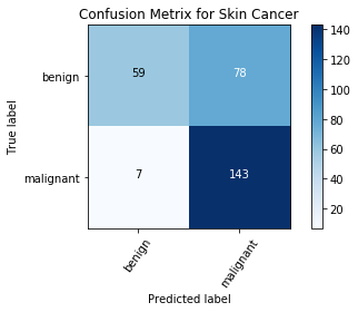
Confusion Matrix
Confusion Matrix is a very important metric when analyzing misclassification. Each row of the matrix represents the instances in a predicted class while each column represents the instances in an actual class. The diagonals represent the classes that have been correctly classified. This helps as we not only know which classes are being misclassified but also what they are being misclassified as.
ROC Curves
The 45 degree line is the random line, where the Area Under the Curve or AUC is 0.5 . The further the curve from this line, the higher the AUC and better the model. The highest a model can get is an AUC of 1, where the curve forms a right angled triangle. The ROC curve can also help debug a model. For example, if the bottom left corner of the curve is closer to the random line, it implies that the model is misclassifying at Y=0. Whereas, if it is random on the top right, it implies the errors are occurring at Y=1.

Results

Conclusions
Although this project is far from complete but it is remarkable to see the success of deep learning in such varied real world problems. In this blog, I have demonstrated how to classify benign and malignant breast cancer from a collection of microscopic images using convolutional neural networks and transfer learning.
References/Further Readings
Transfer Learning for Image Classification in Keras
One stop guide to Transfer Learning
Predicting Invasive Ductal Carcinoma using Convolutional Neural Network (CNN) in Keras
Classifying histopathology slides as malignant or benign using Convolutional Neural Network
Breast cancer histopathological image classification using convolutional neural networks with small…
Although successful detection of malignant tumors from histopathological images largely depends on the long-term...
Deep Learning for Image Classification with Less Data
Deep Learning is indeed possible with less data
Before You Go
The corresponding source code can be found here.
abhinavsagar/Breast-cancer-classification
Benign vs Malignant classifier using convolutional neural networks The dataset can be downloaded from here. pip install…
Contacts
If you want to keep updated with my latest articles and projects follow me on Medium. These are some of my contacts details:
Happy reading, happy learning and happy coding!
Bio: Abhinav Sagar is a senior year undergrad at VIT Vellore. He is interested in data science, machine learning and their applications to real-world problems.
Original. Reposted with permission.
Related:
- Detecting Breast Cancer with Deep Learning
- How to Easily Deploy Machine Learning Models Using Flask
- Understanding Cancer using Machine Learning