Beginners Guide to the Three Types of Machine Learning
The following article is an introduction to classification and regression — which are known as supervised learning — and unsupervised learning — which in the context of machine learning applications often refers to clustering — and will include a walkthrough in the popular python library scikit-learn.
By Rebecca Vickery, Data Scientist
Machine learning problems can generally be divided into three types. Classification and regression, which are known as supervised learning, and unsupervised learning which in the context of machine learning applications often refers to clustering.
In the following article, I am going to give a brief introduction to each of these three problems and will include a walkthrough in the popular python library scikit-learn.
Before I start I’ll give a brief explanation for the meaning behind the terms supervised and unsupervised learning.
Supervised Learning: In supervised learning, you have a known set of inputs (features) and a known set of outputs (labels). Traditionally these are known as X and y. The goal of the algorithm is to learn the mapping function that maps the input to the output. So that when given new examples of X the machine can correctly predict the corresponding y labels.
Unsupervised Learning: In unsupervised learning, you only have a set of inputs (X) and no corresponding labels (y). The goal of the algorithm is to find previously unknown patterns in the data. Quite often these algorithms are used to find meaningful clusters of similar samples of X so in effect finding the categories intrinsic to the data.
Classification
In classification, the outputs (y) are categories. These can be binary, for example, if we were classifying spam email vs not spam email. They can also be multiple categories such as classifying species of flowers, this is known as multiclass classification.
Let’s walk through a simple example of classification using scikit-learn. If you don’t already have this installed it can be installed either via pip or conda as outlined here.
Scikit-learn has a number of datasets that can be directly accessed via the library. For ease in this article, I will be using these example datasets throughout. To illustrate classification I will use the wine dataset which is a multiclass classification problem. In the dataset, the inputs (X) consist of 13 features relating to various properties of each wine type. The known outputs (y) are wine types which in the dataset have been given a number 0, 1 or 2.
The imports I am using for all the code in this article are shown below.
import pandas as pd
import numpy as npfrom sklearn.datasets import load_wine
from sklearn.datasets import load_bostonfrom sklearn.model_selection import train_test_split
from sklearn import preprocessingfrom sklearn.metrics import f1_score
from sklearn.metrics import mean_squared_error
from math import sqrtfrom sklearn.neighbors import KNeighborsClassifier
from sklearn.svm import SVC, LinearSVC, NuSVC
from sklearn.tree import DecisionTreeClassifier
from sklearn.ensemble import RandomForestClassifier, AdaBoostClassifier, GradientBoostingClassifier
from sklearn.discriminant_analysis import LinearDiscriminantAnalysis
from sklearn.discriminant_analysis import QuadraticDiscriminantAnalysis
from sklearn import linear_model
from sklearn.linear_model import ElasticNetCV
from sklearn.svm import SVRfrom sklearn.cluster import KMeans
from yellowbrick.cluster import KElbowVisualizer
from yellowbrick.cluster import SilhouetteVisualizer
In the below code I am downloading the data and converting to a pandas data frame.
wine = load_wine()
wine_df = pd.DataFrame(wine.data, columns=wine.feature_names)
wine_df['TARGET'] = pd.Series(wine.target)
The next stage in a supervised learning problem is to split the data into test and train sets. The train set can be used by the algorithm to learn the mapping between inputs and outputs, and then the reserved test set can be used to evaluate how well the model has learned this mapping. In the below code I am using the scikit-learn model_selection function train_test_split to do this.
X_w = wine_df.drop(['TARGET'], axis=1)
y_w = wine_df['TARGET']
X_train_w, X_test_w, y_train_w, y_test_w = train_test_split(X_w, y_w, test_size=0.2)
In the next step, we need to choose the algorithm that will be best suited to learn the mapping in your chosen dataset. In scikit-learn there are many different algorithms to choose from, all of which use different functions and methods to learn the mapping, you can view the full list here.
To determine the best model I am running the following code. I am training the model using a selection of algorithms and obtaining the F1-score for each one. The F1 score is a good indicator of the overall accuracy of a classifier. I have written a detailed description of the various metrics that can be used to evaluate a classifier here.
classifiers = [
    KNeighborsClassifier(3),
    SVC(kernel="rbf", C=0.025, probability=True),
    NuSVC(probability=True),
    DecisionTreeClassifier(),
    RandomForestClassifier(),
    AdaBoostClassifier(),
    GradientBoostingClassifier()
    ]
for classifier in classifiers:
    model = classifier
    model.fit(X_train_w, y_train_w)
    y_pred_w = model.predict(X_test_w)
    print(classifier)
    print("model score: %.3f" % f1_score(y_test_w, y_pred_w, average='weighted'))
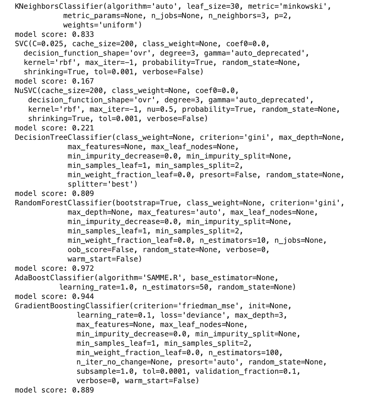
A perfect F1 score would be 1.0, therefore, the closer the number is to 1.0 the better the model performance. The results above suggest that the Random Forest Classifier is the best model for this dataset.
Regression
In regression, the outputs (y) are continuous values rather than categories. An example of regression would be predicting how many sales a store may make next month, or what the future price of your house might be.
Again to illustrate regression I will use a dataset from scikit-learn known as the boston housing dataset. This consists of 13 features (X) which are various properties of a house such as the number of rooms, the age and crime rate for the location. The output (y) is the price of the house.
I am loading the data using the code below and splitting it into test and train sets using the same method I used for the wine dataset.
boston = load_boston()
boston_df = pd.DataFrame(boston.data, columns=boston.feature_names)
boston_df['TARGET'] = pd.Series(boston.target)X_b = boston_df.drop(['TARGET'], axis=1)
y_b = boston_df['TARGET']
X_train_b, X_test_b, y_train_b, y_test_b = train_test_split(X_b, y_b, test_size=0.2)
We can use this cheat sheet to see the available algorithms suited to regression problems in scikit-learn. We will use similar code to the classification problem to loop through a selection and print out the scores for each.
There are a number of different metrics used to evaluate regression models. These are all essentially error metrics and measure the difference between the actual and predicted values achieved by the model. I have used the root mean squared error (RMSE). For this metric, the closer to zero the value is the better the performance of the model. This article gives a really good explanation of error metrics for regression problems.
regressors = [
    linear_model.Lasso(alpha=0.1),
    linear_model.LinearRegression(),
    ElasticNetCV(alphas=None, copy_X=True, cv=5, eps=0.001, fit_intercept=True,
       l1_ratio=0.5, max_iter=1000, n_alphas=100, n_jobs=None,
       normalize=False, positive=False, precompute='auto', random_state=0,
       selection='cyclic', tol=0.0001, verbose=0),
    SVR(C=1.0, cache_size=200, coef0=0.0, degree=3, epsilon=0.1,
    gamma='auto_deprecated', kernel='rbf', max_iter=-1, shrinking=True,
    tol=0.001, verbose=False),
    linear_model.Ridge(alpha=.5)
    ]for regressor in regressors:
    model = regressor
    model.fit(X_train_b, y_train_b)
    y_pred_b = model.predict(X_test_b)
    print(regressor)
    print("mean squared error: %.3f" % sqrt(mean_squared_error(y_test_b, y_pred_b)))
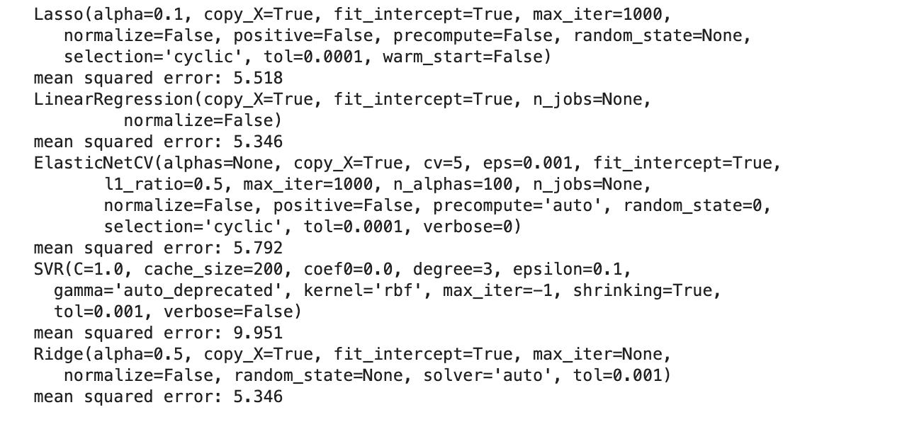
The RMSE score suggests that either the linear regression and ridge regression algorithms perform best for this dataset.
Unsupervised learning
There are a number of different types of unsupervised learning but for simplicity here I am going to focus on the clustering methods. There are many different algorithms for clustering all of which use slightly different techniques to find clusters of inputs.
Probably one of the most widely used methods is Kmeans. This algorithm performs an iterative process whereby a specified number of randomly generated means are initiated. A distance metric, Euclidean distance is calculated for each data point from the centroids, thus creating clusters of similar values. The centroid of each cluster then becomes the new mean and this process is repeated until the optimum result has been achieved.
Let’s use the wine dataset we used in the classification task, with the y labels removed, and see how well the k-means algorithm can identify the wine types from the inputs.
As we are only using the inputs for this model I am splitting the data into test and train using a slightly different method.
np.random.seed(0)
msk = np.random.rand(len(X_w)) < 0.8
train_w = X_w[msk]
test_w = X_w[~msk]
As Kmeans is reliant on the distance metric to determine the clusters it is usually necessary to perform feature scaling (ensuring that all features have the same scale) before training the model. In the below code I am using the MinMaxScaler to scale the features so that all values fall between 0 and 1.
x = train_w.values
min_max_scaler = preprocessing.MinMaxScaler()
x_scaled = min_max_scaler.fit_transform(x)
X_scaled = pd.DataFrame(x_scaled,columns=train_w.columns)
With K-means you have to specify the number of clusters the algorithm should use. So one of the first steps is to identify the optimum number of clusters. This is achieved by iterating through a number of values of k and plotting the results on a chart. This is known as the Elbow method as it typically produces a plot with a curve that looks a little like the curve of your elbow. The yellowbrick library (which is a great library for visualising scikit-learn models and can be pip installed) has a really nice plot for this. The code below produces this visualisation.
model = KMeans()
visualizer = KElbowVisualizer(model, k=(1,8))
visualizer.fit(X_scaled)
visualizer.show()
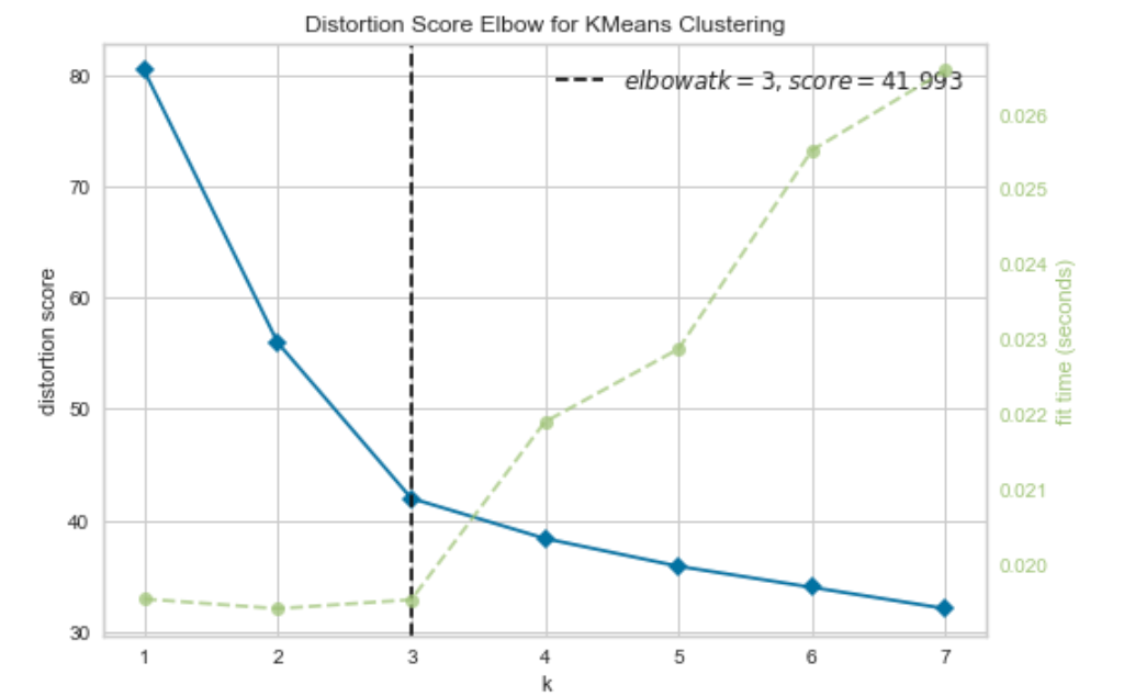
Ordinarily, we wouldn’t already know how many categories we have in a dataset where we are using a clustering technique. However, in this case, we know that there are three wine types in the data — the curve has correctly selected three as the optimum number of clusters to use in the model.
The next step is to initialise the K-means algorithm and fit the model to the training data and evaluate how effectively the algorithm has clustered the data.
One method used for this is known as the silhouette score. This measures the consistency of values within the clusters. Or in other words how similar to each other the values in each cluster are, and how much separation there is between the clusters. The silhouette score is calculated for each value and will range from -1 to +1. These values are then plotted to form a silhouette plot. Again yellowbrick provides a simple way to construct this type of plot. The code below creates this visualisation for the wine dataset.
model = KMeans(3, random_state=42)
visualizer = SilhouetteVisualizer(model, colors='yellowbrick')visualizer.fit(X_scaled)
visualizer.show()
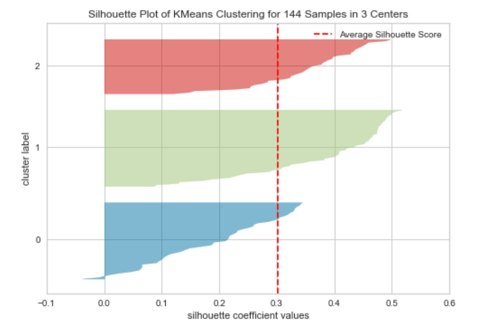
A silhouette plot can be interpreted in the following way:
- The closer the mean score (which is the red dotted line in the above) is to +1 the better matched the data points are within the cluster.
- Data points with a score of 0 are very close to the decision boundary for another cluster (so the separation is low).
- Negative values indicate that the data points may have been assigned to the wrong cluster.
- The width of each cluster should be reasonably uniform if they aren’t then the incorrect value of k may have been used.
The plot for the wine data set above shows that cluster 0 may not be as consistent as the others due to most data points being below the average score and a few data points having a score below 0.
Silhouette scores can be particularly useful in comparing one algorithm against another or different values of k.
In this post, I wanted to give a brief introduction to each of the three types of machine learning. There are many other steps involved in all of these processes including feature engineering, data processing and hyperparameter optimisation to determine both the best data preprocessing techniques and the best models to use.
Thanks for reading!
Bio: Rebecca Vickery is learning data science through self study. Data Scientist @ Holiday Extras. Co-Founder of alGo.
Original. Reposted with permission.
Related:
- Machine Learning Classification: A Dataset-based Pictorial
- Python Libraries for Interpretable Machine Learning
- Five Command Line Tools for Data Science