Visualizing Bias-Variance
In this article, we'll explore some different perspectives of what the bias-variance trade-off really means with the help of visualizations.
By Theodore Tsitsimis, Machine Learning Scientist
Bias-Variance trade-off is a fundamental concept of Machine Learning. Here we'll explore some different perspectives of what this trade-off really means with the help of visualizations.
Bias-Variance in real life
A lot of our decisions are influenced by others, when observing their actions and comparing ourselves with them (through some social similarity metric). At the same time, we maintain our own set of rules that we learn through experience and reasoning. In this context:
- Bias is when we have very simplistic rules that don't really explain real-life situations. For example, thinking you can become a doctor by watching Youtube videos.
- Variance is when we always change our minds by listening to different groups of people and mimicking their actions. For example, when you see someone well-shaped in the gym, eating protein bars after workout and you think that protein bars is what you also need. And then you listen someone saying that they bought some fitness equipment which helped them grow their muscles and you go right ahead and buy the same machine.
A trade-off perspective
Bias-Variance is very often called a trade-off. When talking about trade-offs, we're usually referring to situations with 2 (or more) competing quantities where strengthening the one results in the reduction of the other and vice versa. A famous example is the exploration-exploitation trade-off in reinforcement learning, where increasing the exploration factor (e.g. ε-greedy) causes the agent to exploit less the already estimated high-value states.
On the other hand, bias-variance is rather a decomposition. It is shown that the expected test error (mean squared error) of a regression model can be decomposed to 3 terms: variance, bias and irreducible error (due to noise and intrinsic variability):

However, in contrast to the exploration-exploitation trade-off where you can directly control the 2 competing quantities, bias and variance are not levers that you can just pull to control the error. It's just another way of writing the test error and bias and variance emerge from this decomposition.
But why is it called a trade-off then? Flexible models tend to have low bias and high variance, while more rigid models tend to have high bias and low variance. Model flexibility is something you can control (regularization, number of parameters, etc) and therefore indirectly control bias and variance.
Bias-Variance in simple terms
We read in Bishop's Pattern Recognition and Machine Learning that the bias-variance decomposition is the result of attempting to model prediction uncertainty by running a learning algorithm to multiple datasets sampled from the same distribution. And concludes:
- The bias term represents the extent to which the average prediction over all datasets differs from the desired regression function
- The variance term measures the extent to which the solutions for individual datasets vary around their average, and hence this measures the extent to which the learned function is sensitive to the particular choice of dataset.
Fit "by inspection"
Let's put some context (and graphs) here. Consider the below 1D dataset that was generated by the function ### and was perturbed by some Gaussian noise.
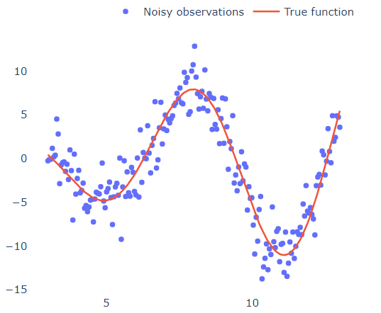
What if we wanted to fit a polynomial in these points?
We can look at the graph and after taking a step back and squinting our eyes really well, we sketch a line that approximately passes through all points (like the red line in the graph). We then observe that the y values tend to increase towards +infinity (if you squint hard enough) for high and low x values, which gives us the hint that it should be an even-degree polynomial. We then see that the points cut the x-axis 4 times (4 real roots), which means that it should be an at least 4-degree polynomial. We finish by observing that the graph has 3 turning points (going from increasing to decreasing or vice versa), again indicating that we have a 4-degree polynomial.
By "squinting our eyes" we basically did some kind of noise smoothing to see the "bigger picture" instead of the small and irrelevant variations of the dataset.
However, how can we be sure that this is indeed the right choice?
Just throw a 1000-degree polynomial and see what happens
Since we can't be sure about the degree of a polynomial that would best approximate the underlying process, or we are just too bored to estimate it, we could just use the most "complex" model we can imagine to fit the points. To validate this argument, we fit multiple polynomials of increasing degree to see how they behave:
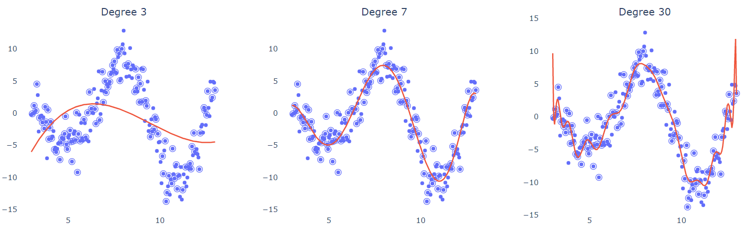
Half of the points (circled) were used for training in each case. It's obvious that the low-degree model (left) can't curve and bend enough to fit the data. The 7-degree polynomial seems to elegantly pass between the points, as if it can ignore (smooth out) the noise. What's more interesting is that the high-degree polynomial (right) tries to interpolate through the points and achieves it in some degree. But is this what we want? What would happen if were given a different set of training points? Would the predictions and shape of the regression curve change?
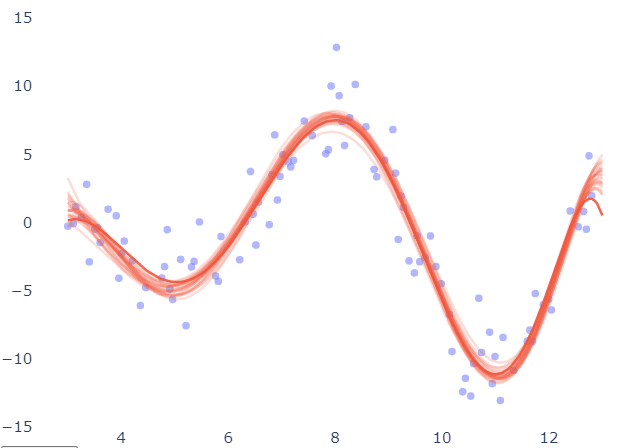
Below, the same fitting was repeated for different subsets of the data and the resulting curves are overlayed to check their variability. The results in the case of the 7-degree polynomial seem to be pretty consistent.
The model is robust to changes in training set, as long as they are uniformly sampled from the input space.
Now the same diagram for the 30-degree polynomial:

Predictions seem to oscillate up and down for different training sets. The main impact of this is that we can't trust the prediction of such a model, because if by chance we had a slightly different set of data, the prediction of the same input sample would probably change.
To better illustrate this argument, the below plot shows the distributions of predictions for the 3 models when evaluated on a single test point (in this case at x=7):
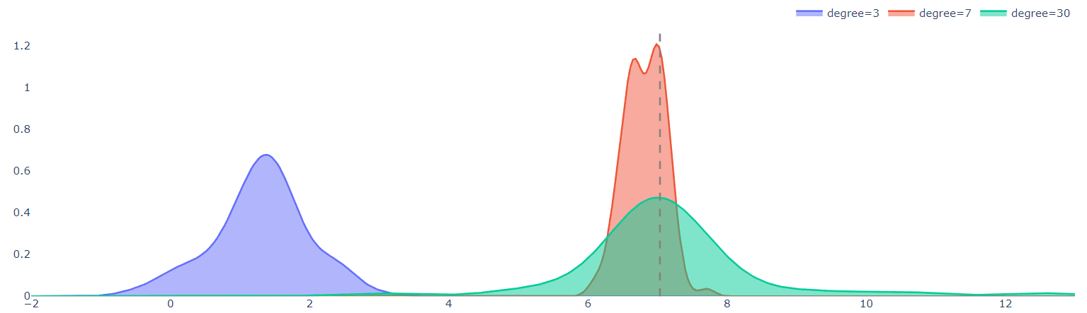
The dashed line is the true value of the function at x=7.
That's what Random Forests® do
The green distribution of the high-degree model in the above graph shows that the predictions vary a lot for different datasets. This is not a good property of the model since it is not robust to small dataset perturbations. But note that the average of the distribution is a very good prediction of the actual target, even better than the average value of the 7-degree model (red distribution). Averaging (bagging) over many realizations of the dataset is a beneficial procedure and can overcome overfitting and variance. This is actually what Random Forests® do and give pretty good results most of the times without much tuning.
Hopefully, this visualizations will help make more clear how bias-variance affect model performance and why averaging many models can lead to better predictions.
Bio: Theodore Tsitsimis is a machine learning scientist. He is currently working in a consulting firm solving business problems using data and machine learning for diverse industries. He holds a B.Sc. and M.Sc. from the school of Electrical and Computer Engineering in National Technical University of Athens, where he conducted research on robotics.
Related:
- How to Create Unbiased Machine Learning Models
- The Three Edge Case Culprits: Bias, Variance, and Unpredictability
- 20 Core Data Science Concepts for Beginners