IBM Watson Analytics – Will it Replace Data Scientists ?
We review IBM Watson Analytics Beta version, the service which aims to provide an automated data scientist and intended for business users who want to move beyond spreadsheets for analysis .
IBM is working hard to commercialize the Watson. It released the beta version of Watson Analytics on September. The service aimed to play the role of data scientists and is for business users who do not want to use Spreadsheets for analysis .
I tried the beta version recently and played with its sample dataset of customer retention for telecommunication companies. Let me first walk you through the whole process.
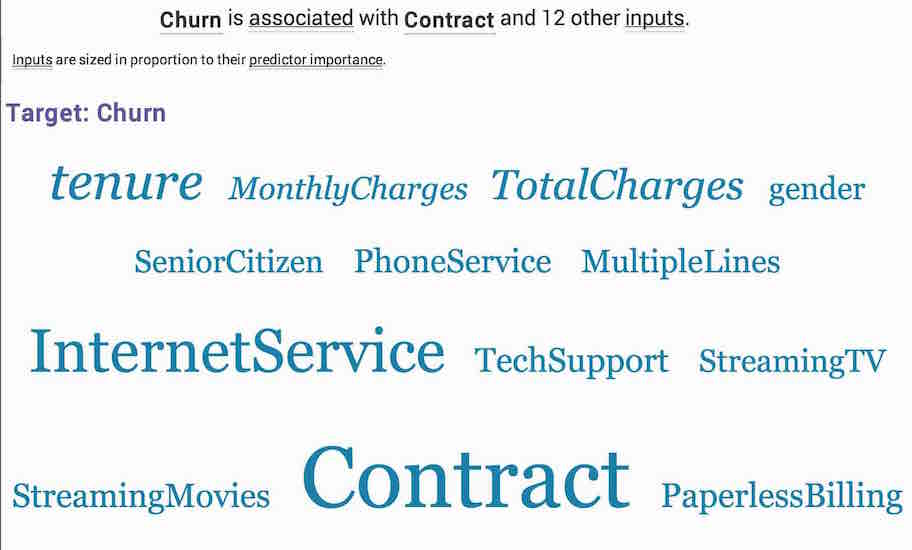
The dataset contains 21 features and the target variable is whether a customer will churn. After loading the data and creating a workbook, top predictors of target variables came out as Contract, Tech Support, Tenure, Internet Service, Online Security, show on the spiral circle. The nearer to the center, the more influence on the target variable. We can change or add target variable as we want.
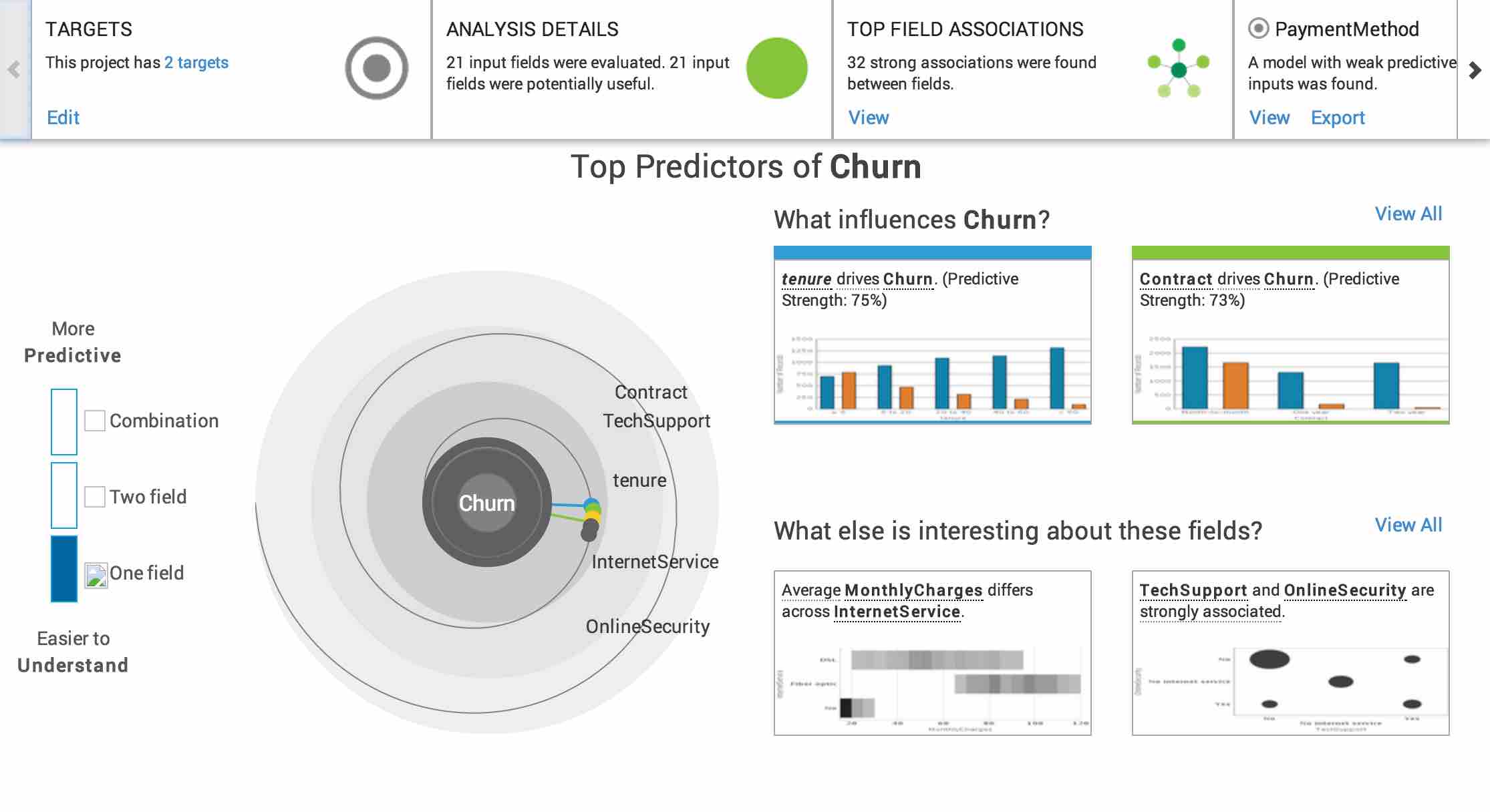
Watson gives more decent figures on the right side. If we choose one field on the left side, it generates charts for each predictor and also interesting discoveries from the dataset. The Analytic platform uses Chi-Square test to tell whether a feature is a predictor of the target variable.The predictive strength here is measured by classification accuracy.
For interesting discoveries part, Watson provides three kinds of graphs to describe relations between features. Followings show association, difference, correlation respectively.

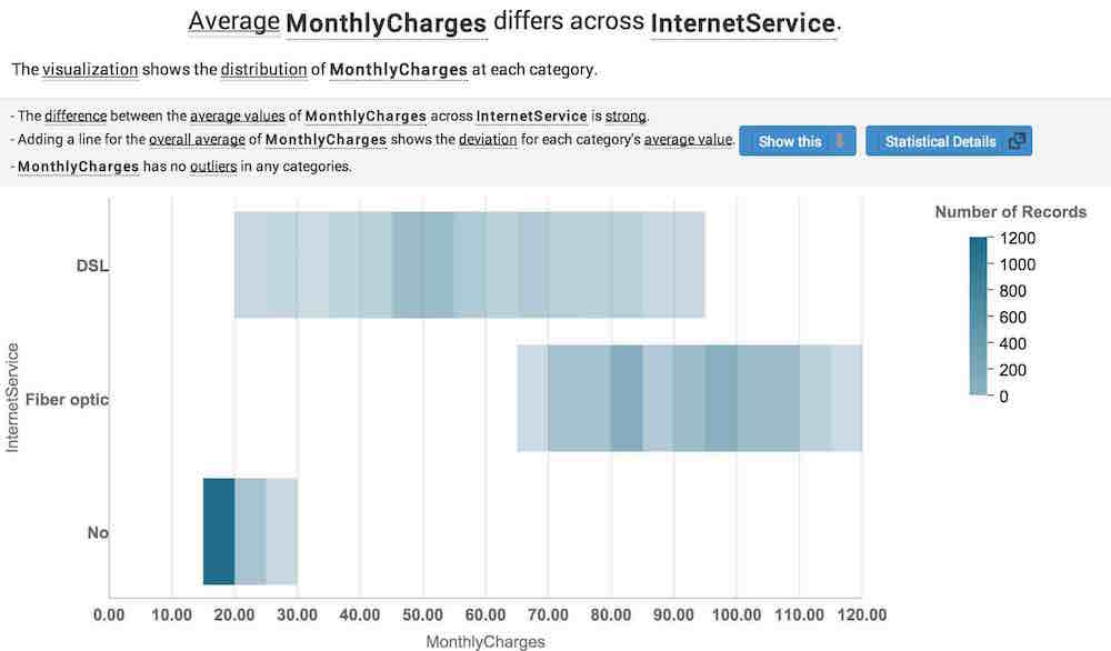
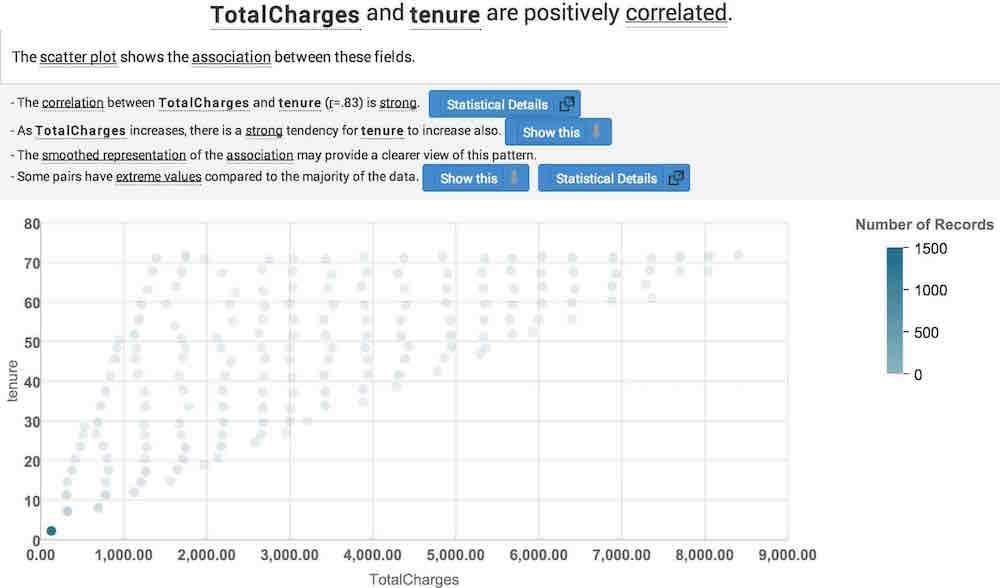
The bubble plot shows the number of records by the size of bubble at each combination of Technology Support and Online Security. The association between these two field is measured by Cramer’s V. The second visualization chart shows the different distribution of Monthly Charges at each category of Internet service. We can see clearly that Monthly charges vary across Internet service, which is a naive result in this case. The scatter plot shows a strong positive correlation between Total Charges and Tenure. Watson provides fifty chart in the churn case.
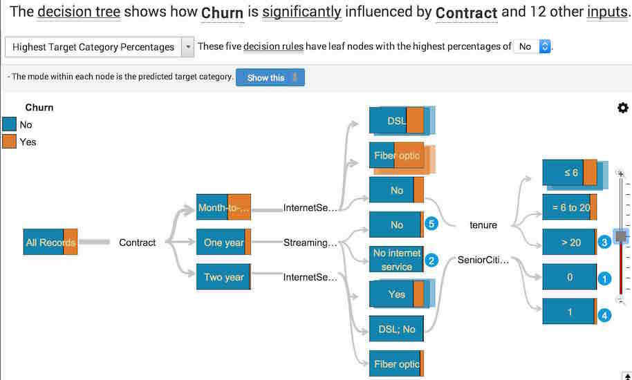
If choosing two field, we will see the interaction of which two fields will influence the target variable. The most interesting part is when we choose combination. Watson outputs a decision tree and a predictor graph.
What I use is the first part of Watson Analytics, Predict and Explain. It has no idea which conclusion is useful for business decision, but shows all the findings from the dataset, sorted by statistical significance. It could get an A as a junior, while still could not graduate from college. There are also Finding the stories in data and Forecasting future values coming soon. As more features are available in the future, the platform will be smarter hopefully.
Related: