Clustering Uber Rideshare Data
This blog discusses clustering the Uber ridesharing dataset, with a focus on interpretation and understanding the concepts in the real world.
By Dhilip Subramanian, Data Scientist and AI Enthusiast
According to Gartner, by 2020, a quarter billion connected vehicles will form a major element of the Internet of Things. Connected vehicles are projected to generate 25GB of data per hour, which can be analyzed to provide real-time monitoring and apps, and will lead to new concepts of mobility and vehicle usage. Ref: Gartner

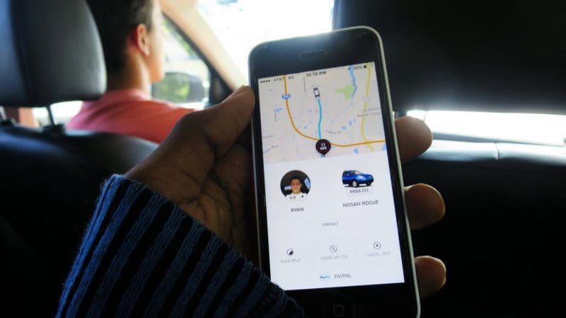
Uber Technologies Inc. is a peer-to-peer ride sharing platform. Uber's platform connects the drivers who can drive to a customer's location. Uber uses machine learning, for calculating pricing to finding the optimal positioning of cars to maximizing profits. I have used the public Uber trip dataset to discuss building a real-time example for analysis and monitoring of car GPS data.
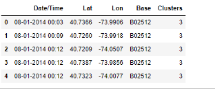
The Uber trip dataset contains data generated by Uber from New York City. The data is freely available on FiveThirtyEight.
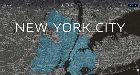
The data draws from all five boroughs of NYC: Brooklyn, Queens, Manhattan, Bronx, and Staten Island. I applied K-means clustering on this dataset to understand the trips taken with Uber and to identify rides in different boroughs within New York.
Clustering is the process of dividing the datasets into groups, consisting of similar data-points”. Clustering is a type of unsupervised machine learning, which is used when you have unlabeled data.
The K-means clustering algorithm's main goal is to group similar elements or data points into a cluster. The “K” in K-means represents the number of clusters. You can check here to gain an understanding of the K-means algorithm.
This blog discusses the use case of how we applied clustering algorithm to the Uber ridesharing dataset. A total of 6 clusters were identified; the validation of clusters is not discussed in this blog, which mostly focused on interpretation and understanding the concepts in the real world.
Importing necessary libraries

Uber pickups data available at FiveThirtyEight were from April to September 2014. Here, I have used the August 2014 data for the explanation.
Reading the CSV file
Output
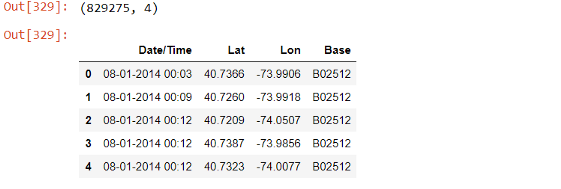
The dataset has 829,275 observations and four columns. It has four attributes:
- Date/Time: The date and time of the Uber pickup.
- Lat(Latitude): The latitude of the Uber pickup
- Lon(Longitude): The longitude of the Uber pickup.
- Base: the TLC base company code affiliated with the Uber pickup.
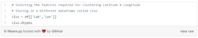
Selecting features
Here, we have selected Latitude and Longitude in a separate dataframe called ‘clus’.
Output
The first step in applying k-means clustering is to find the optimal value for K. This can be found through the elbow plot as shown below.
Output

Output
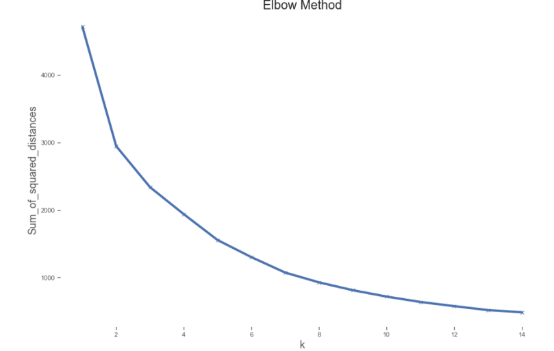
From the above elbow plot, we can see that the sum of the squared distance of the observations from their closest cluster centroid keeps decreasing with an increase in the number of clusters. We can see that after K=6 there is a significant reduction. We can choose either 6 or 7 clusters, and for this application we have chosen 6.
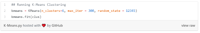
Performing k-Means Clustering
Here we assign a number of clusters for the K-means algorithm:
Output

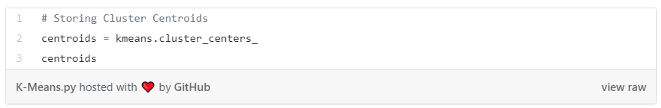
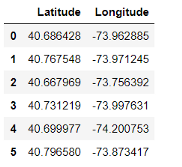
Storing the Cluster Centroids
Here we store the cluster centroids in a different object called centroids:
Output
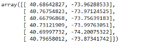
We can see six centroids from the above output. For example, 40.68, -73.96 is the centroid for cluster 1, those numbers representing cluster centroid latitude and longitude values. Similarly, we have centroids for other clusters.
Visualizing centroids
We take the latitudes and longitudes from the centroids and convert them into two separate dataframes. We merge both of the dataframes and named the result ‘clocation’ for easy visualization.
Output

Output
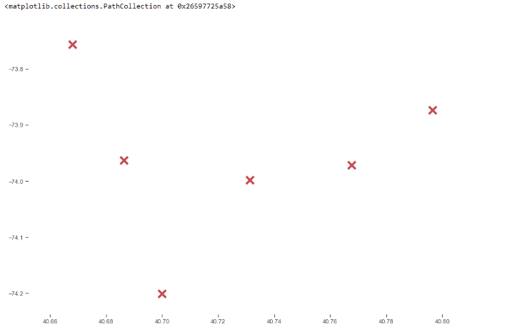
We can see all the centroids pertaining to each cluster in the above scatter plot. However, this doesn’t show any meaningful information. Let’s plot the same in Google Maps (latitude & longitude) and visualize.
Here, we used the Folium library for generating the map. Passing the centroids and map the location:
Output
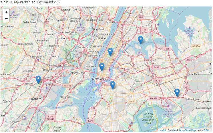
We can see that all the six centroids have been plotted on the map. How are these centroids helpful for Uber?
- Uber can use these centroids as their hubs. Whenever Uber receives a new ride request, they can check the closeness with each of these centroids. Whichever particular centroid is closer, Uber can direct the vehicle from that particular location to the customer location.
- Uber has many drivers and provides services to many locations. If Uber knows the hub (particular centroid), and if they are getting a lot of ride request then strategically they can place their drivers in better locations wherein their probability of getting a ride request is greater. This will help Uber to serve the customer faster as vehicles are placed closer to the location and also help to grow their business.
- Uber can make use of these centroids for the optimal placing of their vehicles. They can find which centroid at which part of the day have more ride requests. For example, if Uber gets more request from centroid 0 (cluster 1) at 11 AM, but far fewer requests from centroid 3 (cluster 4), then they can redirect the vehicles to cluster 1 from cluster 4 (if there is an increased vehicle presence in cluster 4).
- Uber can use these centroids for optimal pricing by analyzing which cluster deals with maximum requests, peak times etc. Suppose they don’t have many vehicles available to be sent to a particular location (more demand), then they can do optimal pricing as demand is high and supply is less.
Storing Clusters
We store the clusters and merge them into the original dataset:
Output
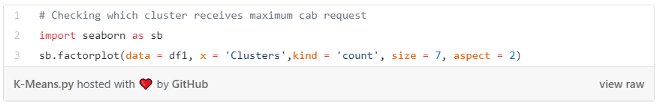
Which cluster receives maximum ride request?
Grouping and visualizing the total number of clusters:
Output
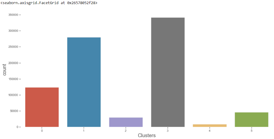
Cluster 3 received the most ride requests followed by cluster 1. Cluster 4 received the fewest requests. Uber can place more vehicles in Cluster 3 to meet higher demands.
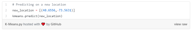
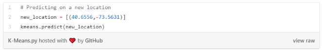
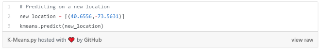
Checking new location
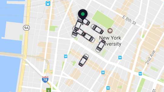
If Uber gets a new ride request (as getting their new location through longitude and latitude) then pass the latitude and longitude value, then it would predict which cluster from which the vehicle should go.
Output
![]()
Passing the new request latitude and longitude value (40.65,-73.56). The new request will be assigned to cluster 2 as it’s a distance from the centroid of cluster 2 is minimal compared to other centroids. The vehicle will come from cluster 2.
Here we have taken data only for August 2014 which pertains to the five boroughs of NYC. In real-time, there is far more data (and clusters) to consider, as Uber has a presence in many countries and locations. These centroids can act as a hub for all their ride requests in a defined area.
The above shows how k-means clustering could help Uber perform optimal pricing and the optimal positioning of cars in order to serve their customer faster and grow their business.
Keep learning and stay tuned for more!
Bio: Dhilip Subramanian is a Mechanical Engineer and has completed his Master's in Analytics. He has 9 years of experience with specialization in various domains related to data including IT, marketing, banking, power, and manufacturing. He is passionate about NLP and machine learning. He is a contributor to the SAS community and loves to write technical articles on various aspects of data science on the Medium platform.
Original. Reposted with permission.
Related:
- Centroid Initialization Methods for k-means Clustering
- Exploring the Real World of Data Science
- Five Cool Python Libraries for Data Science