 Data Visualization in Python: Matplotlib vs Seaborn

 Data Visualization in Python: Matplotlib vs Seaborn
Seaborn and Matplotlib are two of Python's most powerful visualization libraries. Seaborn uses fewer syntax and has stunning default themes and Matplotlib is more easily customizable through accessing the classes.
Python offers a variety of packages for plotting data. This tutorial will use the following packages to demonstrate Python's plotting capabilities:
Matplotlib
import matplotlib.pyplot as plt
%matplotlib inline
import numpy as np
In the above code chunk, we import the Matplotliib library with the PyPlot module as plt This is to make it easier to execute commmands as we will see later on in the tutorial. PyPlot contains a range of commands required to create and edit plots. %matplotlib inline is run so that the plot will show underneath the code chunk automatically when it is executed. Otherwise the user will need to type plt.show() everytime a new plot is created. This functionality is exclusive to Jupyter Notebook/IPython. Matplotlib's highly customizable code structure makes it a great guide to other plotting libraries. Lets see how we can generate a scatter plot from matplotlib.
A handy tip is that whenever matplotlib is executed, the output will always include a text output that can be very visually unappealing. To fix this, add a semicolon - ';' at the end of the last line of code when executing a code chunk to generate a figure.
The dataset used is the Bike Sharing Dataset from the UCI Machine Learning Repository.
Matplotlib: Scatter Plot
A scatter plot is one of the most influential, informative, and versatile plots in your arsenal. It can convey an array of information to the user without much work (as demonstrated below)
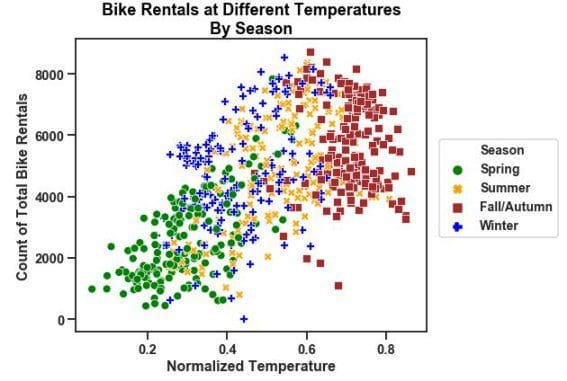
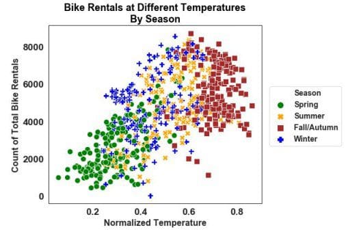
plt.scatter()will give us a scatter plot of the data we pass in as the initial arguments.tempis the x-axis andcntis the y-axis.cdetermines the colors of the data points. Because we passed a string - 'season' which is a column of the dataframe day, the colors correspond to the different seasons. This is a quick and easy method to group data in a visual format.
plt.scatter('temp', 'cnt', data=day, c='season')
plt.xlabel('Normalized Temperature', fontsize='large')
plt.ylabel('Count of Total Bike Rentals', fontsize='large');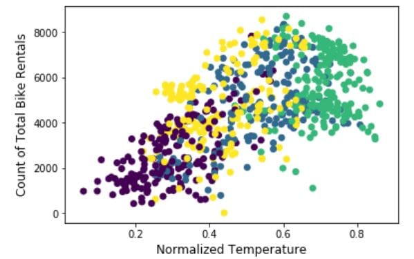
Lets see the information that it shows:
- There were more than 8000 bike rentals at some point in time.
- The normalized temperature has gone above 0.8.
- The amount of bike rentals does not differ much with temperature or season.
- There is a positive linear relationship between bike rentals and normalized temperature.
This graph does indeed give us much information. However, the graph does not produce a legend, which makes it difficult to decipher anything about the seasonal groups. This is due to the Matplotlib being unable to produce a legend when a plot is made in this fashion. In the next section we will see how the above plot is hiding and even misleading viewers.
Lets look at the same plot that has undergone thorough editing. The goal here will be to produce a legend to decipher differences between the groups.
plt.rcParams['figure.figsize'] = [15, 10]

fontdict={'fontsize': 18,
          'weight' : 'bold',
         'horizontalalignment': 'center'}

fontdictx={'fontsize': 18,
          'weight' : 'bold',
          'horizontalalignment': 'center'}

fontdicty={'fontsize': 16,
          'weight' : 'bold',
          'verticalalignment': 'baseline',
          'horizontalalignment': 'center'}

spring = plt.scatter('temp', 'cnt', data=day[day['season']==1], marker='o', color='green')
summer = plt.scatter('temp', 'cnt', data=day[day['season']==2], marker='o', color='orange')
autumn = plt.scatter('temp', 'cnt', data=day[day['season']==3], marker='o', color='brown')
winter = plt.scatter('temp', 'cnt', data=day[day['season']==4], marker='o', color='blue')
plt.legend(handles=(spring,summer,autumn,winter),
           labels=('Spring', 'Summer', 'Fall/Autumn', 'Winter'),
           title="Season", title_fontsize=16,
           scatterpoints=1,
           bbox_to_anchor=(1, 0.7), loc=2, borderaxespad=1.,
           ncol=1,
           fontsize=14)
plt.title('Bike Rentals at Different Temperatures\nBy Season', fontdict=fontdict, color="black")
plt.xlabel("Normalized temperature", fontdict=fontdictx)
plt.ylabel("Count of Total Rental Bikes", fontdict=fontdicty);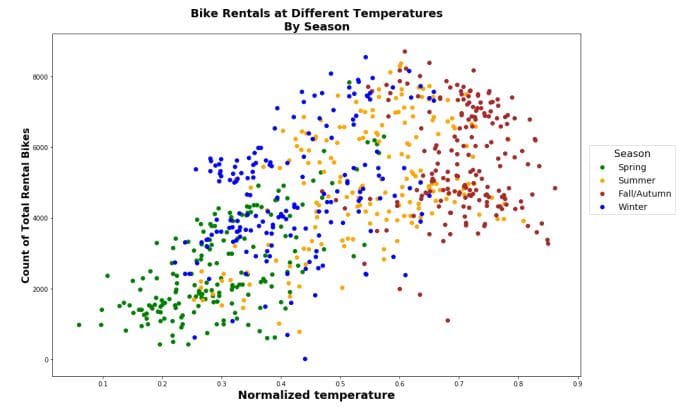
plt.rcParams['figure.figsize'] = [15, 10]allows to control the size of the entire plot. This corresponds to a 15∗10 (length∗width) plot.fontdictis a dictionary that can be passed in as arguments for labeling axes.fontdictfor the title,fontdictxfor the x-axis andfontdictyfor the y-axis.- There are now 4
plt.scatter()function calls corresponding to one of the four seasons. This is seen again in the data argument in which it has been subsetted to correspond to a single season. marker and color arguments correspond to using a'o'to visually represent a data point and the respective color of that marker. plt.legend()is where we can pass our arguments to make a legend. The first two arguments are handles: the actual plots to be represented in the legend and labels: the names corresponding to each plot that will be shown in the legend. scatterpoints are the size of each marker for the scatter plot.bbox_to_anchor=(1, 0.7), loc=2, borderaxespad=1. These 3 arguments are used in tandem to correspond to the location of the legend; click on the link at the start of this sentence to find out the nature of these arguments.
Now we can distinguish the seasons to check for more underlying information. However, even after adding these extra layers, the plot can still hide information and be prone to misinterpretation.
This plot:
- had data overlapping each other.
- was cluttered.
- did not reveal any discernable differences among the seasonality of bike rentals.
- hid patterns such as bike rentals increasing in the spring and summer as temperatures rose.
- shows an overall positive trend between total bike rentals and temperature.
- does not clearly show which season had the lowest temperature in comparison.
Subplots
Creating subplots are probably one of the most attractive and professional charting techniques in the industry. Subplots are necessary when a single plot is overcrowded with information. That information cannot be assessed in that state.
Faceting is the process of creating multiple plots of a graph that share the same axes. Faceting is one of the most versatile techniques of data visualization. Faceted plots can convey information in many dimensions and can reveal information that was previously hidden.
plt.figure()will be used to create an empty plot canvas as explained before. It is saved as fig.fig.add_subplot()will be repeated 4 times to correspond to a respective season. The arguments correspond tonrows,ncols, index. For example inax1it corresponds to the 1st plot of the figure (index starts at 1 in the upper left corner and increases to the right.)- The remaining function calls are either self-explanatory or have been previously covered.
fig = plt.figure()

plt.rcParams['figure.figsize'] = [15,10]
plt.rcParams["font.weight"] = "bold"

fontdict={'fontsize': 25,
          'weight' : 'bold'}

fontdicty={'fontsize': 18,
          'weight' : 'bold',
          'verticalalignment': 'baseline',
          'horizontalalignment': 'center'}

fontdictx={'fontsize': 18,
          'weight' : 'bold',
          'horizontalalignment': 'center'}

plt.subplots_adjust(wspace=0.2, hspace=0.2)

fig.suptitle('Bike Rentals at Different Temperatures\nBy Season', fontsize=25,fontweight="bold", color="black",
             position=(0.5,1.01))

ax1 = fig.add_subplot(221)
ax1.scatter('temp', 'cnt', data=day[day['season']==1], c="green")
ax1.set_title('Spring', fontdict=fontdict, color="green")
ax1.set_ylabel("Count of Total Rental Bikes", fontdict=fontdicty, position=(0,-0.1))


ax2 = fig.add_subplot(222)
ax2.scatter('temp', 'cnt', data=day[day['season']==2], c="orange")
ax2.set_title('Summer', fontdict=fontdict, color="orange")


ax3 = fig.add_subplot(223)
ax3.scatter('temp', 'cnt', data=day[day['season']==3], c="brown")
ax3.set_title('Fall or Autumn', fontdict=fontdict, color="brown")


ax4 = fig.add_subplot(224)
ax4.scatter('temp', 'cnt', data=day[day['season']==4], c="blue")
ax4.set_title("Winter", fontdict=fontdict, color="blue")
ax4.set_xlabel("Normalized temperature", fontdict=fontdictx, position=(-0.1,0));
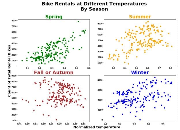
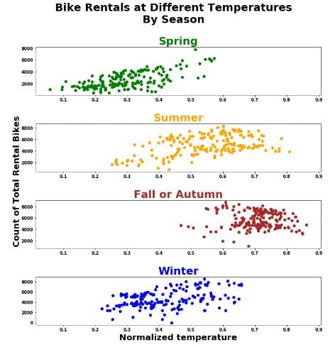
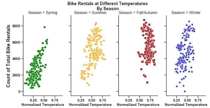
Now we can analyze each group independently and as we will see more effectively. First thing we should notice is that the relationship between temperature and bike rentals differs between seasons:
- Positive linear relationship in the Spring.
- Quadratic non-linear relationship in the Winter and Summer.
- Weak Positive to No discernible relationship in Autumn.
However, again there is a chance of misleading the viewers and it is for less than obvious reasons. The axes are all different among the 4 plots. Most people will not realize that this can cause misleading insights if no caution is taken. See below on how this issue can be fixed:
fig = plt.figure()

plt.rcParams['figure.figsize'] = [12,12]
plt.rcParams["font.weight"] = "bold"

plt.subplots_adjust(hspace=0.60)


fontdicty={'fontsize': 20,
          'weight' : 'bold',
          'verticalalignment': 'baseline',
          'horizontalalignment': 'center'}

fontdictx={'fontsize': 20,
          'weight' : 'bold',
          'horizontalalignment': 'center'}

fig.suptitle('Bike Rentals at Different Temperatures\nBy Season', fontsize=25,fontweight="bold", color="black",
             position=(0.5,1.0))

#ax2 is defined first because the other plots are sharing its x-axis
ax2 = fig.add_subplot(412, sharex=ax2)
ax2.scatter('temp', 'cnt', data=day.loc[day['season']==2], c="orange")
ax2.set_title('Summer', fontdict=fontdict, color="orange")
ax2.set_ylabel("Count of Total Rental Bikes", fontdict=fontdicty, position=(-0.3,-0.2))


ax1 = fig.add_subplot(411, sharex=ax2)
ax1.scatter('temp', 'cnt', data=day.loc[day['season']==1], c="green")
ax1.set_title('Spring', fontdict=fontdict, color="green")


ax3 = fig.add_subplot(413, sharex=ax2)
ax3.scatter('temp', 'cnt', data=day.loc[day['season']==3], c="brown")
ax3.set_title('Fall or Autumn', fontdict=fontdict, color="brown")


ax4 = fig.add_subplot(414, sharex=ax2)
ax4.scatter('temp', 'cnt', data=day.loc[day['season']==4], c="blue")
ax4.set_title('Winter', fontdict=fontdict, color="blue")
ax4.set_xlabel("Normalized temperature", fontdict=fontdictx);
Now this plot grid has been adjusted to share the same x-axis as Summer because it has a wider range for temperature. Now interestingly, this data shows us some new insights:
- Spring had the lowest temperatures.
- Fall/Autumn had the highest temperatures.
- The total number of bike rentals and temperature seem to have a quadratic relationship in the Summer and Autumn.
- Less bikes are rented in low temperatures regardless of season.
- There is a clear positive linear relationship between temperature and total bike rentals in the Spring.
- There seems to be a mild negative linear relationship between temperature and bike rentals in the Fall/Autumn.
fig = plt.figure()

plt.rcParams['figure.figsize'] = [10,10]
plt.rcParams["font.weight"] = "bold"

plt.subplots_adjust(wspace=0.5)
fontdicty1={'fontsize': 18,
          'weight' : 'bold'}

fontdictx1={'fontsize': 18,
          'weight' : 'bold',
          'horizontalalignment': 'center'}

fig.suptitle('Bike Rentals at Different Temperatures\nBy Season', fontsize=25,fontweight="bold", color="black",
             position=(0.5,1.0))

ax3 = fig.add_subplot(143, sharey=ax3)
ax3.scatter('temp', 'cnt', data=day.loc[day['season']==3], c="brown")
ax3.set_title('Fall or Autumn', fontdict=fontdict,color="brown")


ax1 = fig.add_subplot(141, sharey=ax3)
ax1.scatter('temp', 'cnt', data=day.loc[day['season']==1], c="green")
ax1.set_title('Spring', fontdict=fontdict, color="green")
ax1.set_ylabel("Count of Total Rental Bikes", fontdict=fontdicty1, position=(0.5,0.5))


ax2 = fig.add_subplot(142, sharey=ax3)
ax2.scatter('temp', 'cnt', data=day.loc[day['season']==2], c="orange")
ax2.set_title('Summer', fontdict=fontdict, color="orange")


ax4 = fig.add_subplot(144, sharey=ax3)
ax4.scatter('temp', 'cnt', data=day.loc[day['season']==4], c="blue")
ax4.set_title('Winter', fontdict=fontdict, color="blue")
ax4.set_xlabel("Normalized temperature", fontdict=fontdictx, position=(-1.5,0));
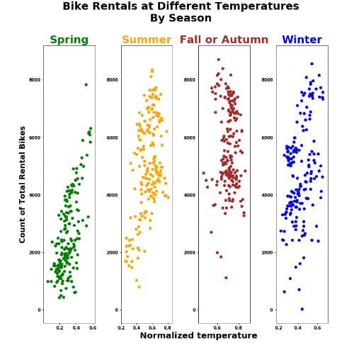
Re-angling/juxtaposing the plots now show another perspective:
- All seasons had over 8000 bike rentals at some point in time.
- There is a large clustering in Autumn and Spring compared to the other seasons.
- Winter and Summer had the most varied amount of bike rentals.
Do not attempt to decipher a relationship between the variables from this angle. It can mislead you again because now it looks like there is a negative linear relationship between bike rentals and temperature in both Spring and Summer and we saw before that this is not the case.
Here is a link to an intuitive tutorial by Real Python on using Matplotlib.
Seaborn
The seaborn package was developed based on the Matplotlib library. It is used to create more attractive and informative statistical graphics. While seaborn is a different package, it can also be used to develop the attractiveness of matplotlib graphics.
While matplotlib is great, we always want to do better. Run the code chunk below to import the seaborn library and create the previous plot and see what happens.
First we import the library with import seaborn as sns. The next line sns.set() will load seaborn's default theme and color palette to the session. Run the code below and watch the change in the chart area and the text.
import seaborn as sns
sns.set()
Once we load seaborn into the session, everytime a matplotlib plot is executed, seaborn's default customizations are added as you see above. However, a huge problem that troubles many users is that the titles can overlap. Combine this with matplotlib's only confusing naming convention for its titles it becomes a nuisance. Nevertheless, the attractive visuals still make it usable for Data Scientist's work.
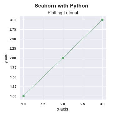
In order to get the titles in the fashion that we want and have more customizability, We need to use the structure below. Note that this is only necessary if we use subtitles in our plots. Sometimes they are necessary so it is better to have it on hand.
fig = plt.figure()
fig.suptitle('Seaborn with Python', fontsize='x-large', fontweight='bold')
fig.subplots_adjust(top=0.87)
#This is used for the main title. 'figure()' is a class that provides all the plotting elements of a diagram.
#This must be used first or else the title will not show.fig.subplots_adjust(top=0.85) solves our overlapping title problem.

ax = fig.add_subplot(111)

fontdict={'fontsize': 14,
        'fontweight' : 'book',
        'verticalalignment': 'baseline',
        'horizontalalignment': 'center'}

ax.set_title('Plotting Tutorial', fontdict=fontdict)
#This specifies which plot to add the customizations. fig.add_sublpot(111) corresponds to top left plot no.1
#(there is only one plot).

plt.plot(x, y, 'go-', linewidth=1) #linewidth=1 to make it narrower
plt.xlabel('x-axis', fontsize=14)
plt.ylabel('yaxis', fontsize=14);
Going deeper into seaborn, we can recreate the above visualizations from the Bike Rentals dataset with fewer lines of code and similar syntax. Seaborn still uses Matplotlib syntax to execute seaborn plots with relatively minor but obvious synctactic differences.
For simplicity and better visuals, I am going to rename and relabel the 'season' column of the bike rentals dataset.
day.rename(columns={'season':'Season'}, inplace=True)
day['Season']=day.Season.map({1:'Spring', 2:'Summer', 3:'Fall/Autumn', 4:'Winter'})
Now that the 'Season' column is edited to our liking, we will continue onto creating a seaborn style visualization of the previous plots.
The first noticeable difference is the default theme that seaborn presents when its default aesthetics are loaded into the session. The default theme as you see directly above is a result of sns.set_style('whitegrid') being applied in the background when sns.set() is called. As we will see this is easily overridden according to our liking with the readily available themes as stated in the below cell:
sns.set_style()must be one of 'white', 'dark', 'whitegrid', 'darkgrid', 'ticks'. This controls the plot area. Such as the color, grid and presence of ticks.sns.set_context()must be in 'paper', 'notebook', 'talk', 'poster'. This controls the layout of the plot in terms of how it is to be read. Such as if it was on a 'poster' where we will see enlarged images and text. 'Talk' will create a plot with a more bold font.
plt.figure(figsize=(7,6))

fontdict={'fontsize': 18,
          'weight' : 'bold',
         'horizontalalignment': 'center'}

sns.set_context('talk', font_scale=0.9)
sns.set_style('ticks')

sns.scatterplot(x='temp', y='cnt', hue='Season', data=day, style='Season',
                    palette=['green','orange','brown','blue'], legend='full')

plt.legend(scatterpoints=1,
           bbox_to_anchor=(1, 0.7), loc=2, borderaxespad=1.,
           ncol=1,
           fontsize=14)
plt.xlabel('Normalized Temperature', fontsize=16, fontweight='bold')
plt.ylabel('Count of Total Bike Rentals', fontsize=16, fontweight='bold')
plt.title('Bike Rentals at Different Temperatures\nBy Season', fontdict=fontdict, color="black",
         position=(0.5,1));
Now lets take a look at the same plot but with sns.set_context('paper', font_scale=2) and sns.set_style('white')
plt.figure(figsize=(7,6))

fontdict={'fontsize': 18,
          'weight' : 'bold',
         'horizontalalignment': 'center'}

sns.set_context('paper', font_scale=2) #this makes the font and scatterpoints much smaller, hence the need for size adjustemnts
sns.set_style('white')

sns.scatterplot(x='temp', y='cnt', hue='Season', data=day, style='Season',
                    palette=['green','orange','brown','blue'], legend='full', size='Season', sizes=[100,100,100,100])

plt.legend(scatterpoints=1,
           bbox_to_anchor=(1, 0.7), loc=2, borderaxespad=1.,
           ncol=1,
           fontsize=14)

plt.xlabel('Normalized Temperature', fontsize=16, fontweight='bold')
plt.ylabel('Count of Total Bike Rentals', fontsize=16, fontweight='bold')
plt.title('Bike Rentals at Different Temperatures\nBy Season', fontdict=fontdict, color="black",
         position=(0.5,1));
Now we have finally recreated our previous matplotlib style plot with Seaborn using fewer lines of code and better resolution in my opinion. Let's take it one step further and facet the plot to finish:
sns.set(rc={'figure.figsize':(20,20)})
sns.set_context('talk', font_scale=2)
sns.set_style('ticks')
g = sns.relplot(x='temp', y='cnt', hue='Season', data=day,palette=['green','orange','brown','blue'],
                col='Season', col_wrap=4, legend=False
                height=6, aspect=0.5, style='Season', sizes=(800,1000))

g.fig.suptitle('Bike Rentals at Different Temperatures\nBy Season' ,position=(0.5,1.05), fontweight='bold', size=18)
g.set_xlabels("Normalized Temperature",fontweight='bold', size=15)
g.set_ylabels("Count of Total Bike Rentals",fontweight='bold', size=20);
In order to change the shape of the figures, the aspect argument needs to be changed. Increasing the value of aspect here will create a more square shaped figure. It works in tandem with height so experiment with the size using both arguments.
To change the number of rows and columns, use the col_wrap argument to do this. This works in tandem with the col argument. It detects the number of categories and allocates it accordingly.
sns.set(rc={'figure.figsize':(20,20)})
sns.set_context('talk', font_scale=2)
sns.set_style('ticks')
g = sns.relplot(x='temp', y='cnt', hue='Season', data=day,palette=['green','orange','brown','blue'],
                col='Season', col_wrap=2, legend=False
                height=4, aspect=1.6, style='Season', sizes=(800,1000))

g.fig.suptitle('Bike Rentals at Different Temperatures\nBy Season' ,position=(0.5,1.05), fontweight='bold', size=18)
g.set_xlabels("Normalized Temperature",fontweight='bold', size=15)
g.set_ylabels("Count of\nTotal Bike Rentals",fontweight='bold', size=20);

Note: Parts of this tutorial were used in a tutorial I prepared for the Victorian Institute of Technology
Related:
- 6 Data Visualization Disasters – How to Avoid Them
- 5 Quick and Easy Data Visualizations in Python with Code
- 10 Useful Python Data Visualization Libraries for Any Discipline