Machine Learning Model Interpretation
Read this overview of using Skater to build machine learning visualizations.
By Himanshu Sharma, Bioinformatics Data Analyst

Tree (Source: By Author)
Interpreting a machine learning model is a difficult task because we need to understand how a model works in the backend, what all parameters the model uses, and how the model is generating the prediction. There are different python libraries that we can use to create machine learning model visualizations and analyze who the model is working.
Machine Learning Model Dashboard
Creating dashboards to interpret machine learning model
Staker is an open-source python library that enables machine learning model interpretations for different types of black-box models. It helps us create different types of visualization, making it easier to understand how a model is working.
In this article, we will explore Skater and what are its different functionalities. Let’s get started…
Installing required libraries
We will start by installing a skater using pip installation. The command given below will install the skater using pip.
!pip install -U skater
Importing required libraries
The next step will be importing the required libraries. To interpret the model using Skater we first need to create a model.
%matplotlib inline
import matplotlib.pyplot
import matplotlib.pyplot as plt
import numpy as np
from sklearn.model_selection
import train_test_split from sklearn.ensemble
import RandomForestClassifier
from sklearn import datasets
from sklearn import svm
from skater.core.explanations import Interpretation
from skater.model import InMemoryModel
from skater.core.global_interpretation.tree_surrogate
import TreeSurrogate
from skater.util.dataops import show_in_notebook
Creating Model
We will create a Random Forest Classifier and use the IRIS dataset.
iris = datasets.load_iris()
digits = datasets.load_digits()
X = iris.data
y = iris.target
clf = RandomForestClassifier(random_state=0, n_jobs=-1)

xtrain, xtest, ytrain, ytest = train_test_split(X,y,test_size=0.2, random_state=0)
clf = clf.fit(xtrain, ytrain)

y_pred=clf.predict(xtest)
prob=clf.predict_proba(xtest)

from skater.core.explanations import Interpretation
from skater.model import InMemoryModel
from skater.core.global_interpretation.tree_surrogate import TreeSurrogate
from skater.util.dataops import show_in_notebook

interpreter = Interpretation(
        training_data=xtrain, training_labels=ytrain, feature_names=iris.feature_names
    )

pyint_model = InMemoryModel(
            clf.predict_proba,
            examples=xtrain,
            target_names=iris.target_names,
            unique_values=np.unique(ytrain).tolist(),
            feature_names=iris.feature_names,
        )
Creating Visualizations
We will start by creating different visualizations that will help us analyze how the model we have created is working.
1. Partial dependence plot
This plot shows us how a particular feature affects the model's prediction.
interpreter.partial_dependence.plot_partial_dependence(
   ['sepal length (cm)'] , pyint_model, n_jobs=-1, progressbar=False, grid_resolution=30, with_variance=True,figsize = (10, 5)
)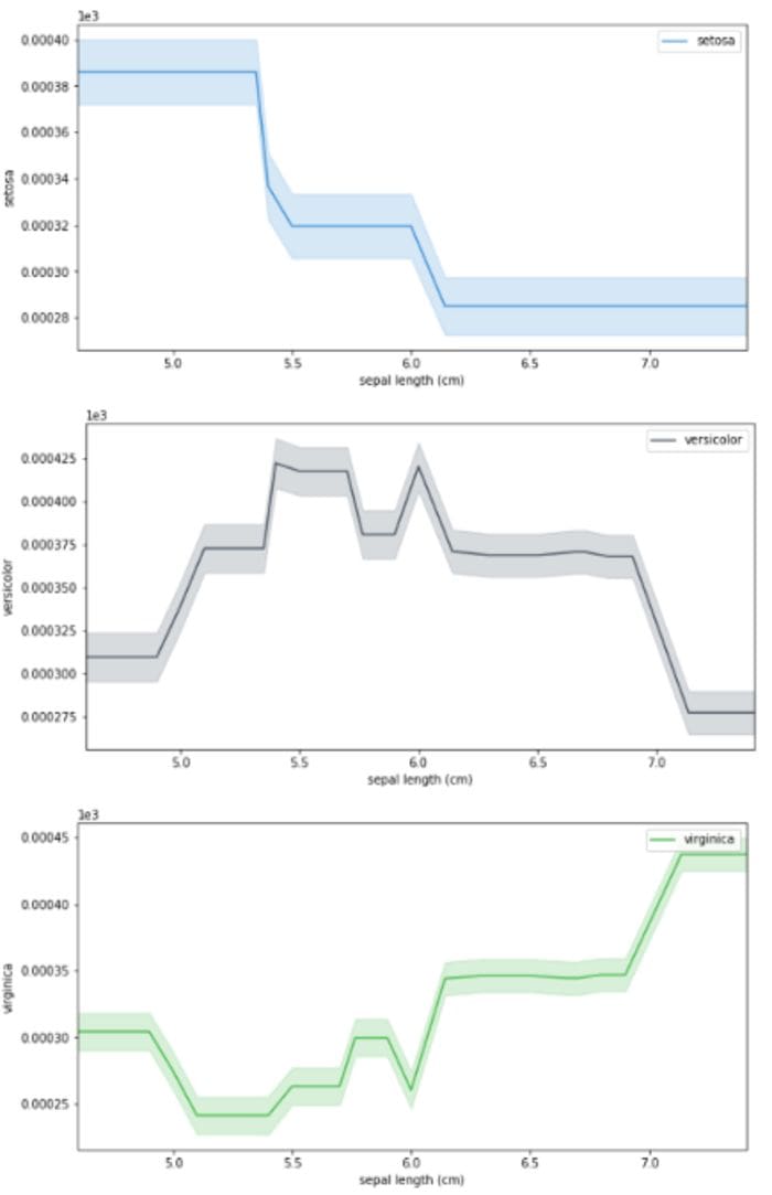
PDP Plot (Source: By Author)
2. Feature importance
In this graph, we will analyze the importance of features in the model that we have created.
plots = interpreter.feature_importance.plot_feature_importance(pyint_model, ascending=True, progressbar=True,
                                n_jobs=-1)
Feature Importance (Source: By Author)
3. Surrogate tree
It is a pictorial representation of the random forest model that we have created. At each step, it is showing the Gini index value, class, etc.
surrogate_explainer = interpreter.tree_surrogate(oracle=pyint_model, seed=5)
surrogate_explainer.fit(xtrain, ytrain)
surrogate_explainer.plot_global_decisions(show_img=True)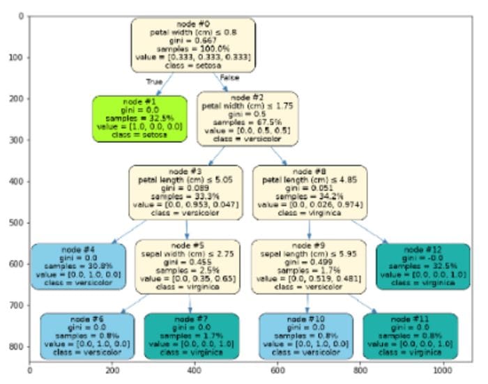
Surrogate Tree(Source: By Author)
This is how we can use Skater to create different graphs that help us analyze how a model is performing. Go ahead try this with different datasets and let me know your comments in the response section.
This article is in collaboration with Piyush Ingale
Before You Go
Thanks for reading! If you want to get in touch with me, feel free to reach me on hmix13@gmail.com or my LinkedIn Profile. You can view my Github profile for different data science projects and packages tutorials. Also, feel free to explore my profile and read different articles I have written related to Data Science.
Bio: Himanshu Sharma is a Bioinformatics Data Analyst at MEDGENOME. Himanshu is a Data Science Enthusiast with hands-on experience in analysing datasets, creating machine learning and deep learning models. He has worked on creating different data science projects and Poc's for different organisations. He has vast experience in creating CNN models for Image recognition and object detection along with RNN for time series prediction. Himanshu is an active blogger and have published around 100+ articles in the field of Data Science.
Original. Reposted with permission.
Related:
- Automating Machine Learning Model Optimization
- The Explainable Boosting Machine
- Interpretability, Explainability, and Machine Learning – What Data Scientists Need to Know